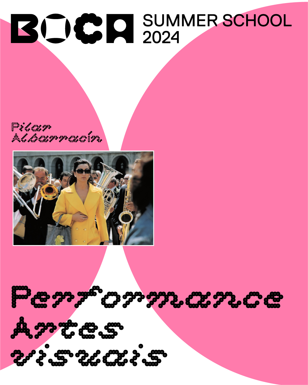
Description
Description
Description


Description


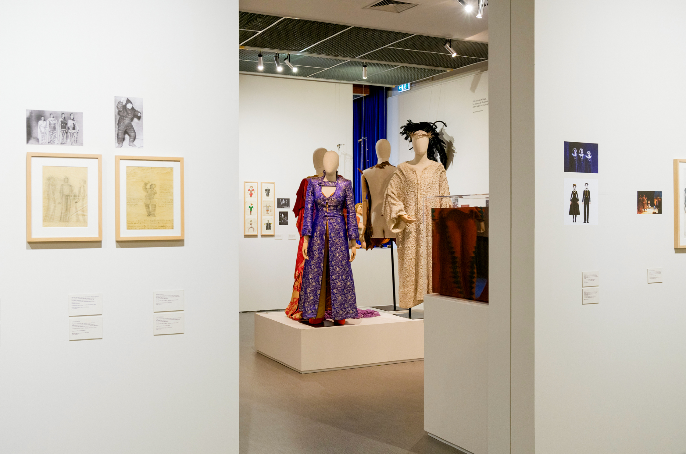

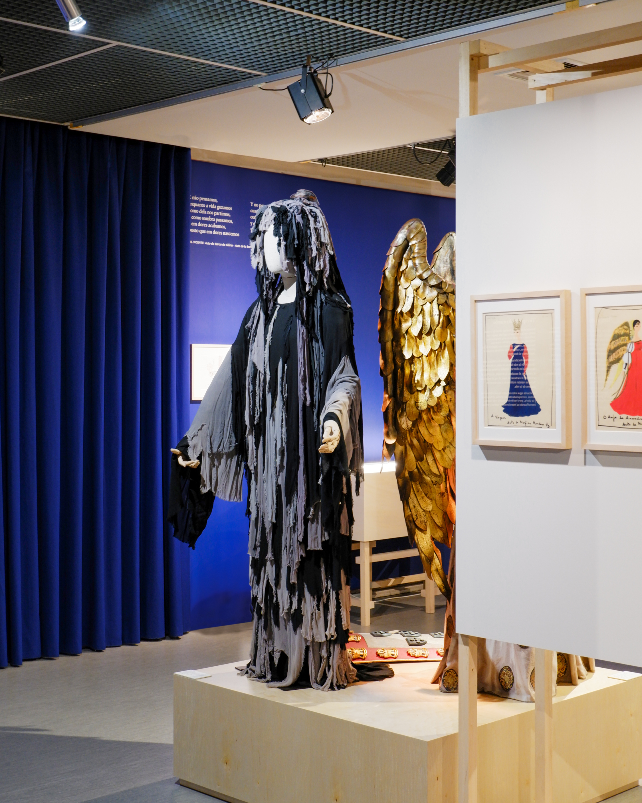
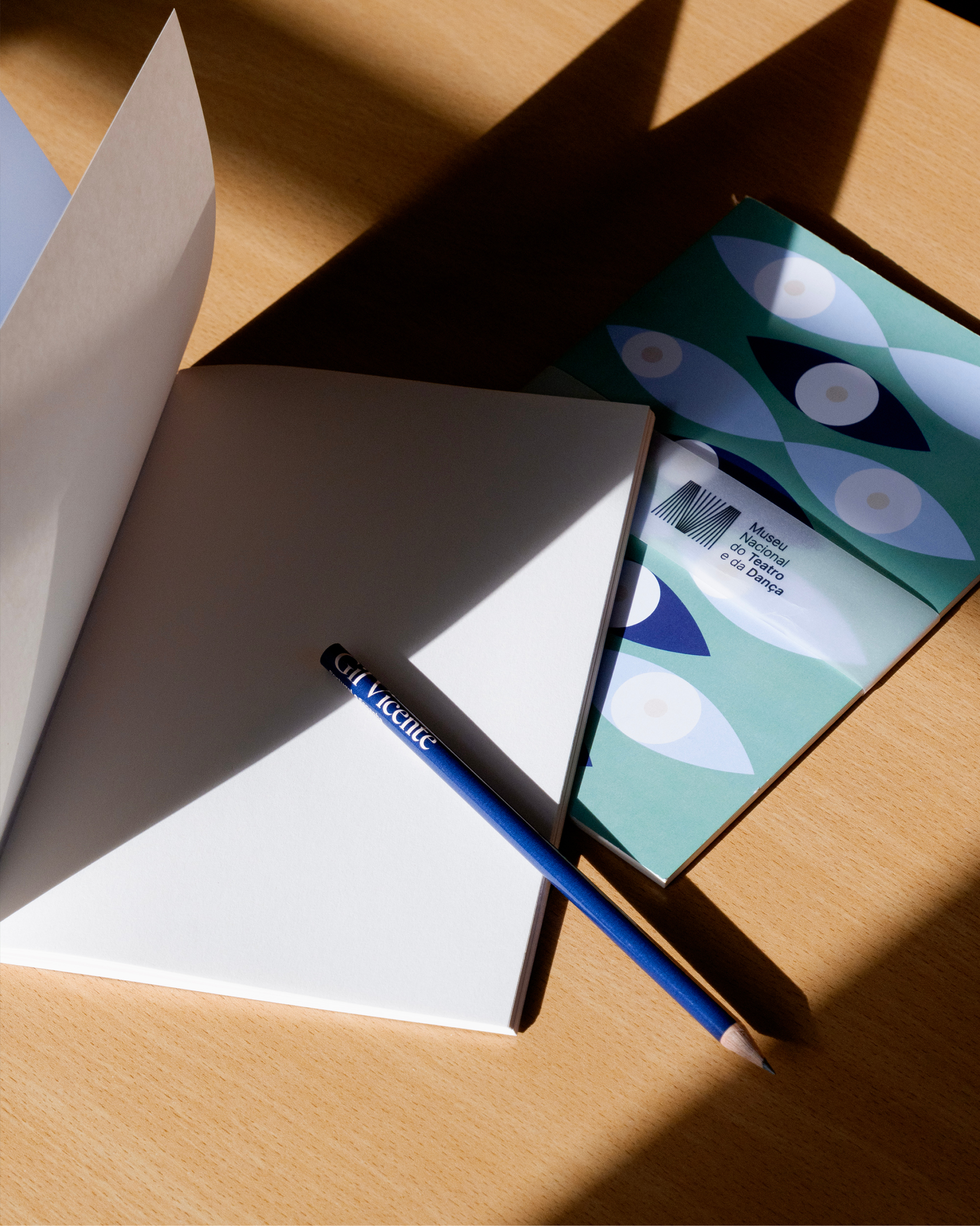

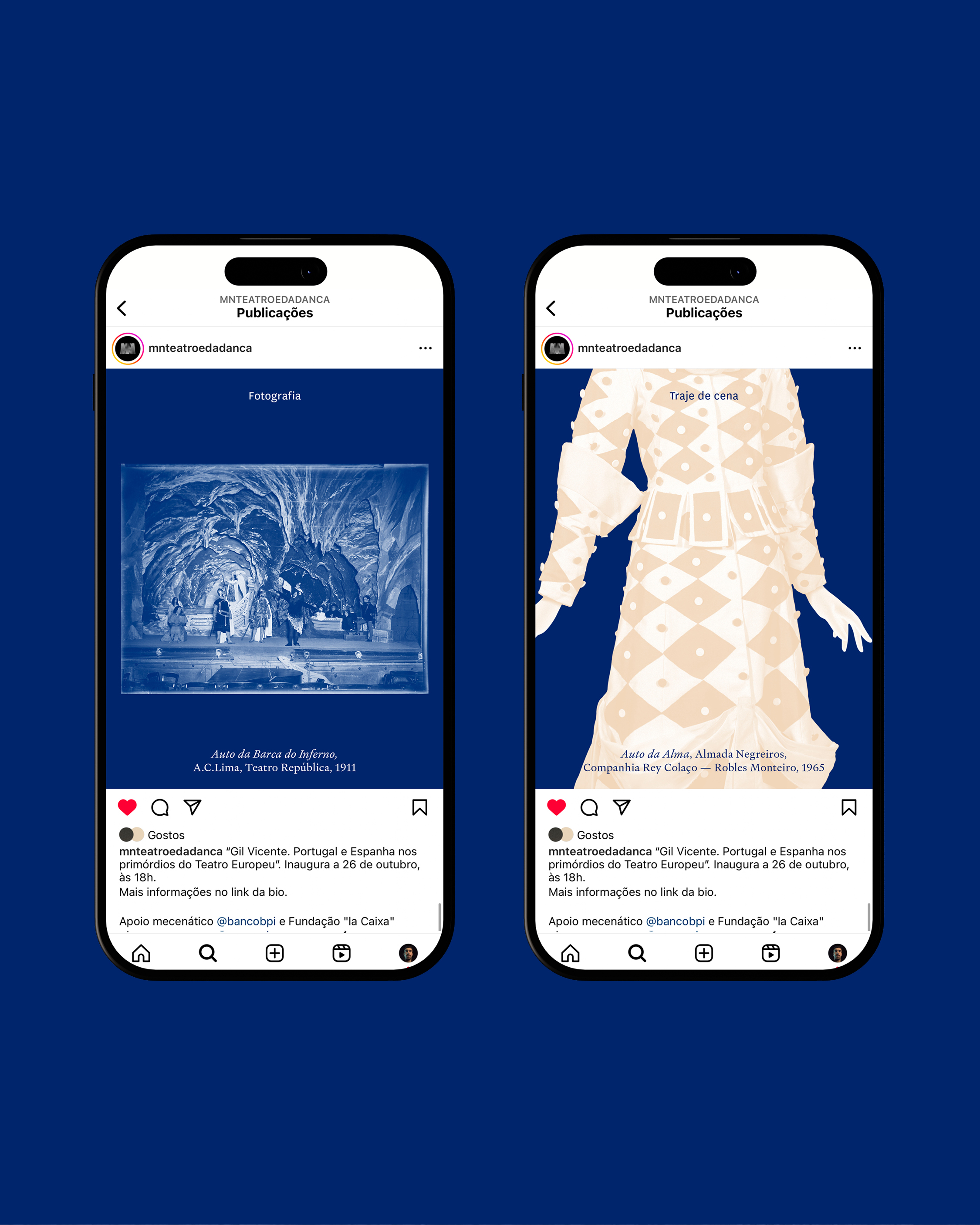


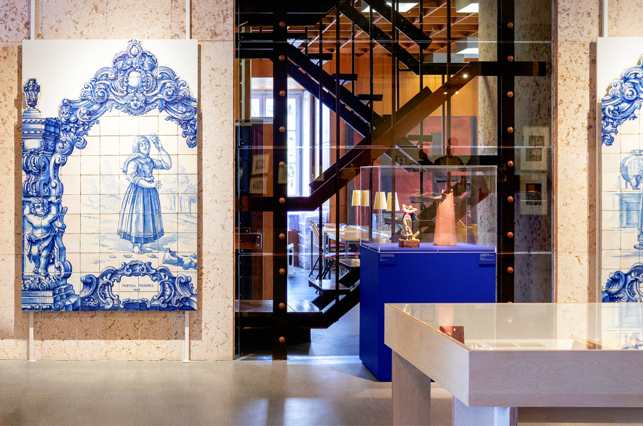
Museu Nacional do Teatro e da Dança
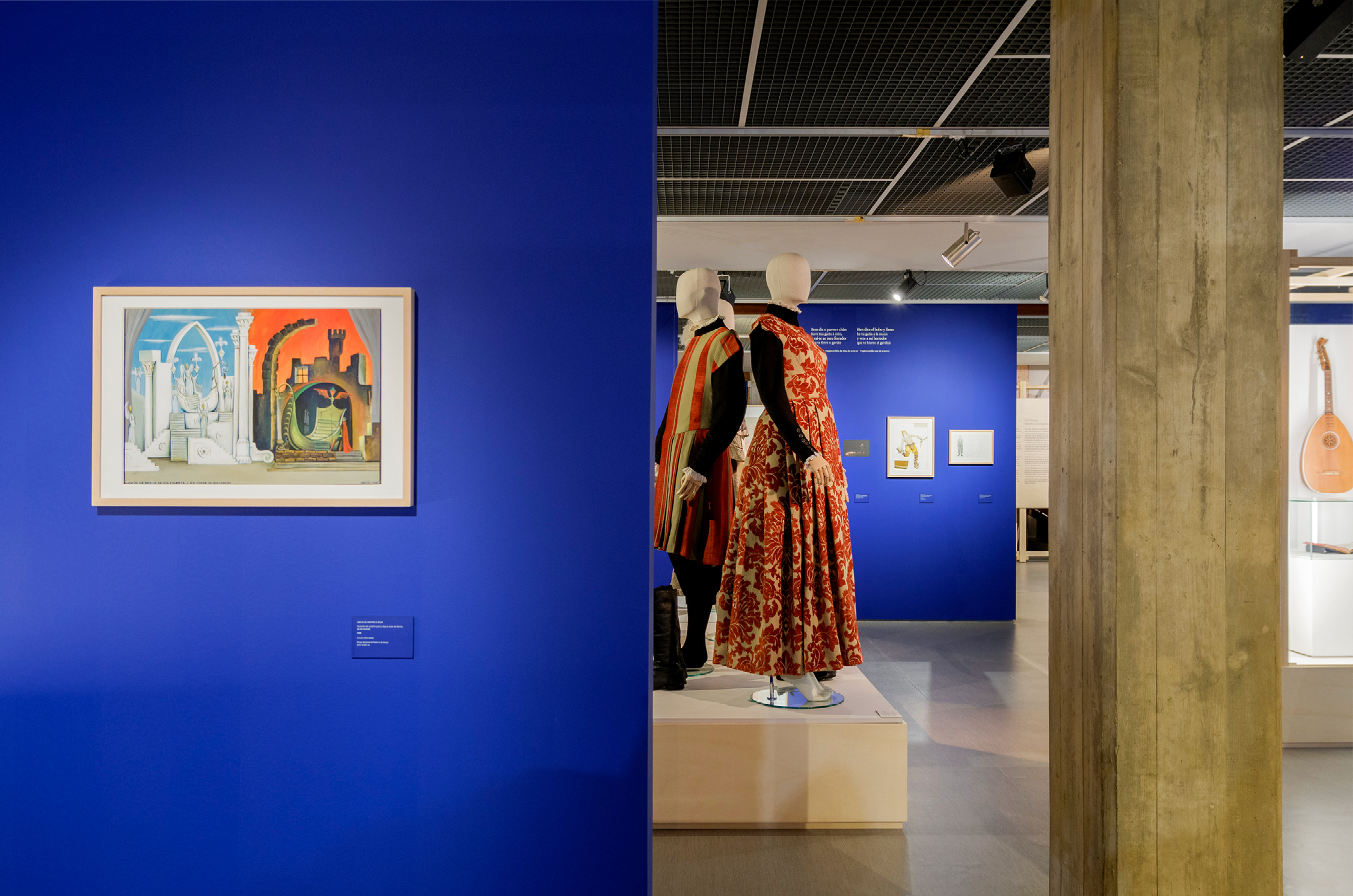
Gil Vicente: Nos primórdios do Teatro EuropeuDescription
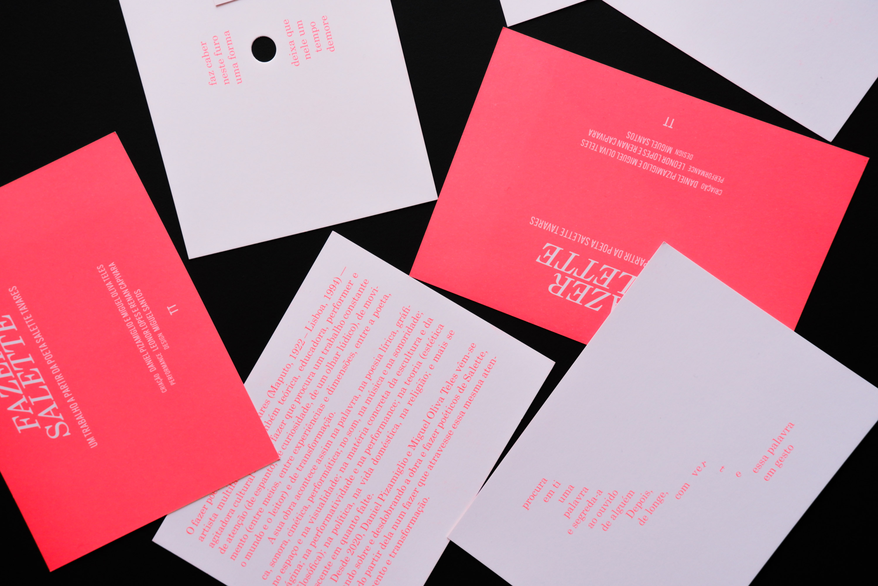
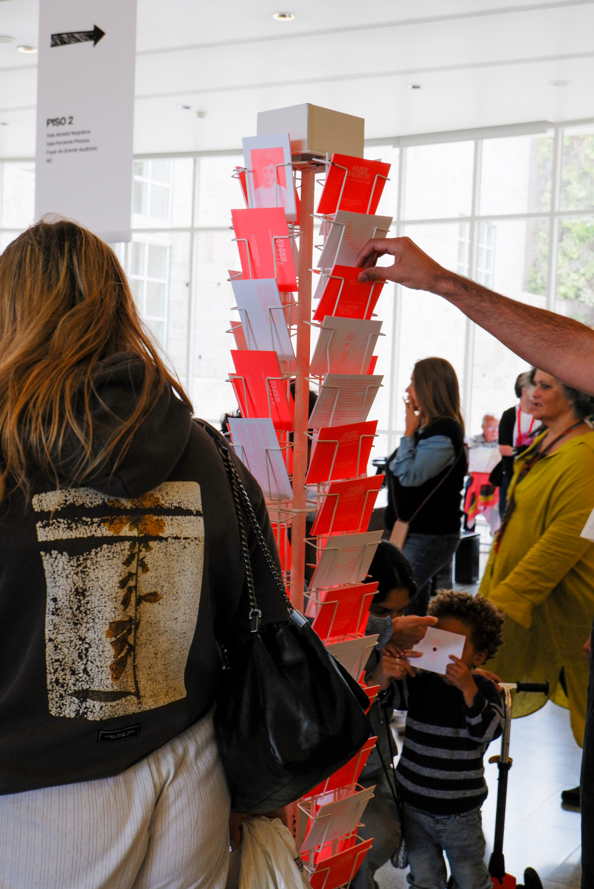
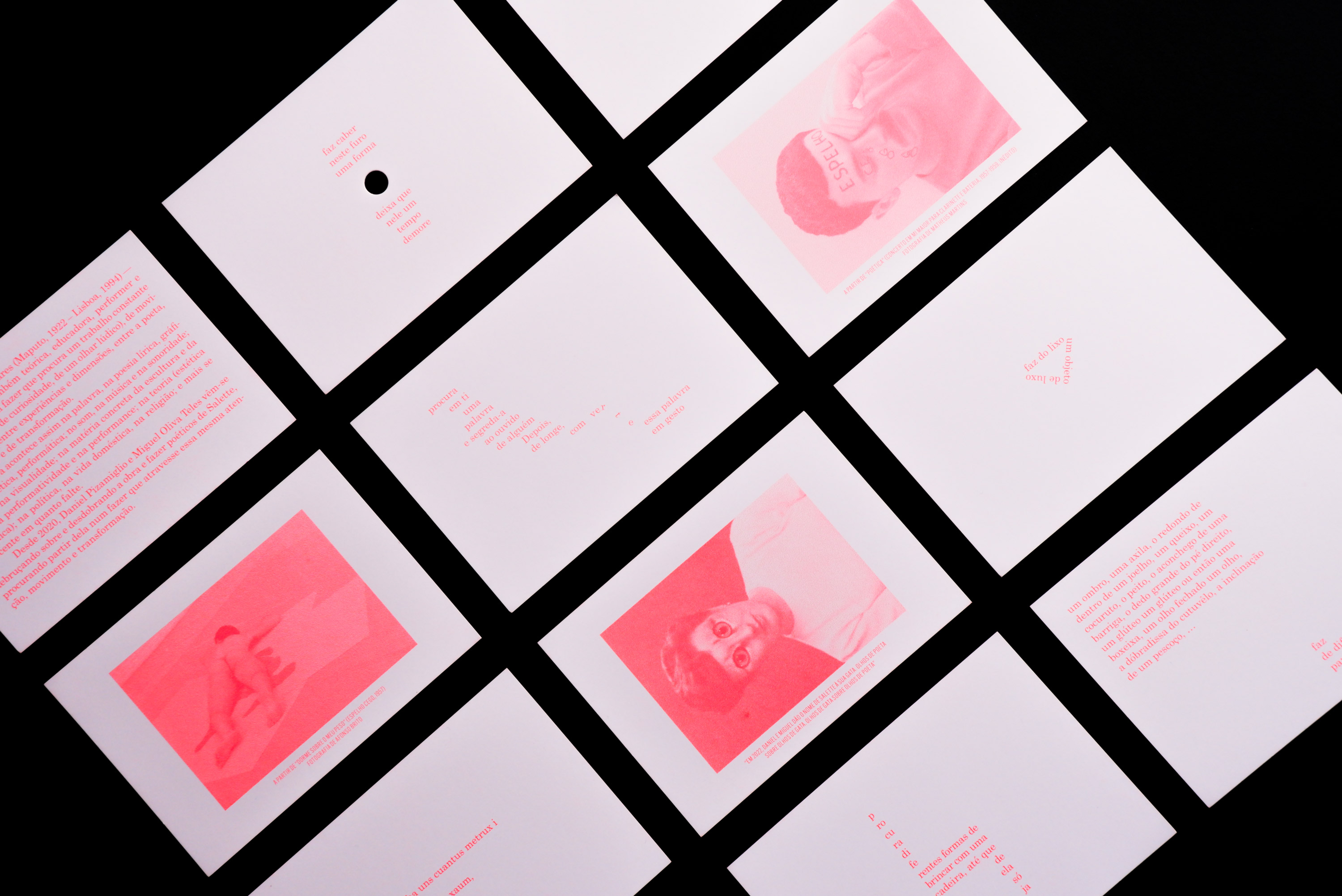

Daniel Pizamiglio e Miguel Teles
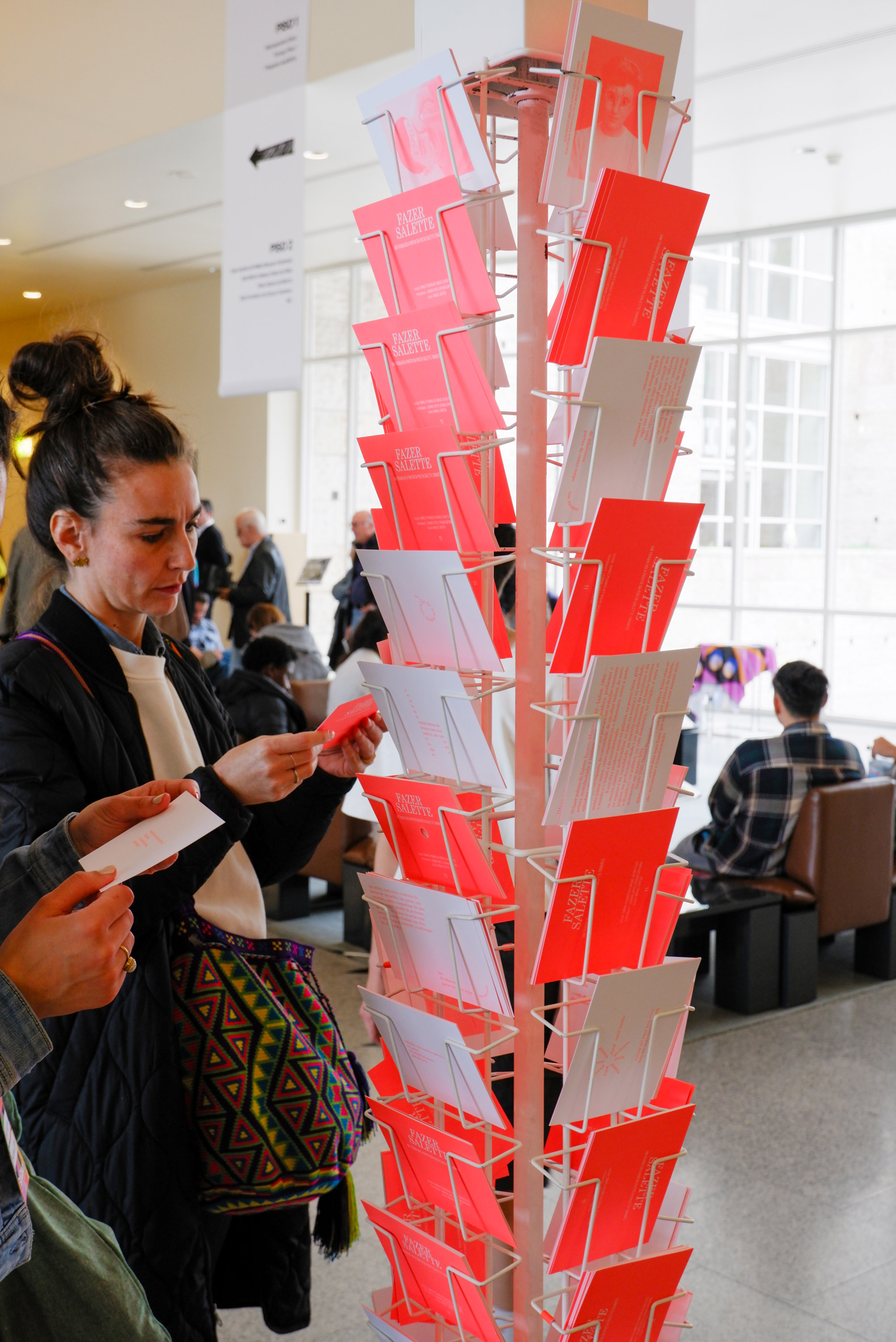
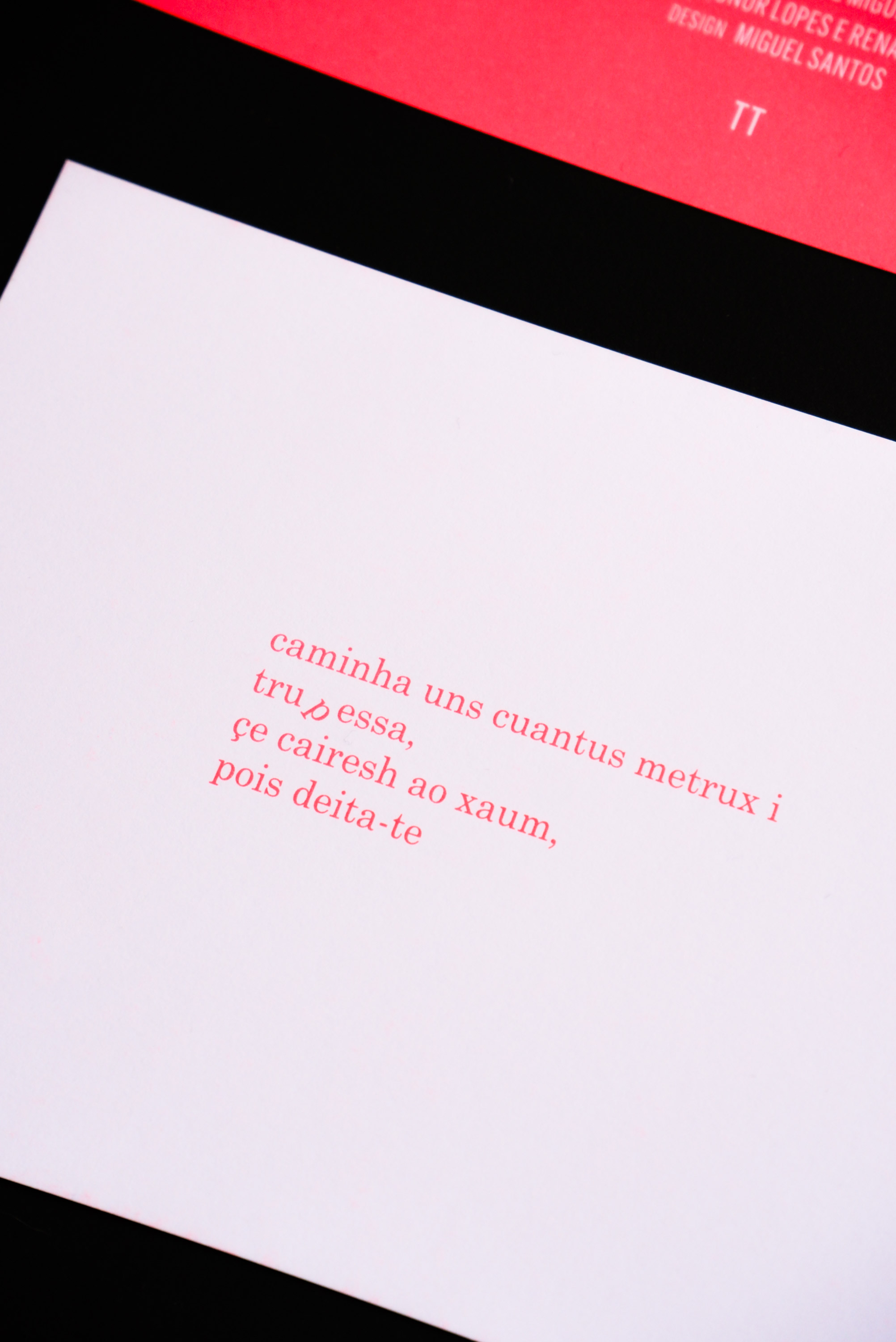
Fazer Salette
Fazer Salette
Description


Companhia João Garcia Miguel
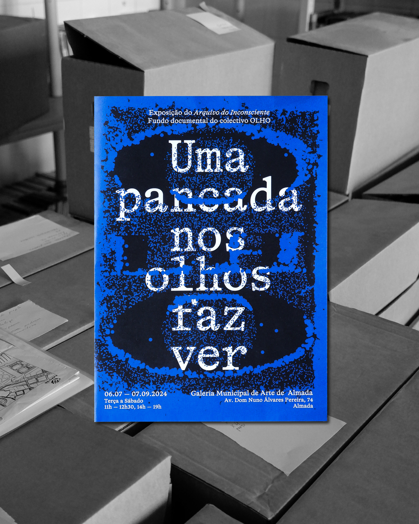
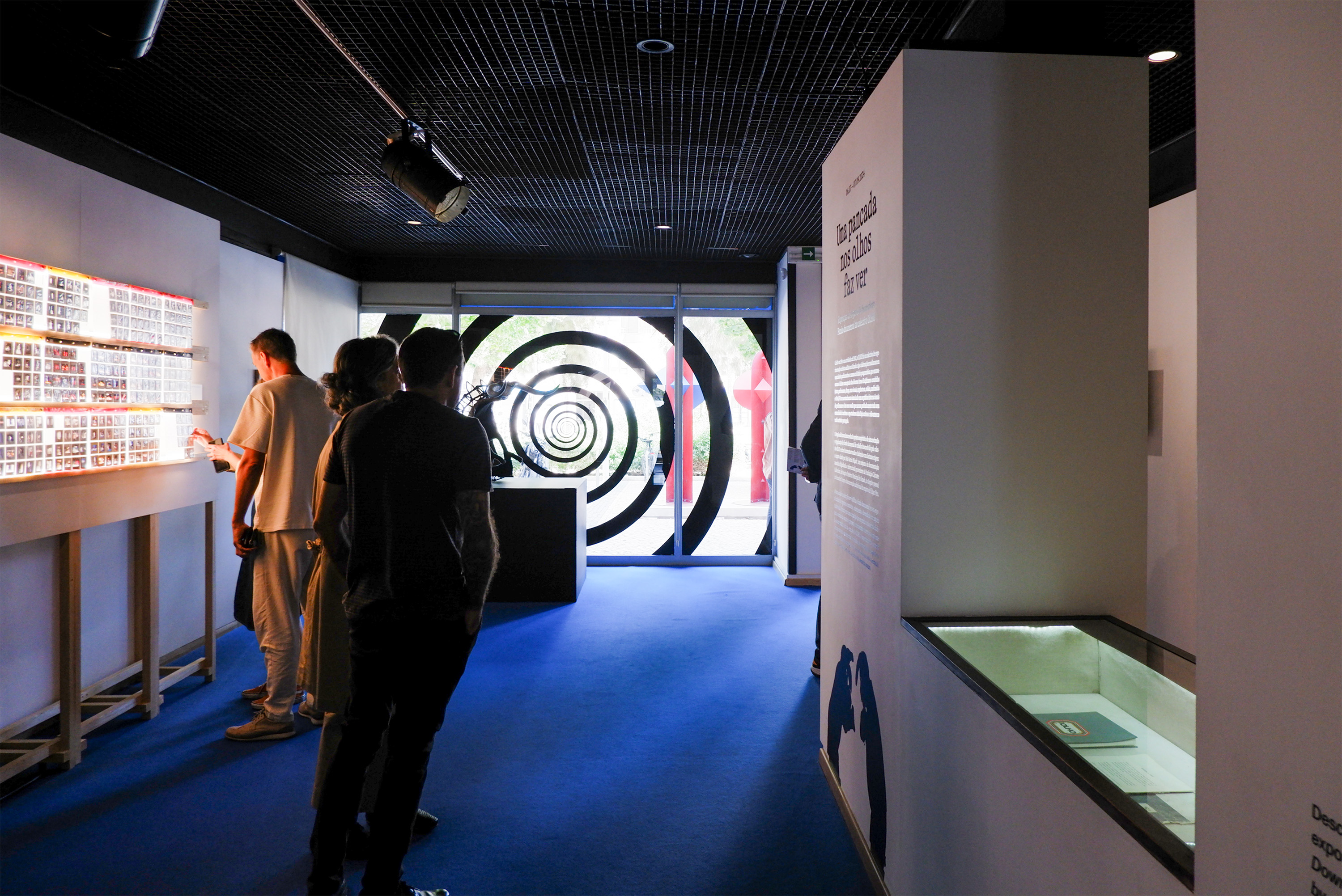
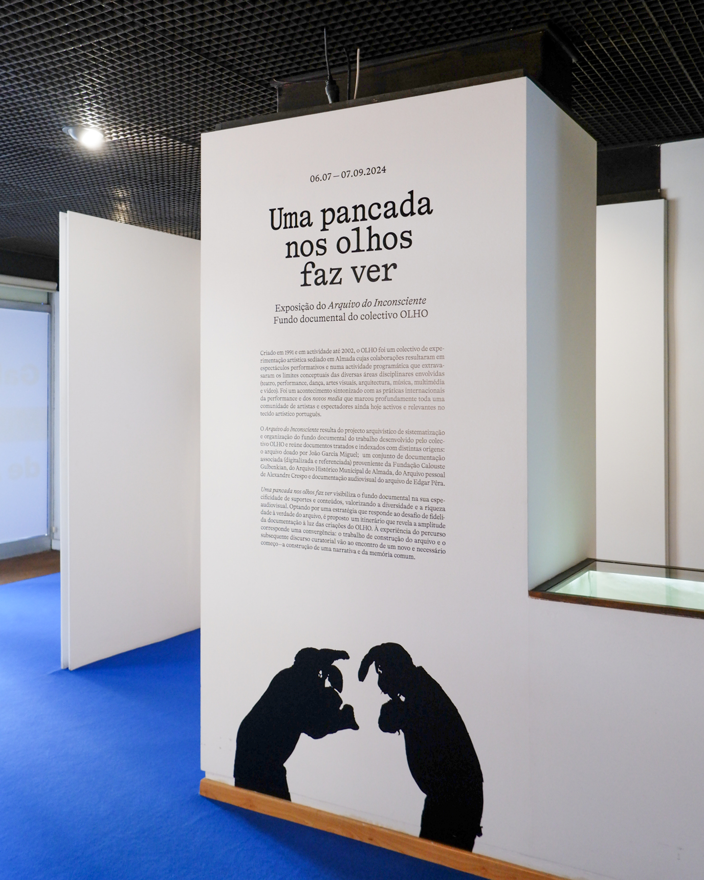
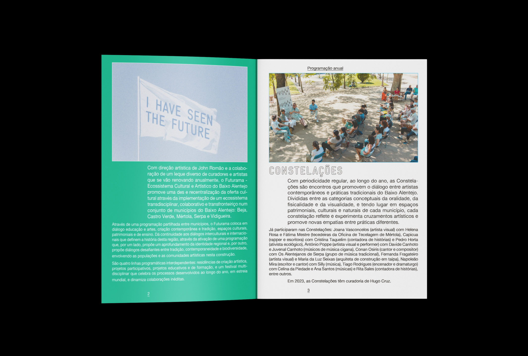
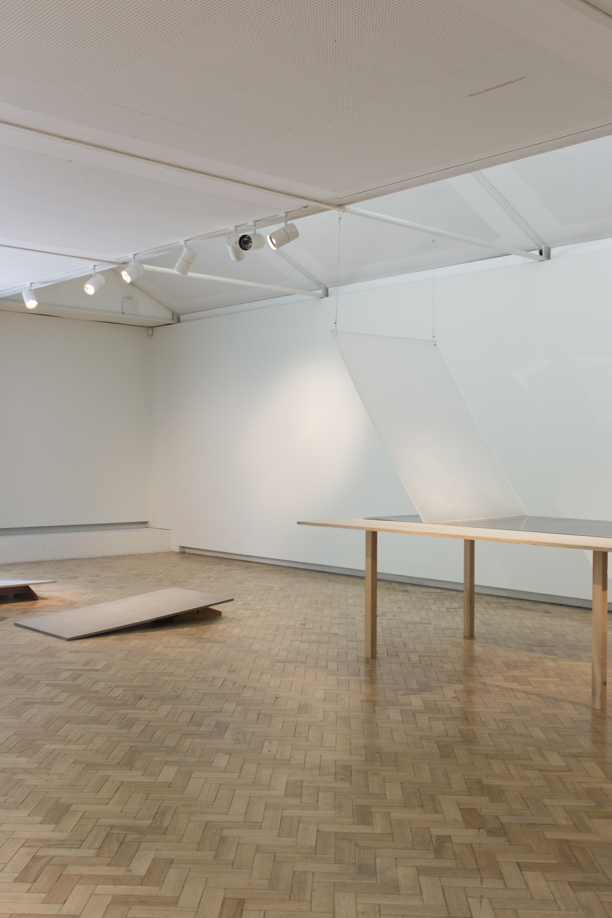
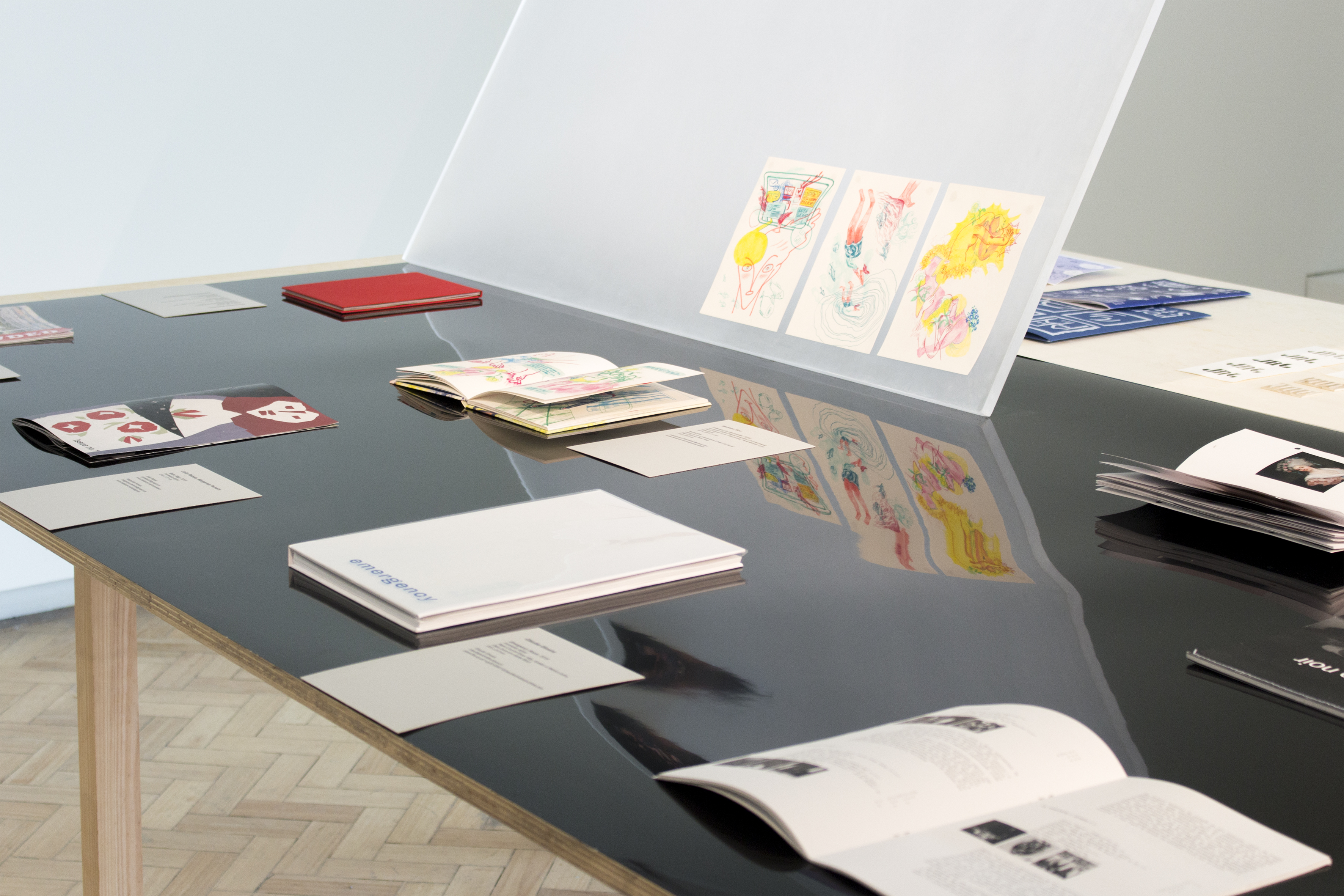
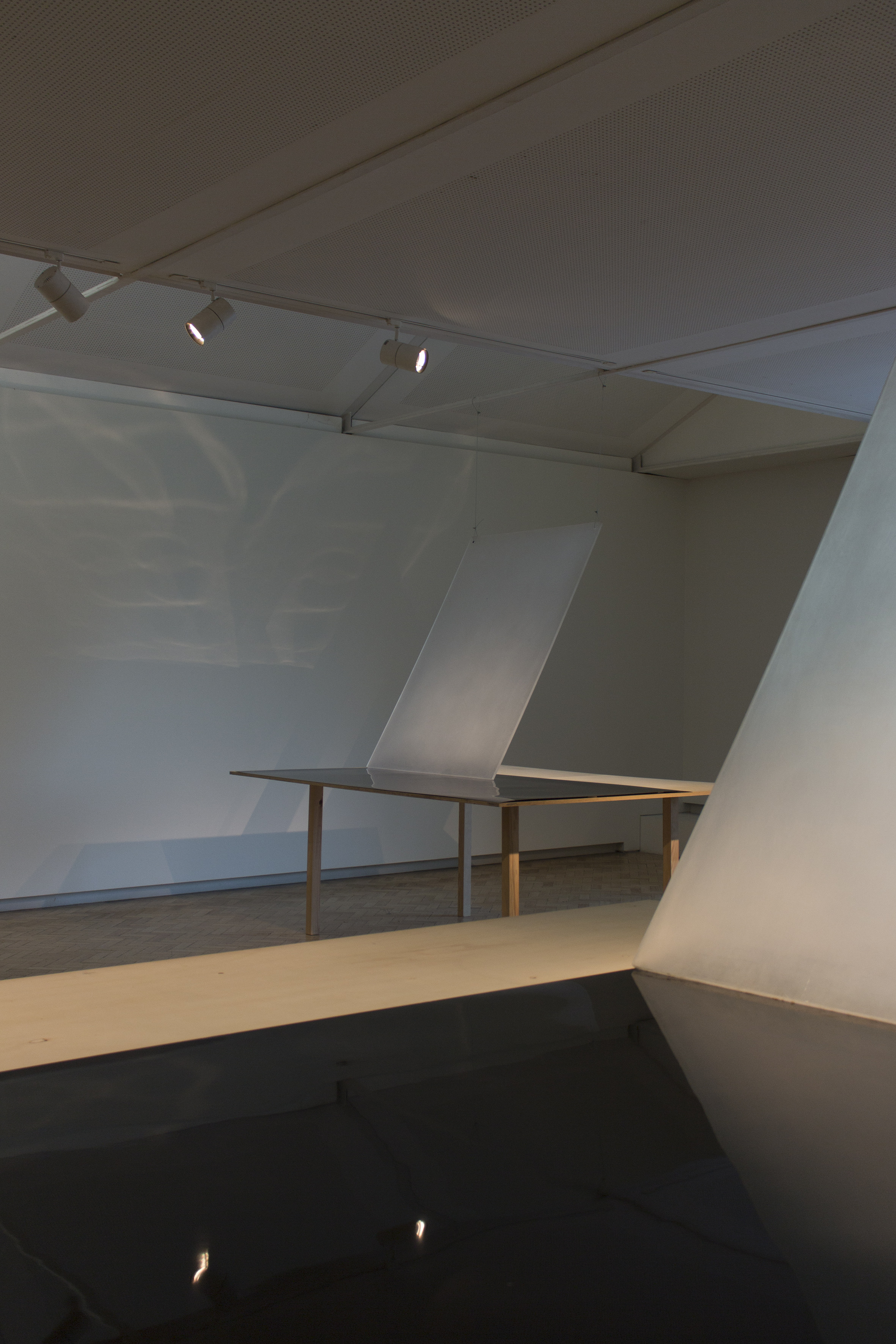
Uma pancada nos olhos faz ver—Exposição do Arquivo do Insconsciente
Fundo documental do colectivo OLHO
Graphic design
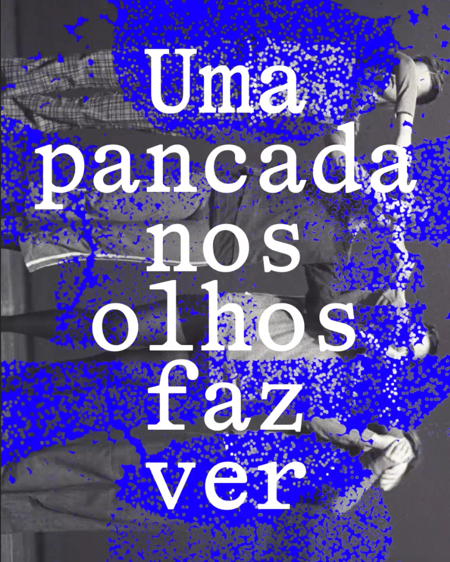
Uma pancada nos olhos faz ver—Exposição do Arquivo do Insconsciente
Fundo documental do colectivo OLHO
Graphic design
Description


+ INFO
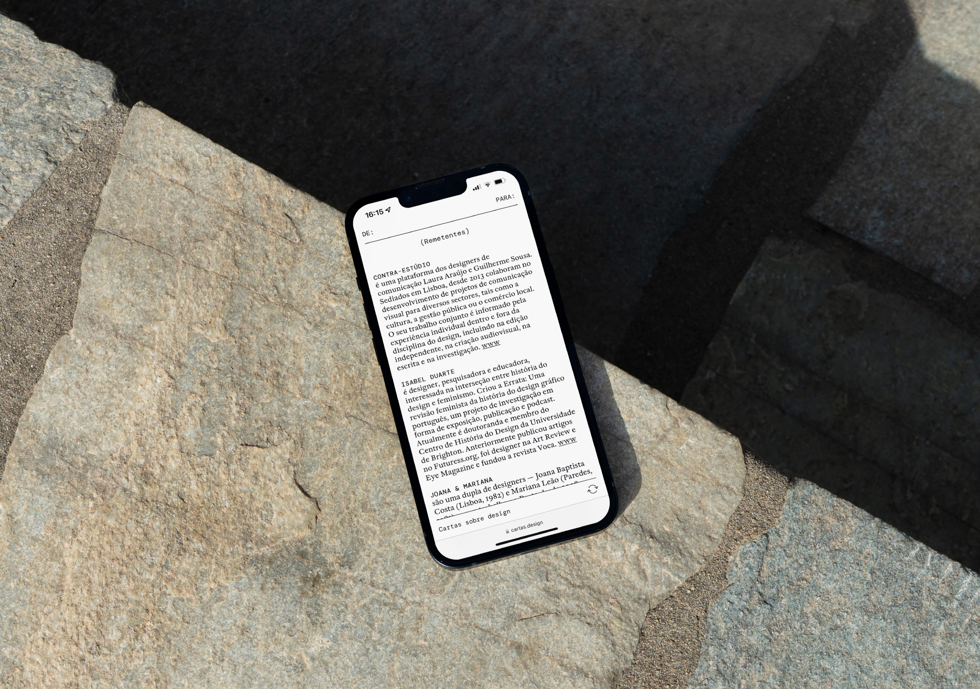
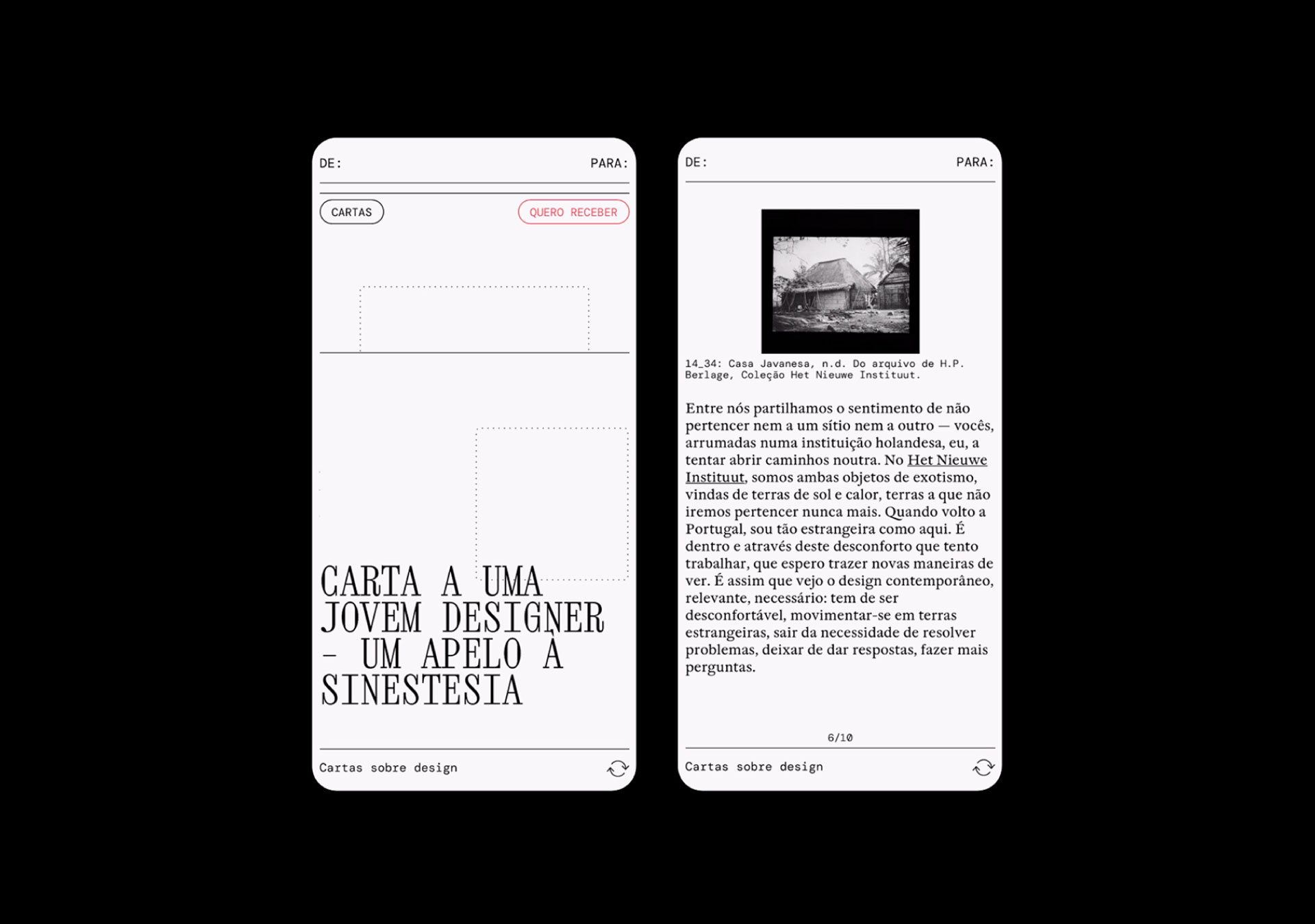
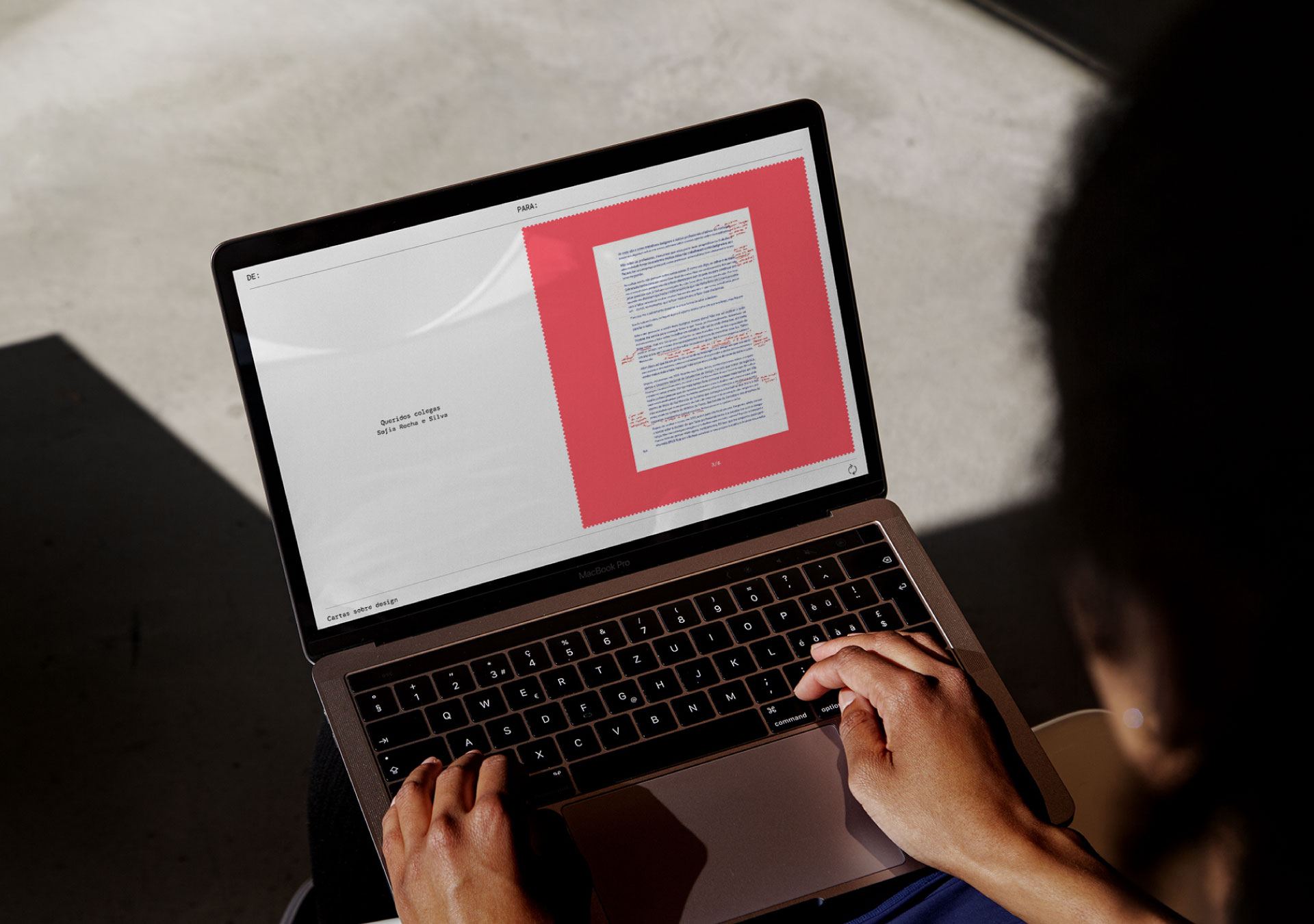
Webdesign for Cartas sobre Design project by Joana & Mariana.
This is a creative project made by writing, reading and sharing open letters between people who have design as a common activity or thought. Part of a question posed to participants was: "who would you like to write a letter to?" The question "to whom?" is fundamental as it seeks to establish a relation of intimacy between peers.
Through the letters, the object that brings together theory and practice, this project is set out to expose the concerns of various voices, creating a space for visibility, reflection and empathy.
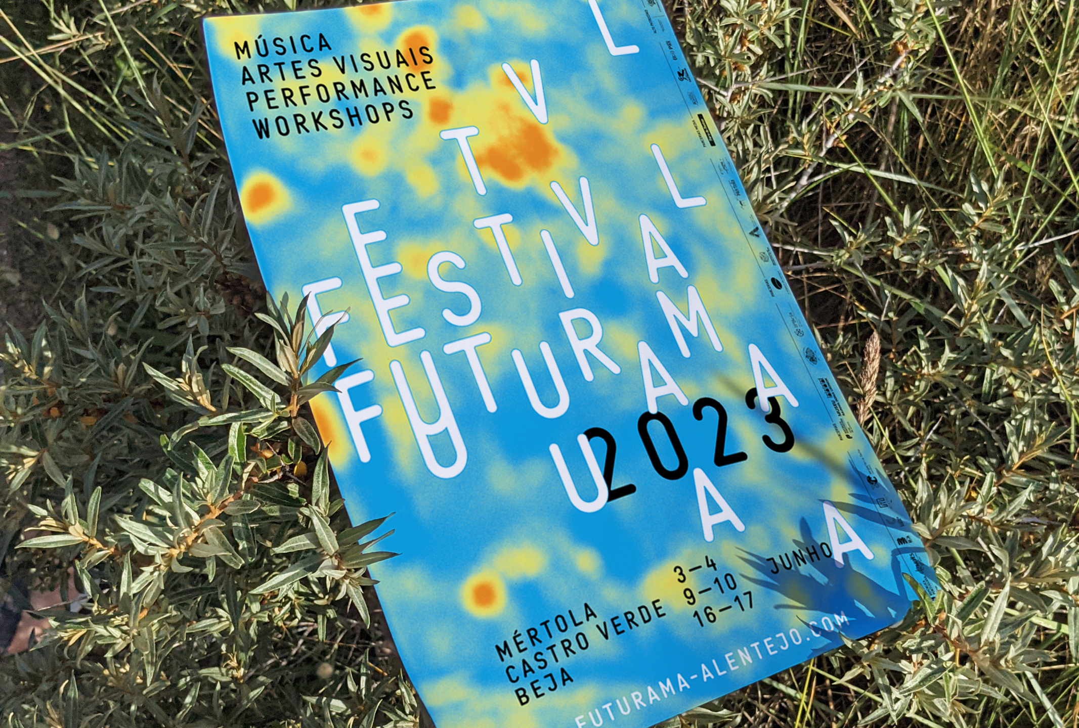
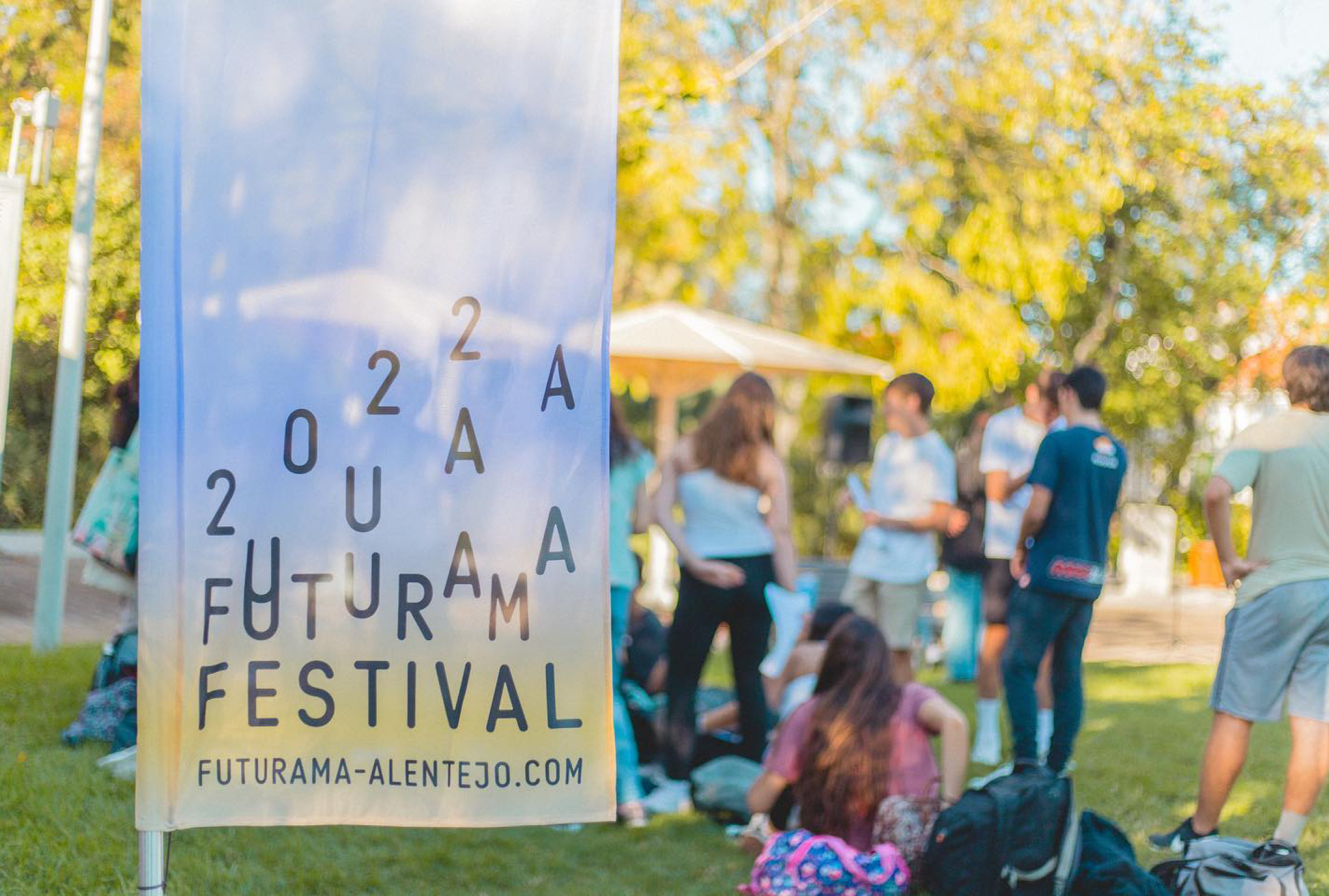
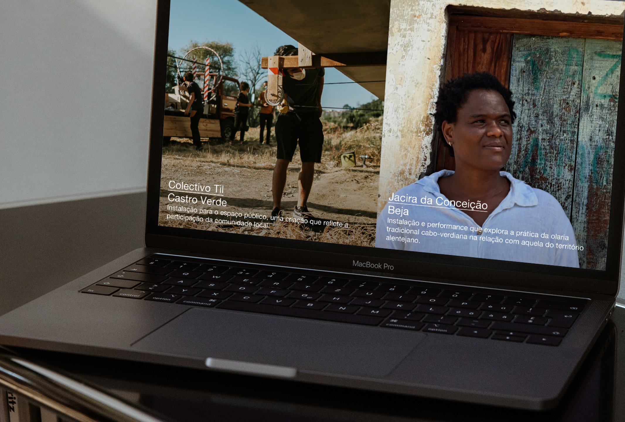
FUTURAMA
Assorted materials for FUTURAMA, Ecossistema Artístico do Baixo Alentejo
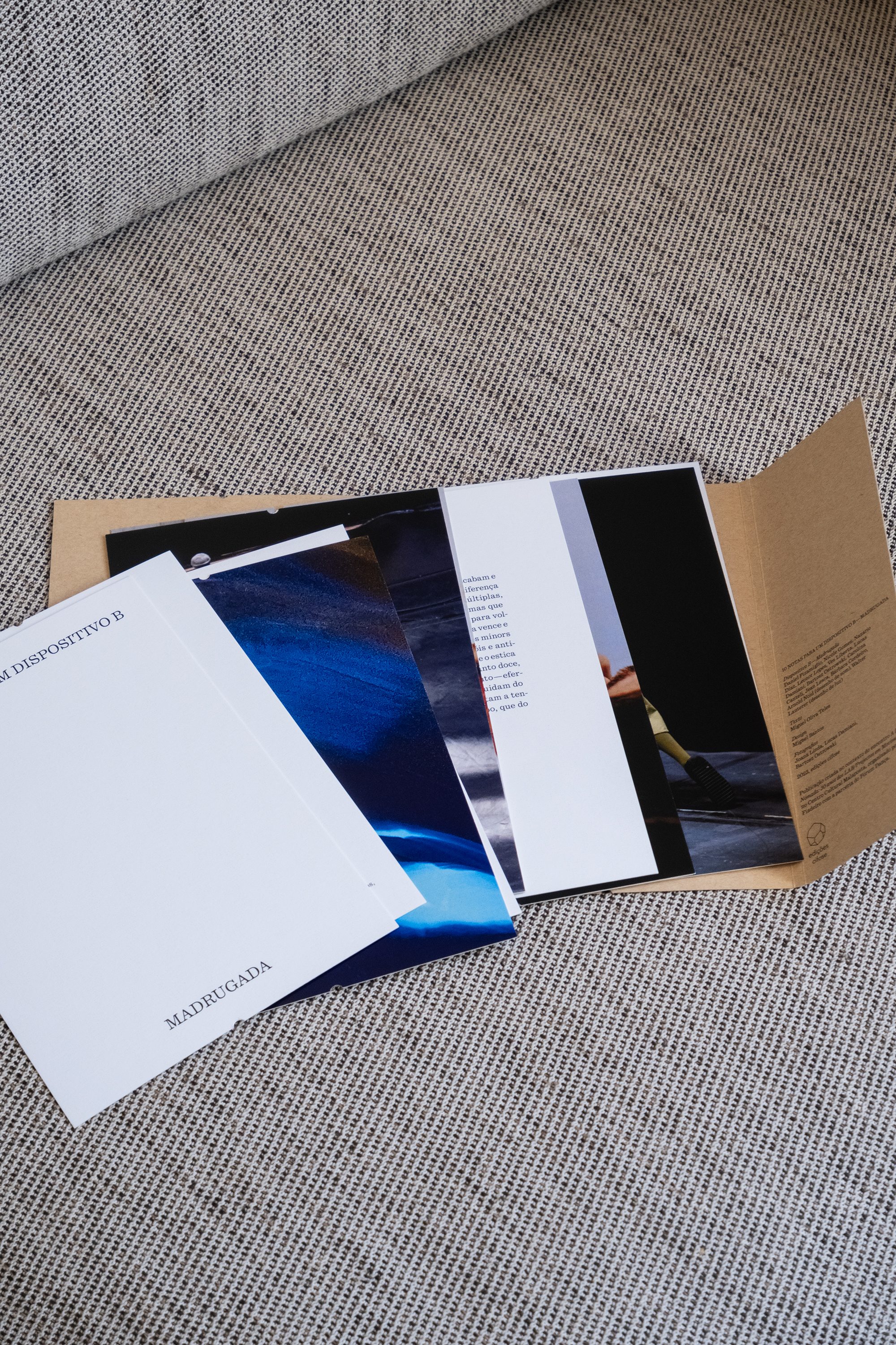
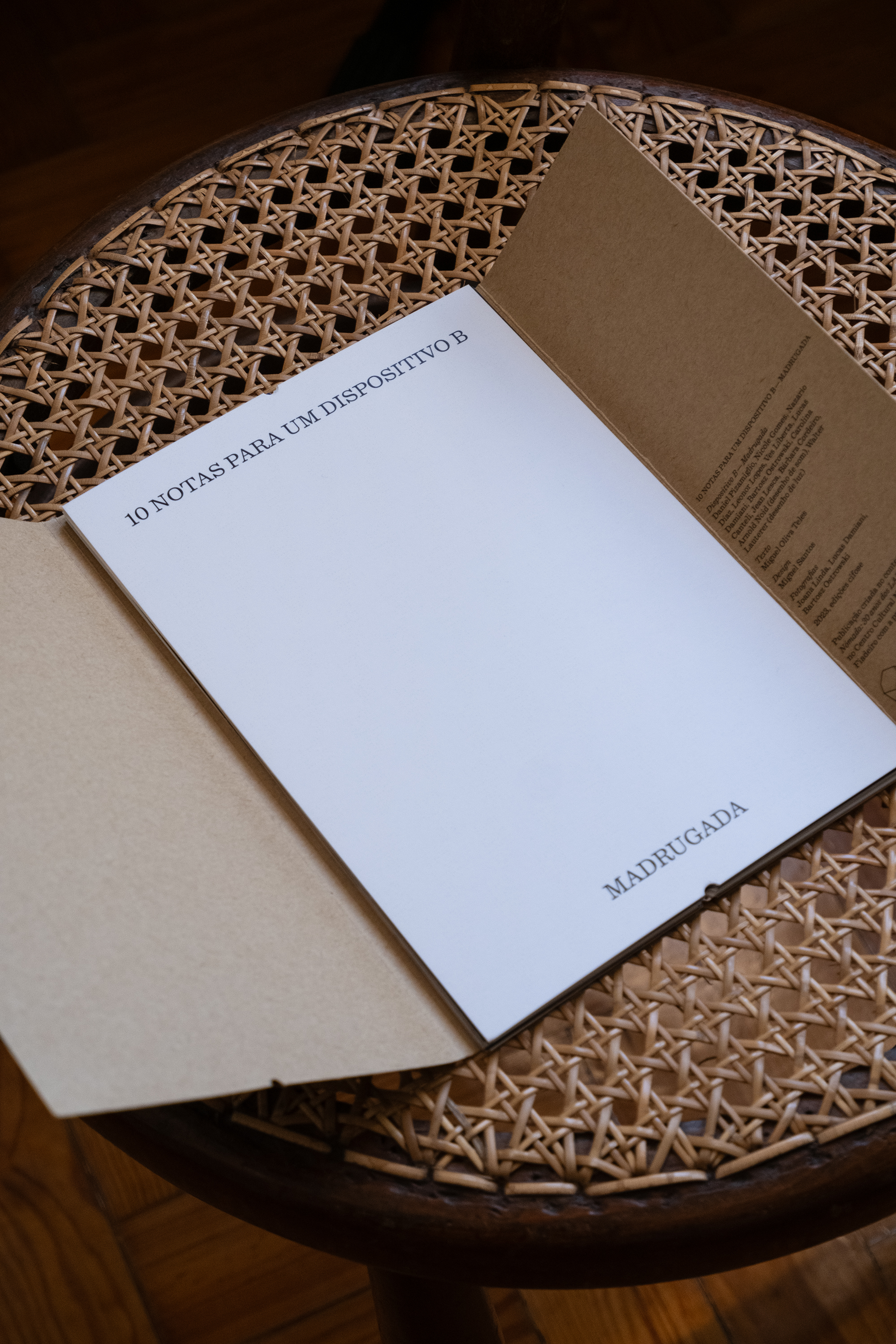


10 NOTAS PARA UM DISPOSITIVO B/MADRUGADA
MIGUEL OLIVA TELES
EDIÇÕES CIFOSE
MIGUEL OLIVA TELES
EDIÇÕES CIFOSE
+ INFO
Editorial project for Miguel Oliva Teles. This publication consists in a collection of poems and photographs taken during the rehearsals of Dispositivo B/Madrugada.
"These notes are what is left for me of those desires. Traces are like this. They are what remains from before—to the afterwards—in the current. They are what is repeated between the desire to archive what is not archivable and the revisitation of a performatic event that exceeds us in such a way that it is almost like it never existed."
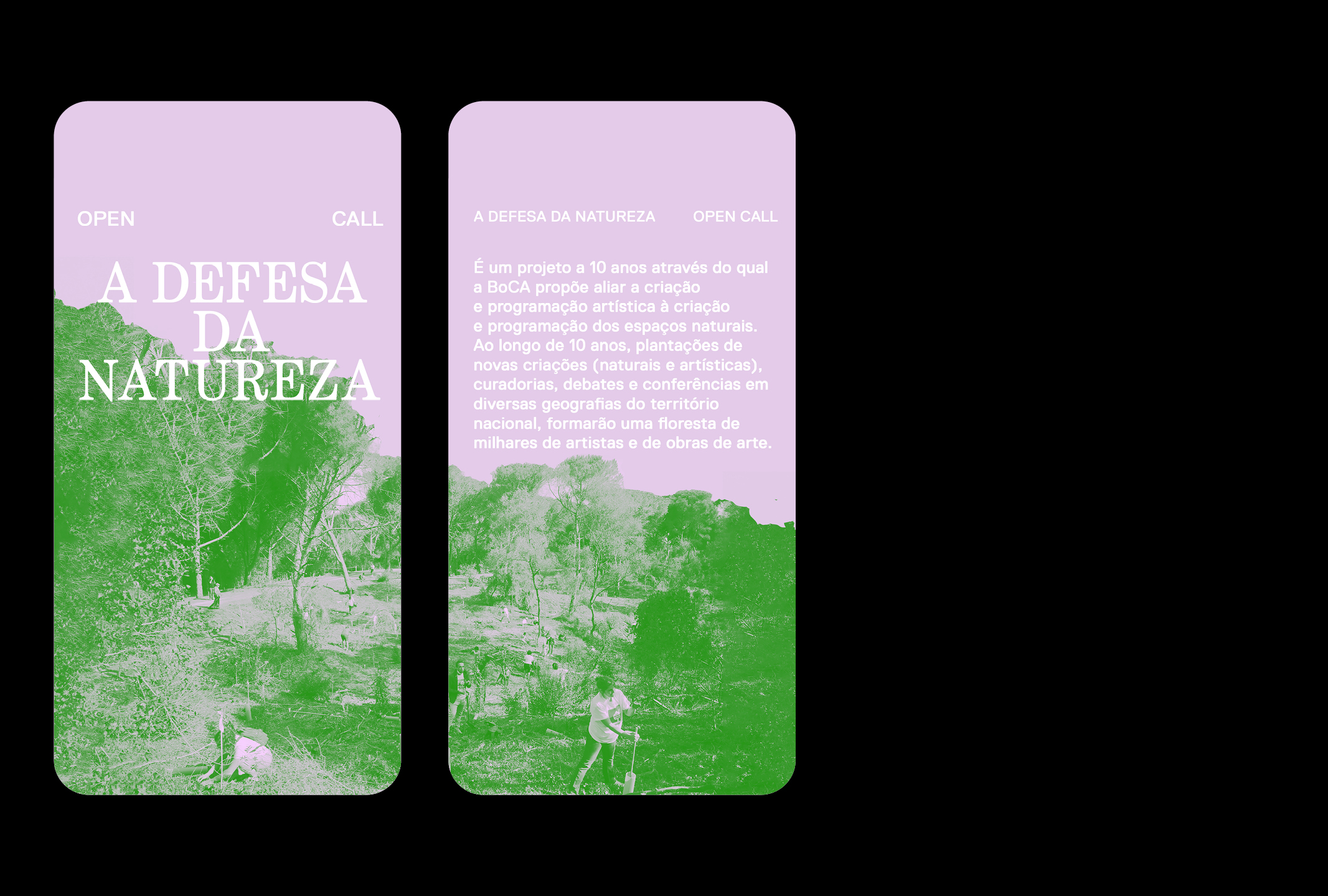
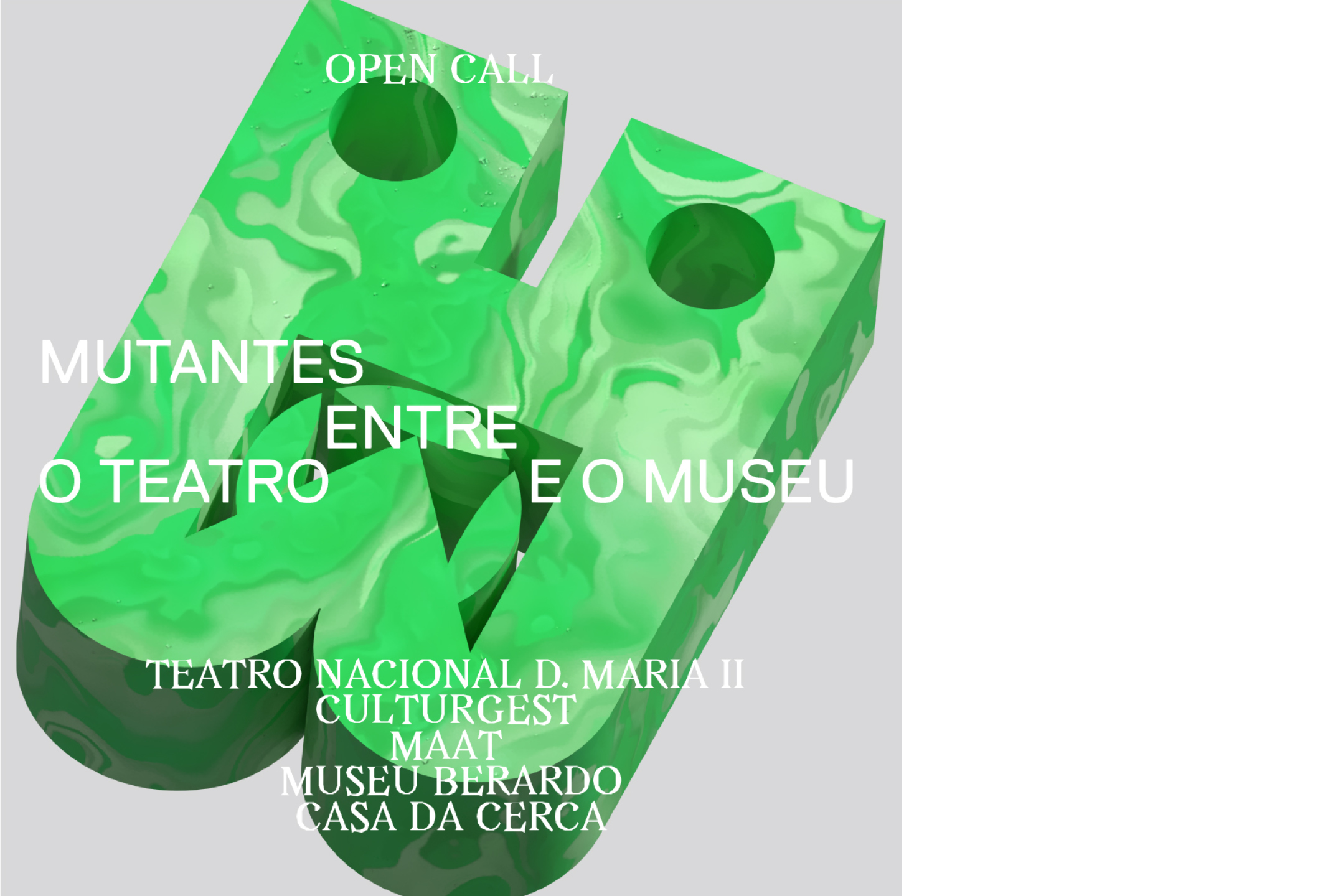

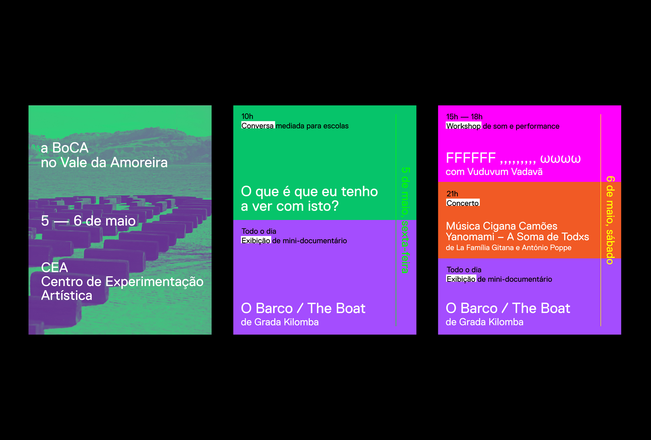


BoCA — Biennial of Contemporary Arts
Published and unpublished work
Published and unpublished work
Published and unpublished work for BoCA — Biennial of Contemporary Arts
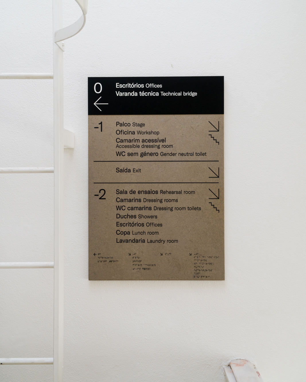

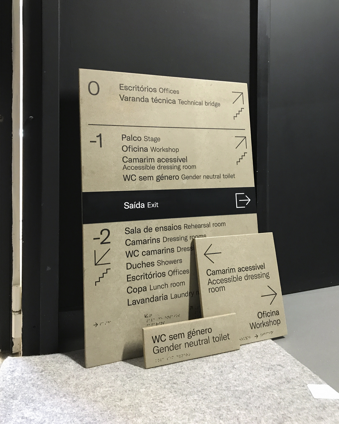

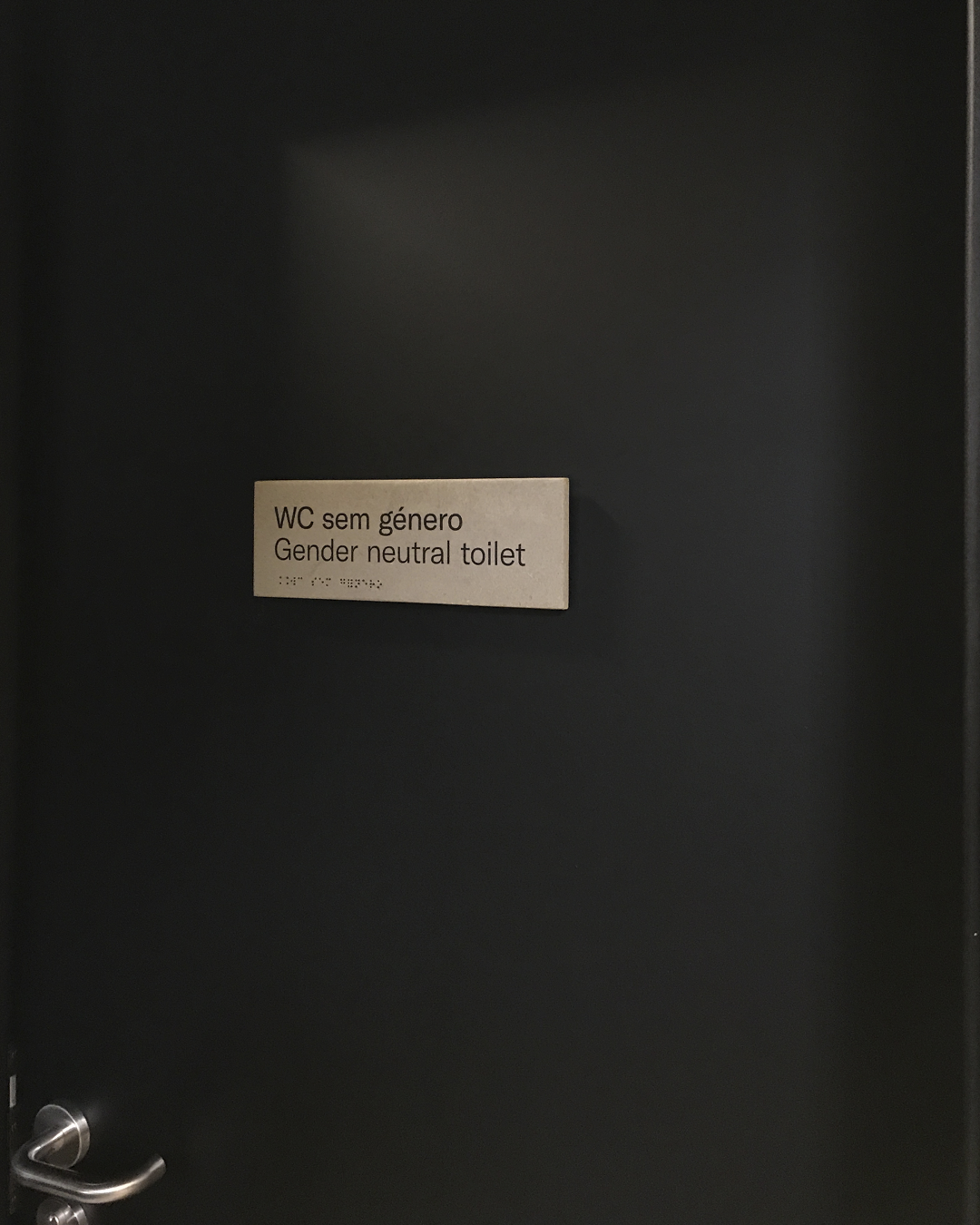
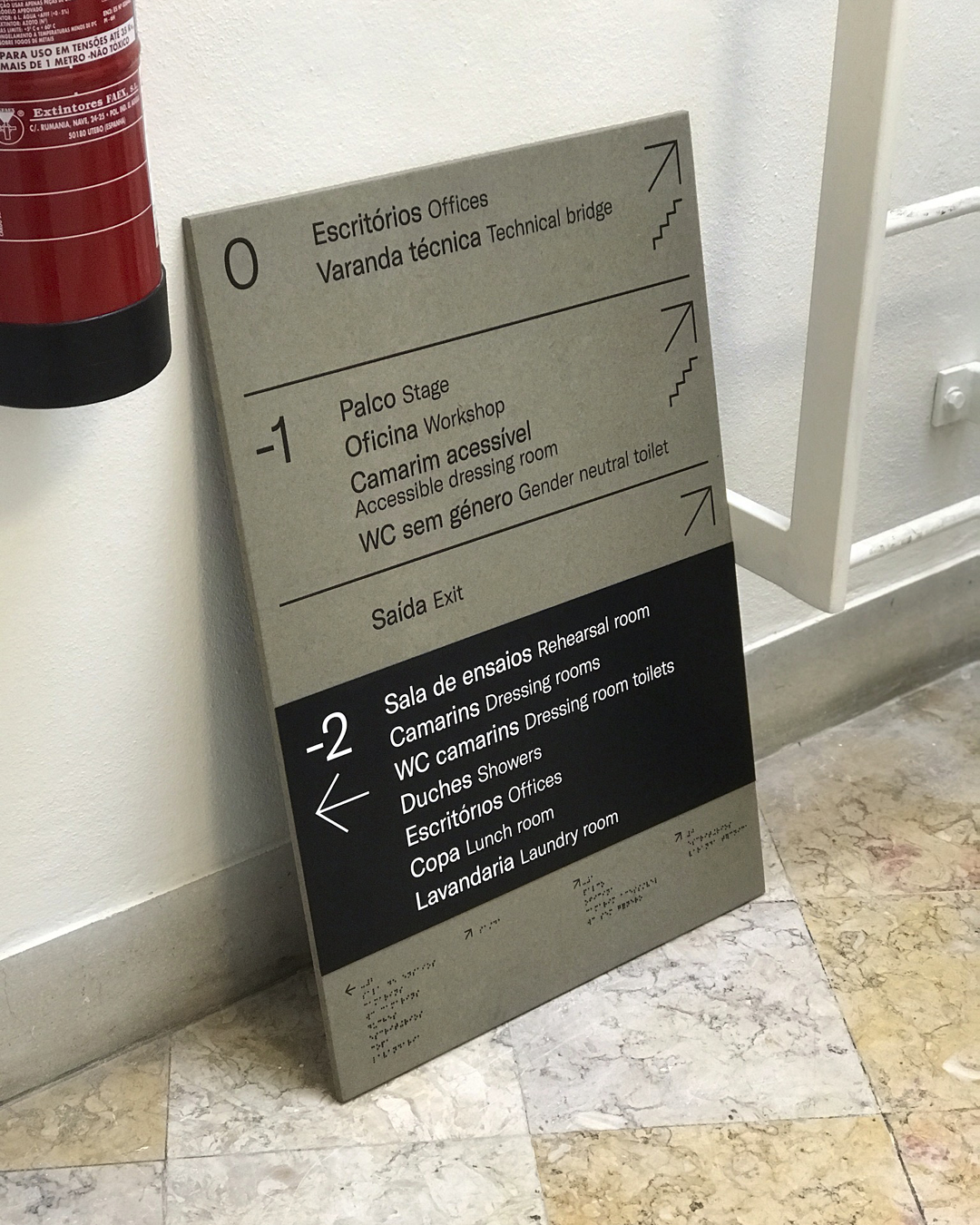

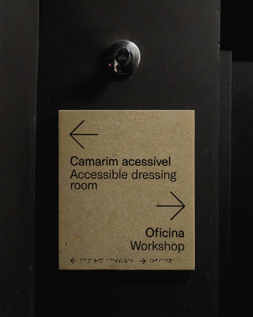
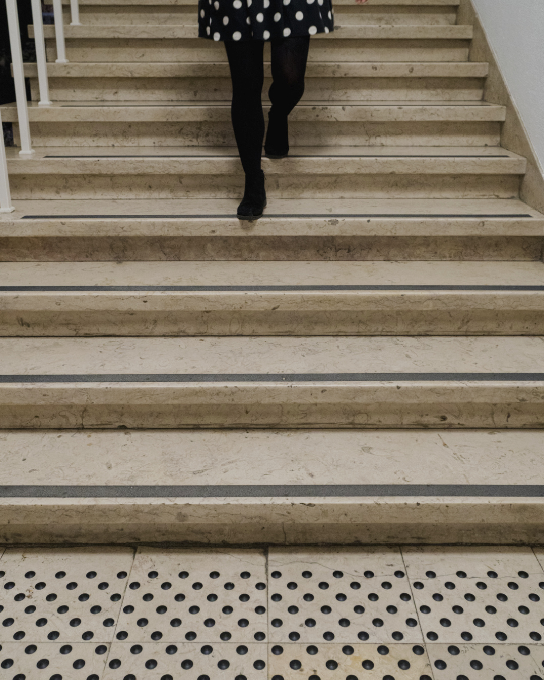
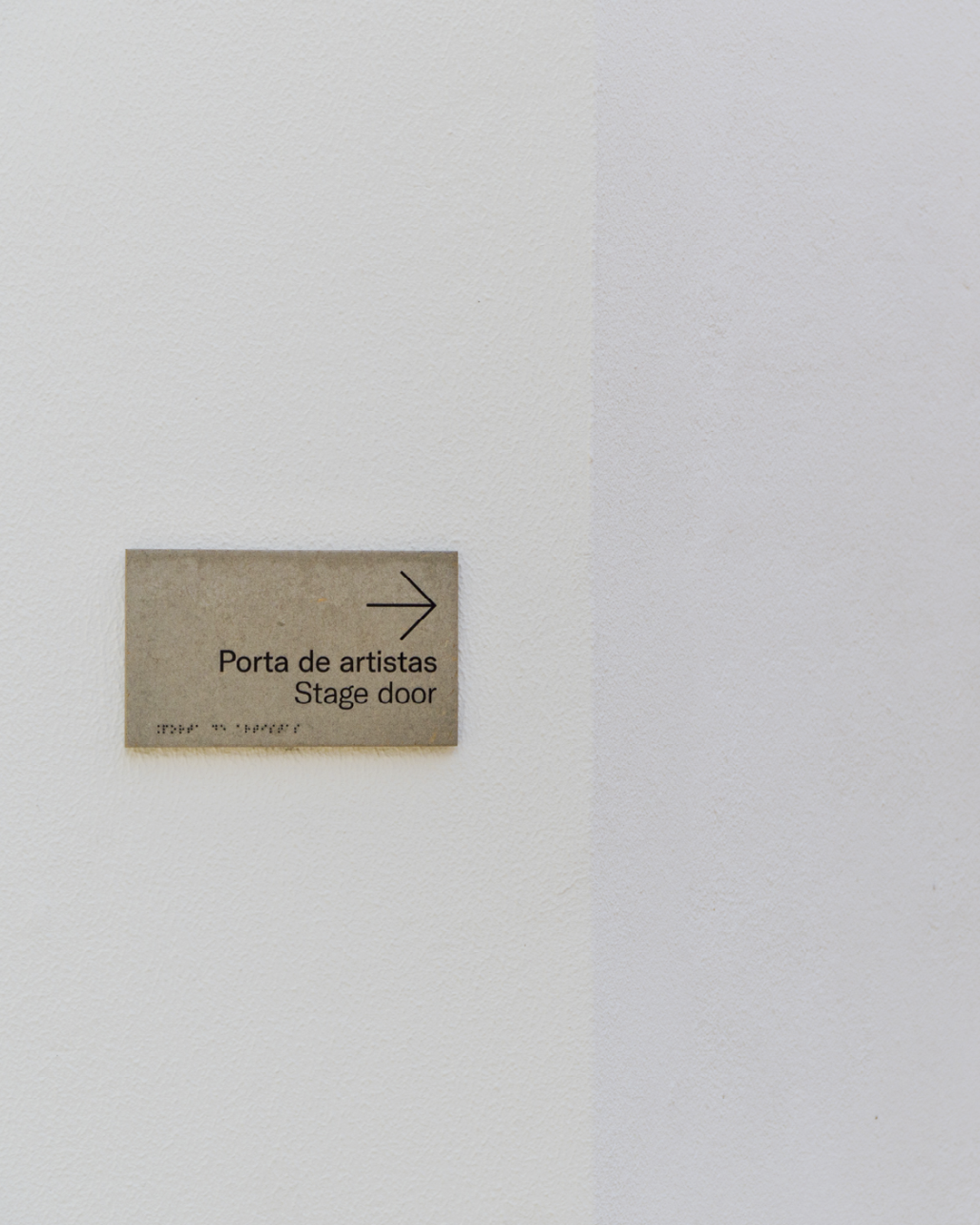
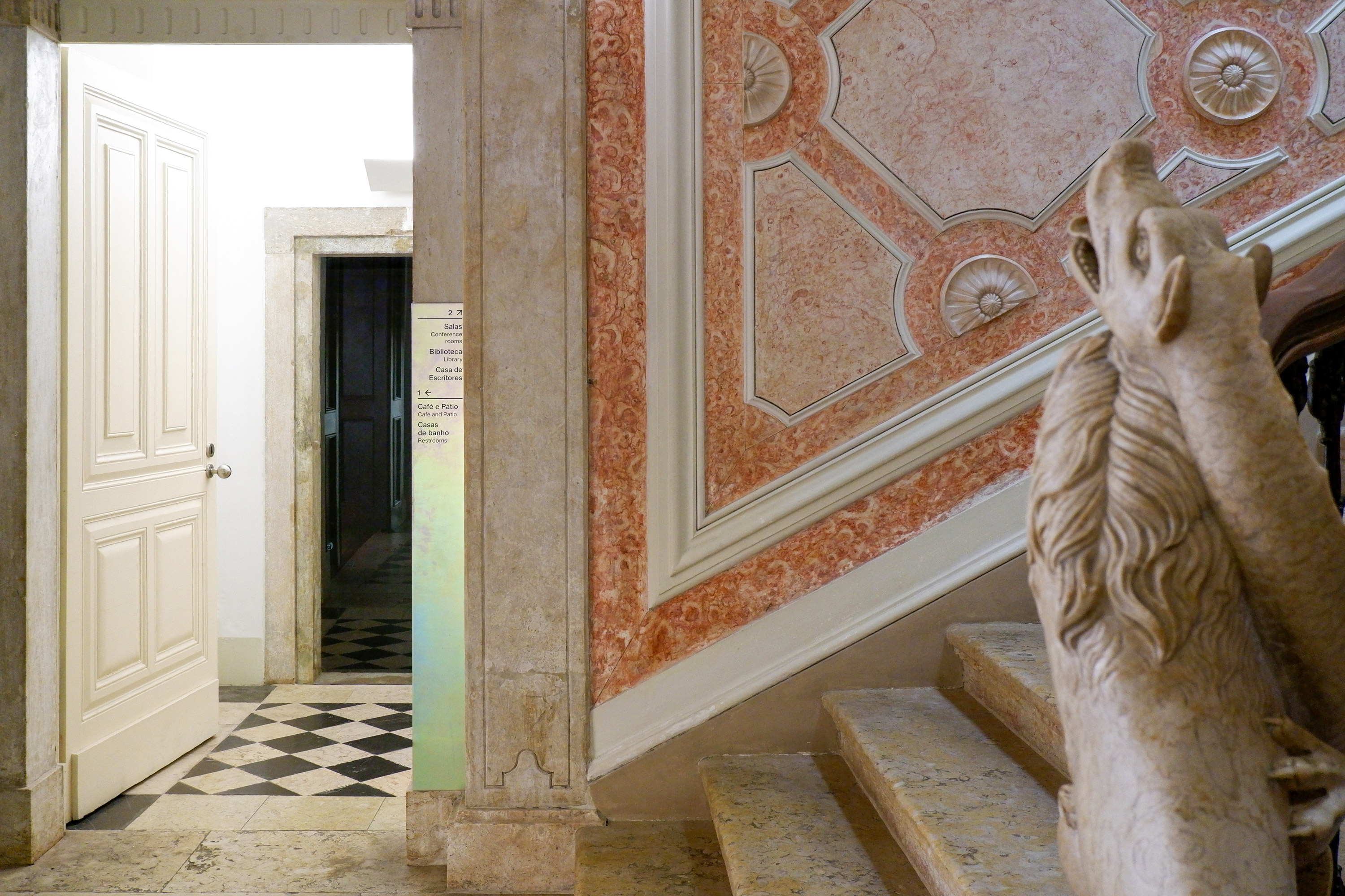
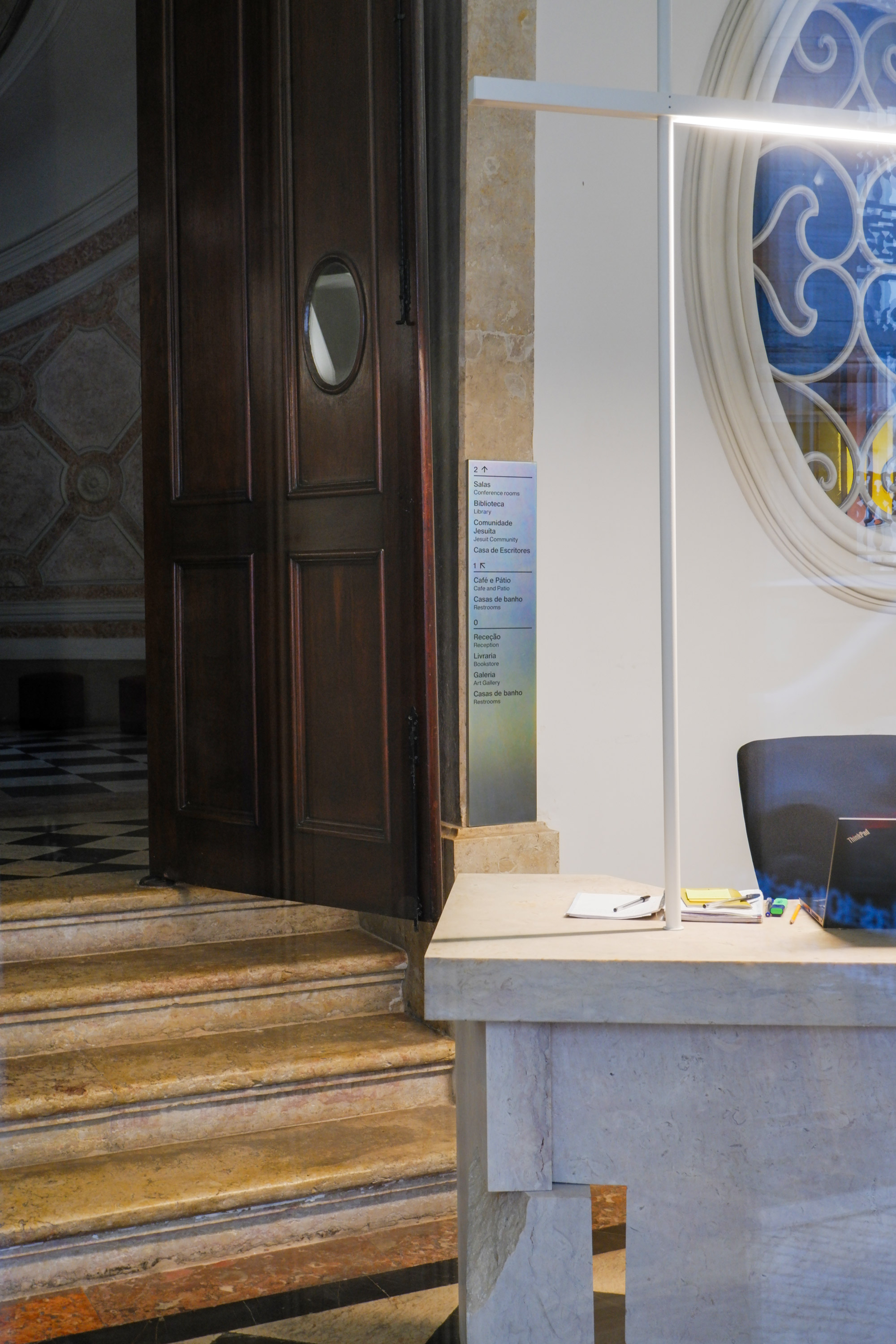
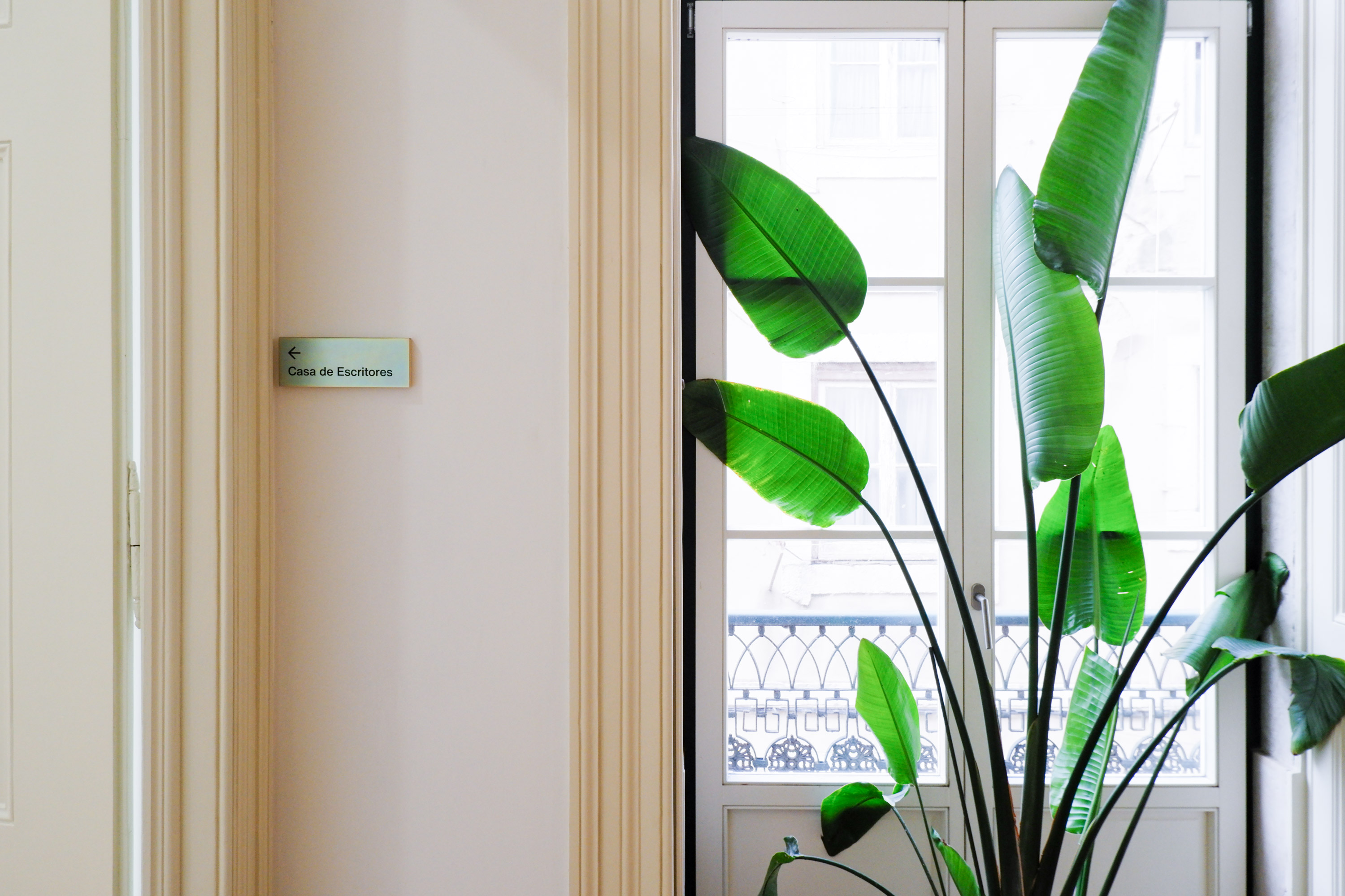
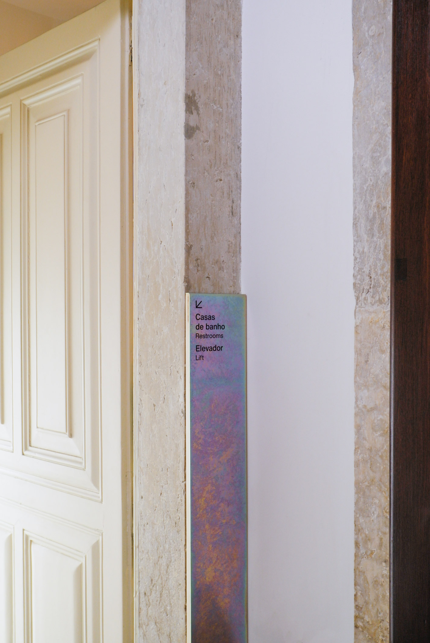
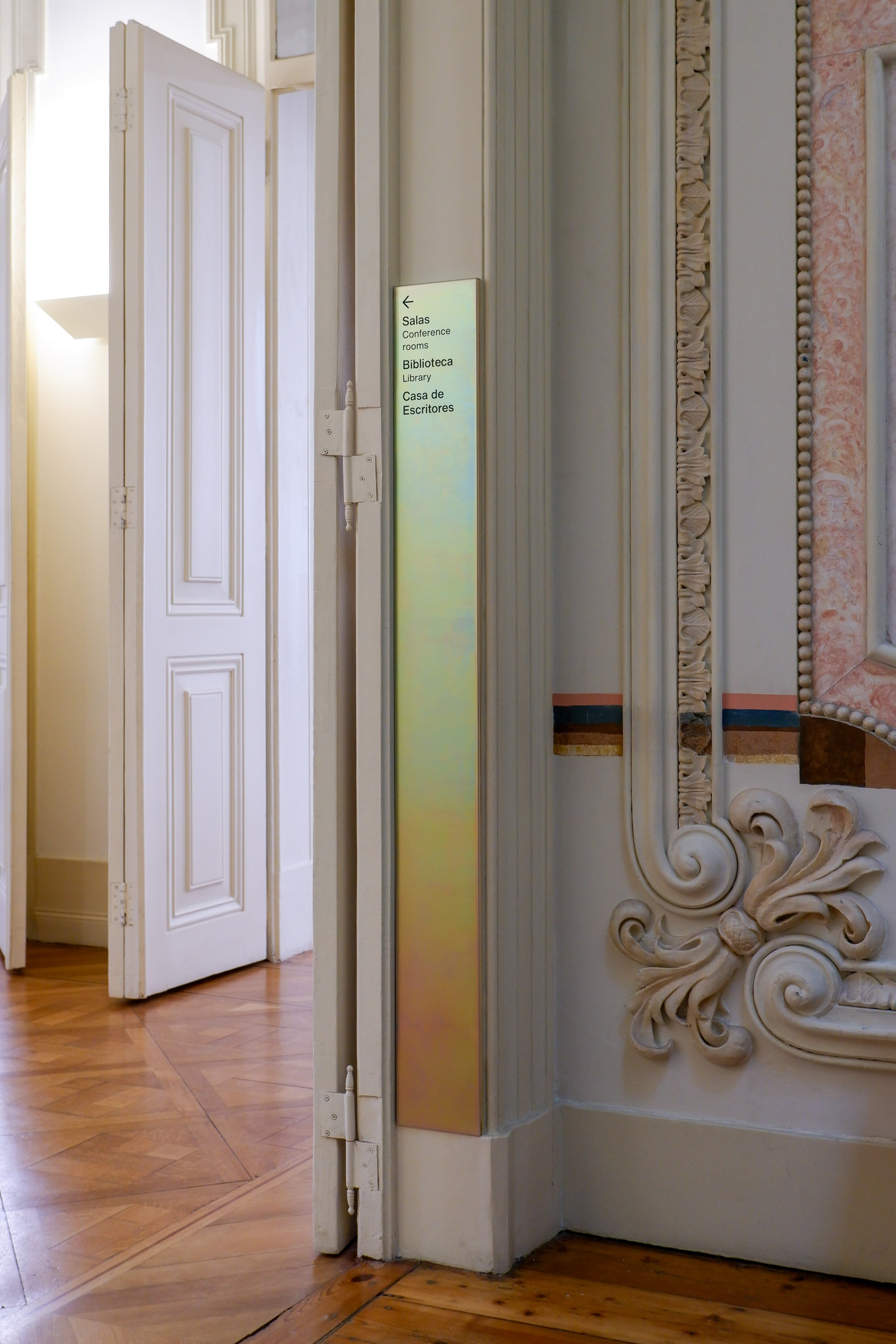
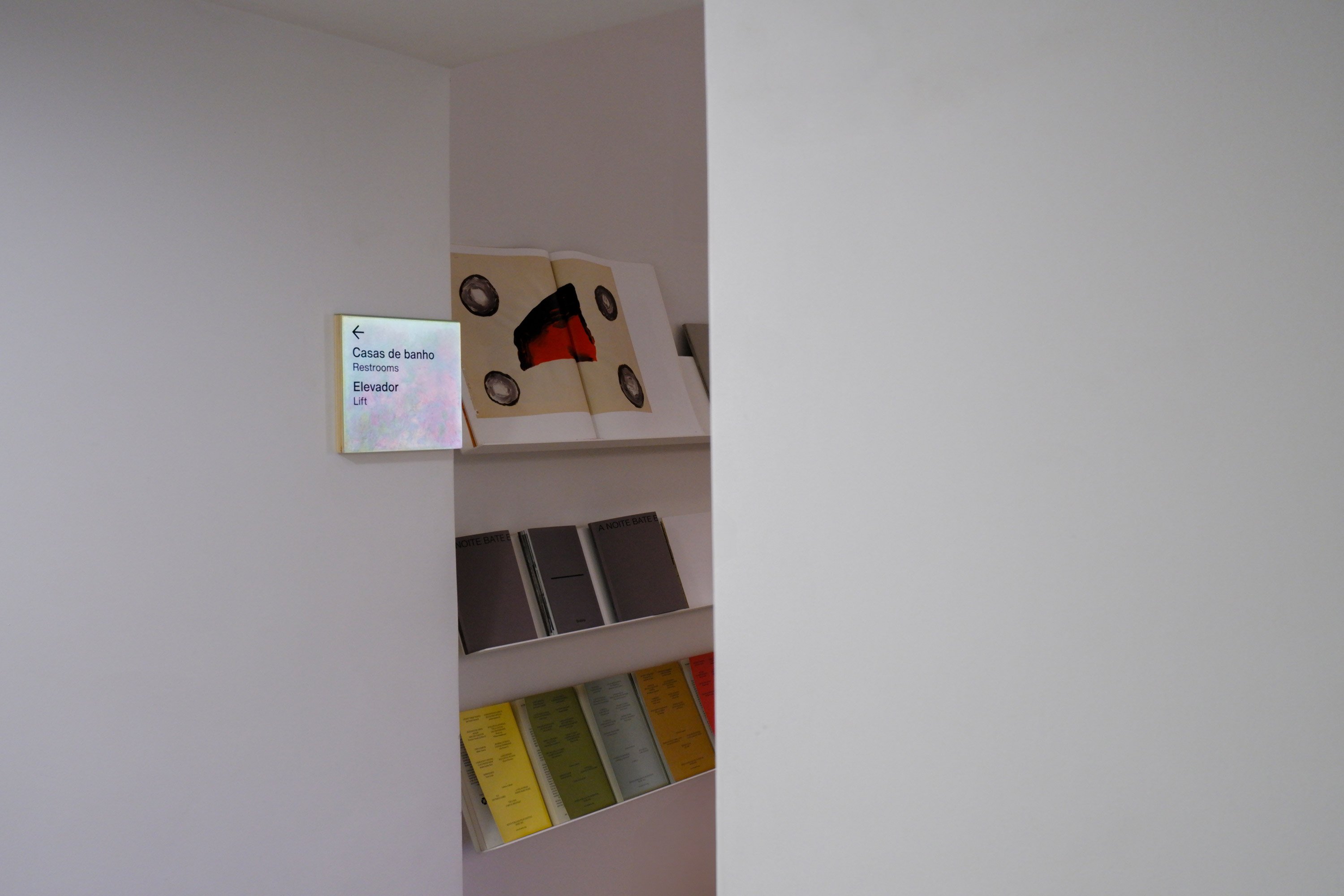
ACCESSIBLE SIGNAGE SYSTEM
TBA
LISBON
TBA
LISBON
+ INFO
Me and António Pedro Faria have worked alongside TBA (Teatro do Bairro Alto) to make its facilities more accessible, by developing wall and floor signage systems.
A combination of raised type and braille on wall pieces, together with tactile floor elements, allow for visually impaired people to have autonomy whilst navigating the building. The pieces are also unusually low on the wall, to be within a reachable distance to human touch.
The persistent awareness of people's differences has never been more important, even if perfect solutions are yet to be found. Institutions must go against the (ableist) grain, and fully commit to making their premises accessible to all.
Photos (except 3, 5, 6): Joana Linda


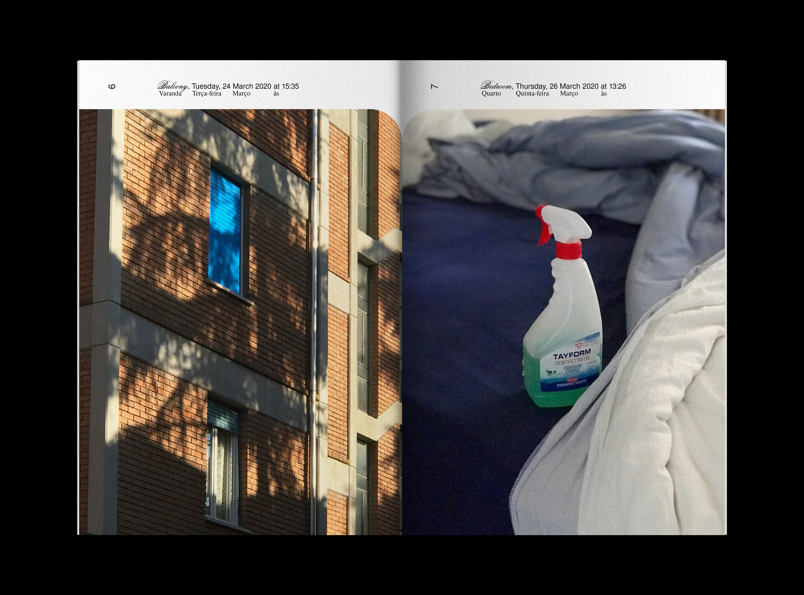
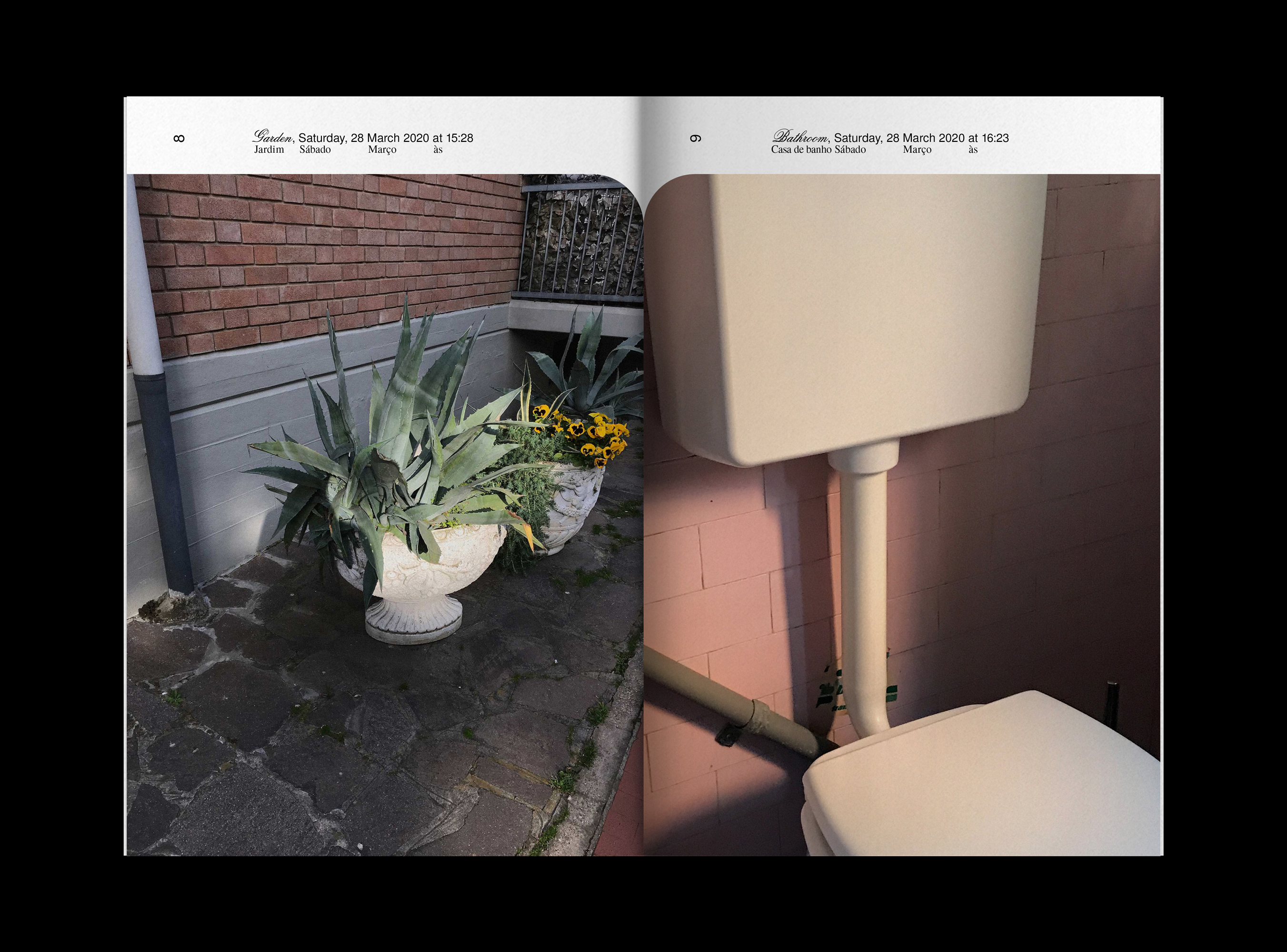


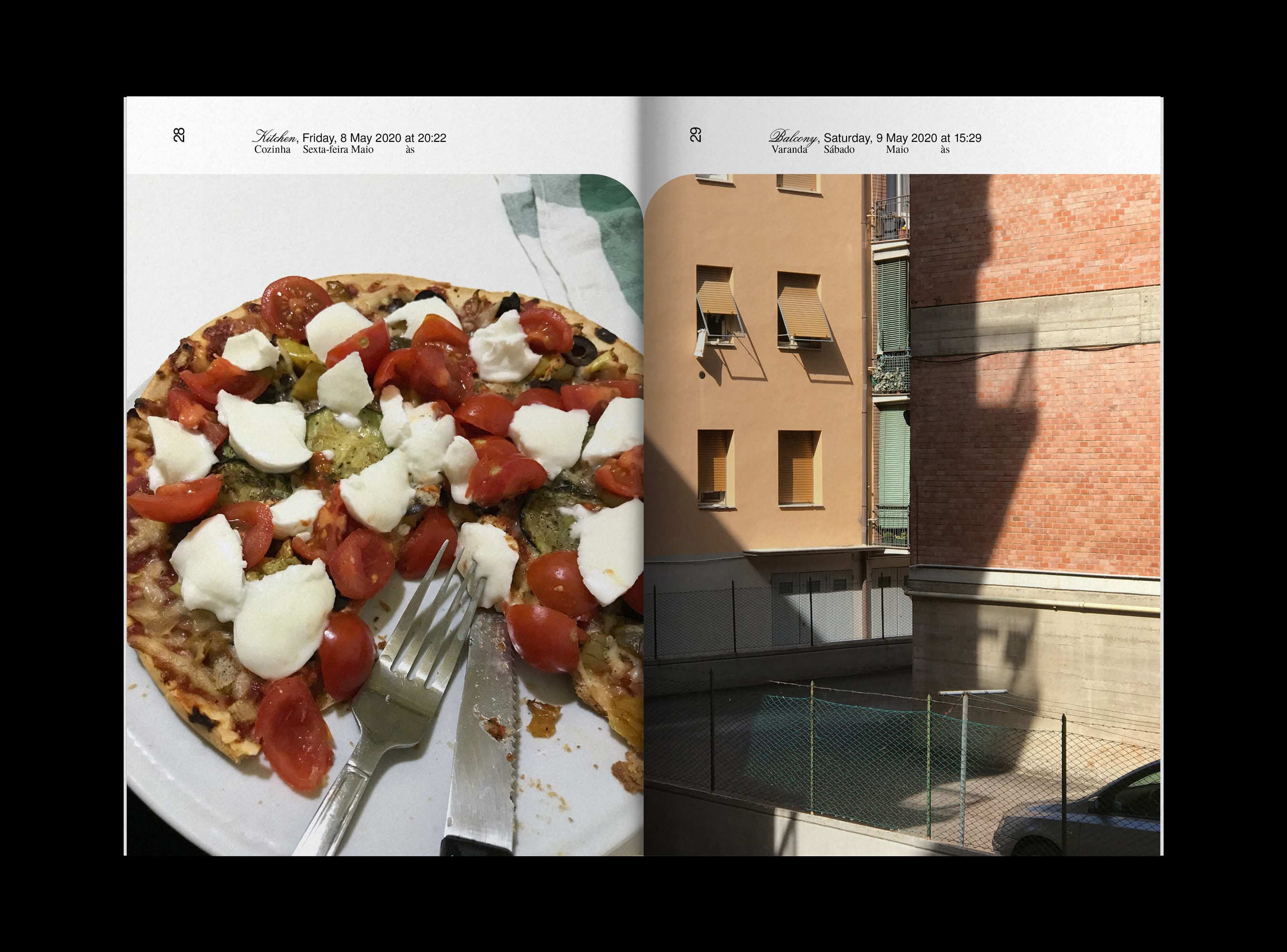


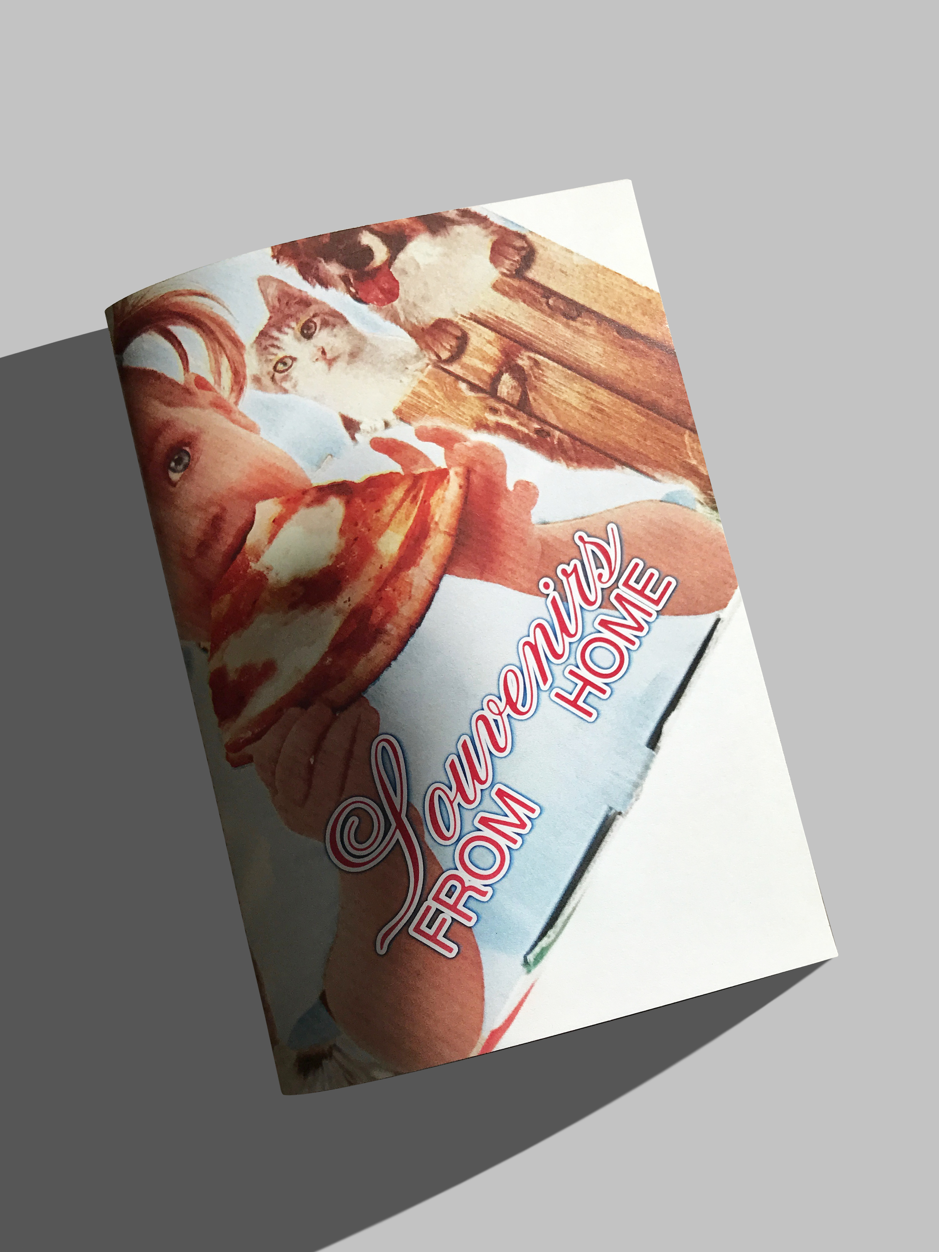
SOUVENIRS FROM HOME
PHOTOGRAPHY DURING LOCKDOWN
REGGIO EMILIA
PHOTOGRAPHY DURING LOCKDOWN
REGGIO EMILIA
+ INFO
February 2020.
I moved to Italy to attend an internship at a design studio. 4 weeks in, the country goes into lockdown.
Exploring trips I had planned on taking around the country now come down to the odd trip to the kitchen, bathroom, and on unexpectedly rare and magical occasions—to venture out to the supermarket. Sightseeing has been redirected to a very specific enclosed area, unveiling new ways to perceive it. Trivialities of the outside world are on standby; new ones are found indoors, as a possible escape from the cataclysm looming over us.
I find myself taking notice of subtle changes in uneventful spaces. Light falls on everyday objects and its surroundings, unveiling parallels between the public and private domains. Domestic scenes look almost carefully orchestrated, where object becomes subject (to the changes in light). Outside, the neighbouring axis is repurposed—buildings’ shadows, with moving sharp angles, are now indicators of the time of the day (a bit like the sundials in the façades of the piazzi I visited before shit hit the fan).
I become more in sync with the physical changes around me. In the absence of outside stimuli, I learn to find them in the immediate space around me. Time leaves its mark on the mundane and ephemeral—food rots, water dries. A form of time regulation denoting a journey through the everyday. The human factor is replaced with the inanimate, yet these images tell a story of warmth, and make quarantine a nice and desirable destination.
These images are souvenirs of a trip I did not intend on taking, in which destination became the same as the point of departure.


+ INFO
Identity and webdesign
The idea behind de logo was that each name should be considered as a building block. Together they lay the first brick creating the foundations for a new architecture project.


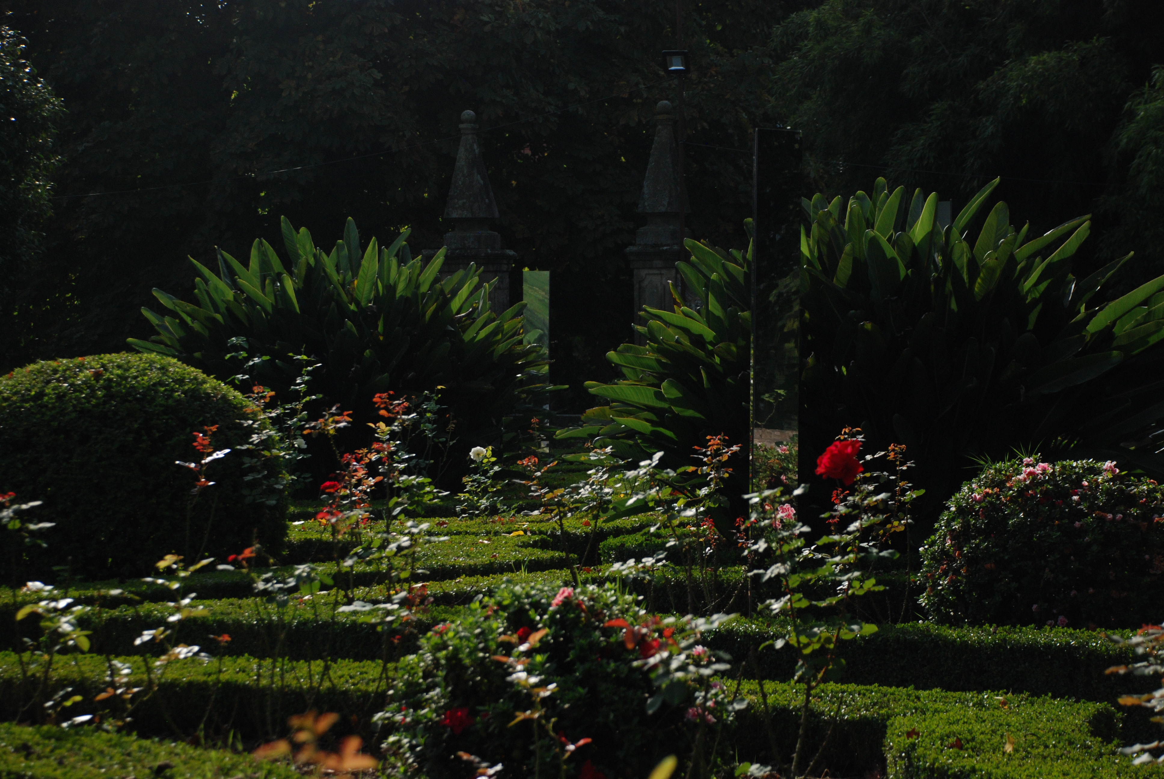
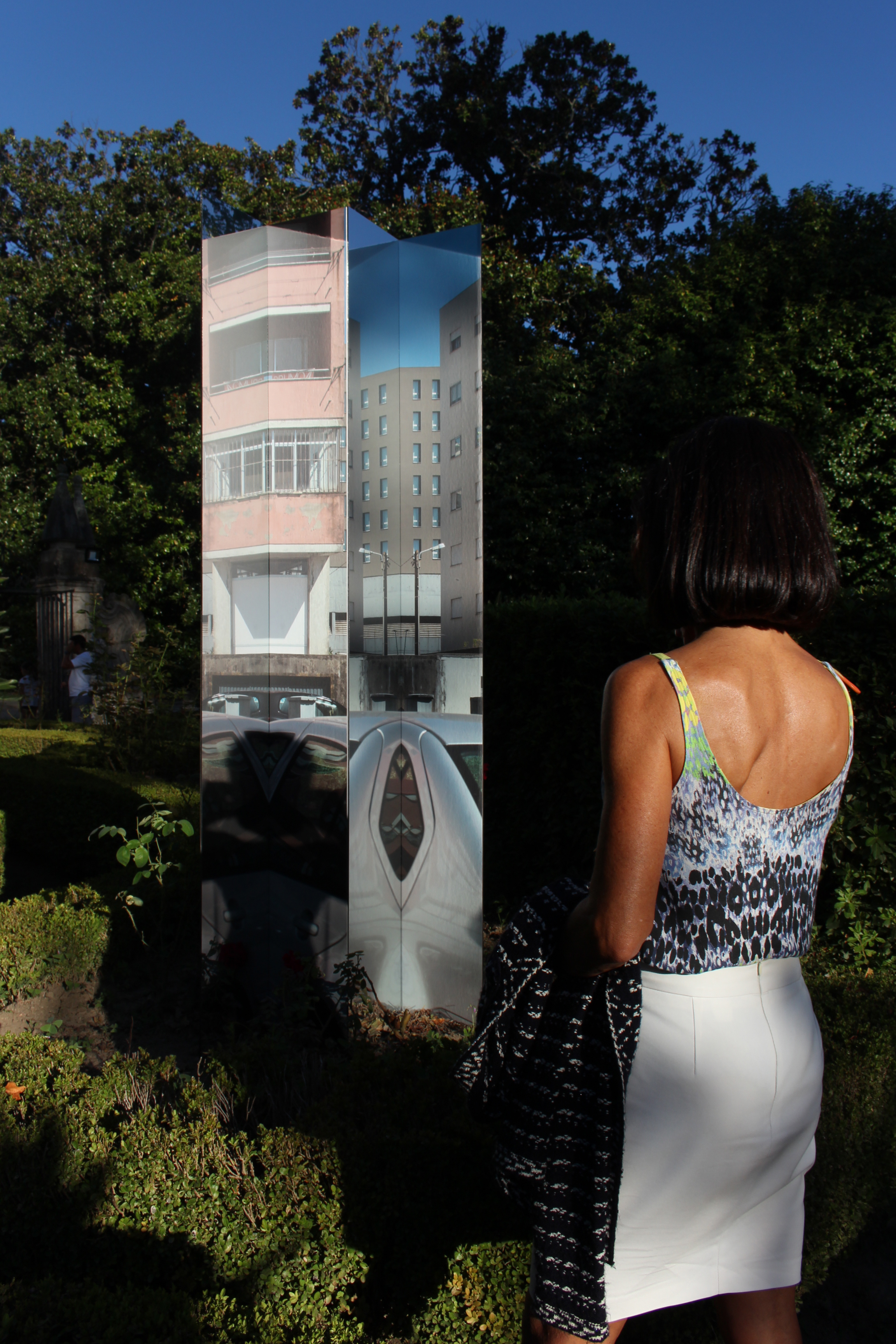

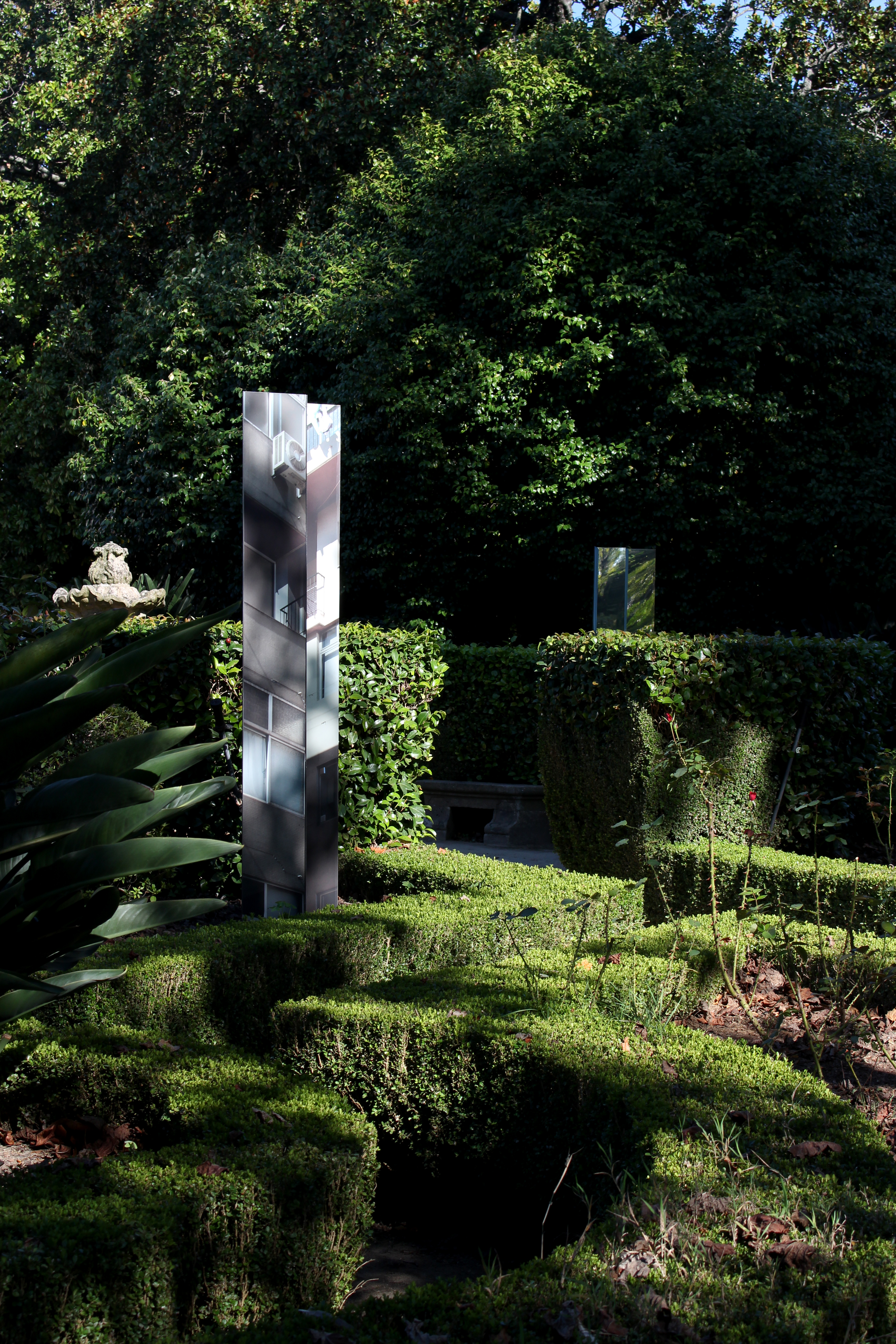


A NOITE DIVIDIDA
ARTISTIC INSTALATION IN BRAGA, PORTUGAL
ARTISTIC INSTALATION IN BRAGA, PORTUGAL
+ INFO
09.2019
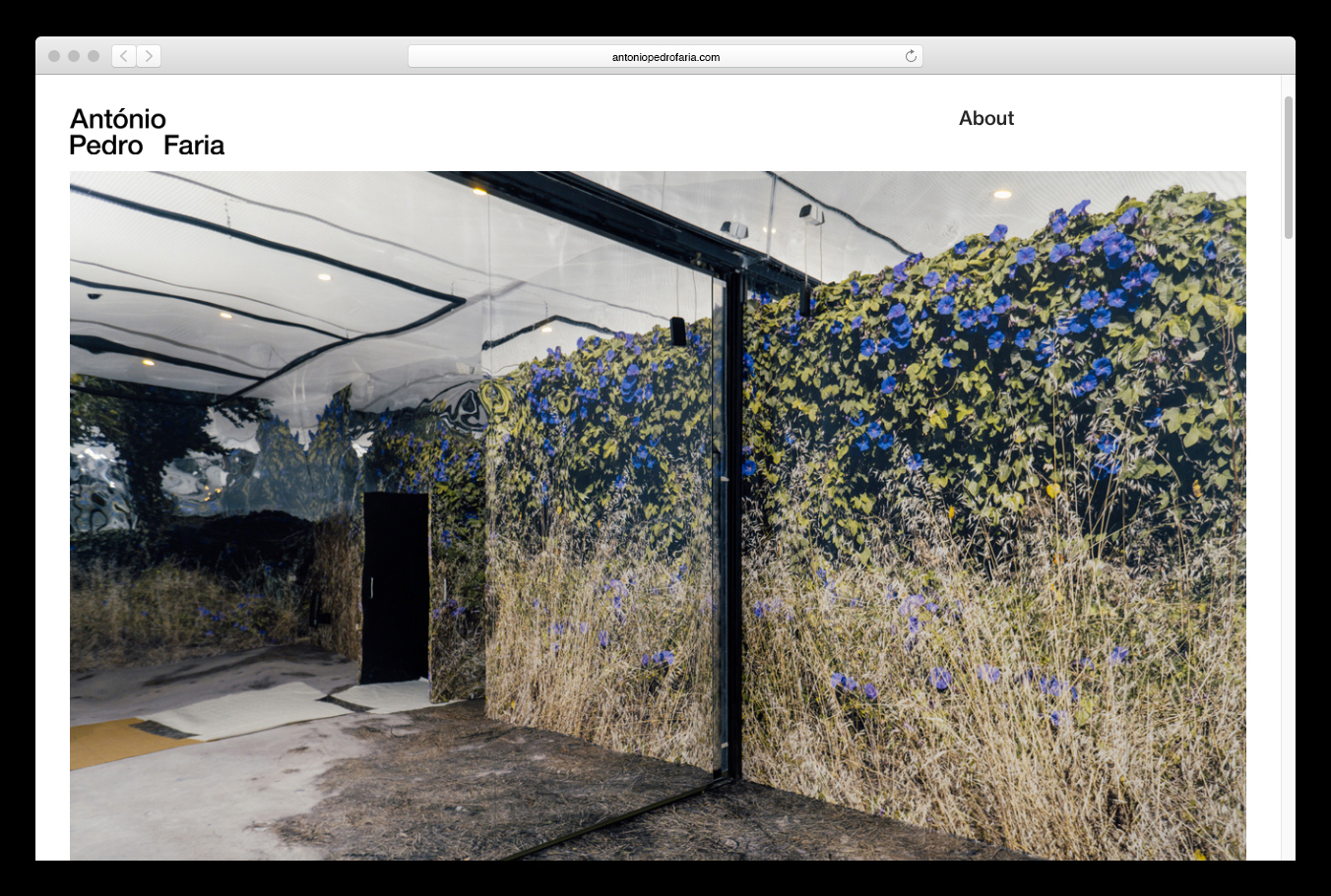
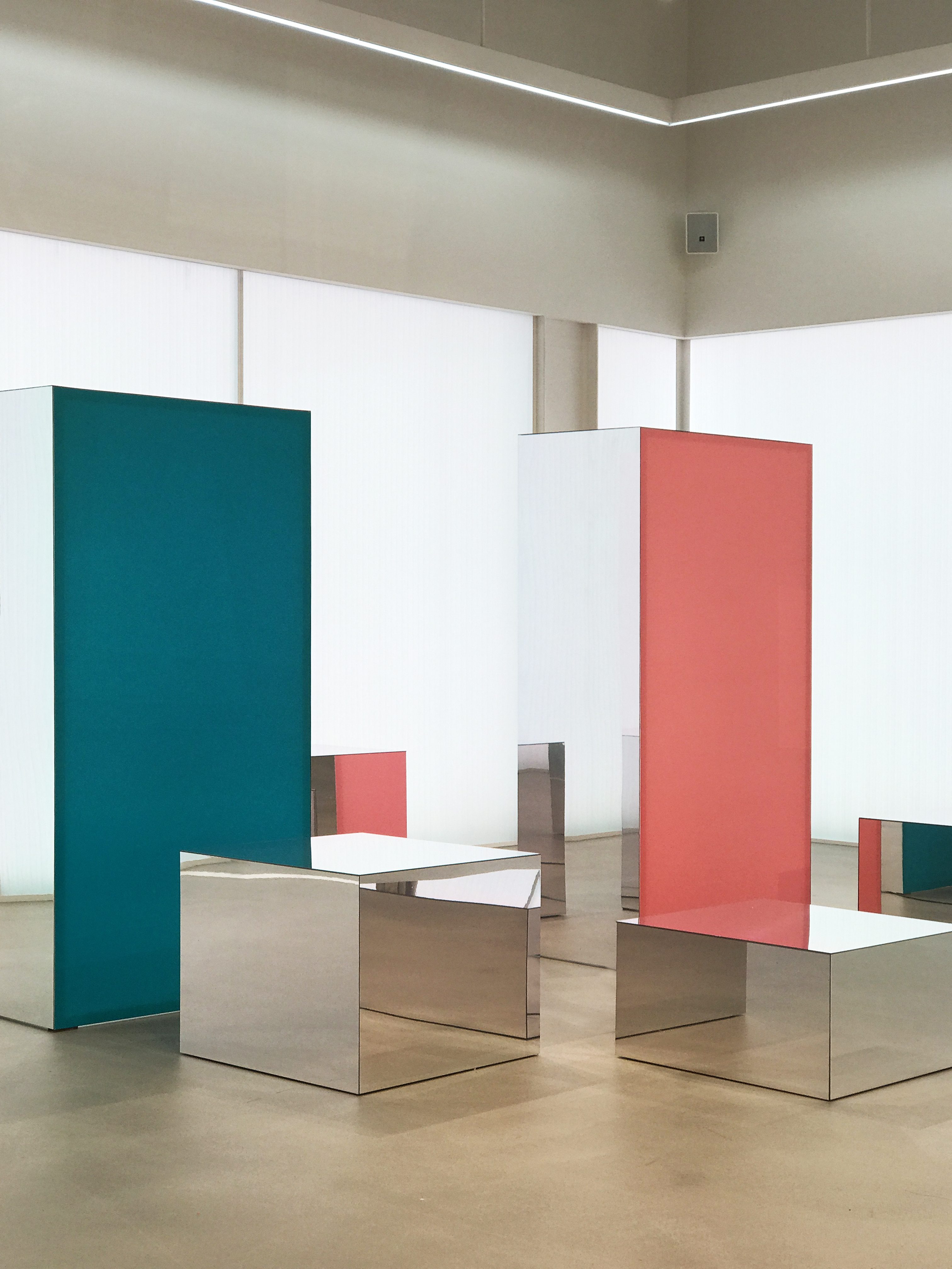
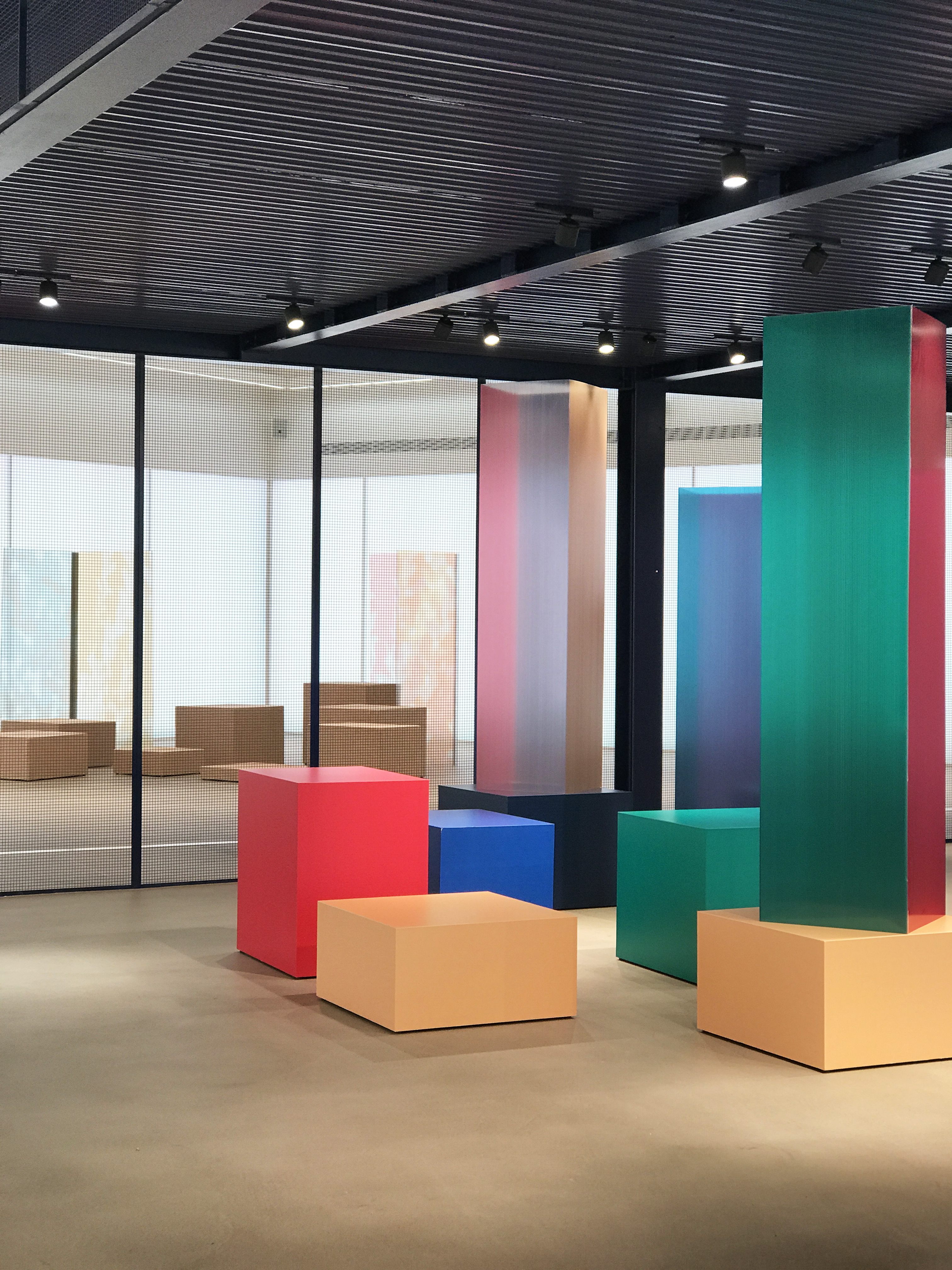
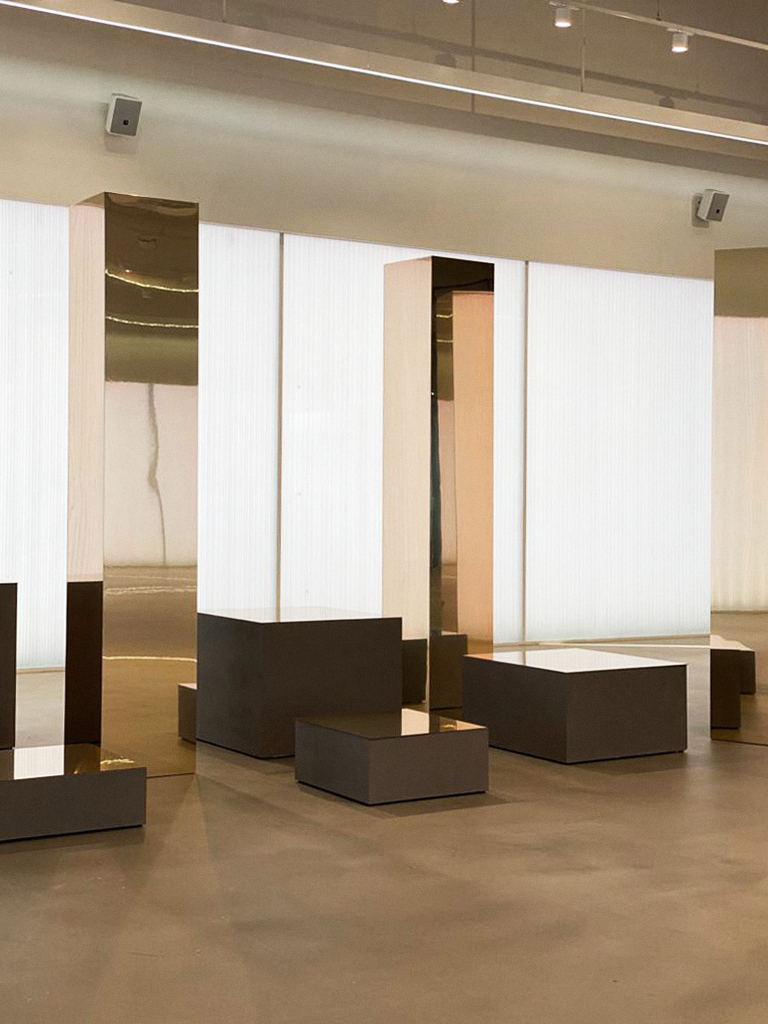
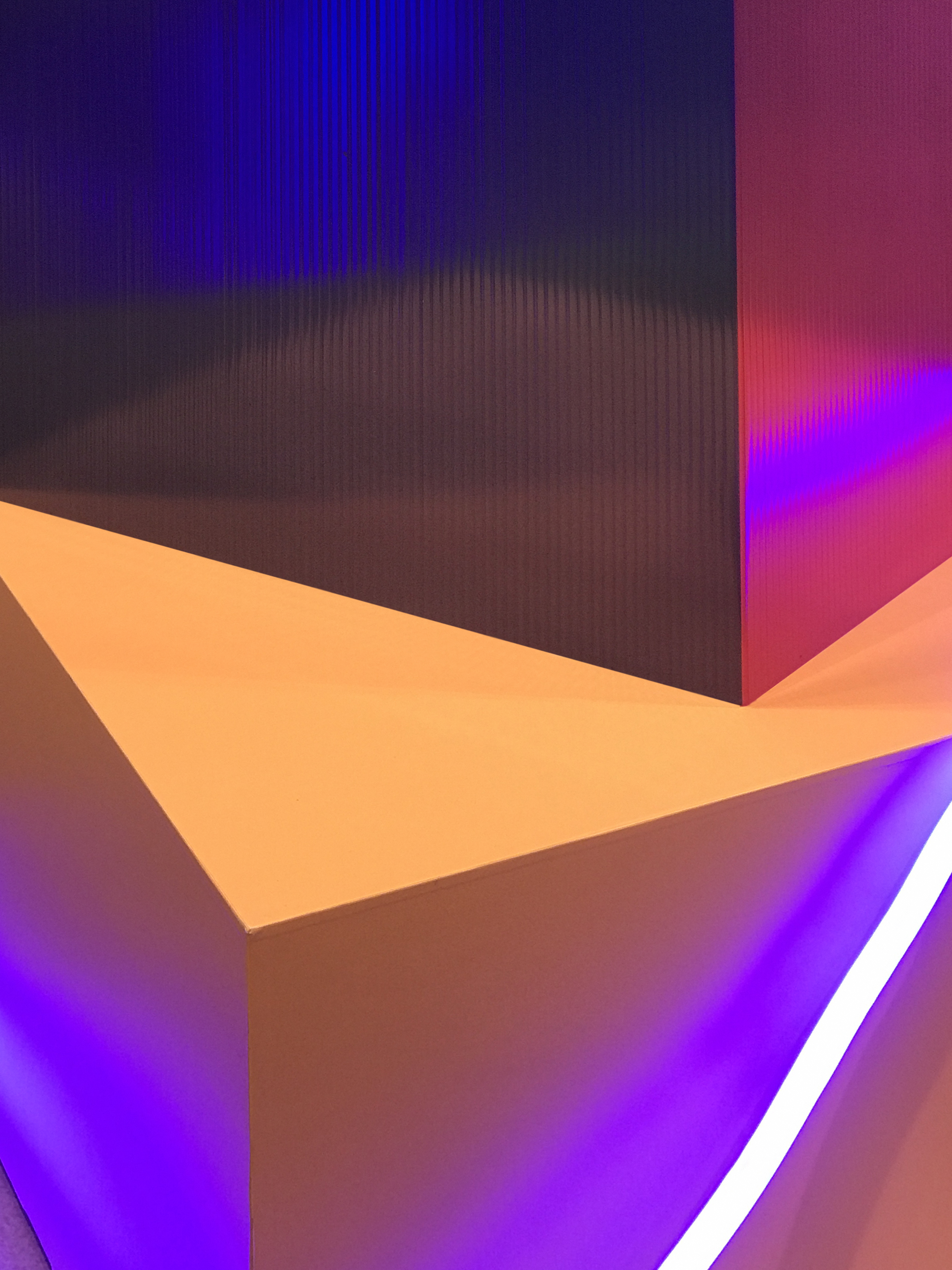
1. A Noite Dividida (The Divided Night) borrows its title from a poetry book authored by Sebastião Alba. Born in Braga, Sebastião Alba or Dinis Gonçalves died at the age of 60, run over in the same city. His notes are fragments of an urban nomadism that shines light on another city, on the fringes of the spaces normally representing the power of the historic city. A marginal, peripheral, fragmented city. A divided city.
2. The device is a pleated structure that enhances this division, through a plane multiplying the viewpoints. The images applied to it are perceived differently depending on the position of the viewer. Their surfaces, whether turned on each other in a close relationship, or turned in opposite directions, suggest meeting points and rupture points, respectively.
3. The Baroque Garden at Biscaínhos Museum, despite being a natural space, is anything but casual or randomly laid out. Like any garden, it is a simulation of nature and therefore a representational space par excellence. The dichotomy between natural and artificial originates in these places, casting light on the biggest paradox: the garden as a seemingly natural space in the city is actually more artificial than the city itself. On the other hand, the marginal and peripheral city becomes more organic than the Garden itself. Its fragmented expansion creates living spaces that go beyond the continuous control of the Garden.
4. This installation aims to show another city and a different outlook on it, how it is built and represented. On the Baroque garden the pleated structures reflect what we choose as the image of human virtuosity, whilst summoning the city’s periphery at a simultaneous pace. Through the reflections of the same plane, a Noite Dividida seeks to enlighten the confrontation of what we chose as our representation together with what we chose not to (the outskirts). And it is within that confrontation that we are able to question what represents us, and what is yet to come.
In collaboration with António Pedro Faria
Images 2 and 5 of the first gallery are from André C. Macedo / Noite Branca Braga 2019

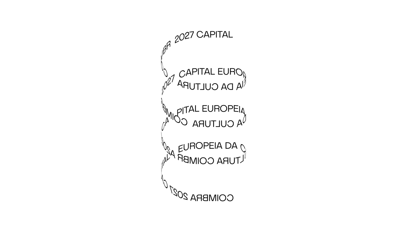


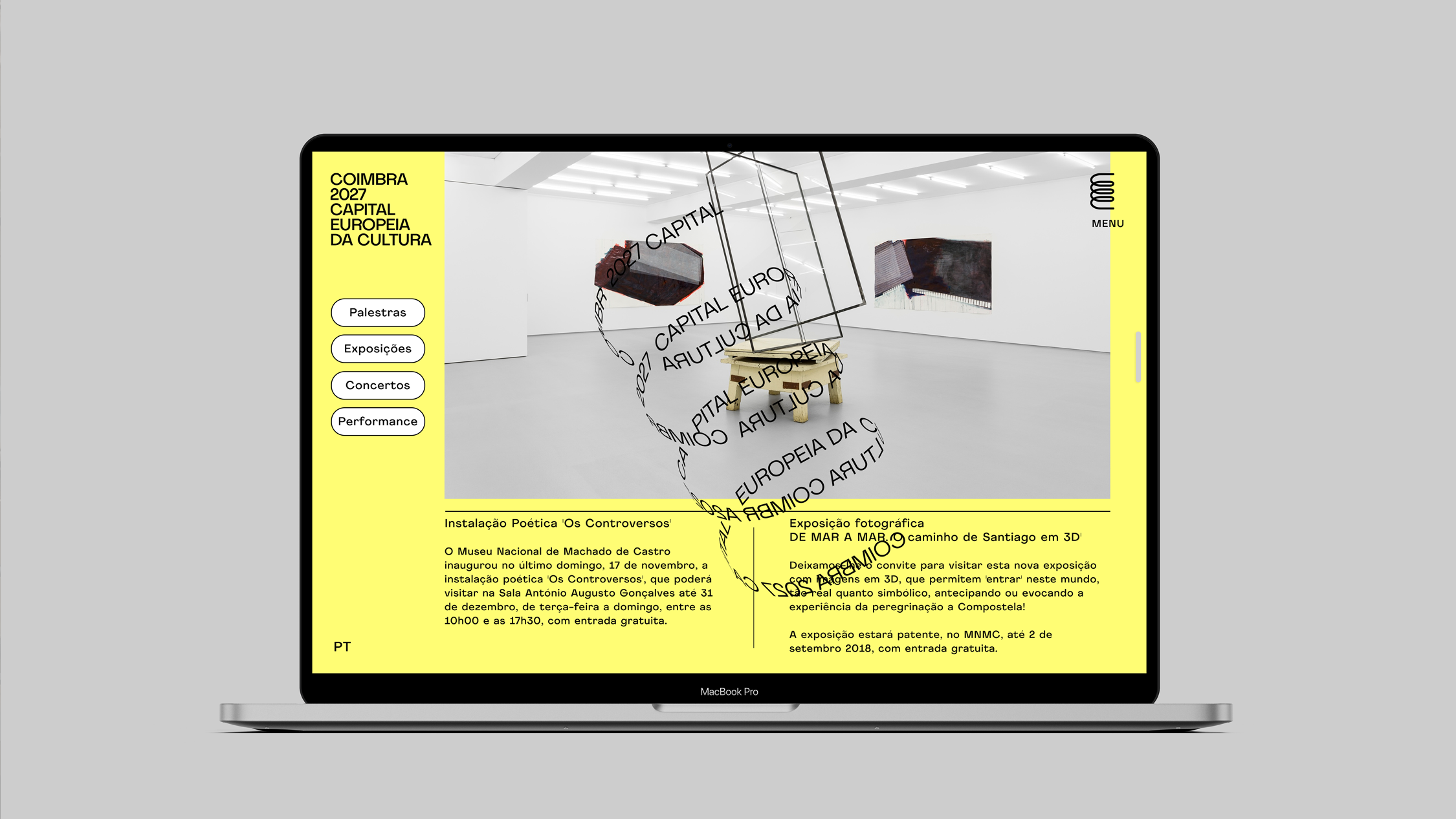
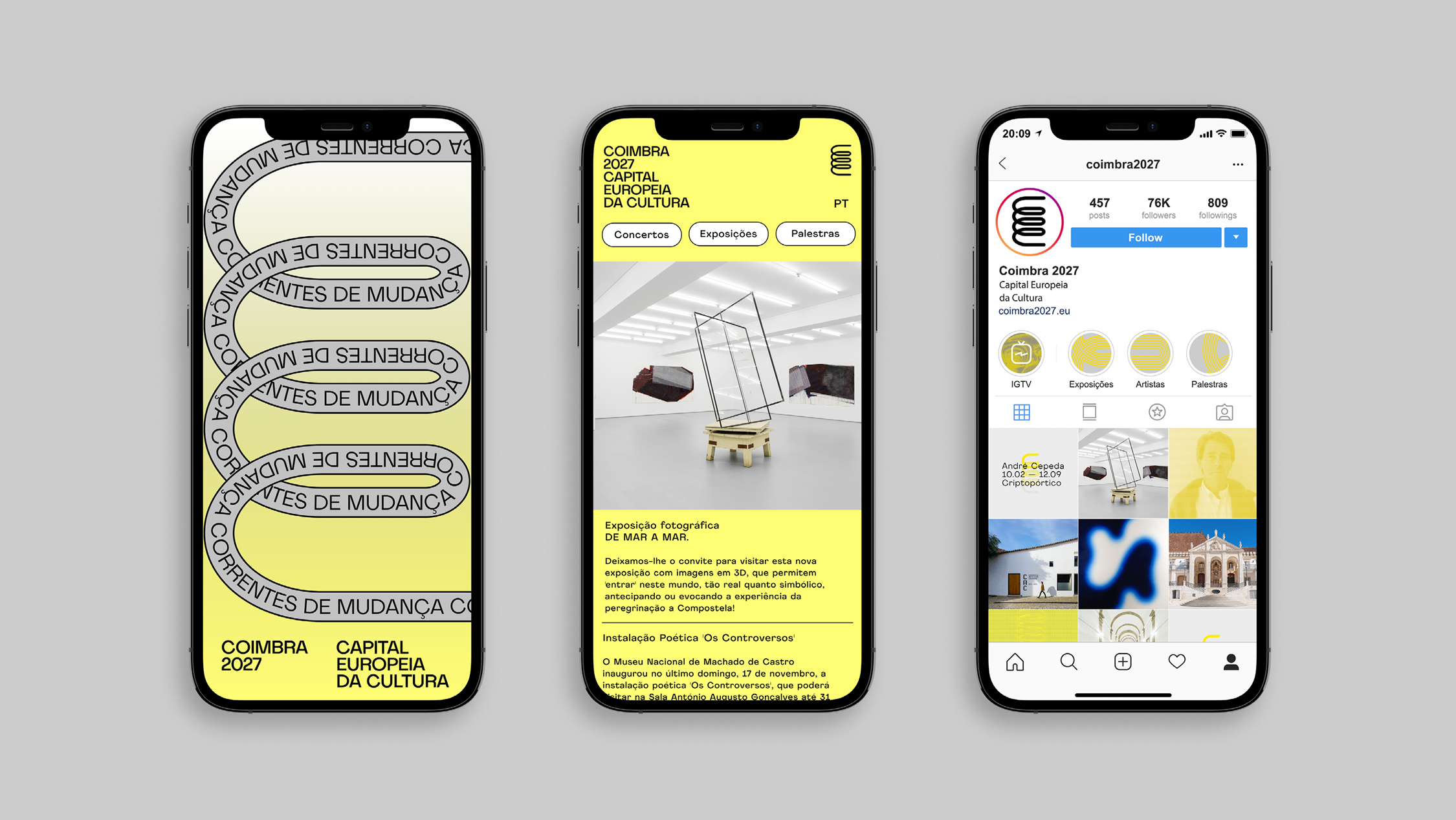
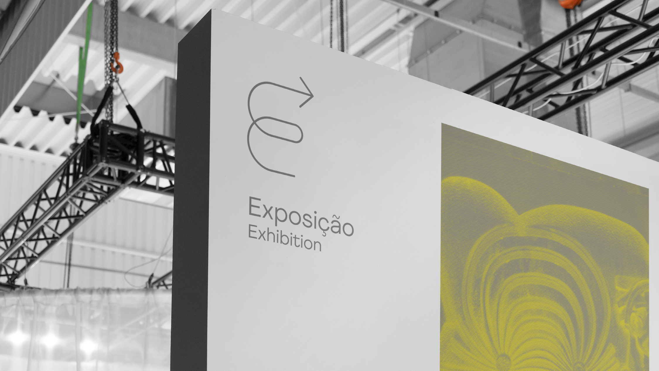

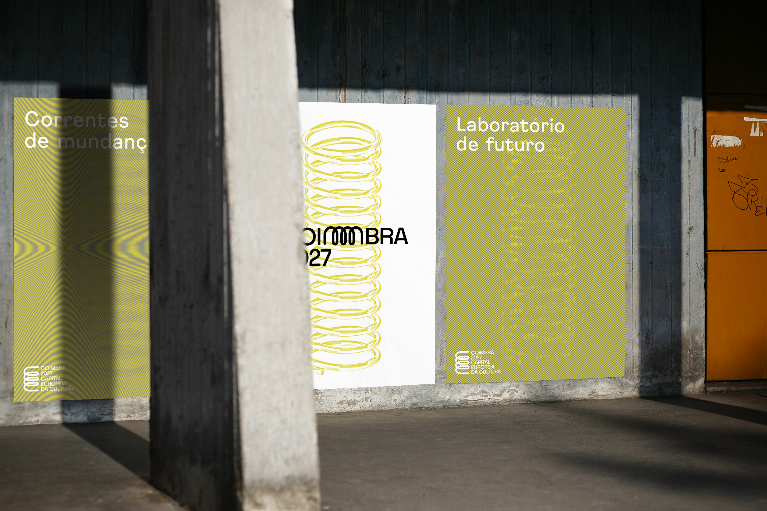

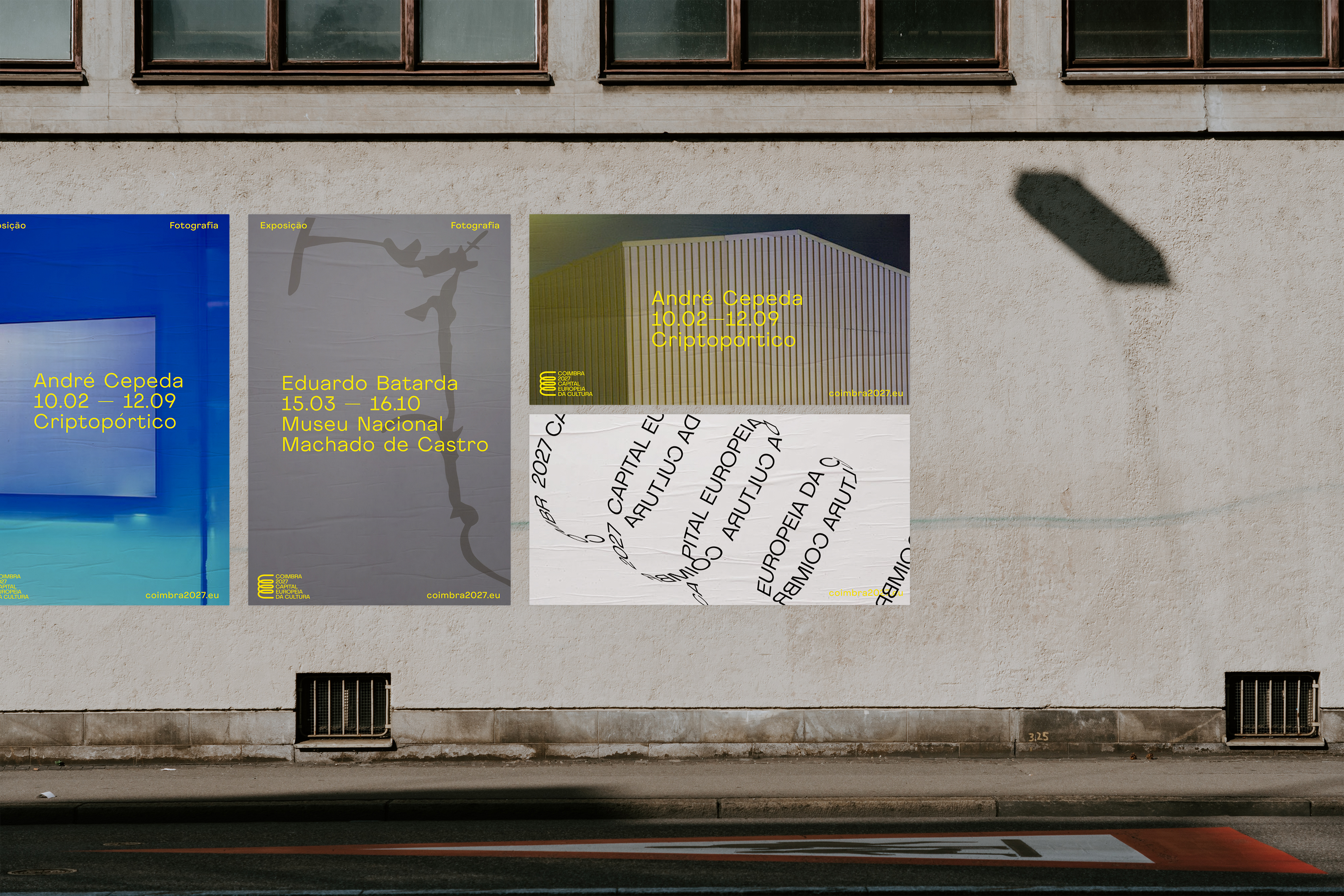
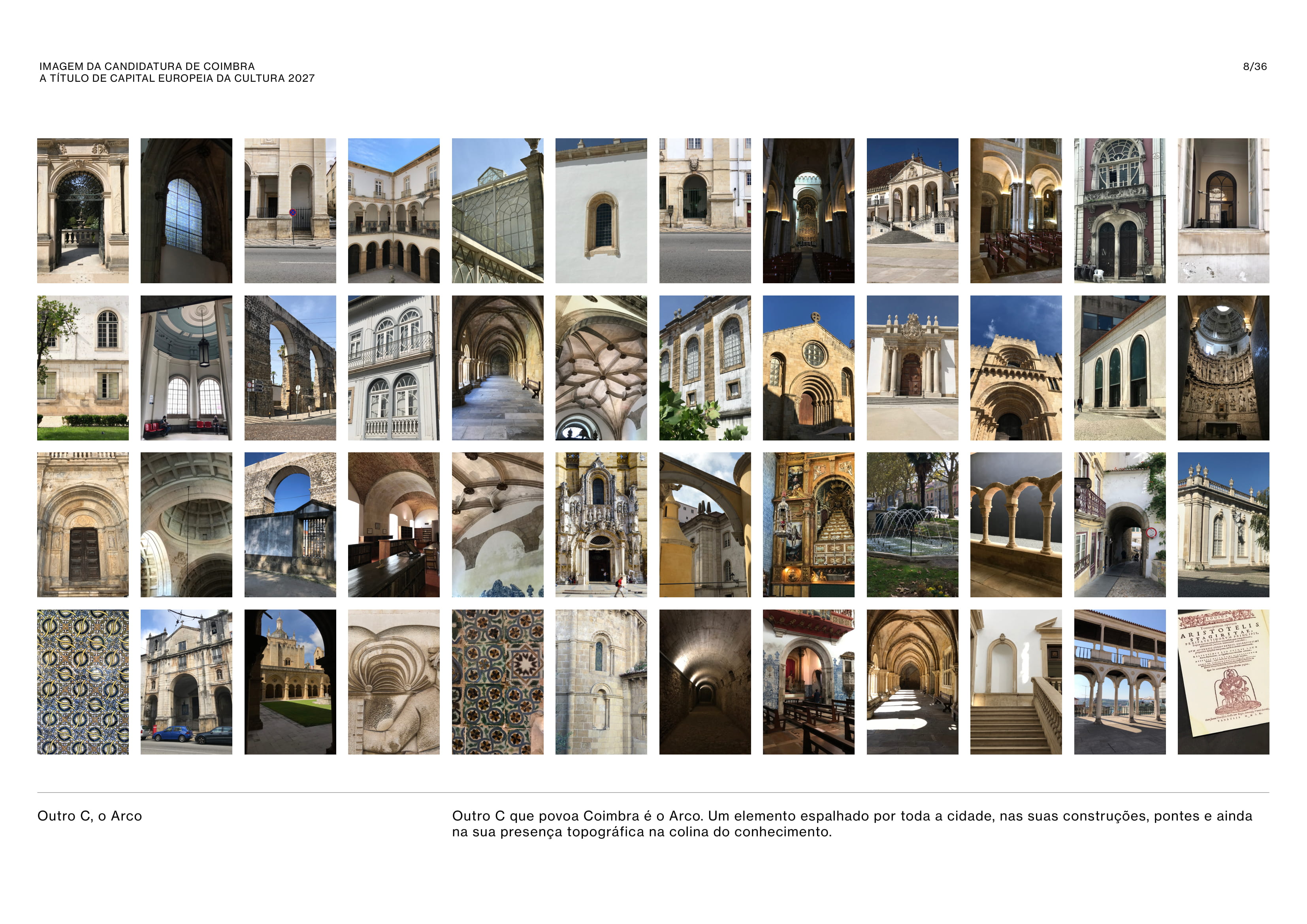
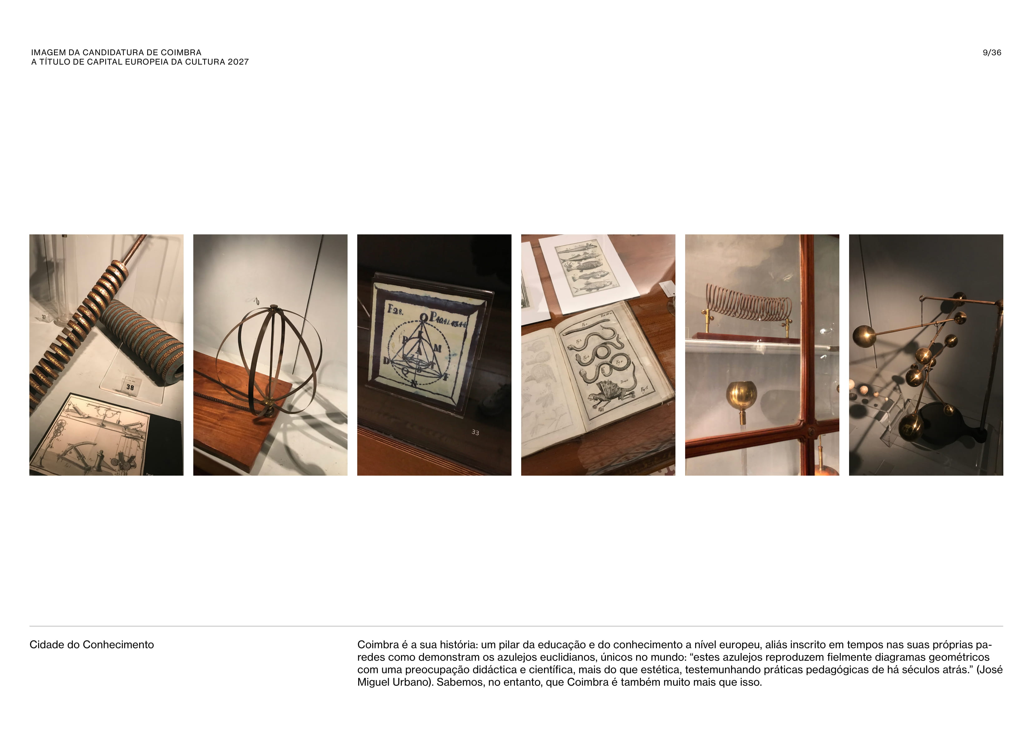
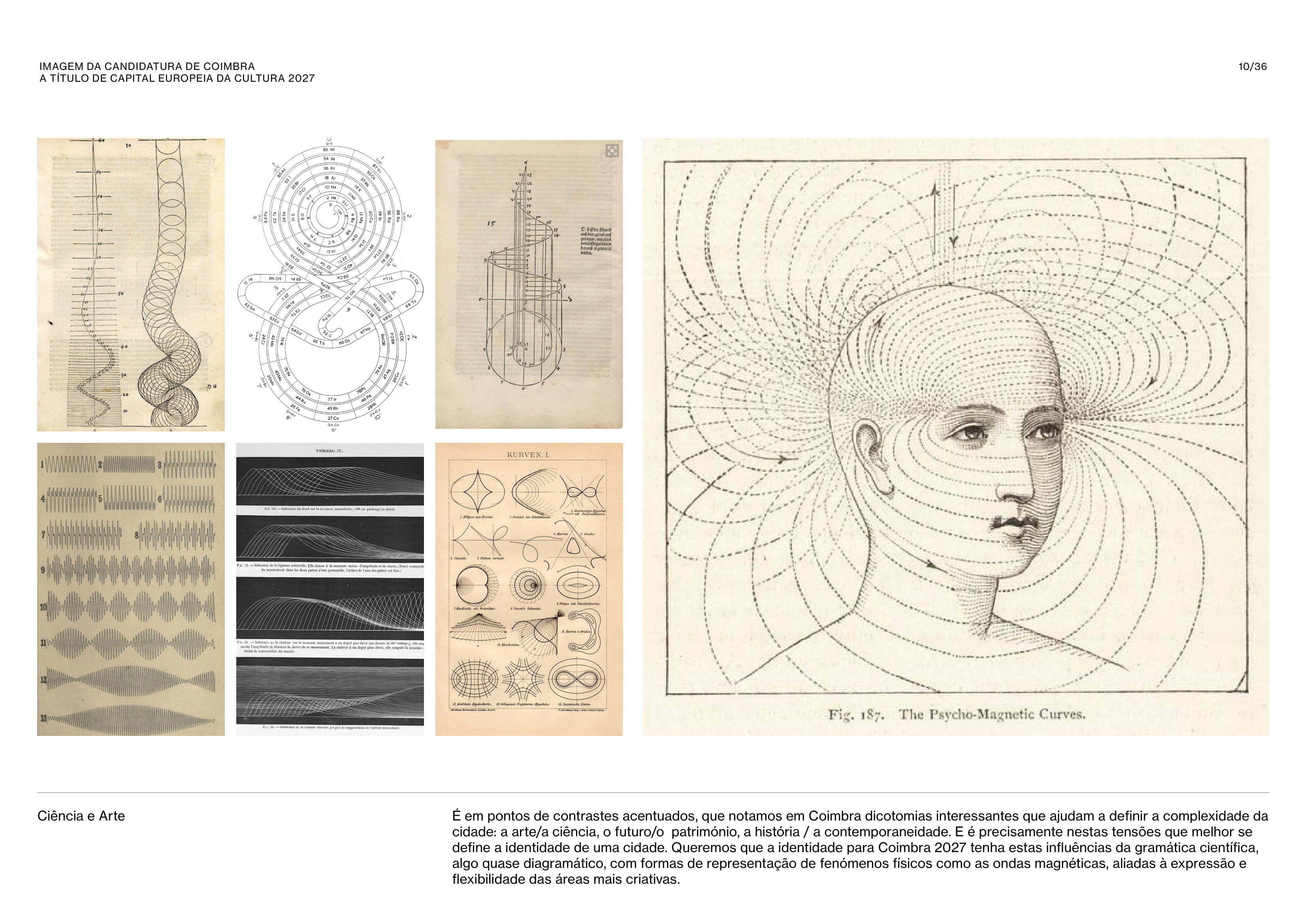
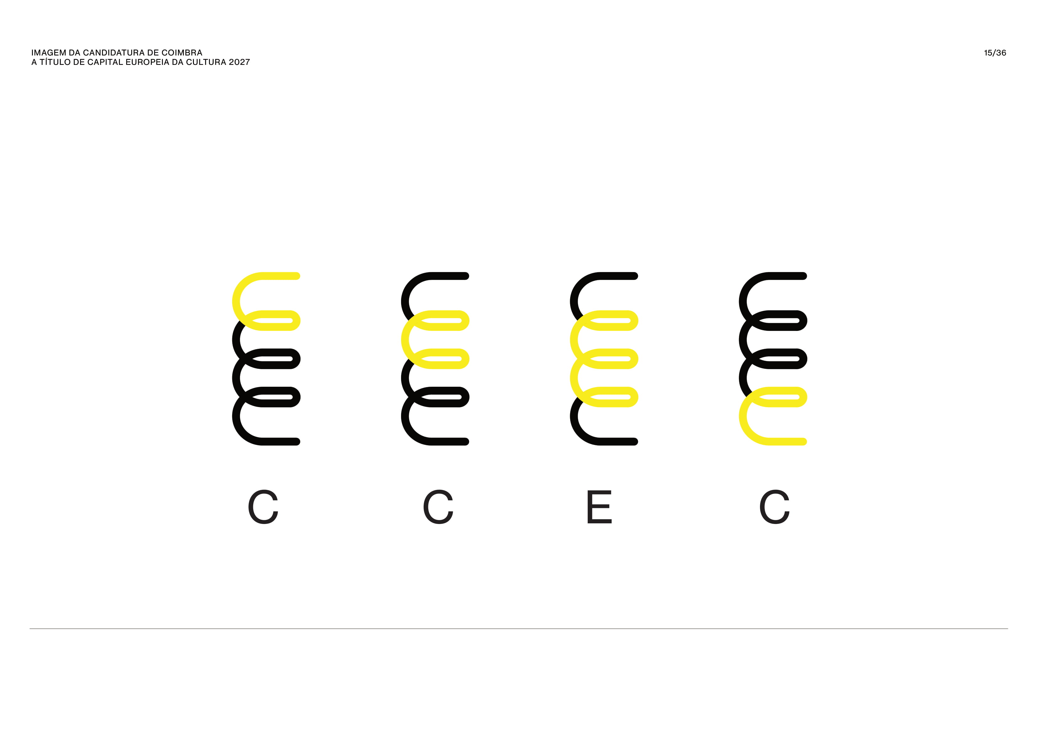


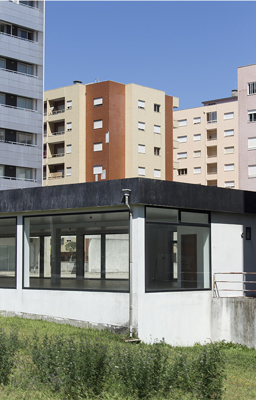
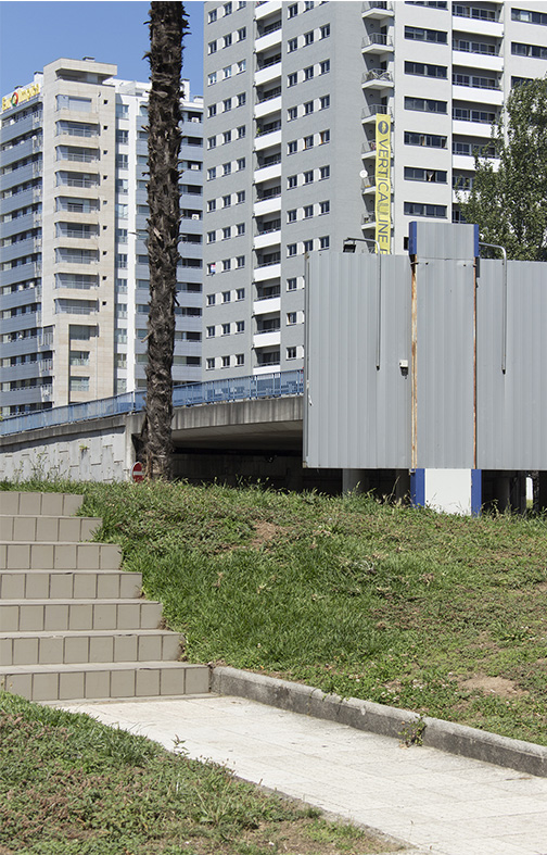
COIMBRA 2027
IDENTITY PROPOSAL
IDENTITY PROPOSAL
+ INFO
Identity and webdesign
Proposal for Coimbra's application to be 2027 European Capital of Culture

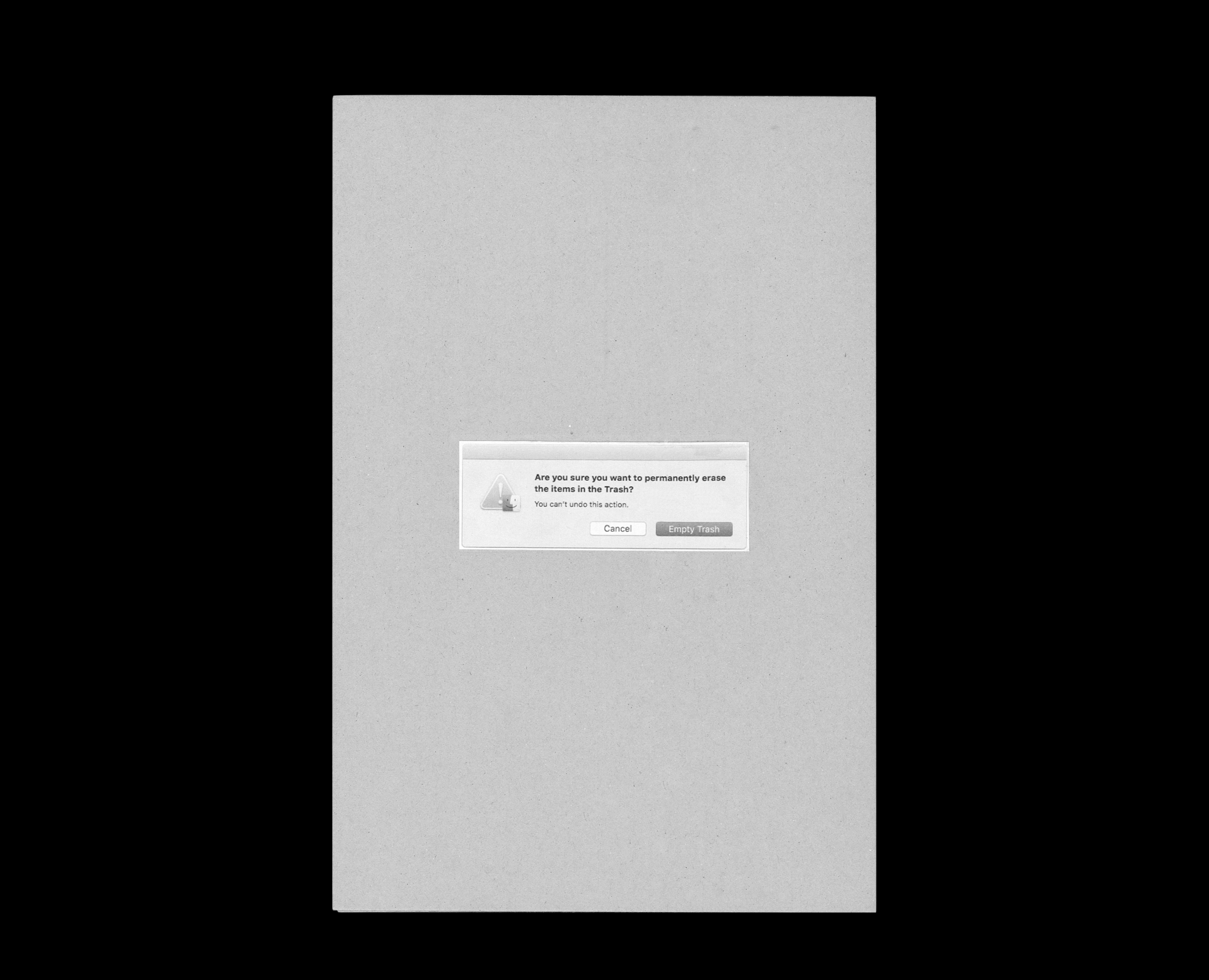
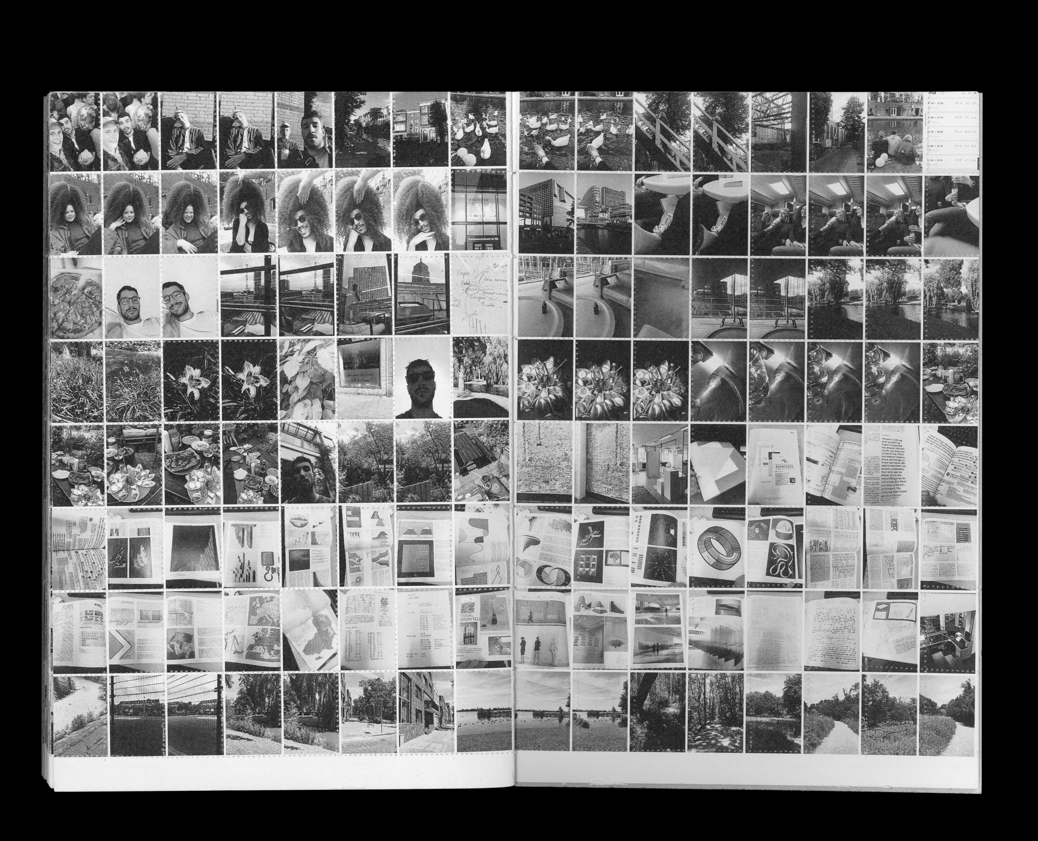
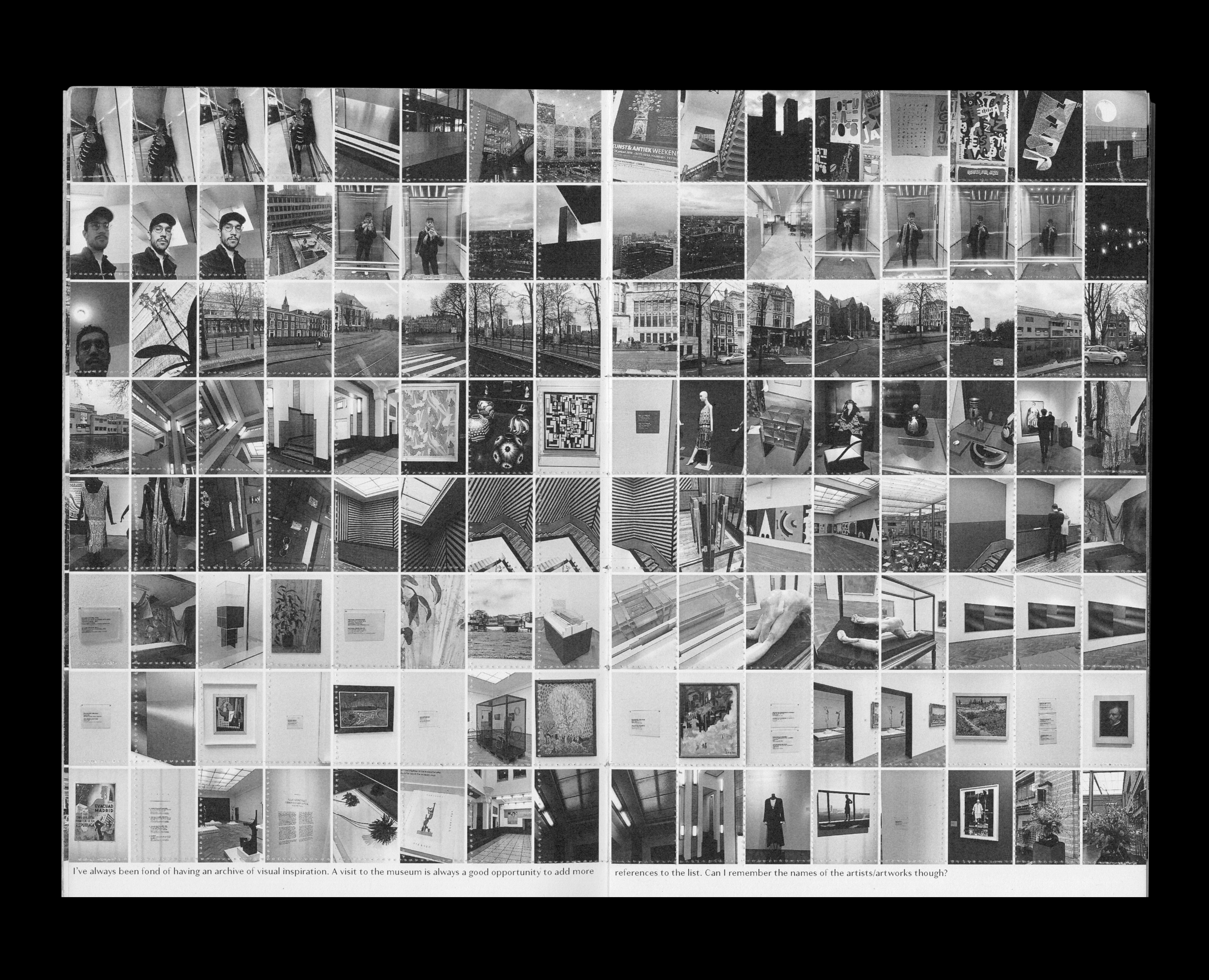

A STORAGE STORY
REMEMBERING TO DELETE OR DELETING TO REMEMBER
ROTTERDAM
REMEMBERING TO DELETE OR DELETING TO REMEMBER
ROTTERDAM
+ INFO
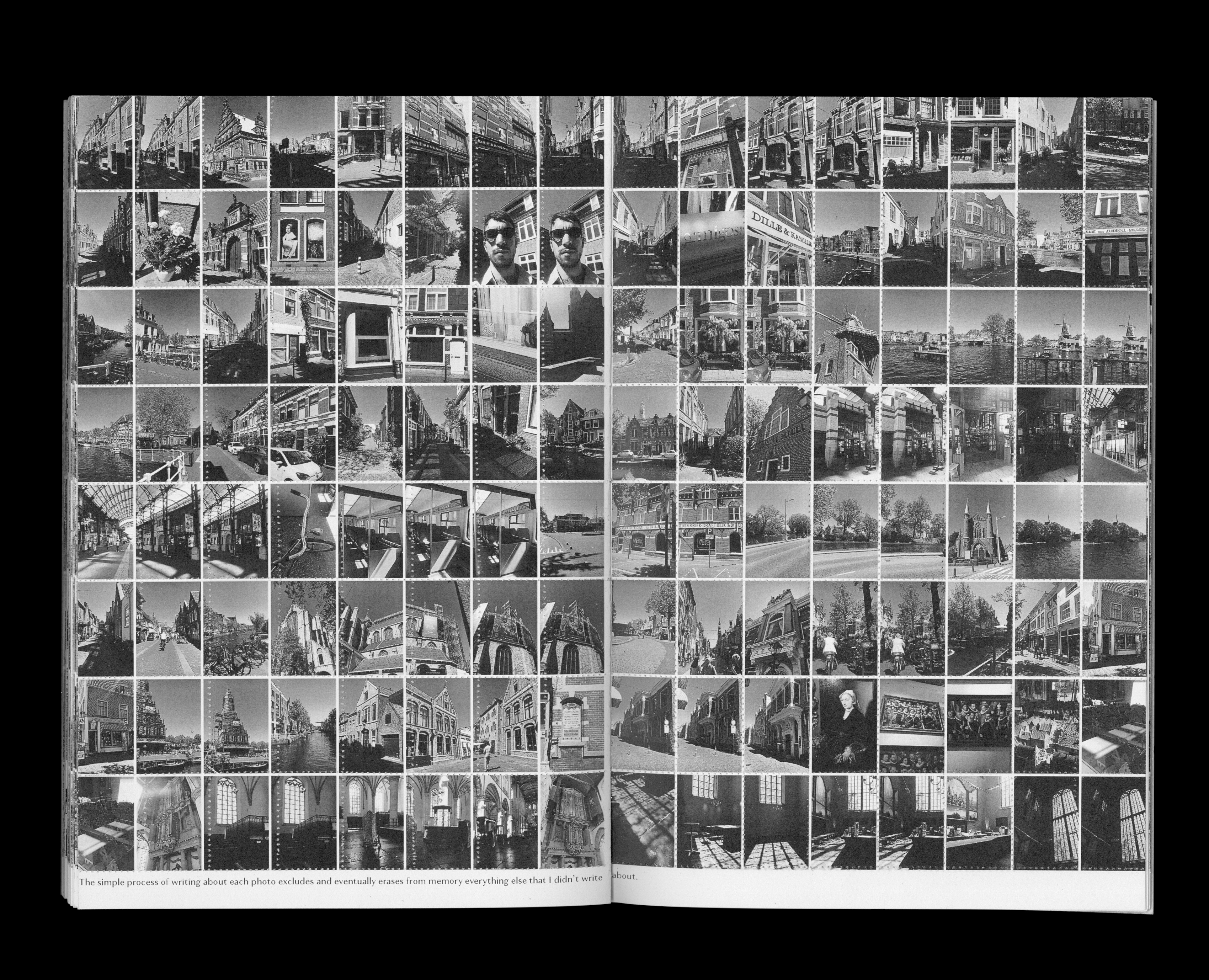
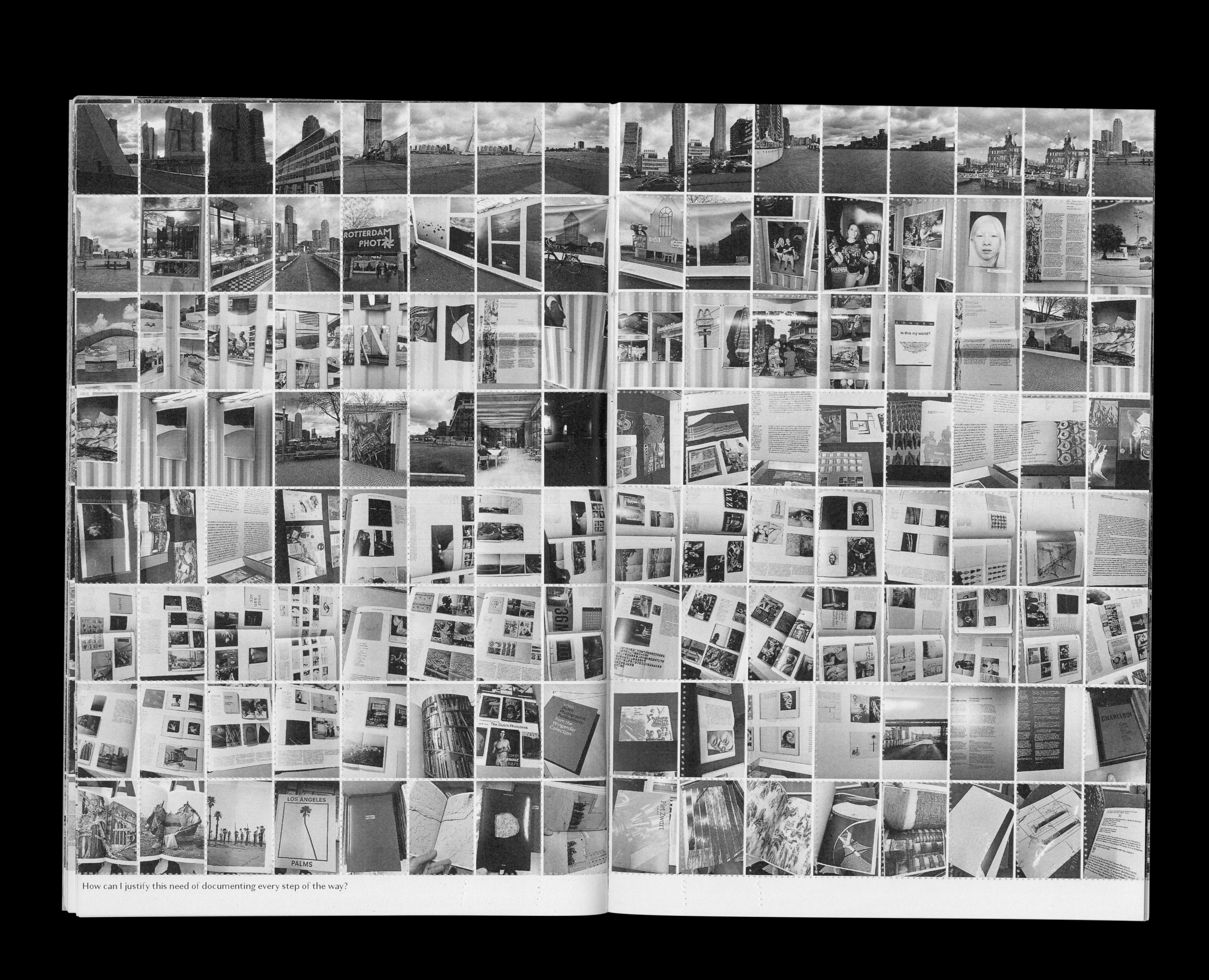
This project started as a response to the vast number
of pictures taken with my phone accumulated whilst living abroad in Rotterdam. There is a constant fear of forgetting the present, and thus this portable device becomes an extension of my body and my memory. Like a secondary storage unit that records and documents what I’m experiencing.
Am I though? This picture-overload on the verge of hoarding might impair my ability to create mental pictures of the surroundings.
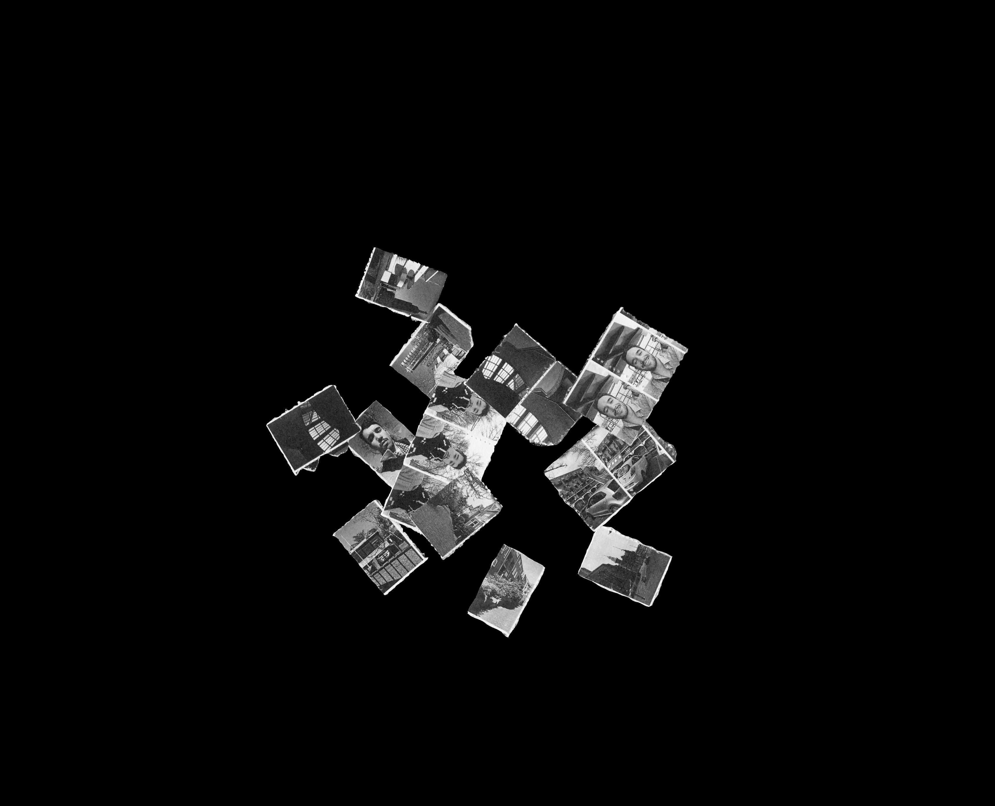
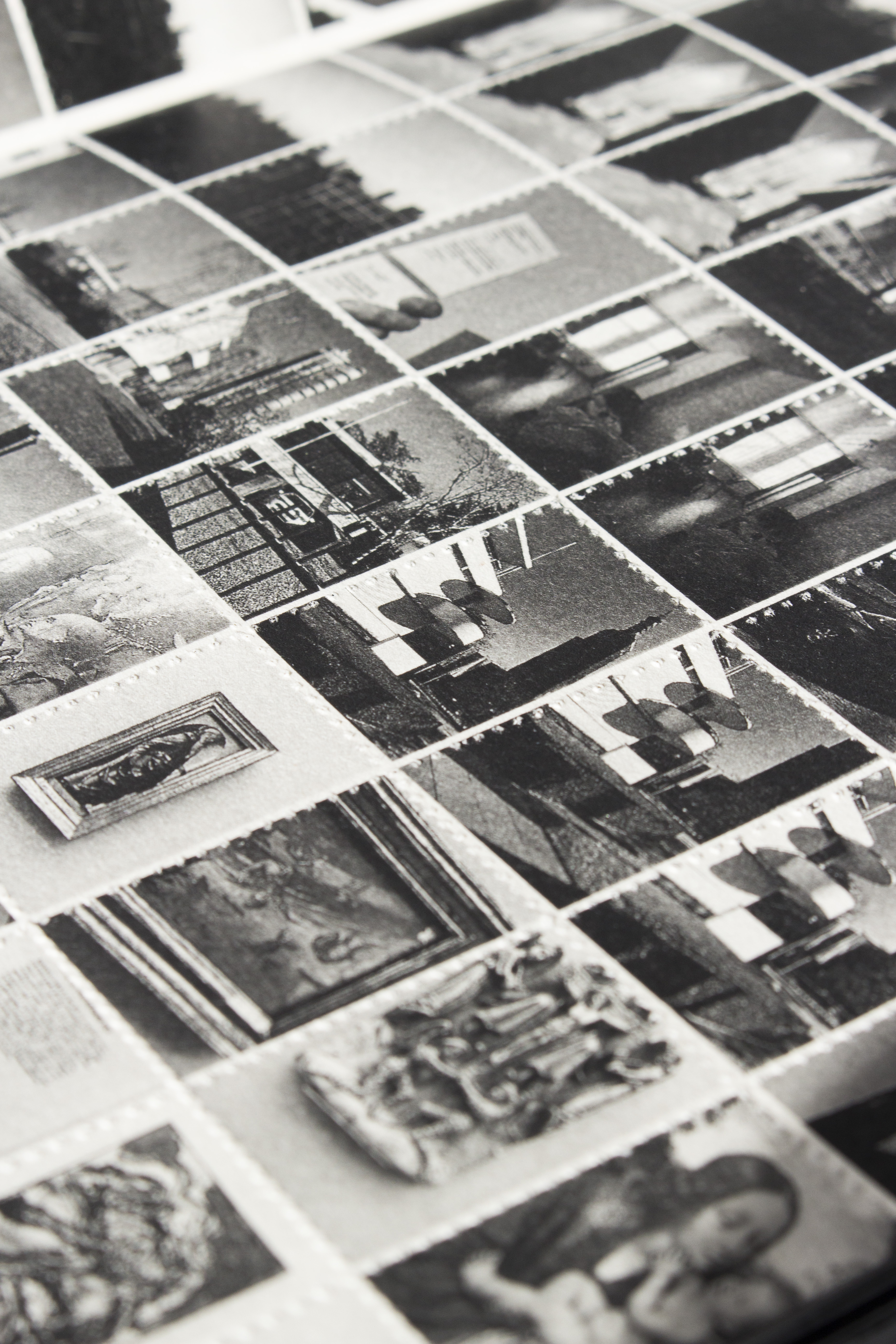
Therefore, this publication is my personal take at confronting and tackling the issue by trying to reflect on the complexity of this reality. By bringing all these files to an analogue medium their longevity is defied. The perforated images become fragile and easily deteriorated or even lost, just like memories do. Maybe the simple act of deleting the pictures might in turn help me to remember them.
On the footer some thoughts and findings that went through my mind during the development of the project are displayed.
The reader is encouraged to help me on this harduous task by tearing off the perforated images that he/she believes should be deleted.
Am I though? This picture-overload on the verge of hoarding might impair my ability to create mental pictures of the surroundings.
Therefore, this publication is my personal take at confronting and tackling the issue by trying to reflect on the complexity of this reality. By bringing all these files to an analogue medium their longevity is defied. The perforated images become fragile and easily deteriorated or even lost, just like memories do. Maybe the simple act of deleting the pictures might in turn help me to remember them.
On the footer some thoughts and findings that went through my mind during the development of the project are displayed.
The reader is encouraged to help me on this harduous task by tearing off the perforated images that he/she believes should be deleted.

+ INFO
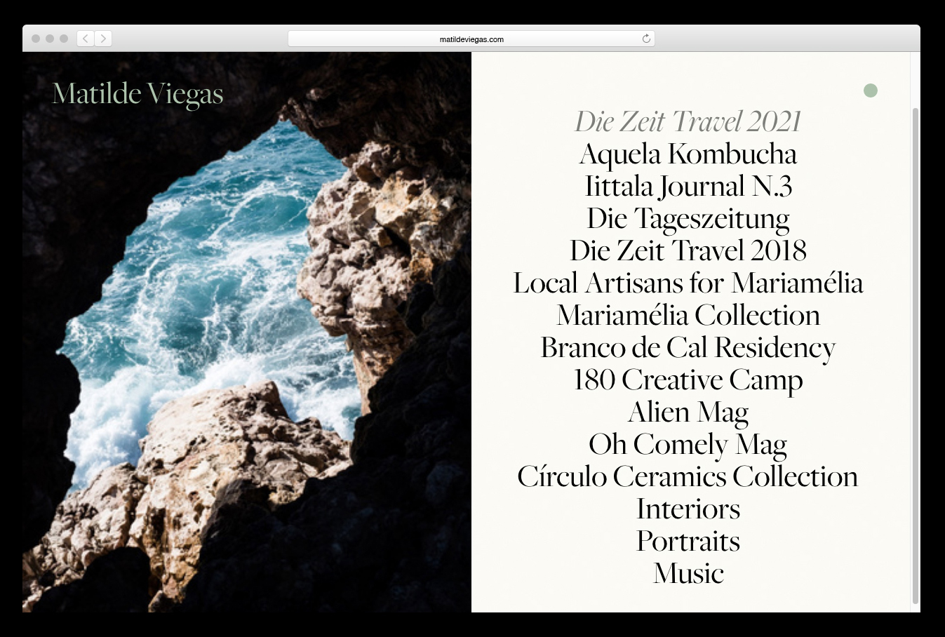
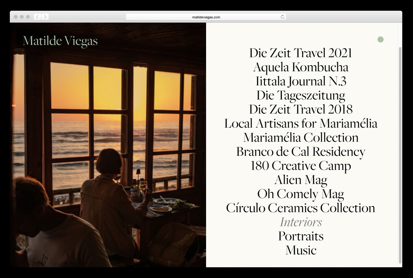
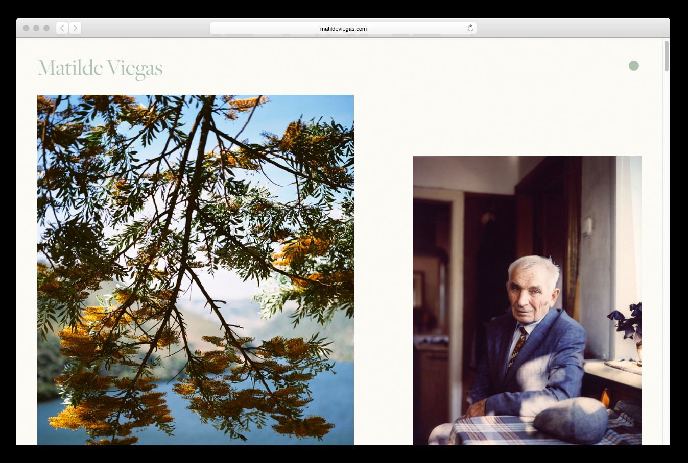
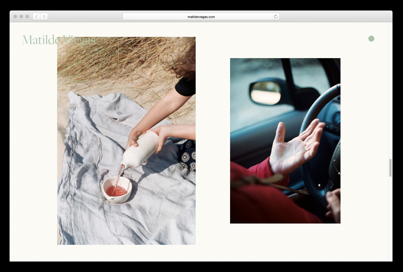
Layout design for Matilde Viegas' professional website. Matilde is a photographer based in Porto, Portugal documenting intimacy and the lives of others, using both digital and film.
I am a photographer based in Porto, Portugal. I primarily document intimacy, and the lives of others, using both digital and film photography.

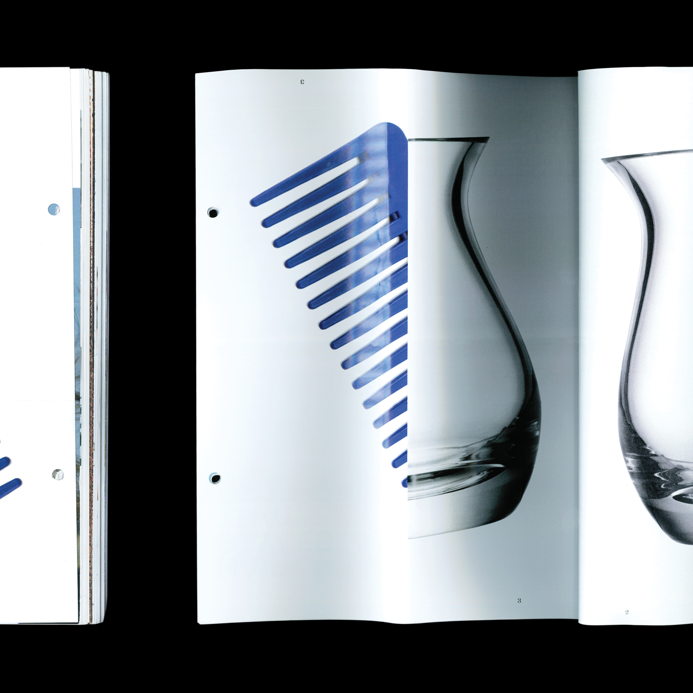


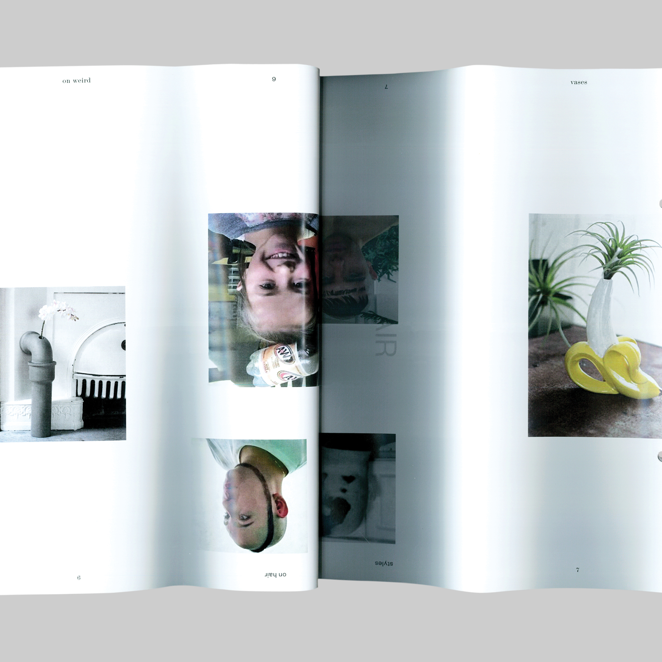
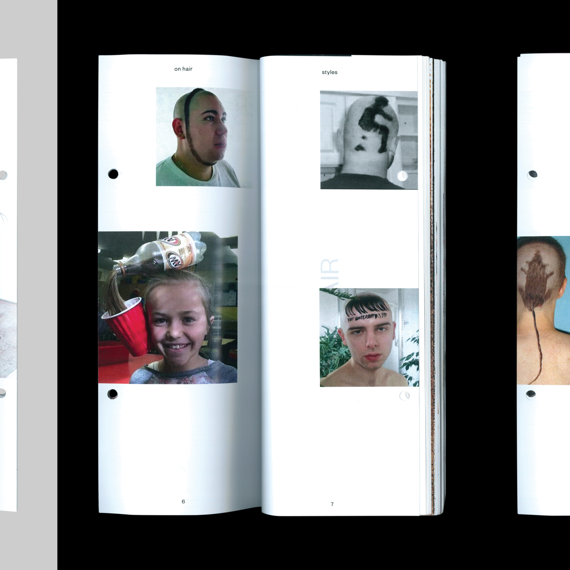

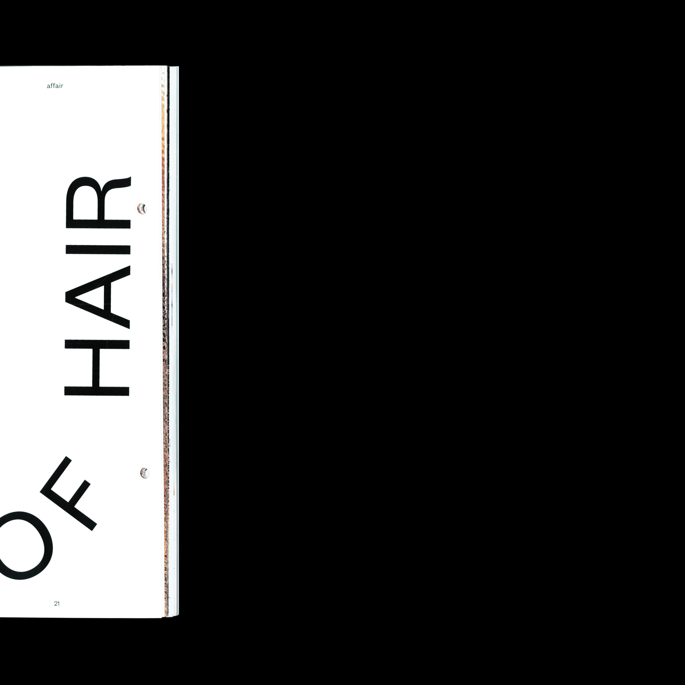

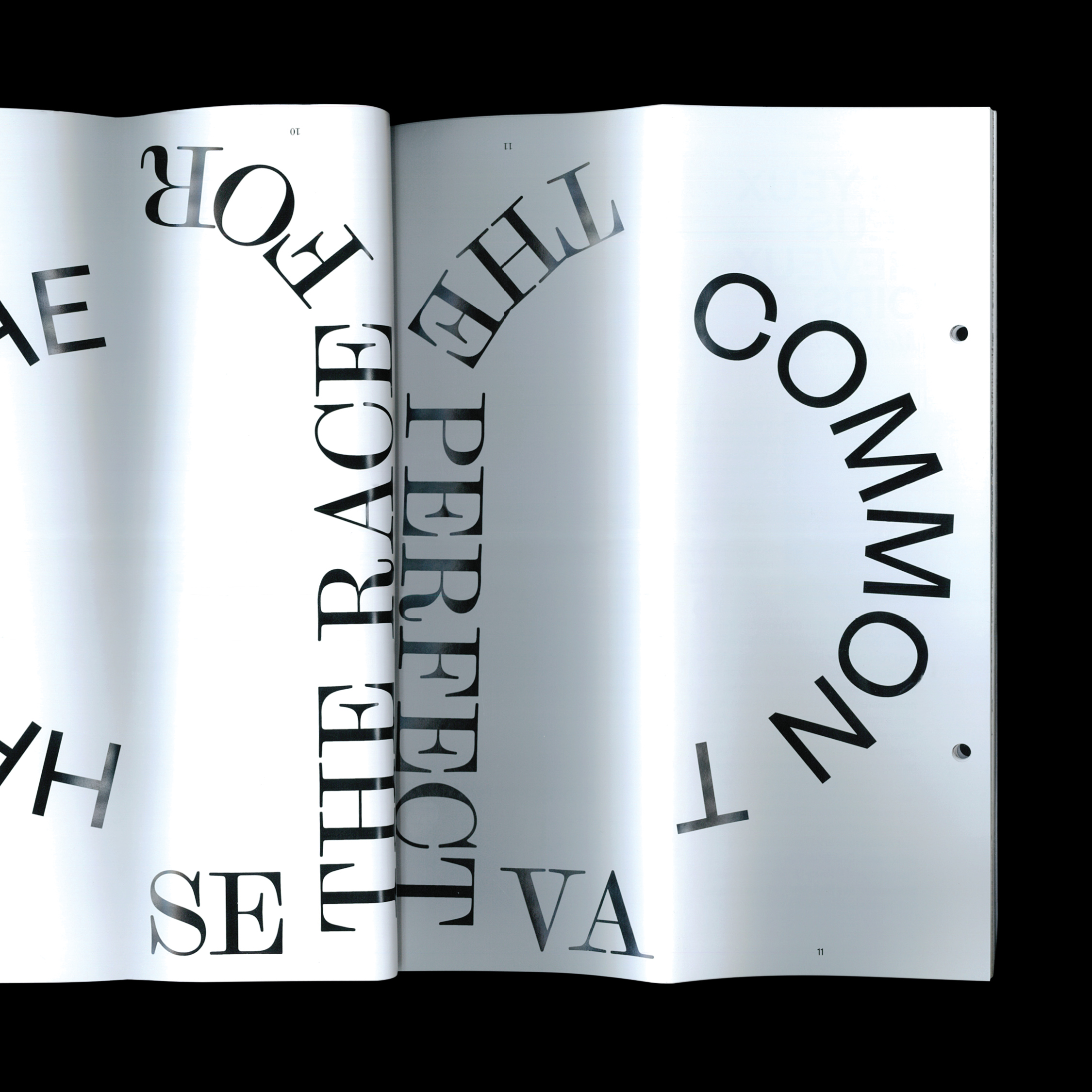

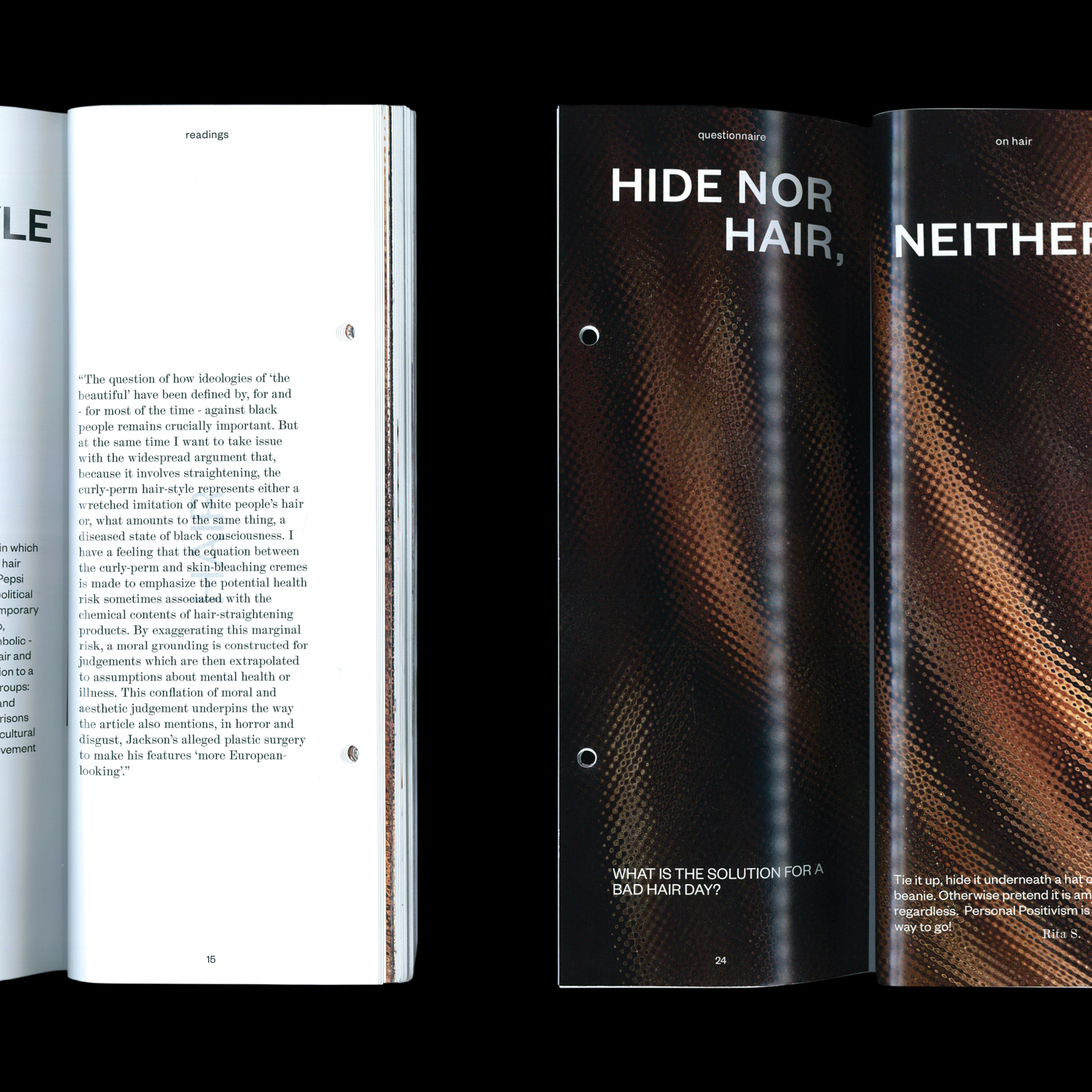
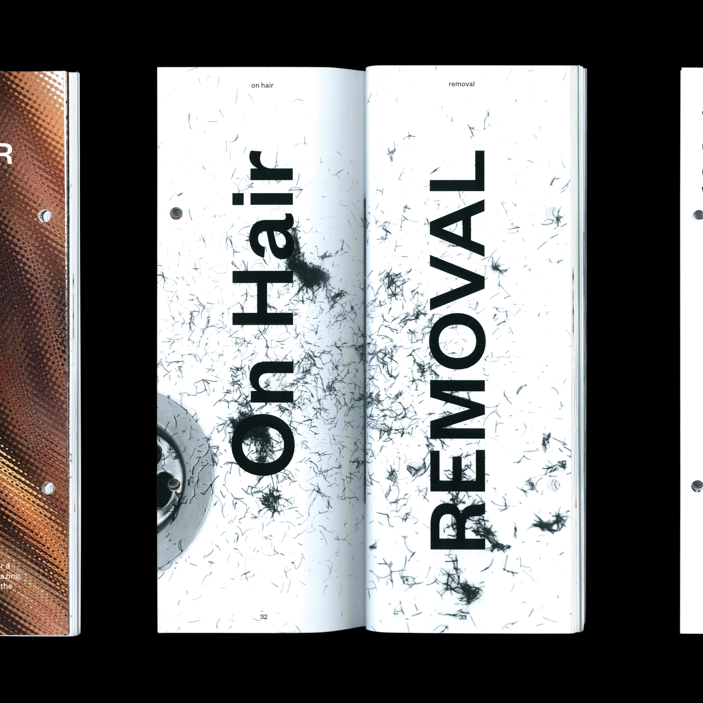
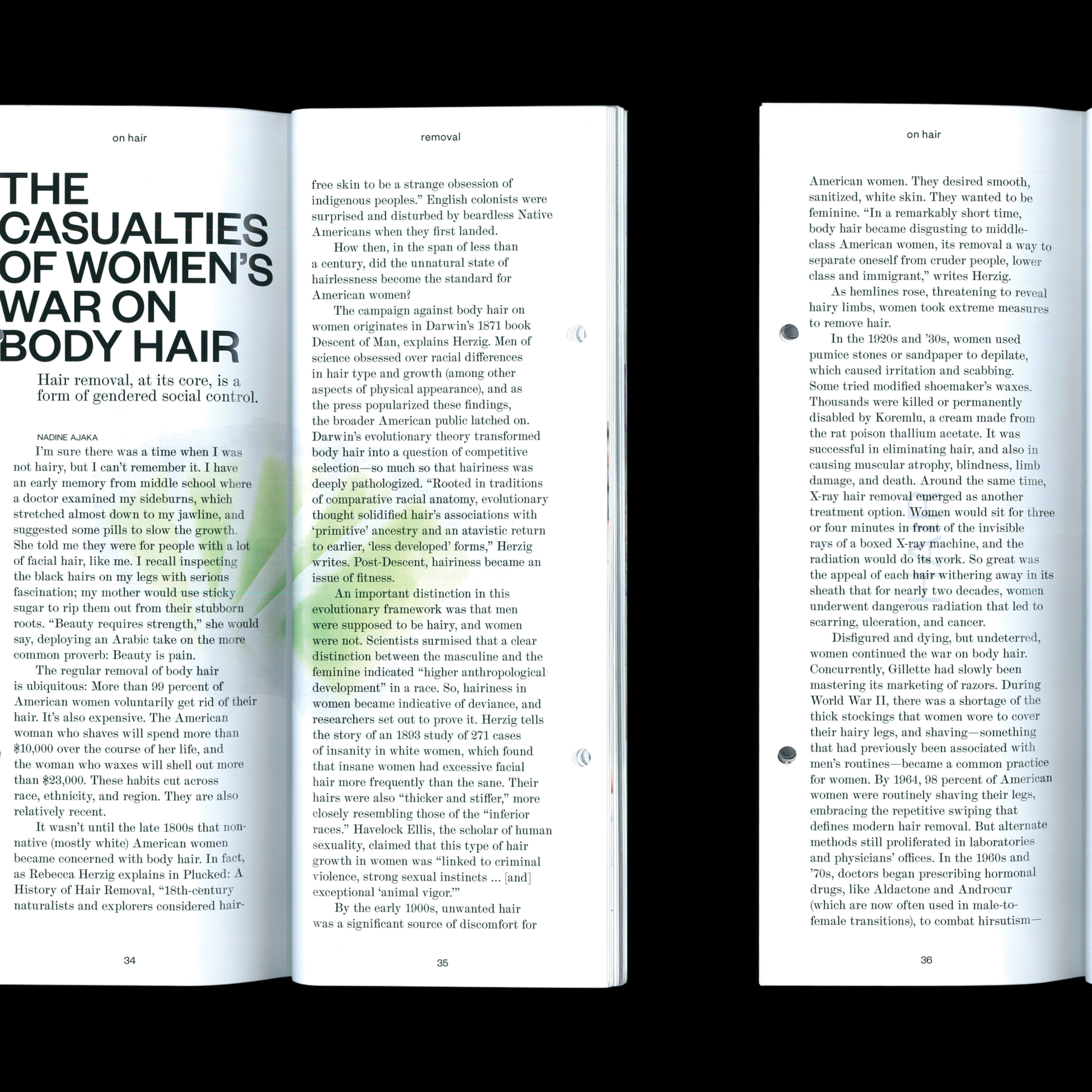
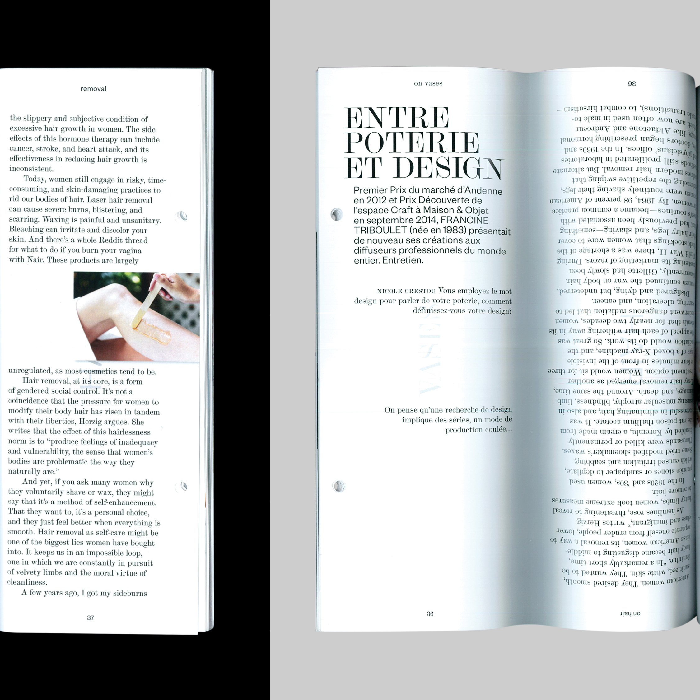
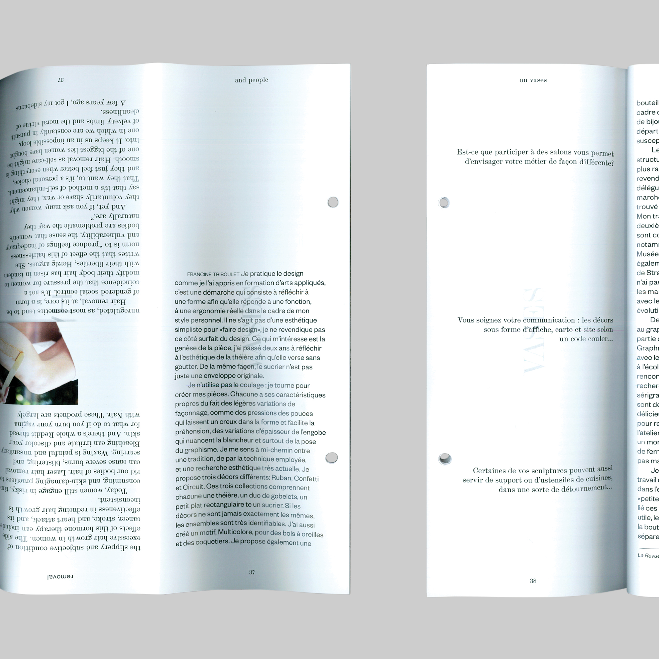
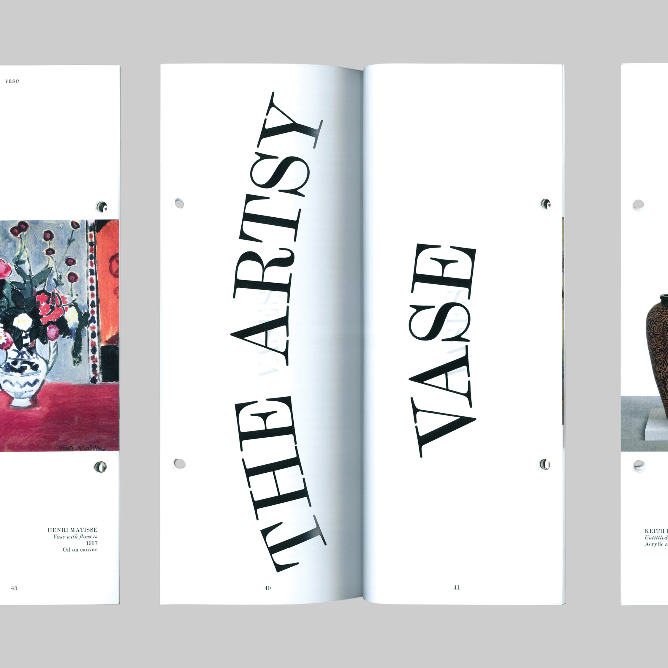


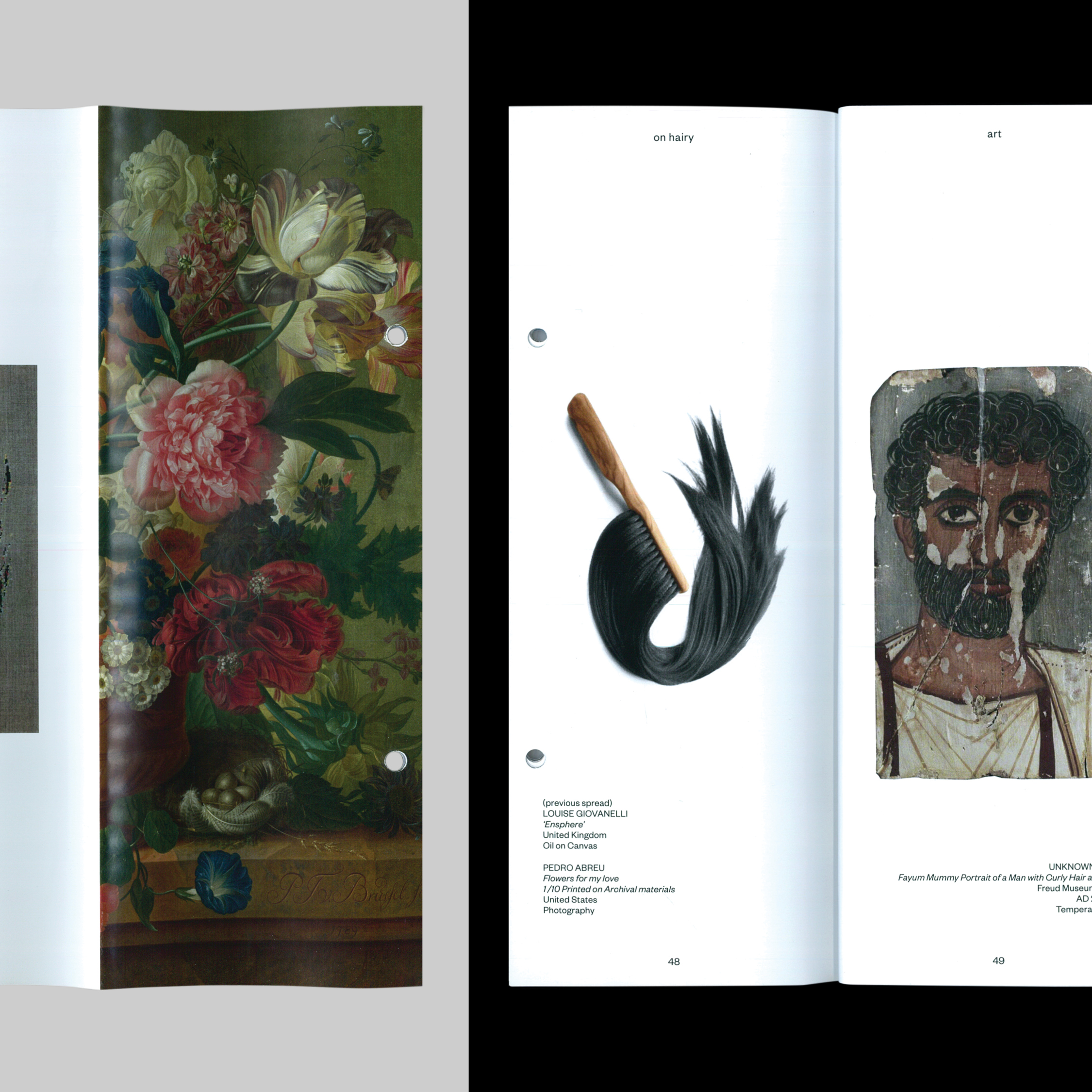
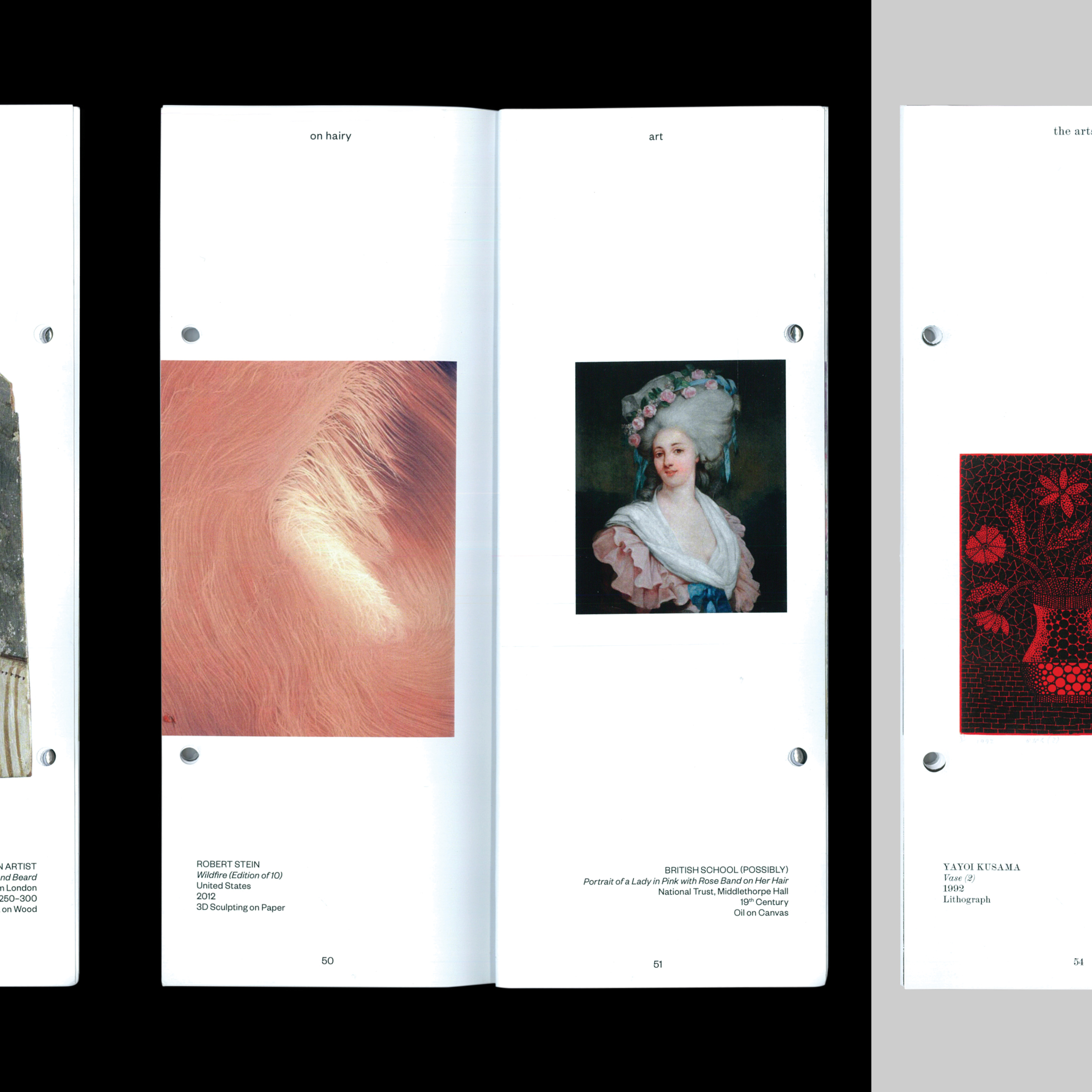
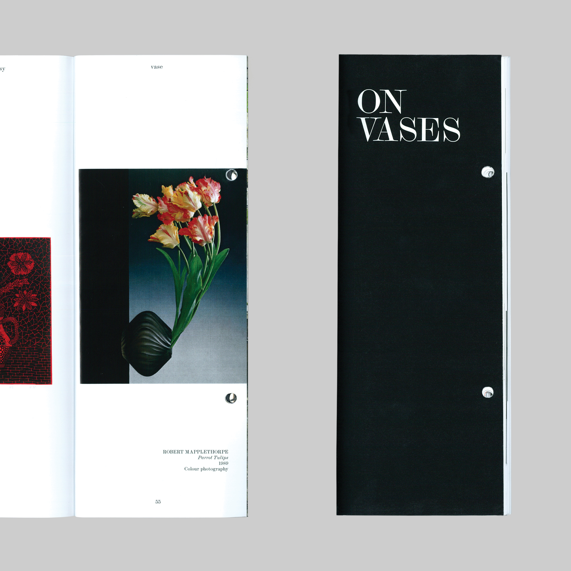
ON HAIR AND VASES
WHEN TWO (SUBJECTS) BECOME ONE
WHEN TWO (SUBJECTS) BECOME ONE
+ INFO
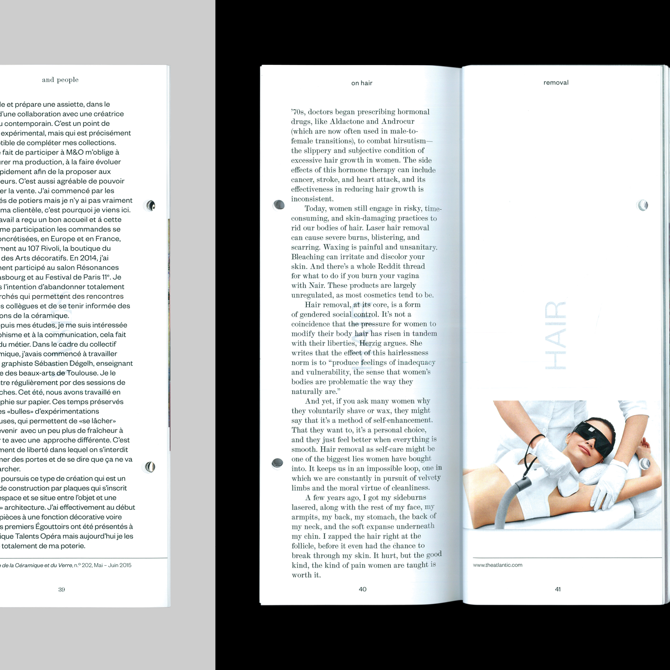
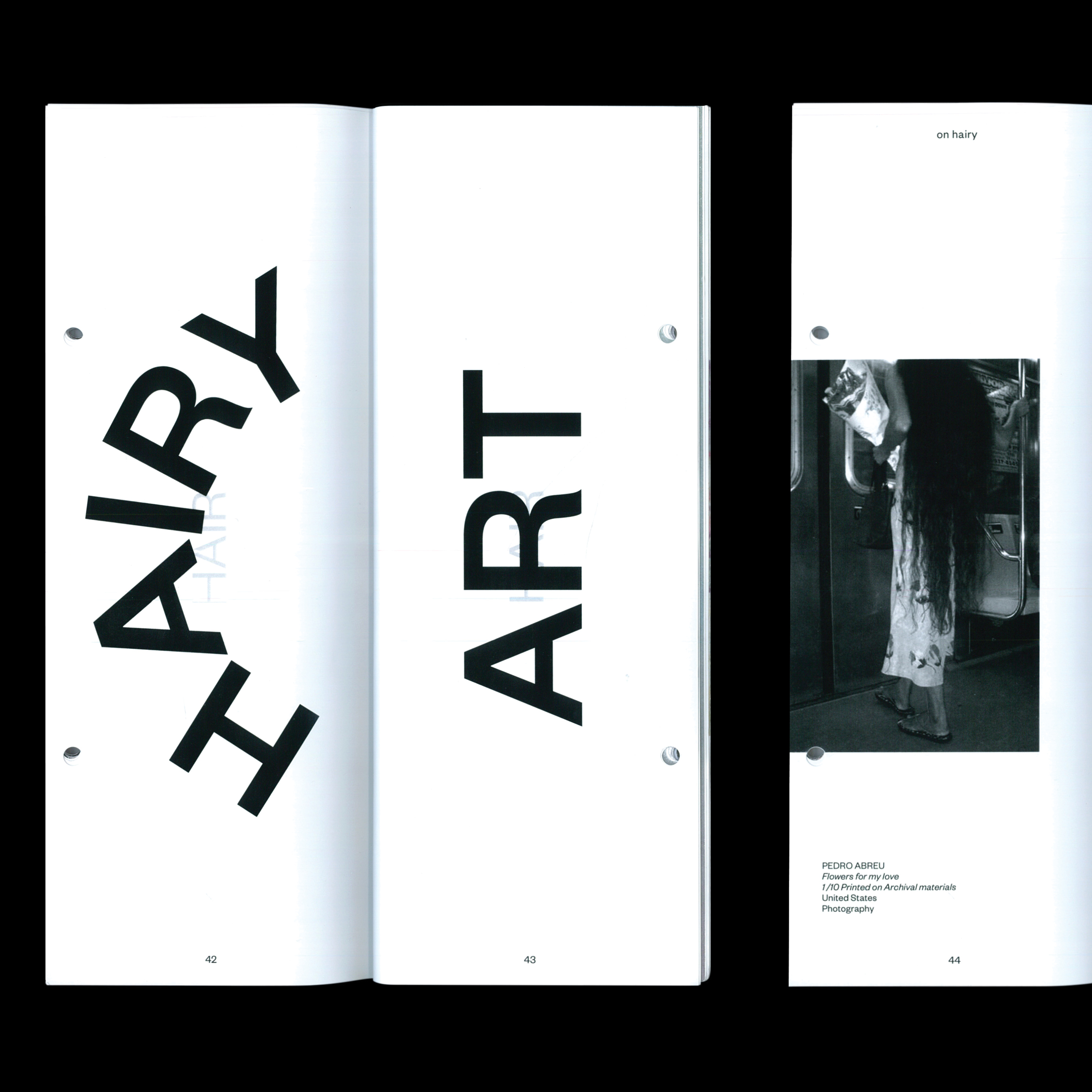
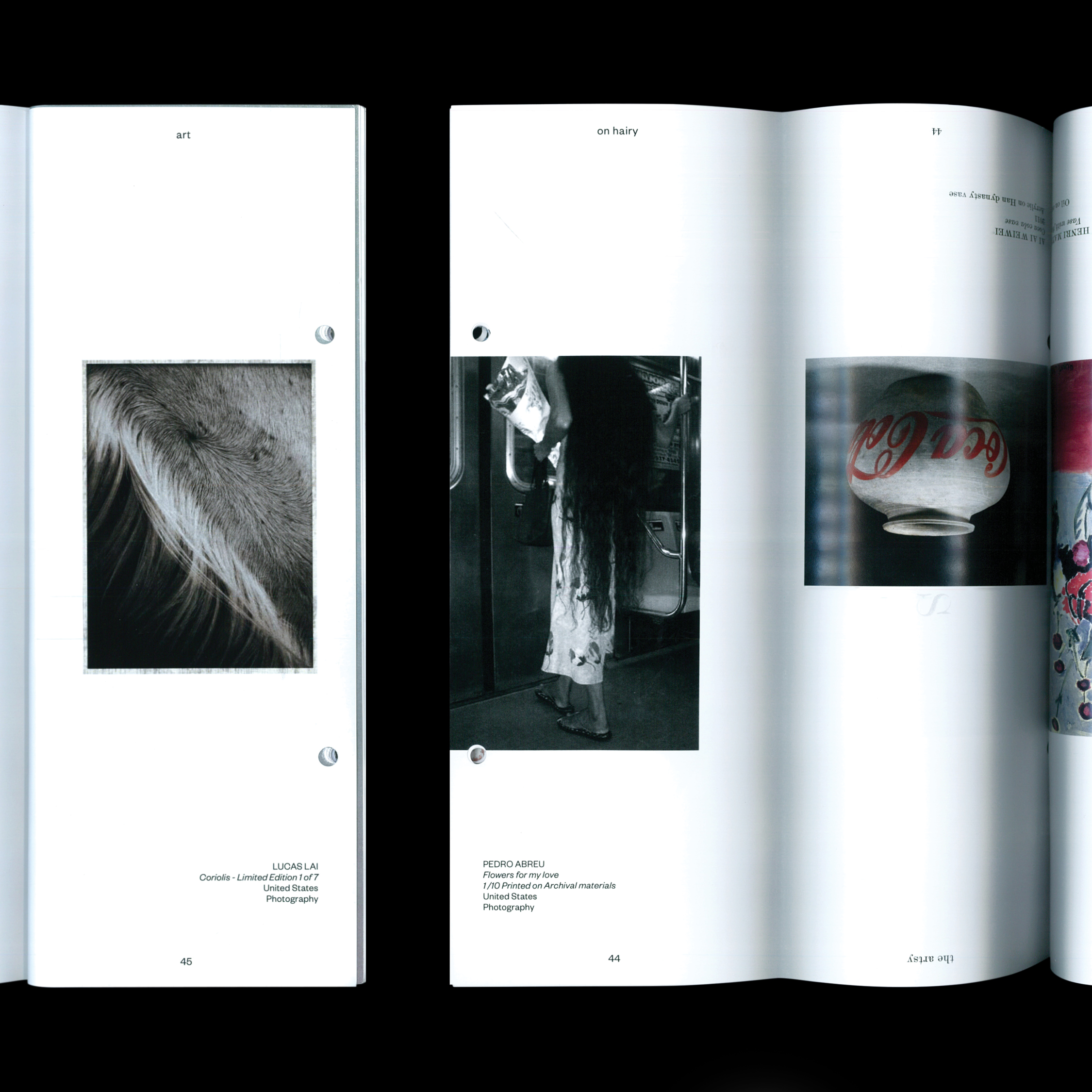
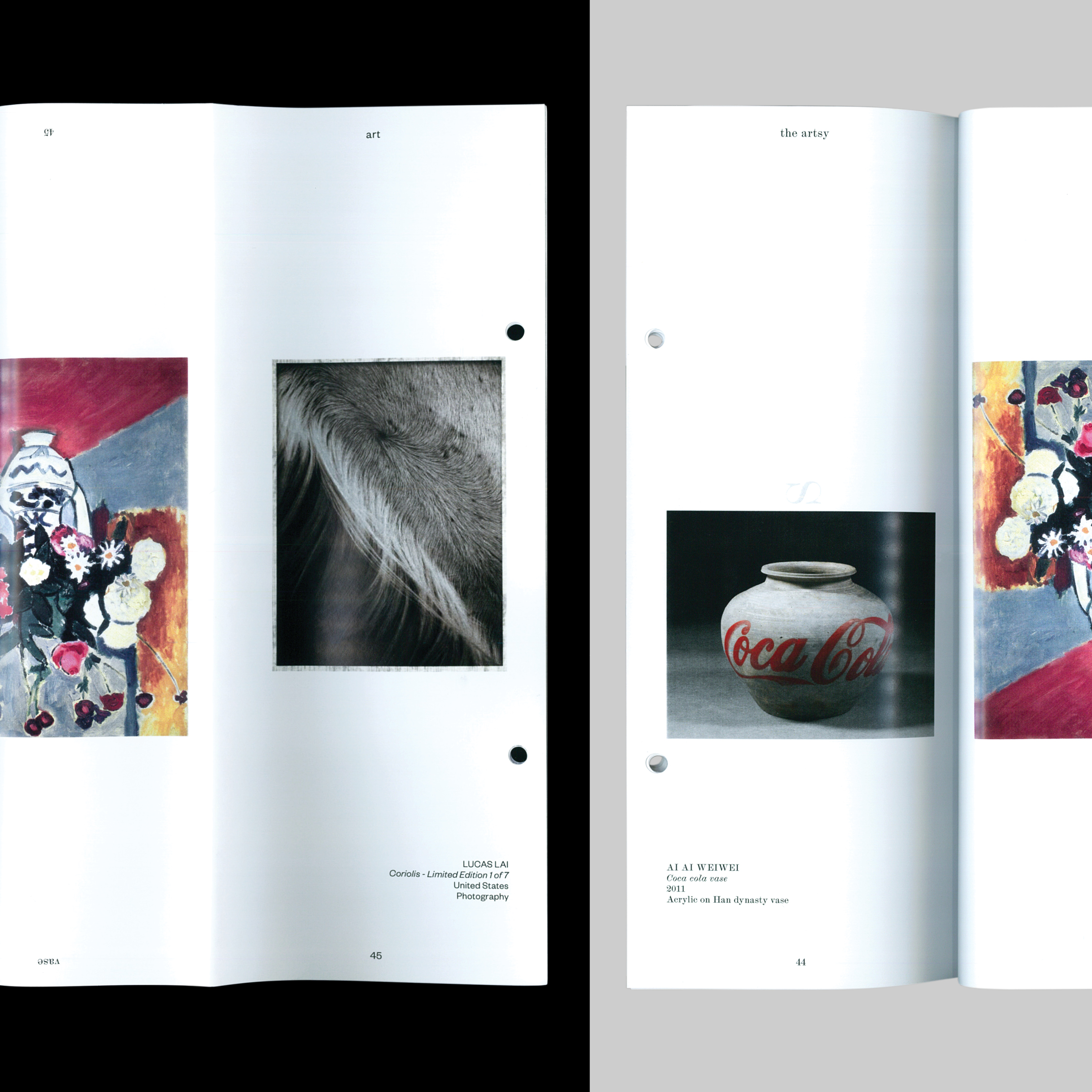
This is a publication about hair and vases. Even though both themes don't go exactly hand in hand, they can surely go page in page.
Flip it, fold it or open it wide. The contents can be seen and read in more than one way. The same applies to the themes.
The layout offers different possibilities to see and explore this object resulting in a playful publication both in imagery and tone of voice.
The magazine gathers various content arranged in a playful and ironic manner. There is an important and apparent relation between the content, the visual aspect and the physicality of the publication.
It can be read in multiple ways due to the way it is organized. The magazine is folded in half and binded in a way that allows the reader to change the reading direction. The fold also enables the division of the publication into two sections, one for each subject.
The layout takes form in a regular mirrored grid system that establishes a symmetric relationship between the themes. Moreover, the content of the publication is not random. In fact, there is a parallel between each chapter of the main subjects.
In collaboration with Rui Miranda
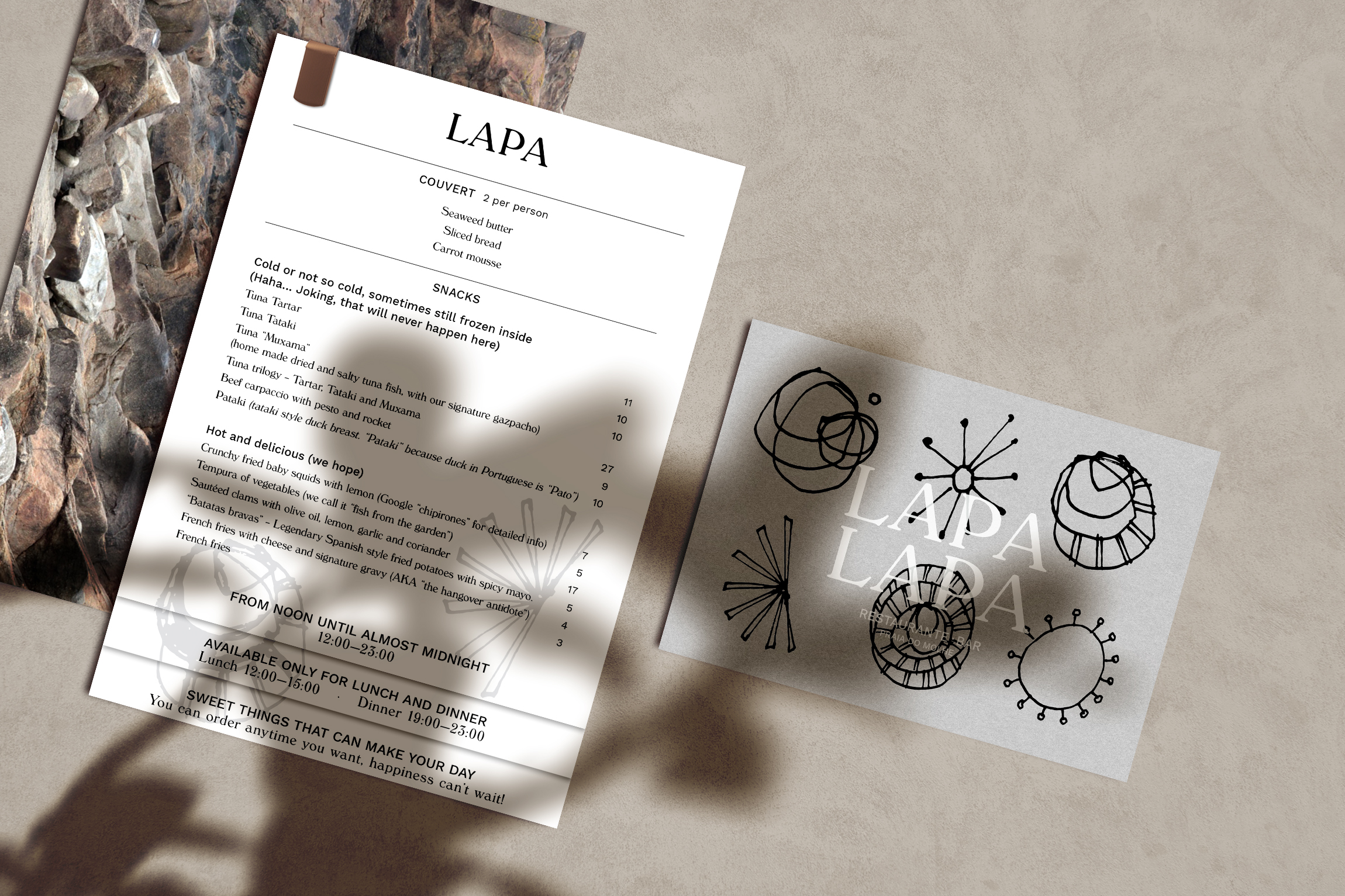
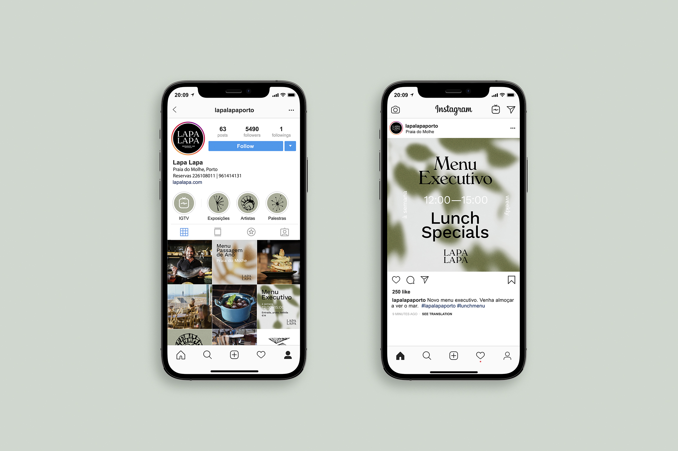
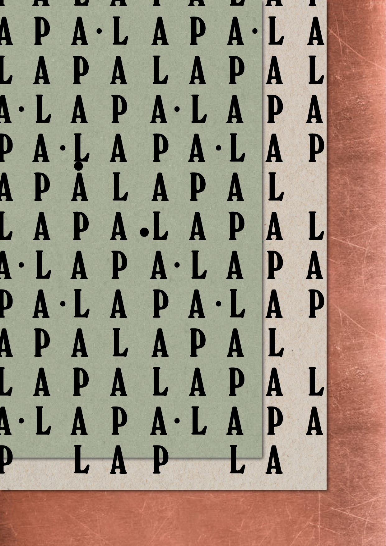
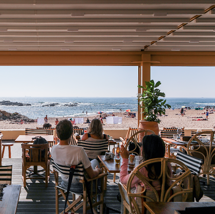
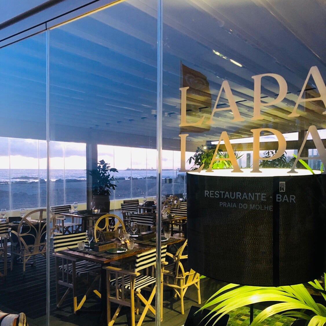
LAPA LAPA
IDENTITY
IDENTITY
+ INFO
Identity for Lapa Lapa Restaurant at Praia do Molhe, Porto.
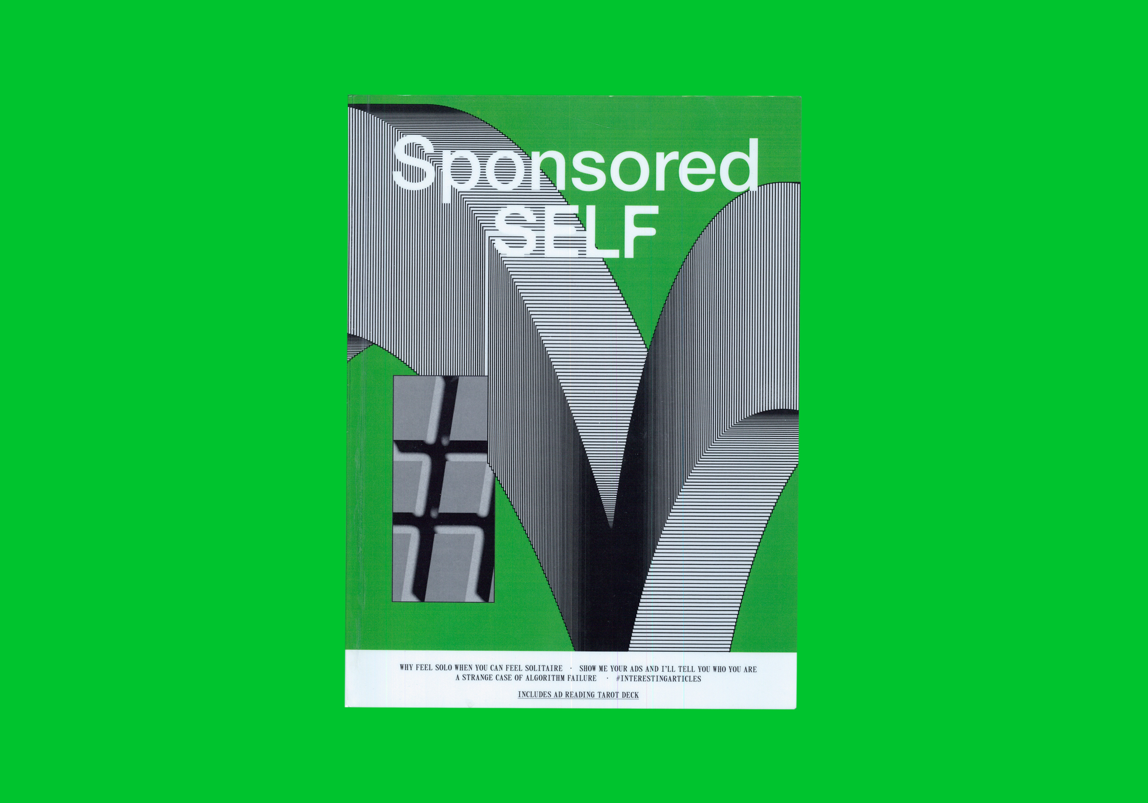
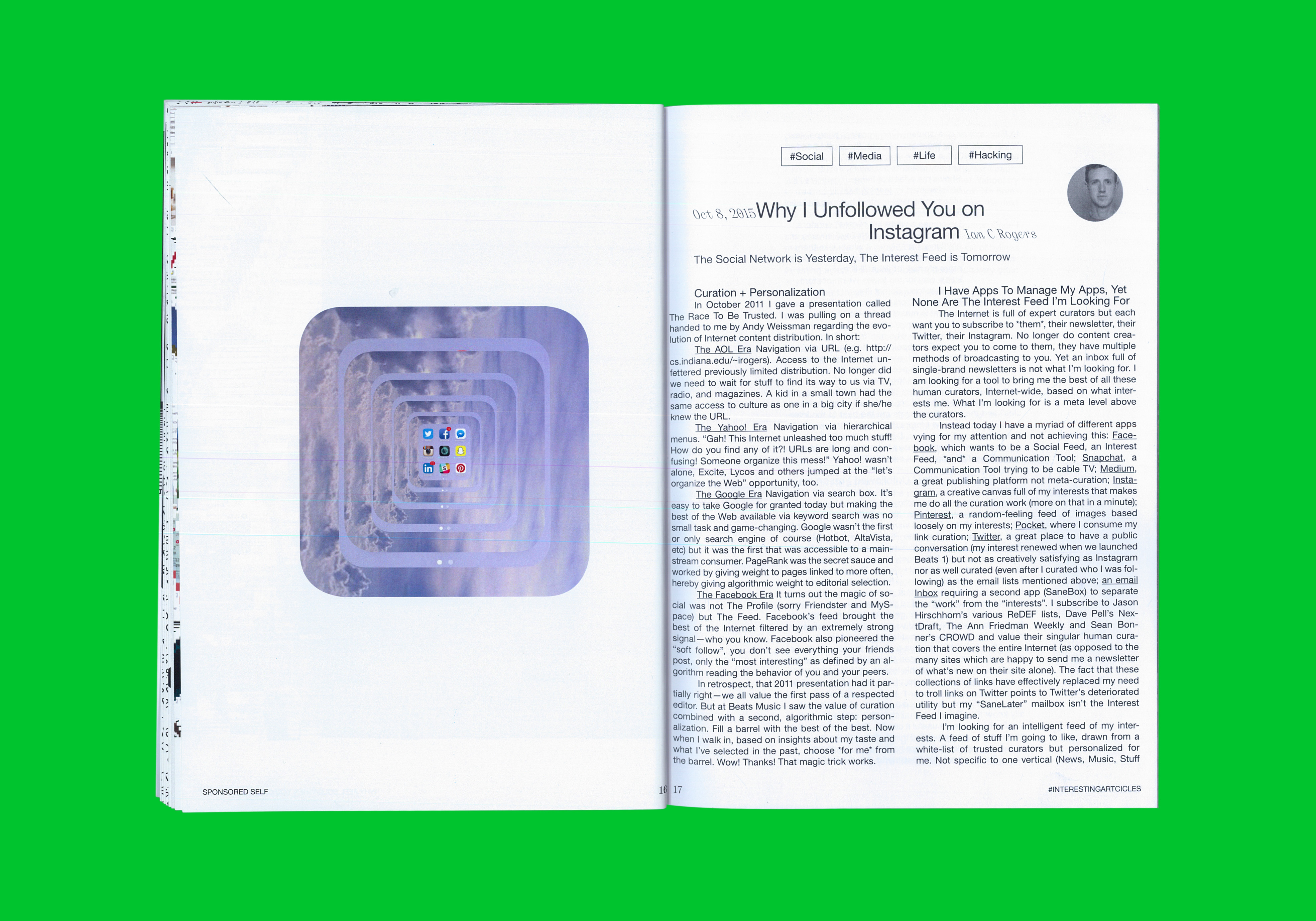
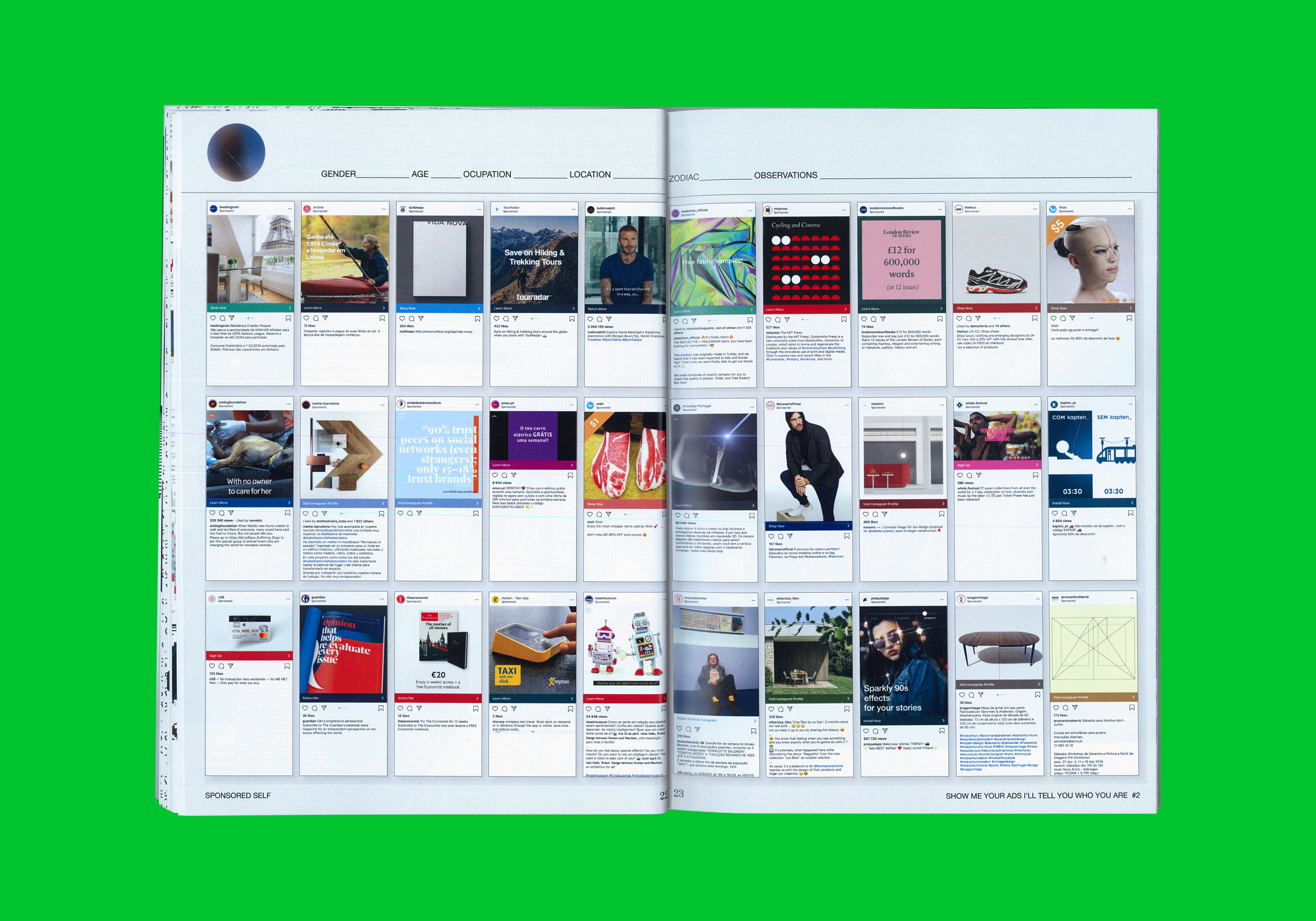
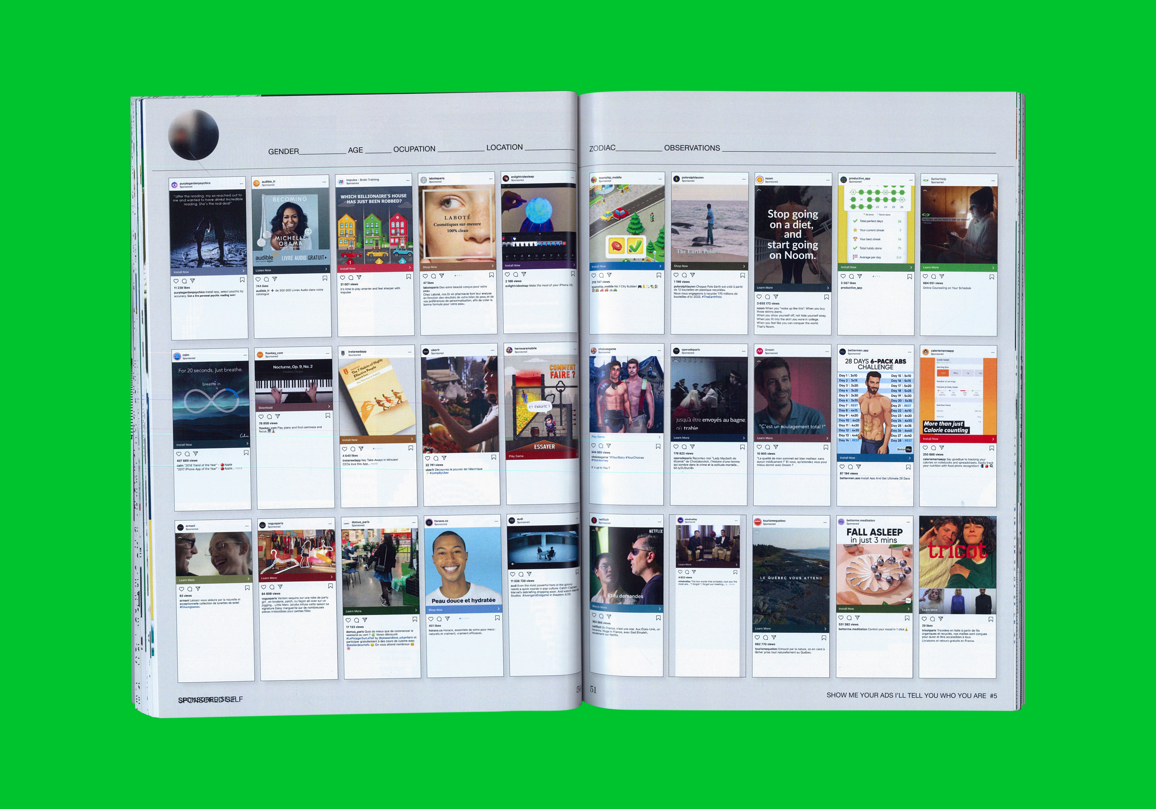
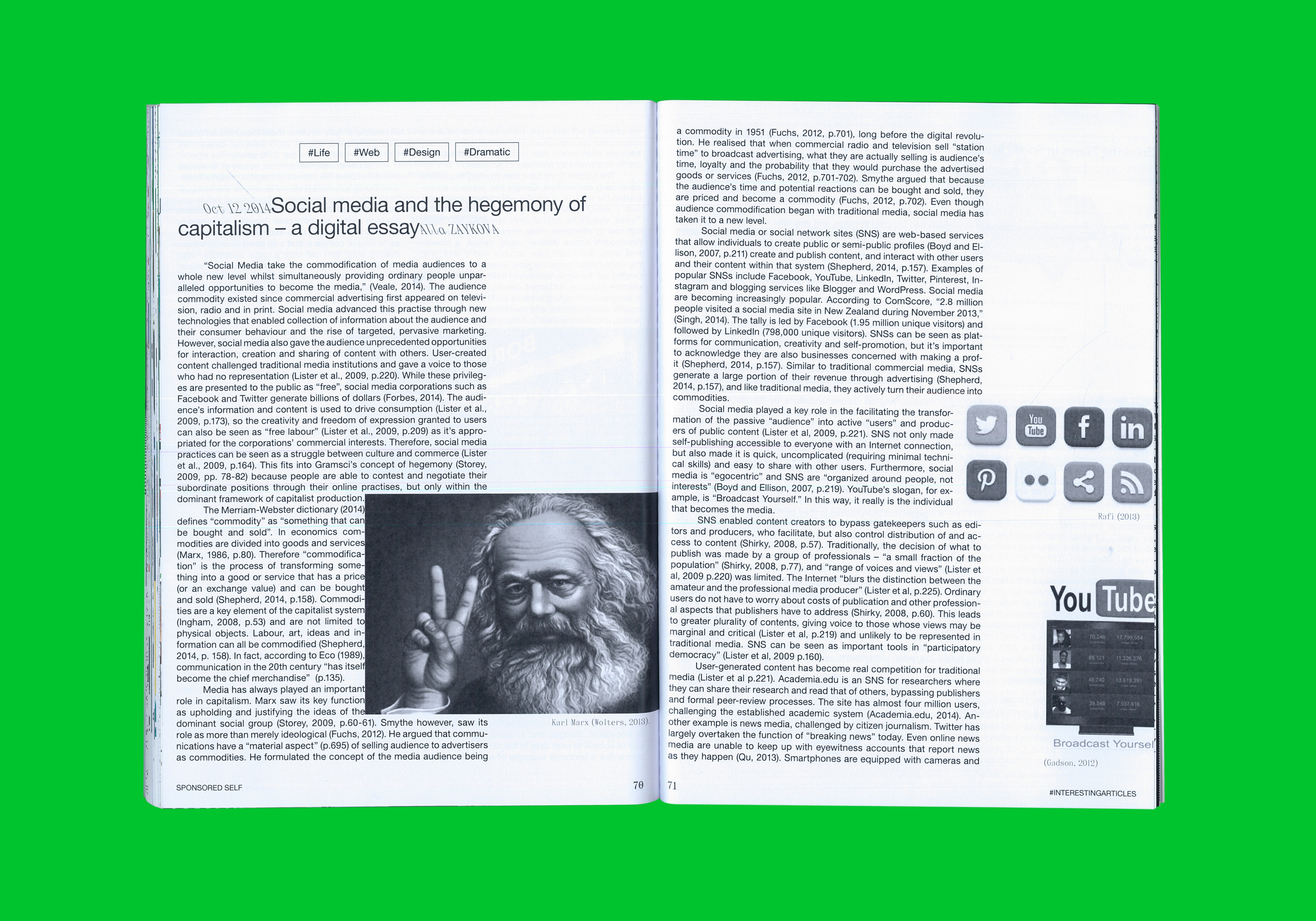
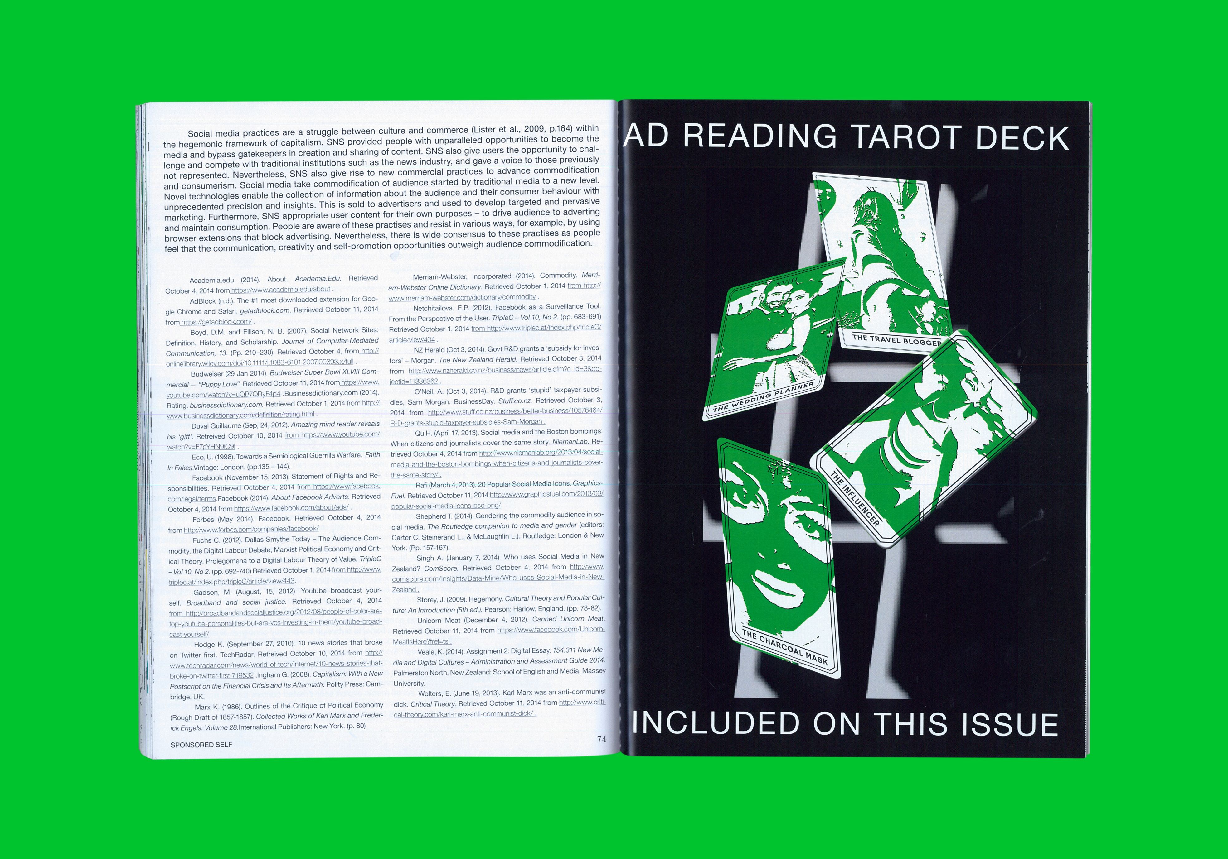
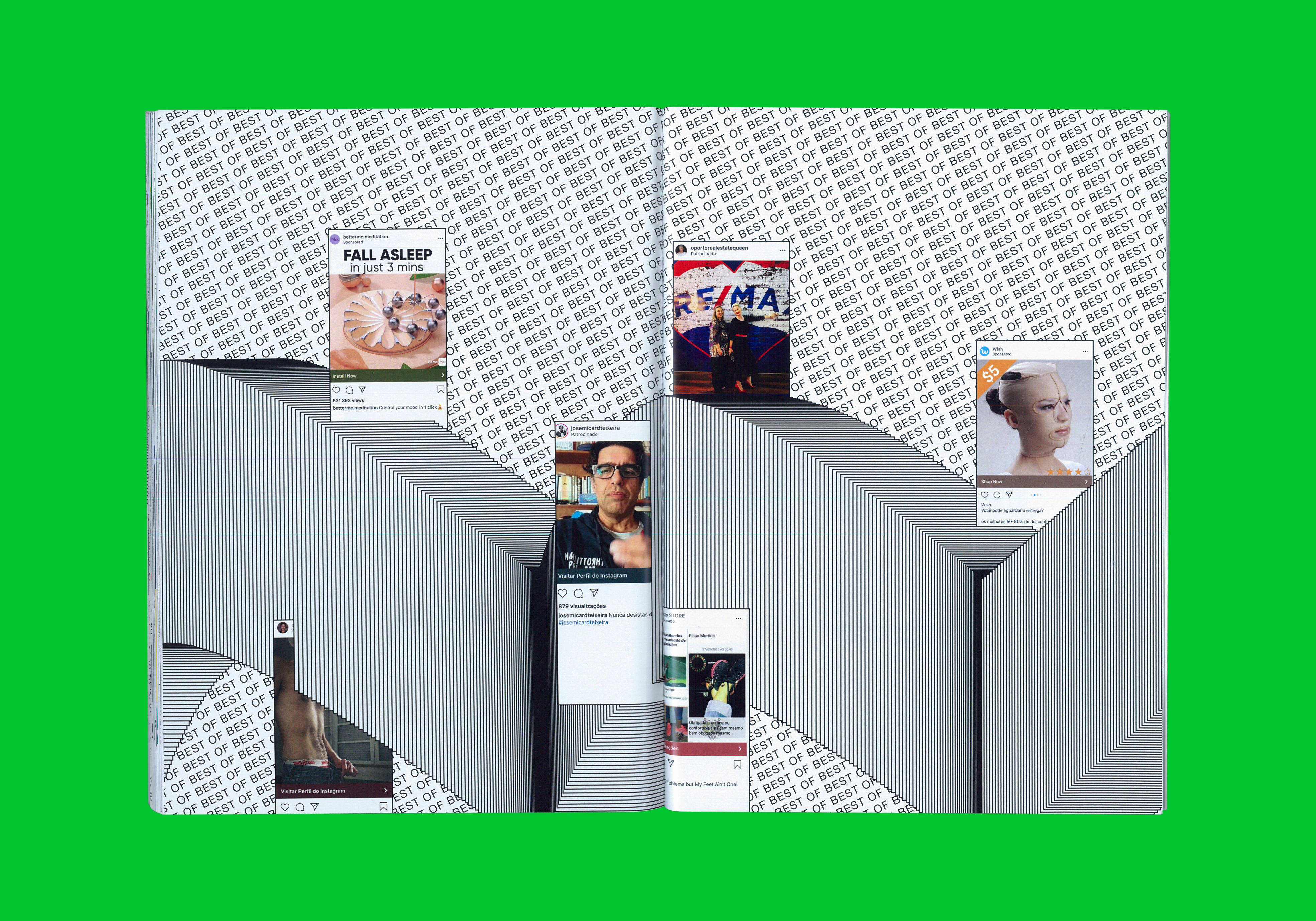
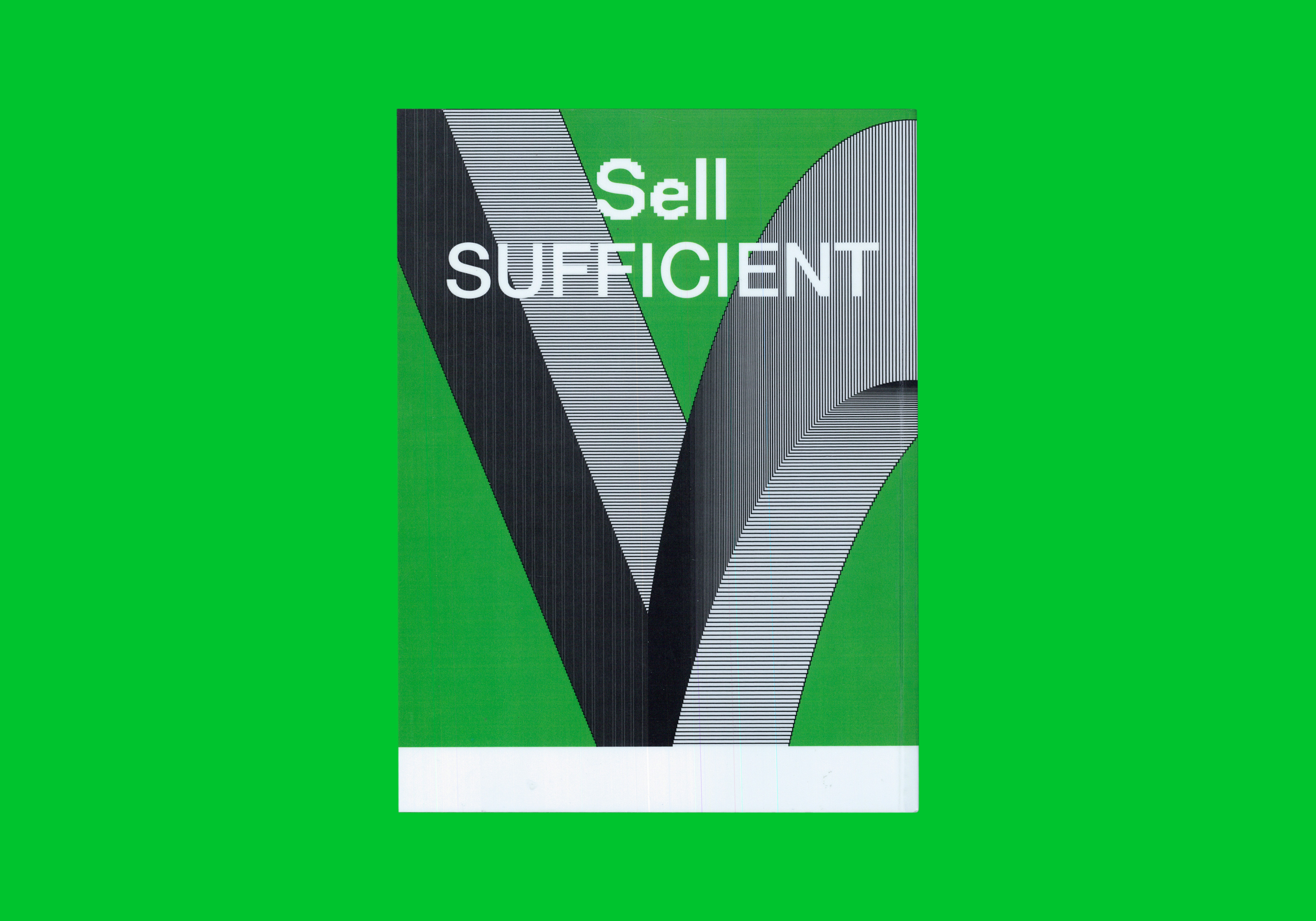
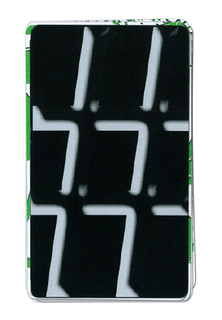


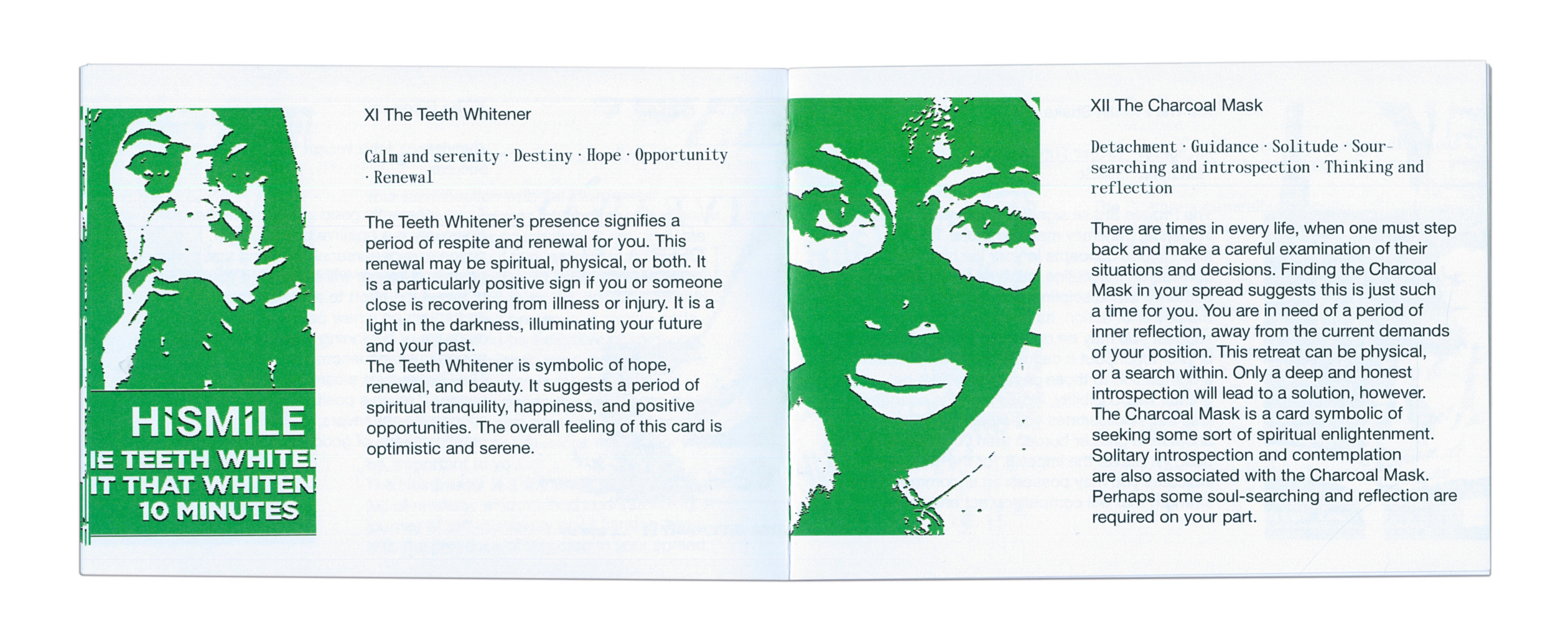

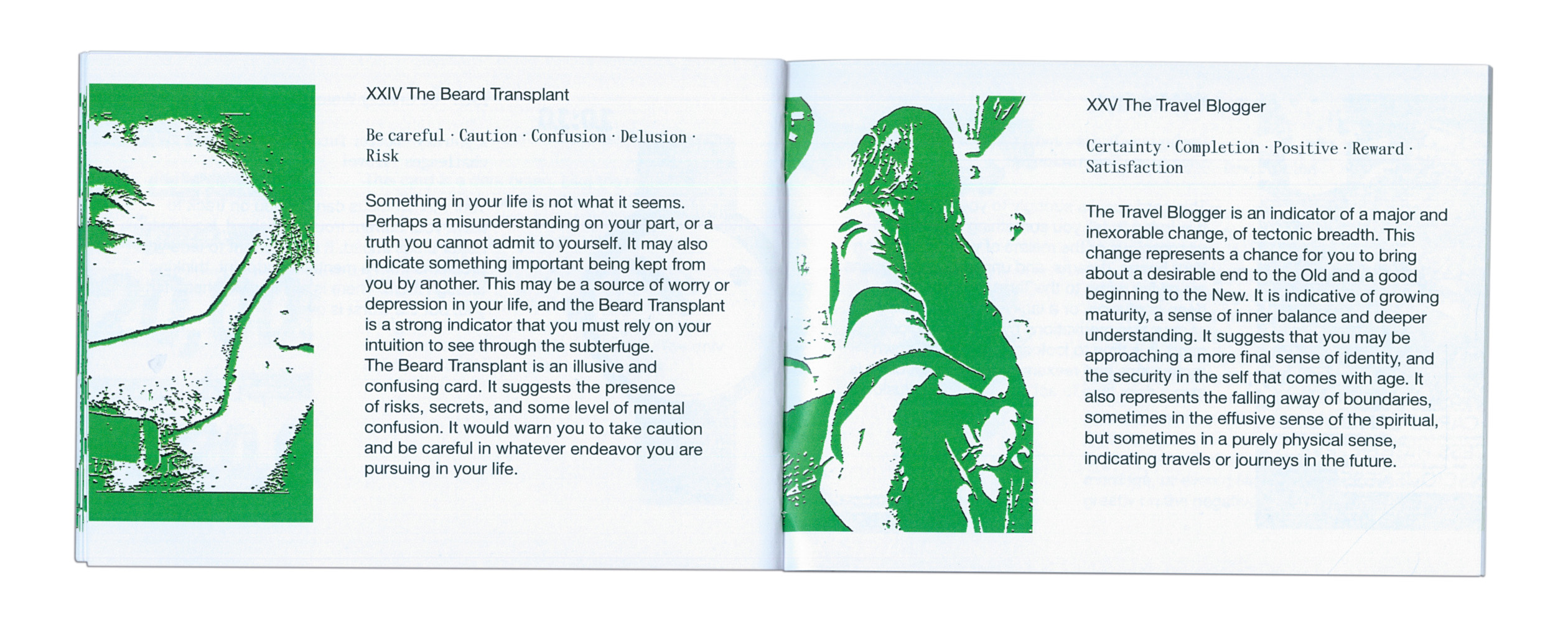

SPONSORED SELF
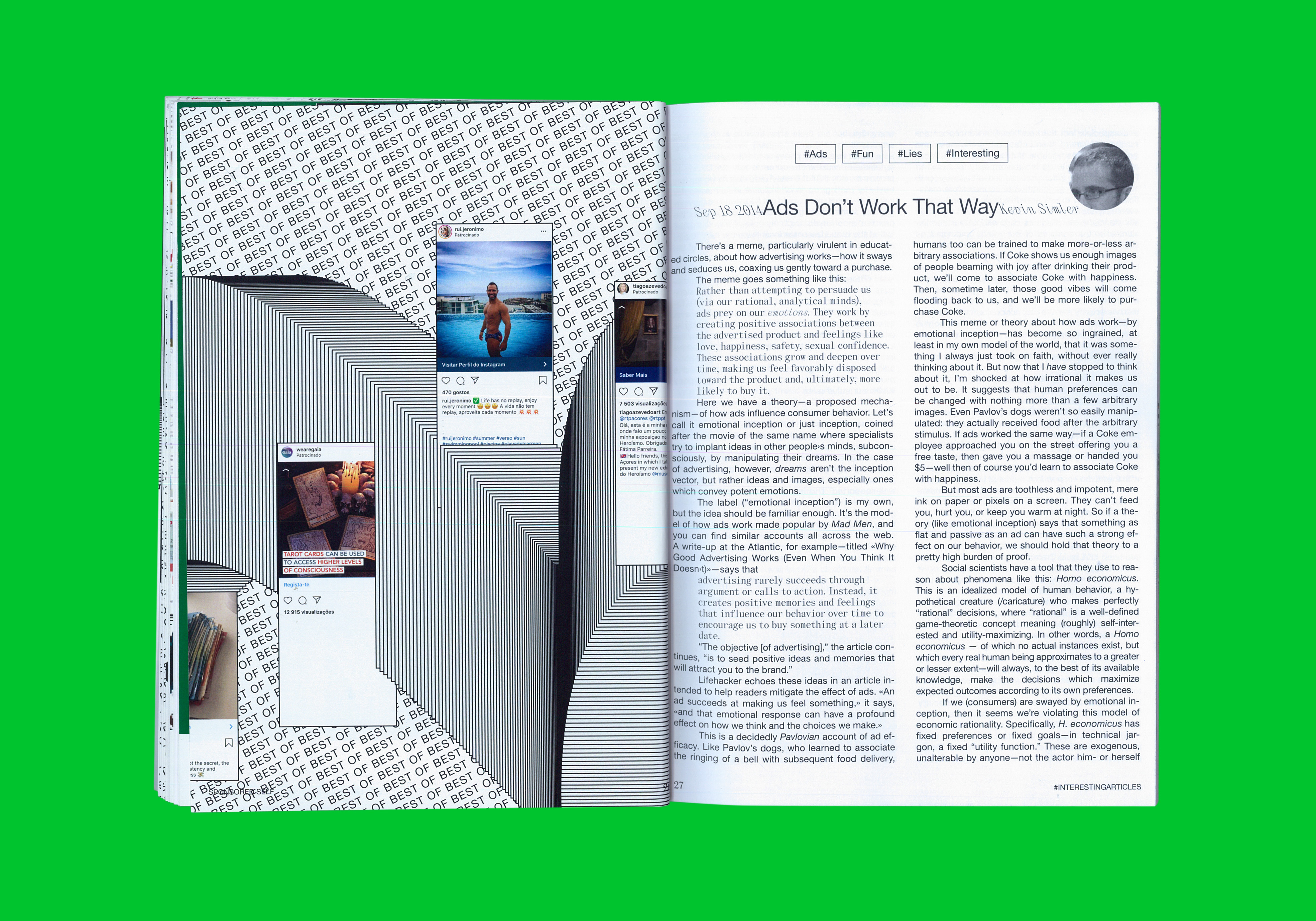
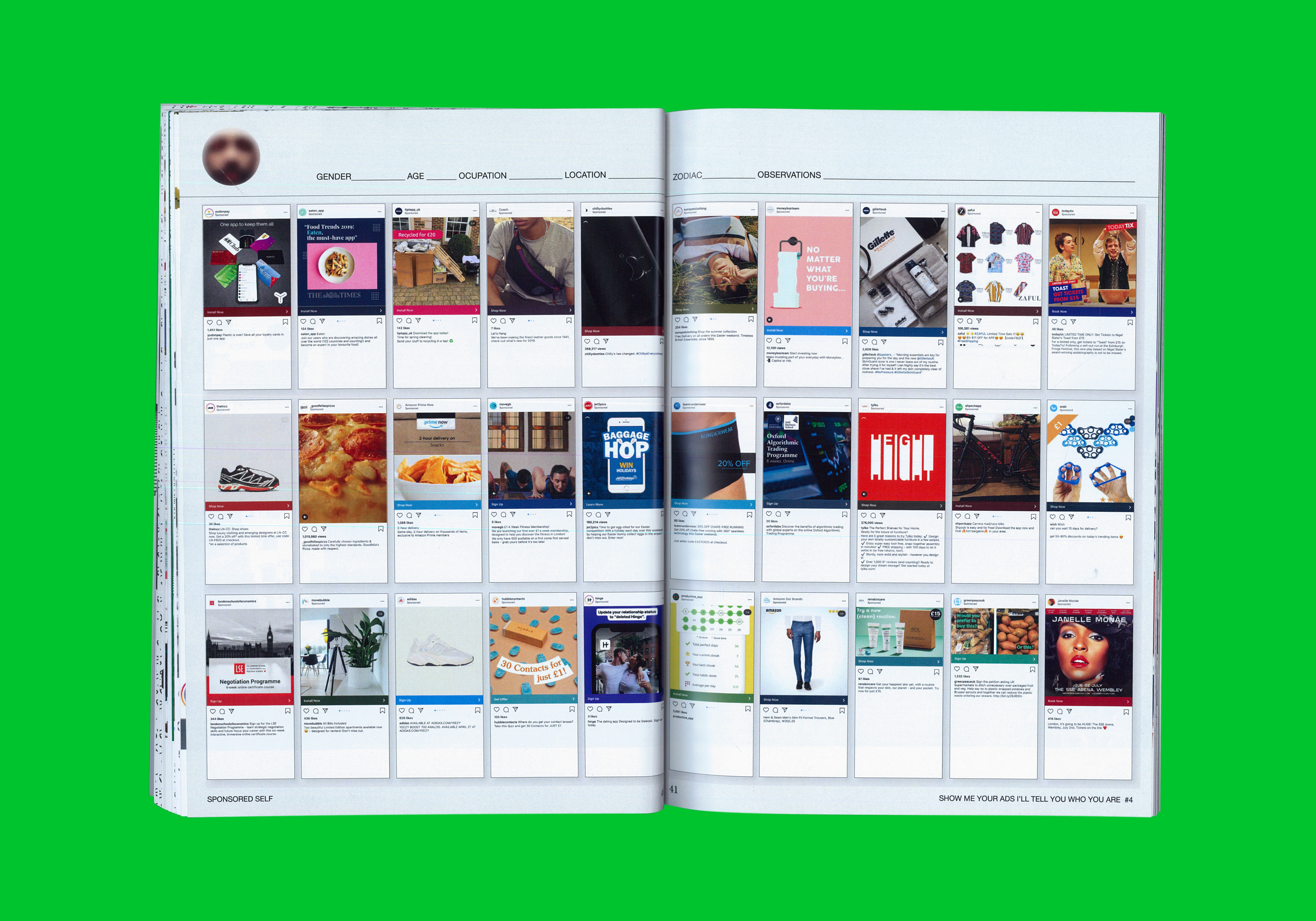
FINDING YOUR TRUE SELF THROUGH YOUR INSTAGRAM ADS – A COMPREHENSIVE GUIDE
FINDING YOUR TRUE SELF THROUGH YOUR INSTAGRAM ADS – A COMPREHENSIVE GUIDE
+ INFO
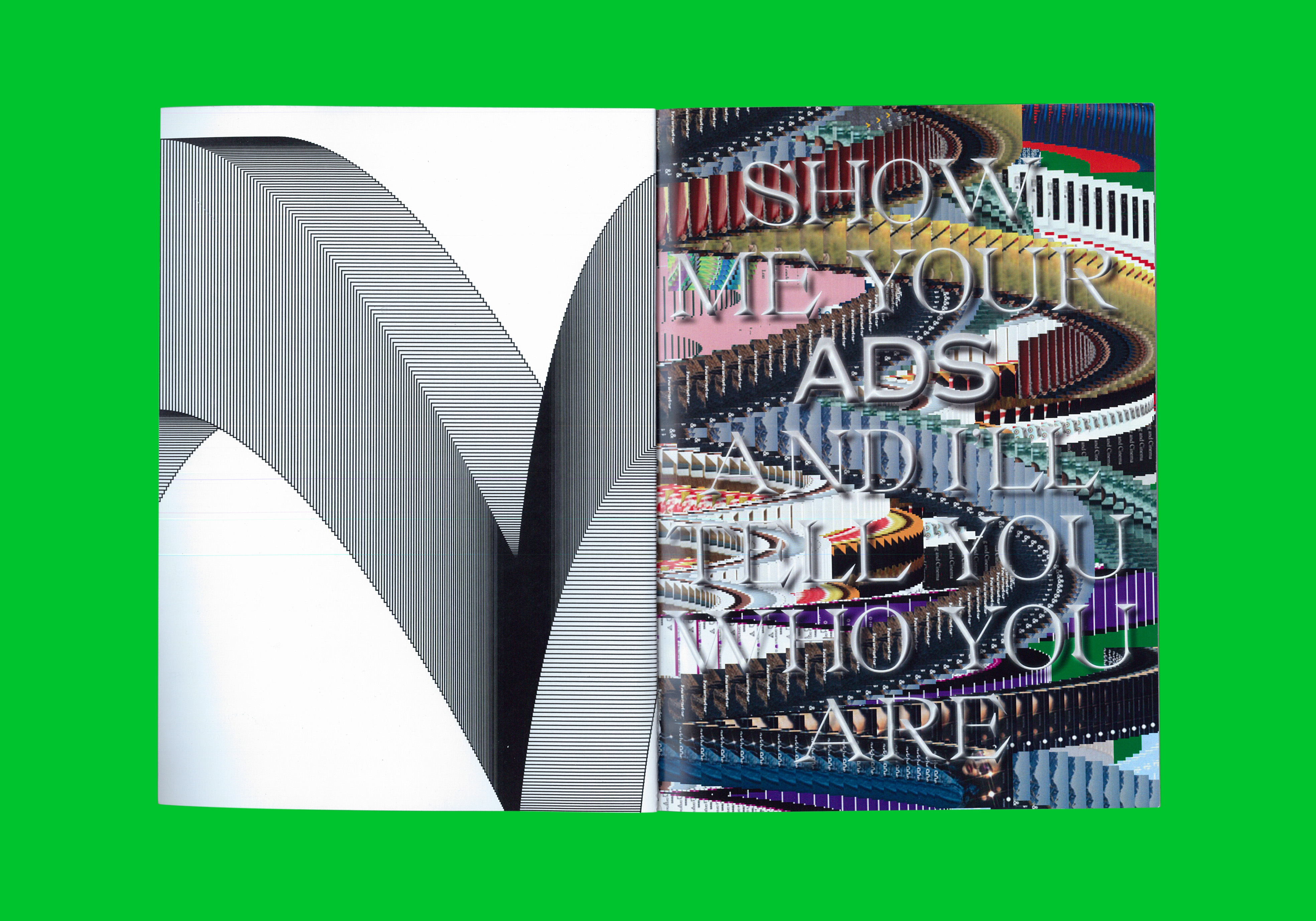
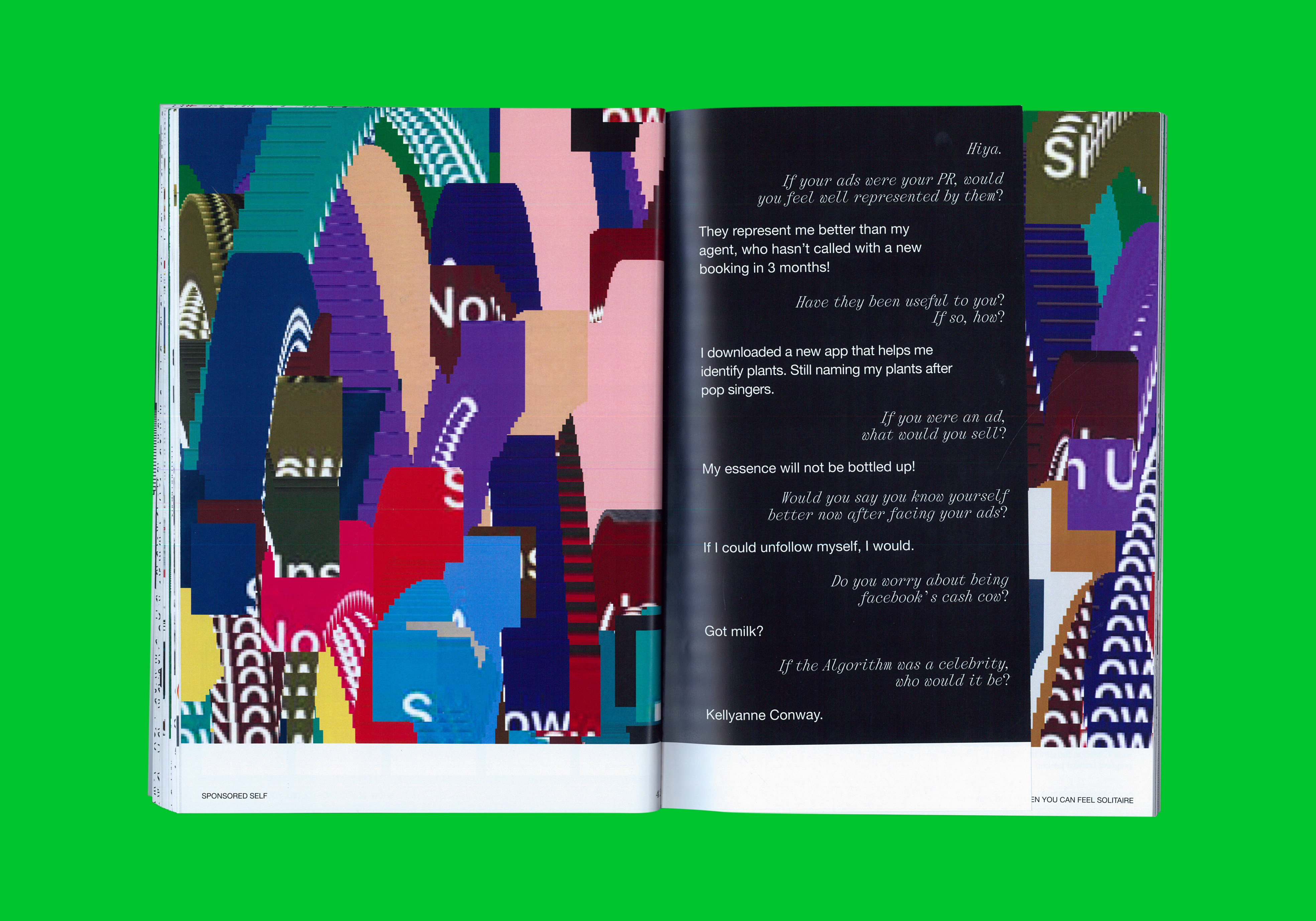
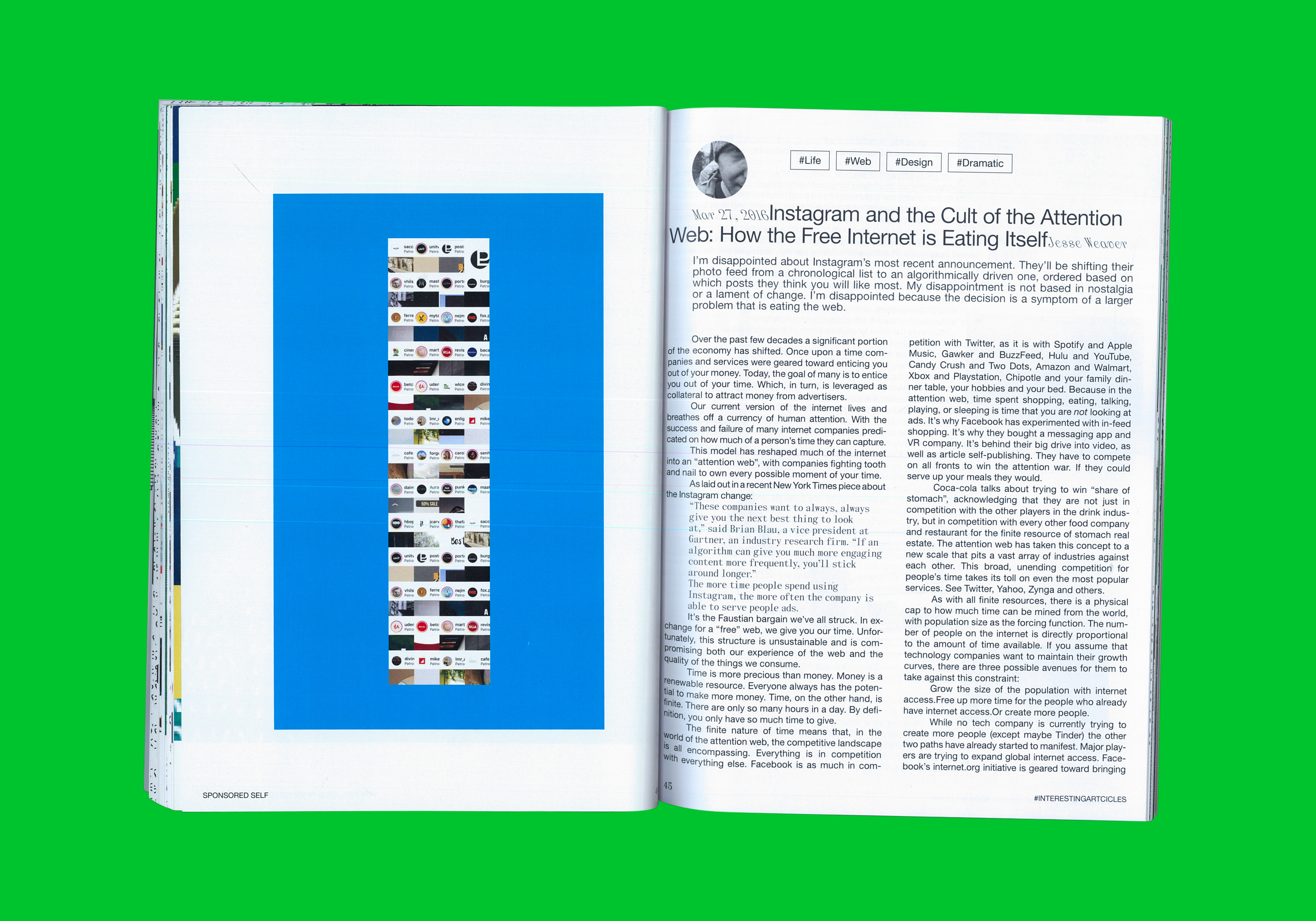
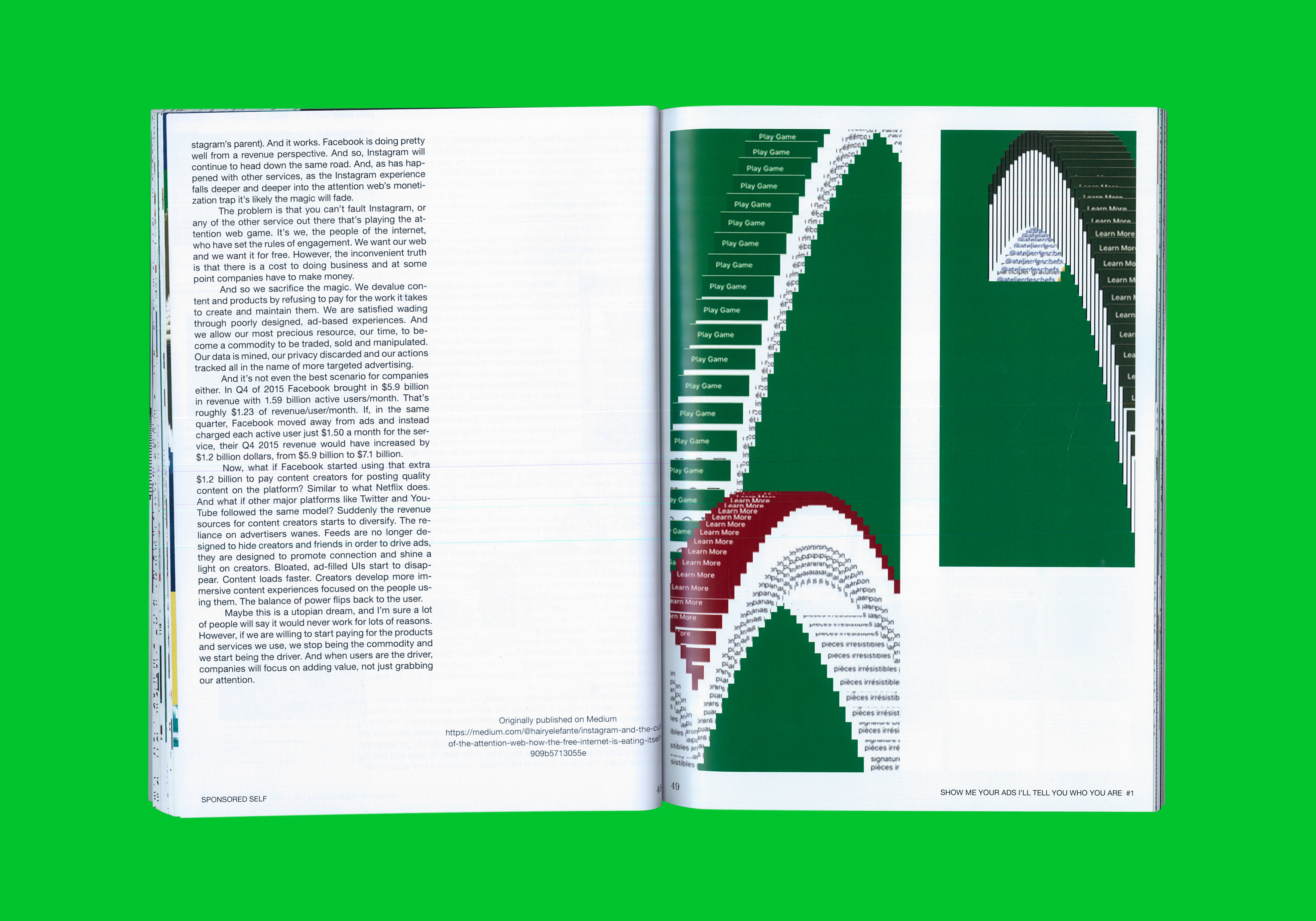
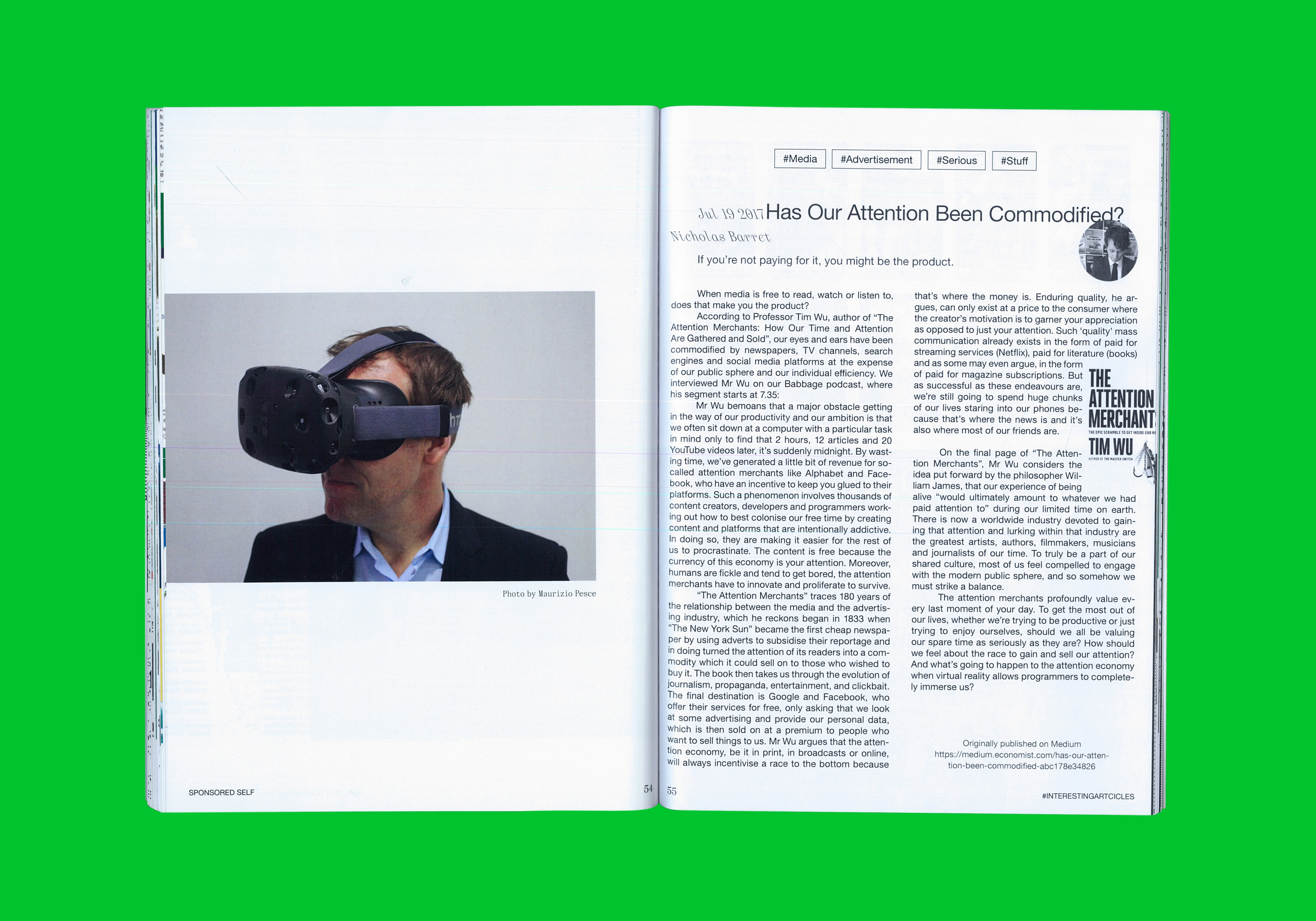
A Strange Case of Algorithm Failure
Faced with poorly targeted ads on Instagram, mostly of naked male wannabe influencers, I had to take a moment to ask myself if I knew who I was anymore. In a Carrie Bradshaw fashion I couldn’t help but wonder if Facebook/Instagram thought I could be a good fit for the typical “hello-im-your-friend-and-im-going-to-show-you-how-to-be-a-millionaire sponsored content.
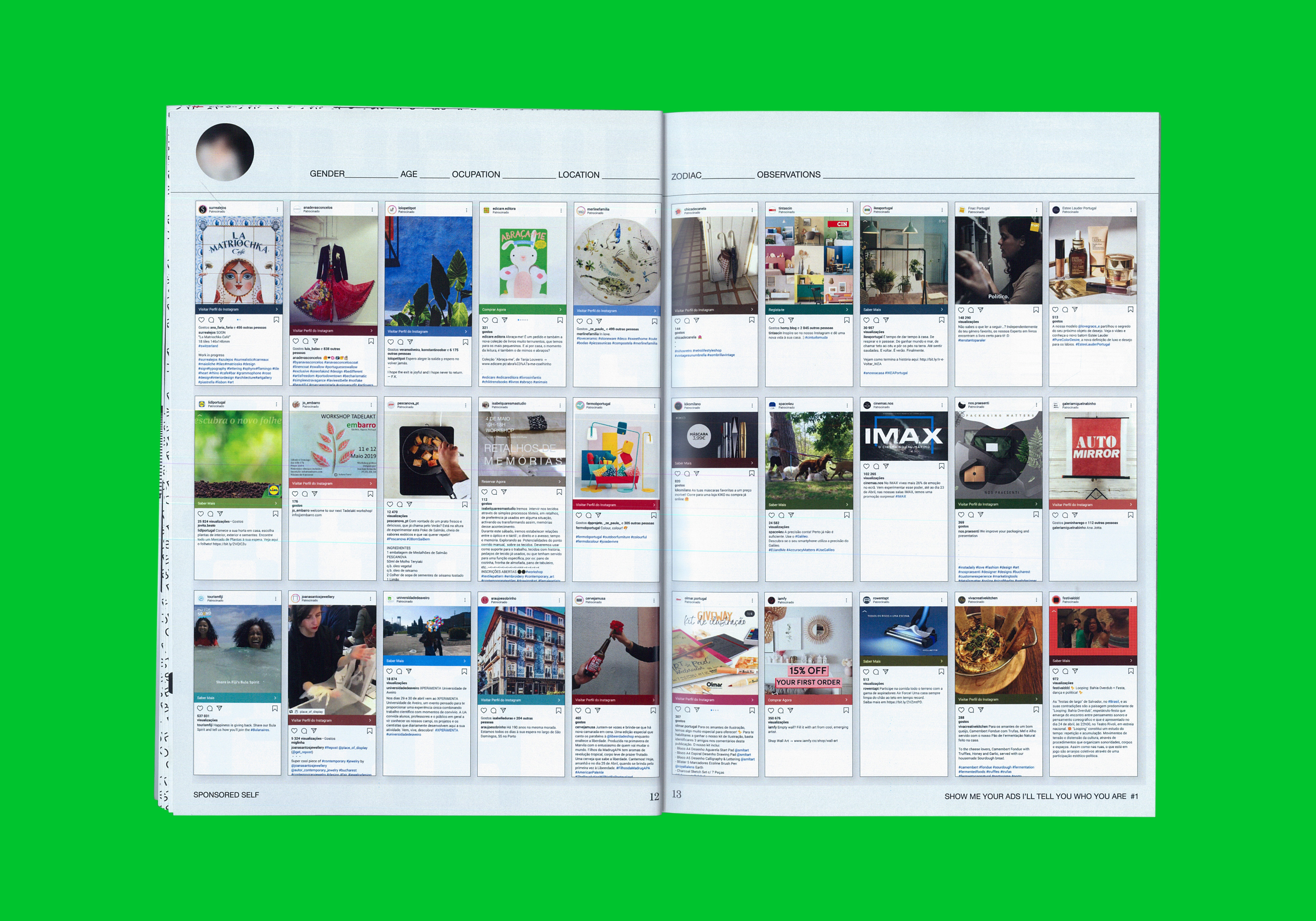
At some point I was curious to see whether my friends were also being shown equally useless ads or if it was just me that was so badly represented by them. After receiving the first screenshots I realised their collection somehow defined a profile that wasn’t too distant from their interests: exhibition ads, holiday deals, Nike trainers, Sushi promos and Lidl videos. This is hard to admit but I envied their ads. Does this make me a bad friend?
I wondered if I could be judged based on my ads. If anyone could for that matter. Maybe the problem was me. I wanted to change. Even tried to mess up with the algorithm but without much success. That was my destiny and I couldn’t get away from it.
Then I realised that maybe it was better that way. After all, I guess Zuckerberg doesn’t know me that well. At least not yet.
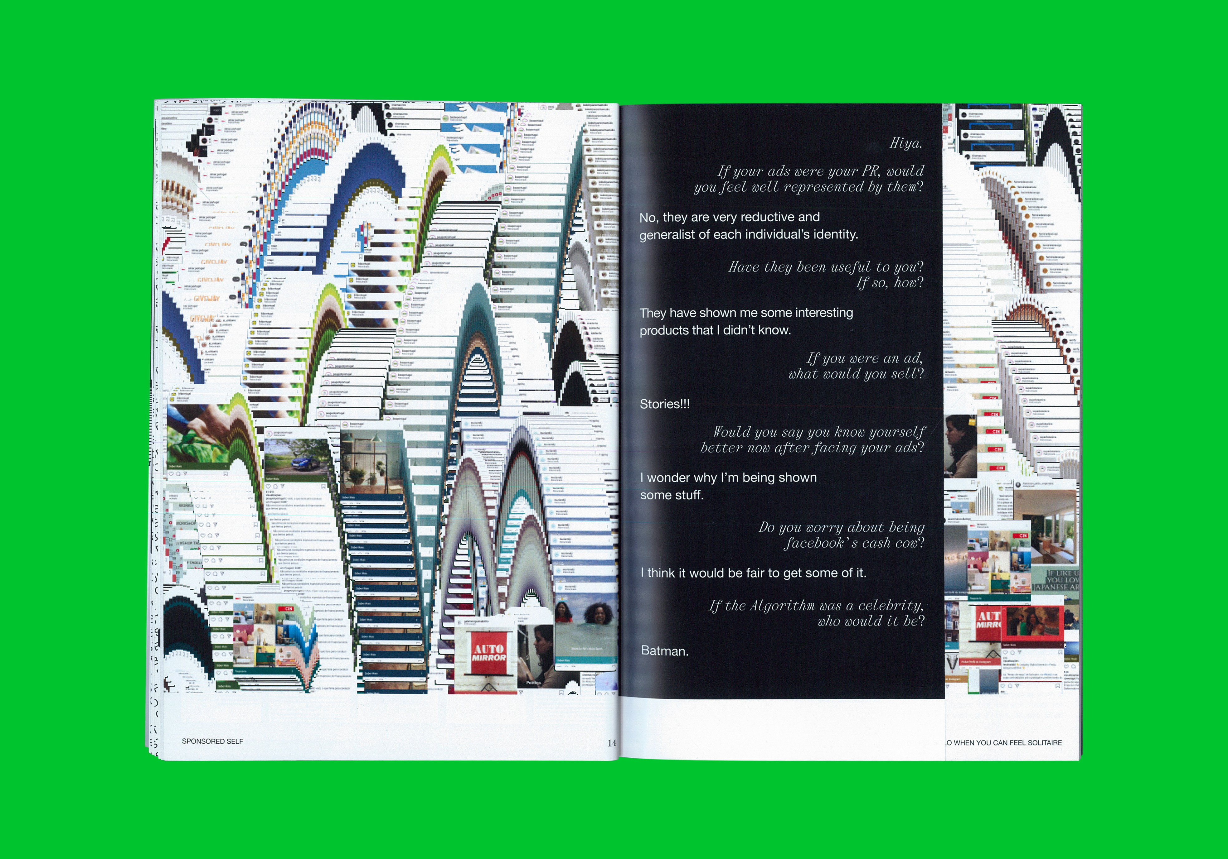
This publication focuses/takes its inspiration from on the ads forced upon us on our Instagram feeds on a daily basis. On the day and age that Facebook/Mark Zuckerberg knows us better than our own mom, I couldn’t help but wonder why were my ads so off grid. I would say that hardly anyone likes their ads but I despised mine.
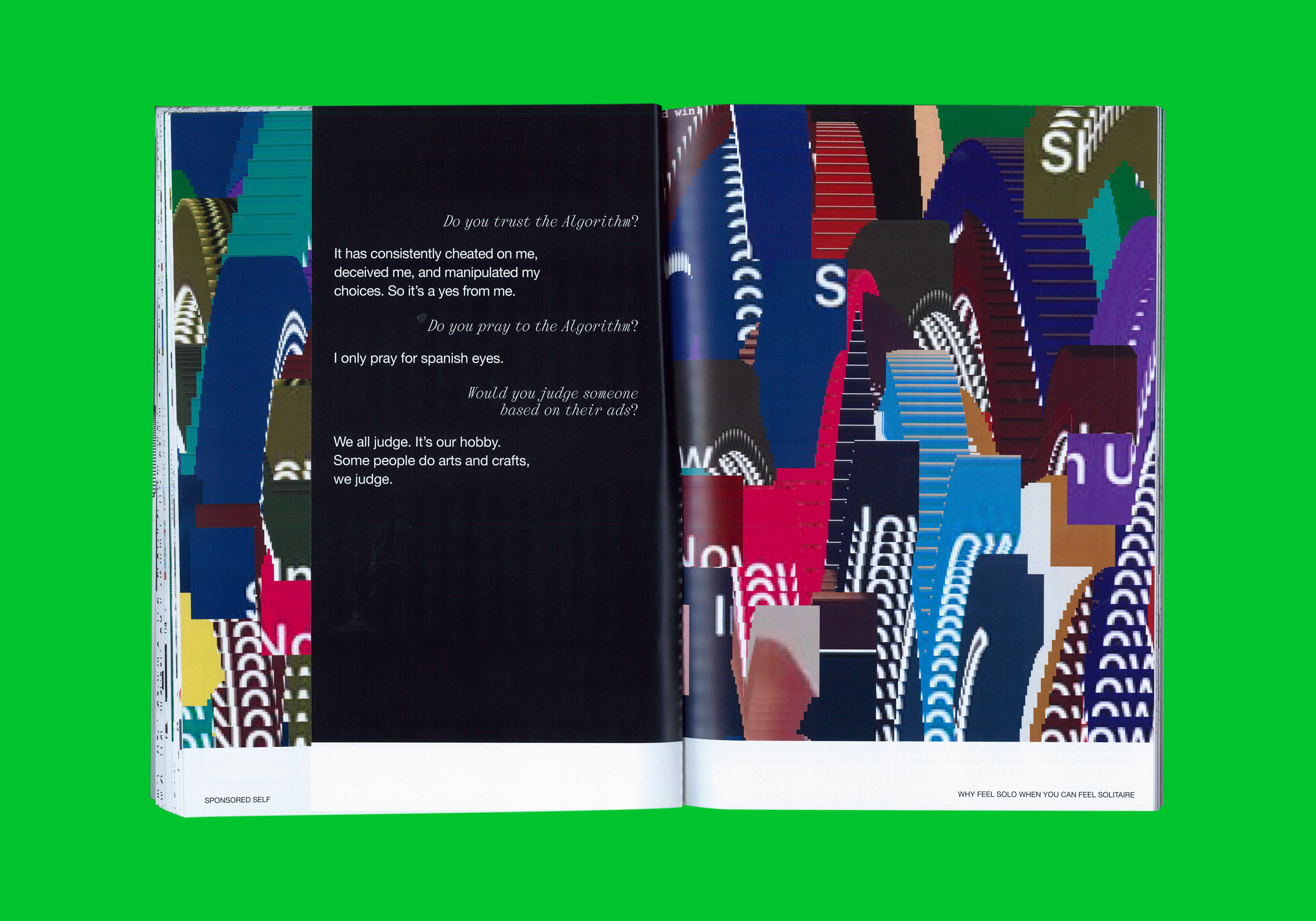
After all the personal data we have provided the tech titans with, they’re becoming closer and closer to guess our every move. And the Algorithm works in mysterious ways.
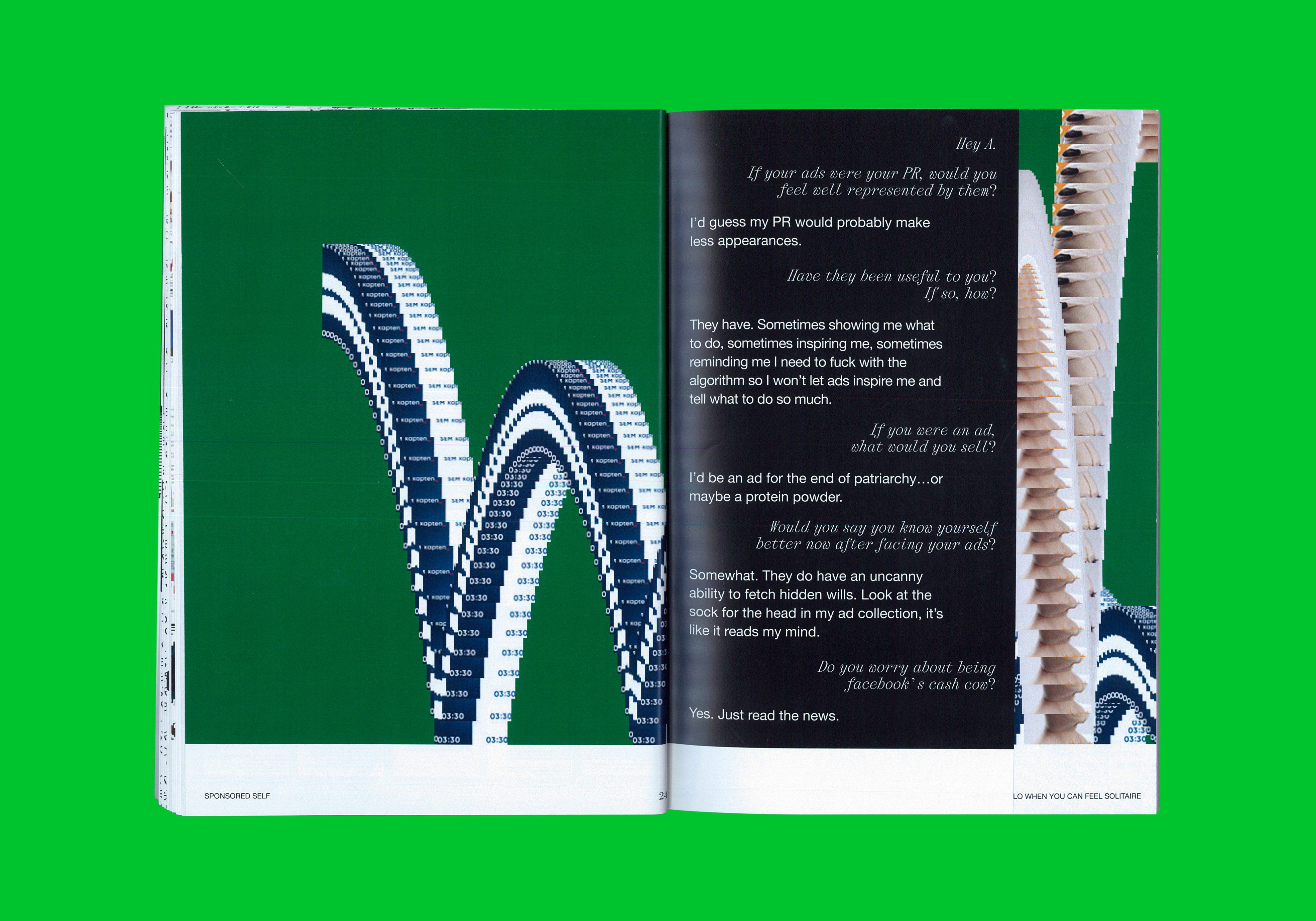
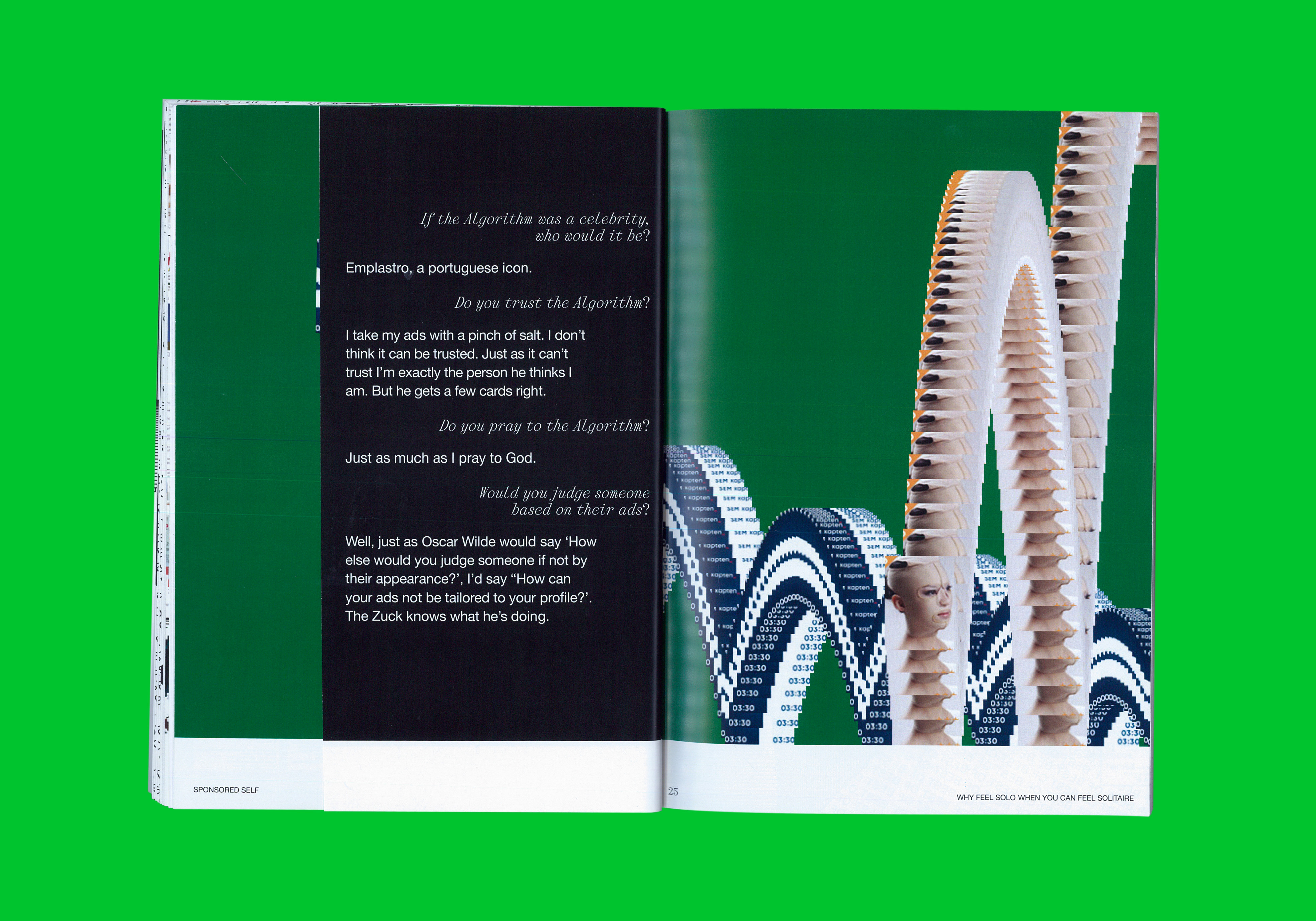
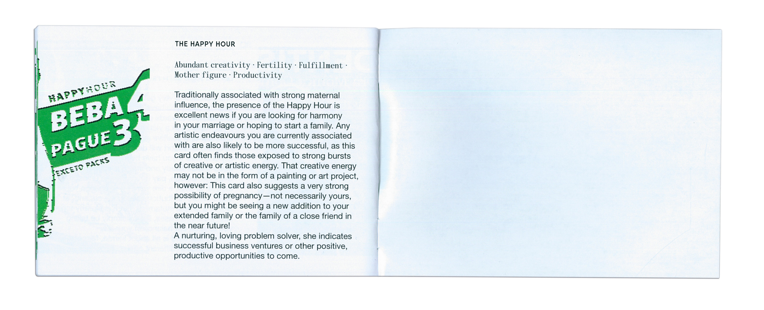
This project places the Algorithm as a sacred, spiritual and divine figure, as it increasingly governs our life. We look for guidance, penitence, reassurance and answers. There is no doubt that Its interventions can be beneficial and useful sometimes. However, it has become virtually impossible to refuse Its meddling.
In order to understand the obscure ways It manifests Itself, this publication seeks to be an aid element in interpreting the signs sent to us when we are online.
Just as Tarot teaches us how to read the cards in order for us to learn what the future might hold, we can turn to our Ads to find out more about who we really are. They announce everything and everyone, including a not so distant future.
This publication focuses/takes its inspiration from on the ads forced upon us on our Instagram feeds on a daily basis. On the day and age that Facebook/Mark Zuckerberg knows us better than our own mom, I couldn’t help but wonder why were my ads so off grid. I would say that hardly anyone likes their ads but I despised mine.
After all the personal data we have provided the tech titans with, they’re becoming closer and closer to guess our every move. And the Algorithm works in mysterious ways.
This project places the Algorithm as a sacred, spiritual and divine figure, as it increasingly governs our life. We look for guidance, penitence, reassurance and answers. There is no doubt that Its interventions can be beneficial and useful sometimes. However, it has become virtually impossible to refuse Its meddling.
In order to understand the obscure ways It manifests Itself, this publication seeks to be an aid element in interpreting the signs sent to us when we are online.
Just as Tarot teaches us how to read the cards in order for us to learn what the future might hold, we can turn to our Ads to find out more about who we really are. They announce everything and everyone, including a not so distant future.
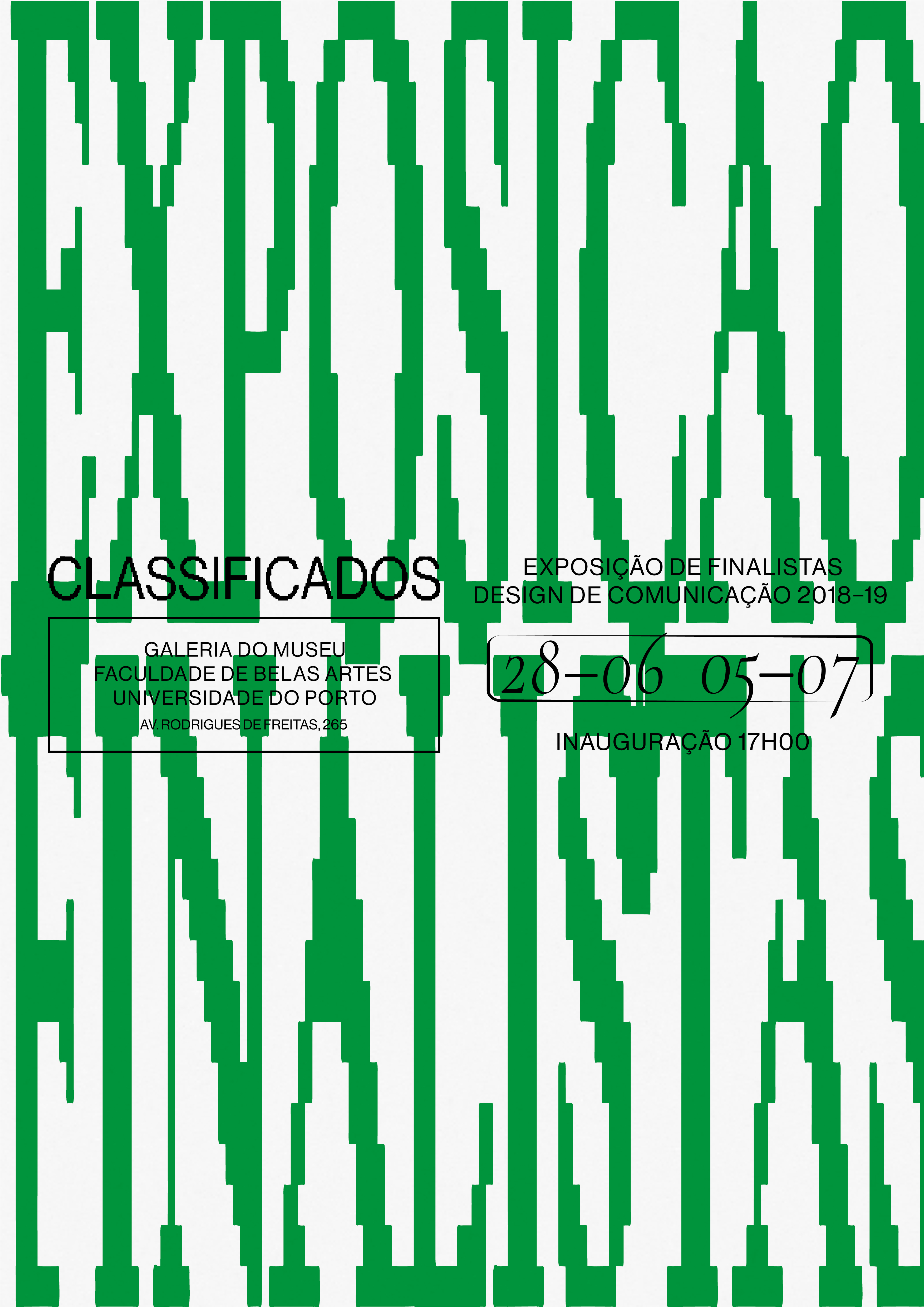
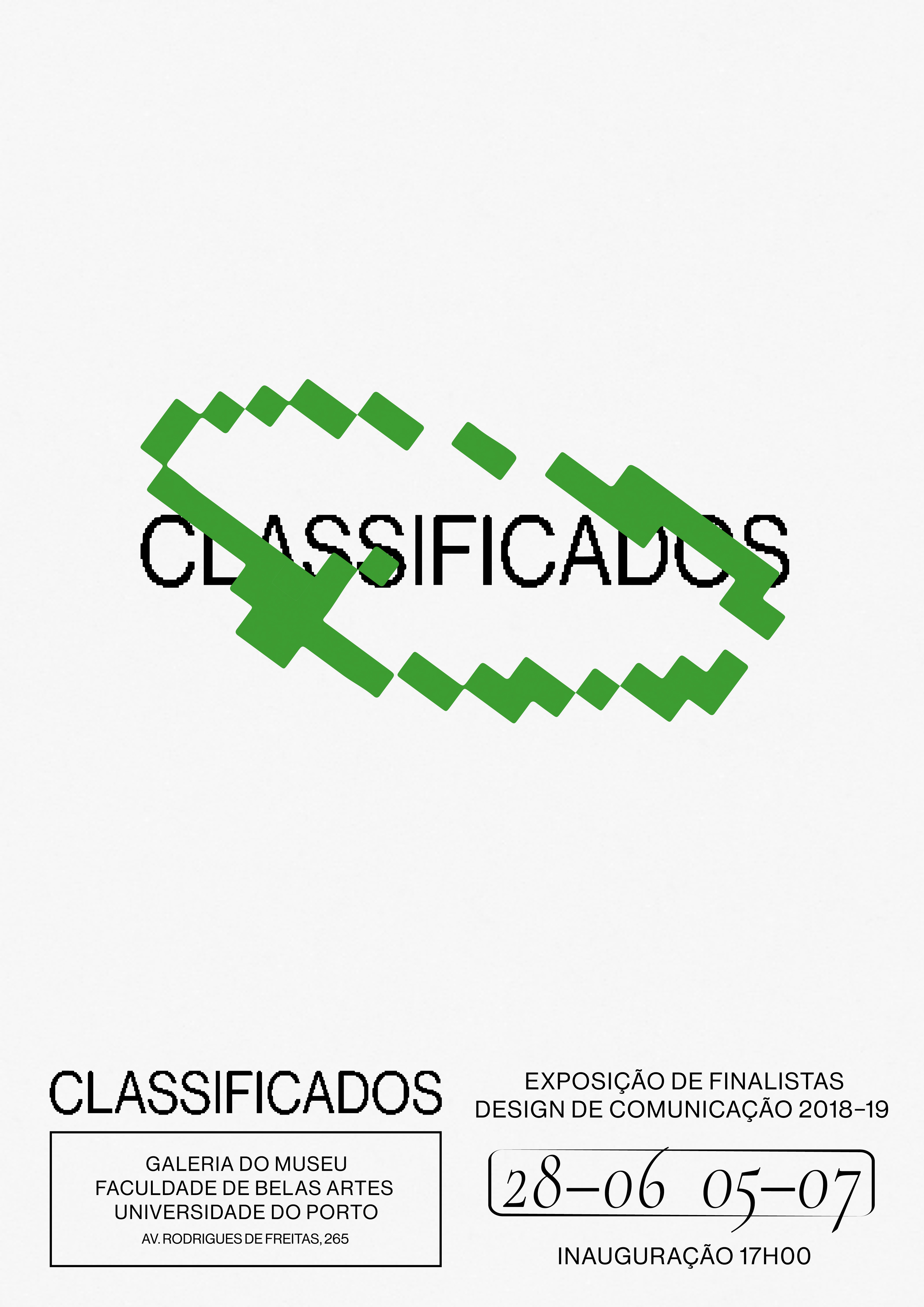
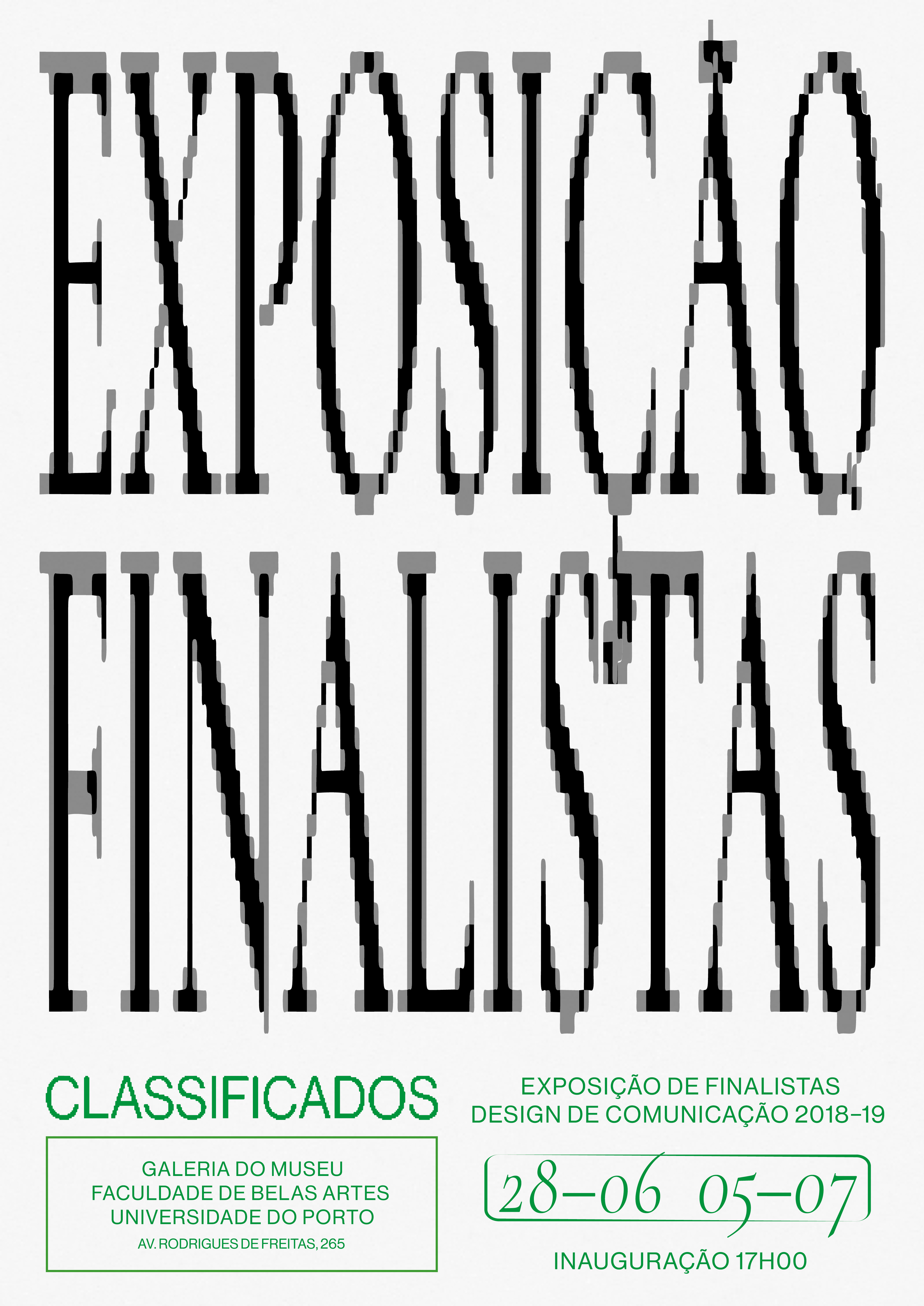
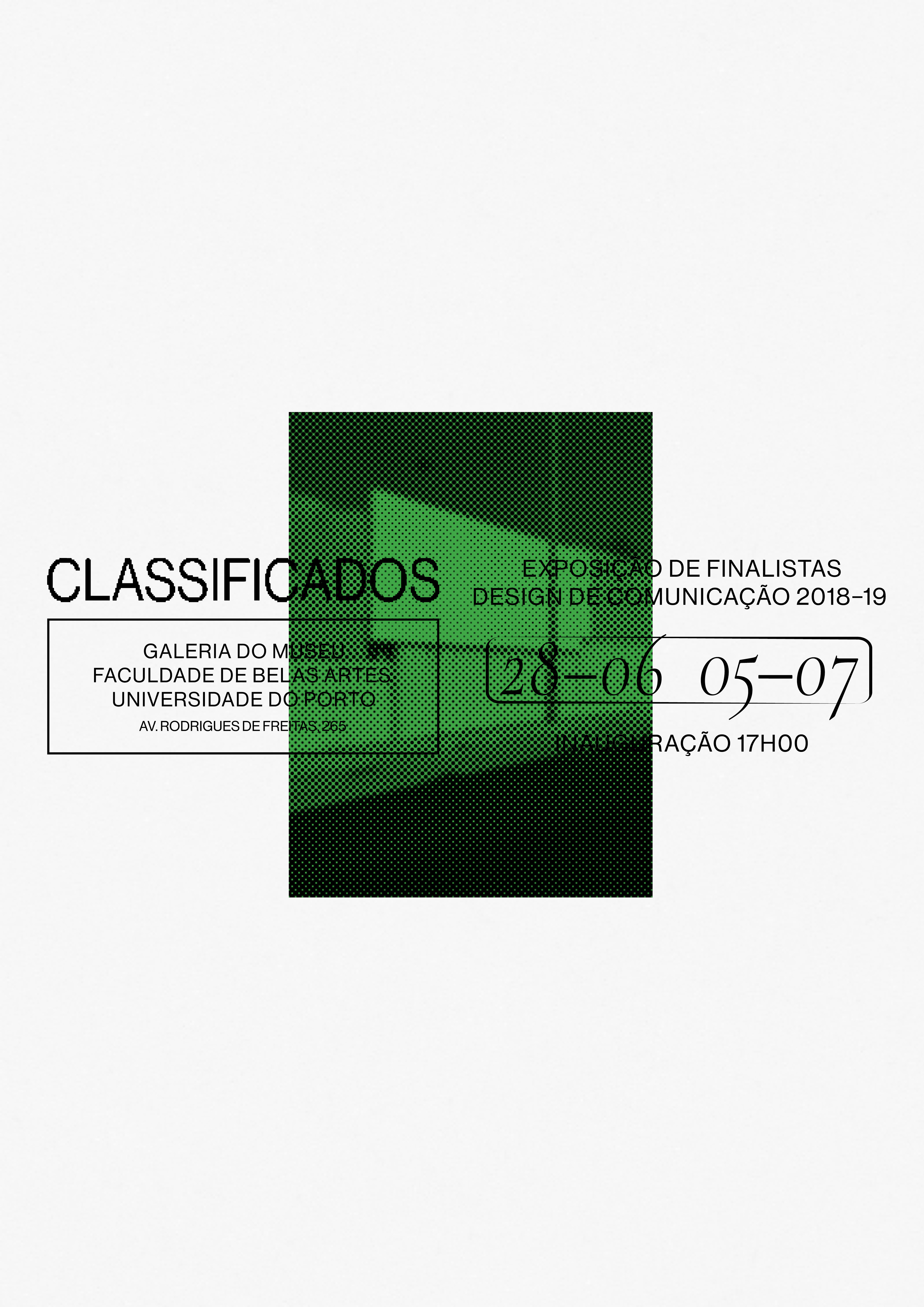
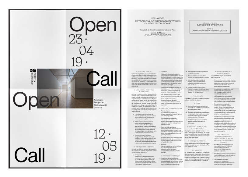
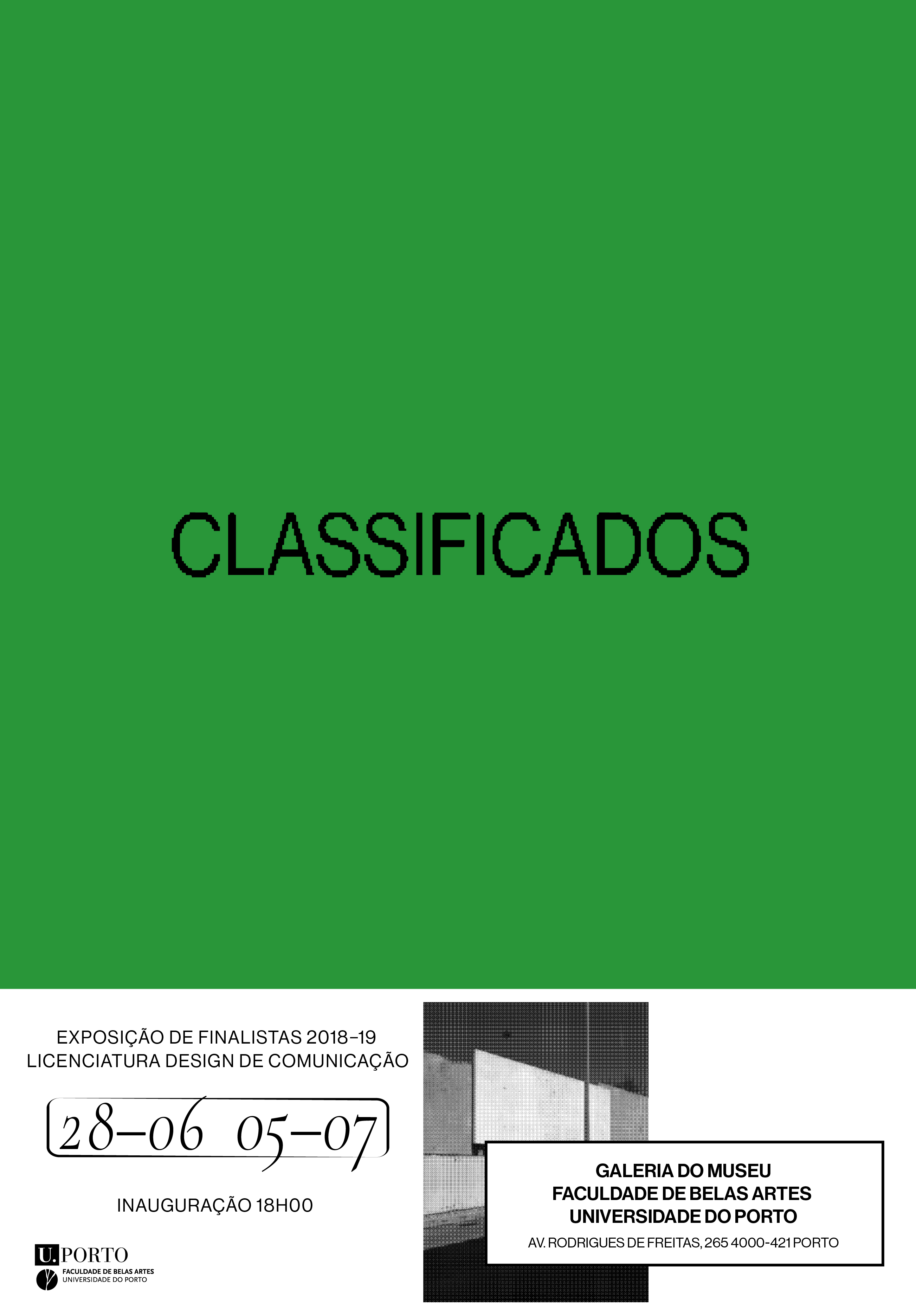

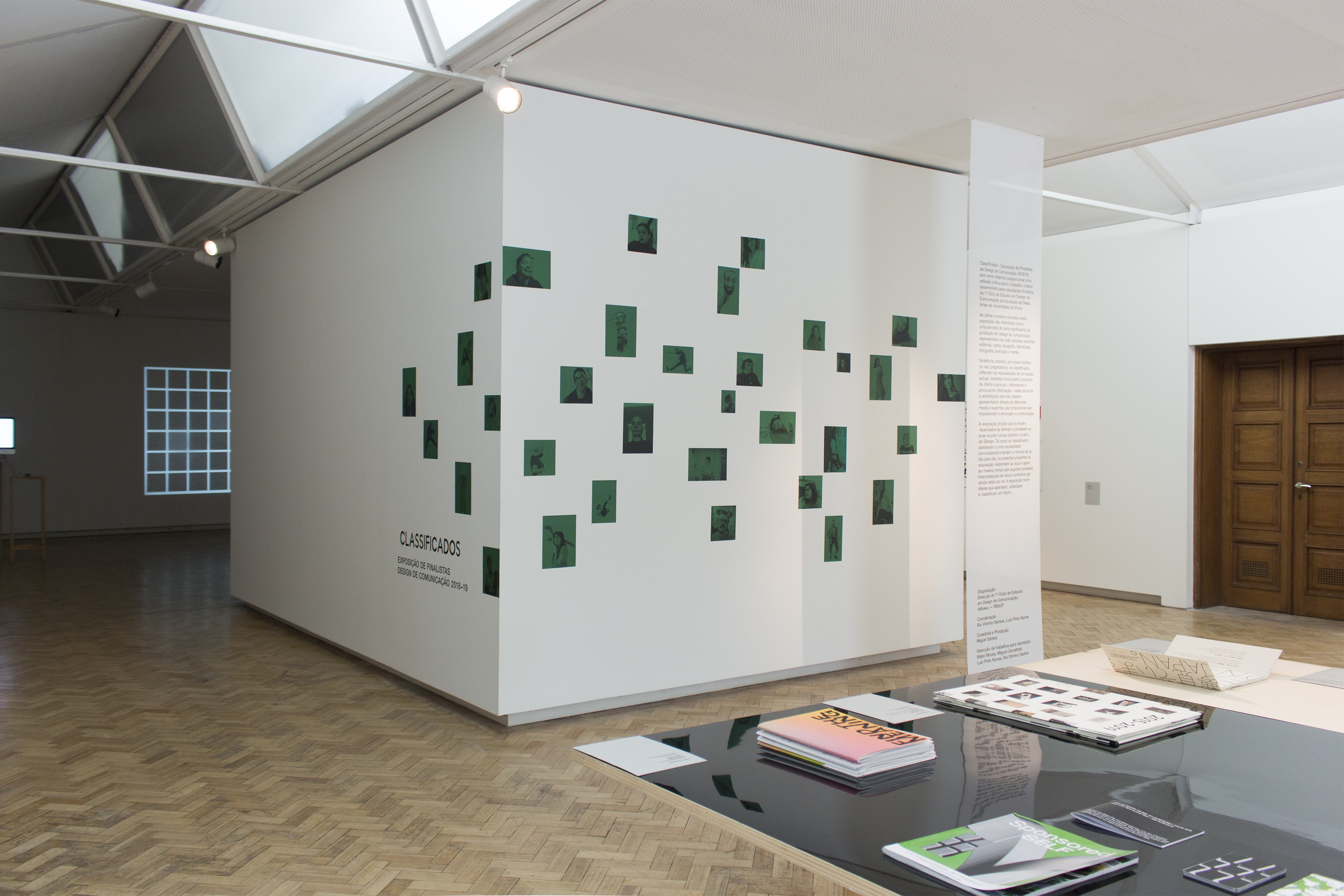
CLASSIFICADOS (CLASSIFIED)
CURATION, PRODUCTION AND IDENTITY FOR THE COMMUNICATION DESIGN GRADUATION SHOW
CURATION, PRODUCTION AND IDENTITY FOR THE COMMUNICATION DESIGN GRADUATION SHOW
+ INFO
During my internship at the Fine Arts School Museum I got to develop the concept, coordinate and produce the communication students graduation show.
‘design’ is related to ‘sign’: a sign of the times, a sign of things to come, a sign of membership. In that case, it would have given a different, but equally plausible, explanation of the world’s contemporary situation. That’s the answer then: Everything depends on Design. VILÉM FLUSSER
Synthetic, direct, sometimes unusual in their pragmatism, the classifieds reflect the needs of a current time. Inserted into a compact grid of supply and demand - informing and seeking information - these ads and requests around us presented through different media are propositions that drive and potentiate communication.
But Classificados (Classified) is more than just a mere reference to the newly graduates need of a job. The exhibition proposes that the new graduates define themselves and consider their future actions regarding the practice of Design. Just as classifieds meet a circumstantial need and tend to be renewed day by day, the projects in the exhibition respond to the here and now while augmenting possible interpretations of new contexts yet to come. The exhibition brings together ideas that mark, anticipate and classify the future.
SALSA JEANS
SET DESIGN
SET DESIGN
+ INFO
Set design for Salsa Jeans new collection showroom, developed at Grow Creativity.
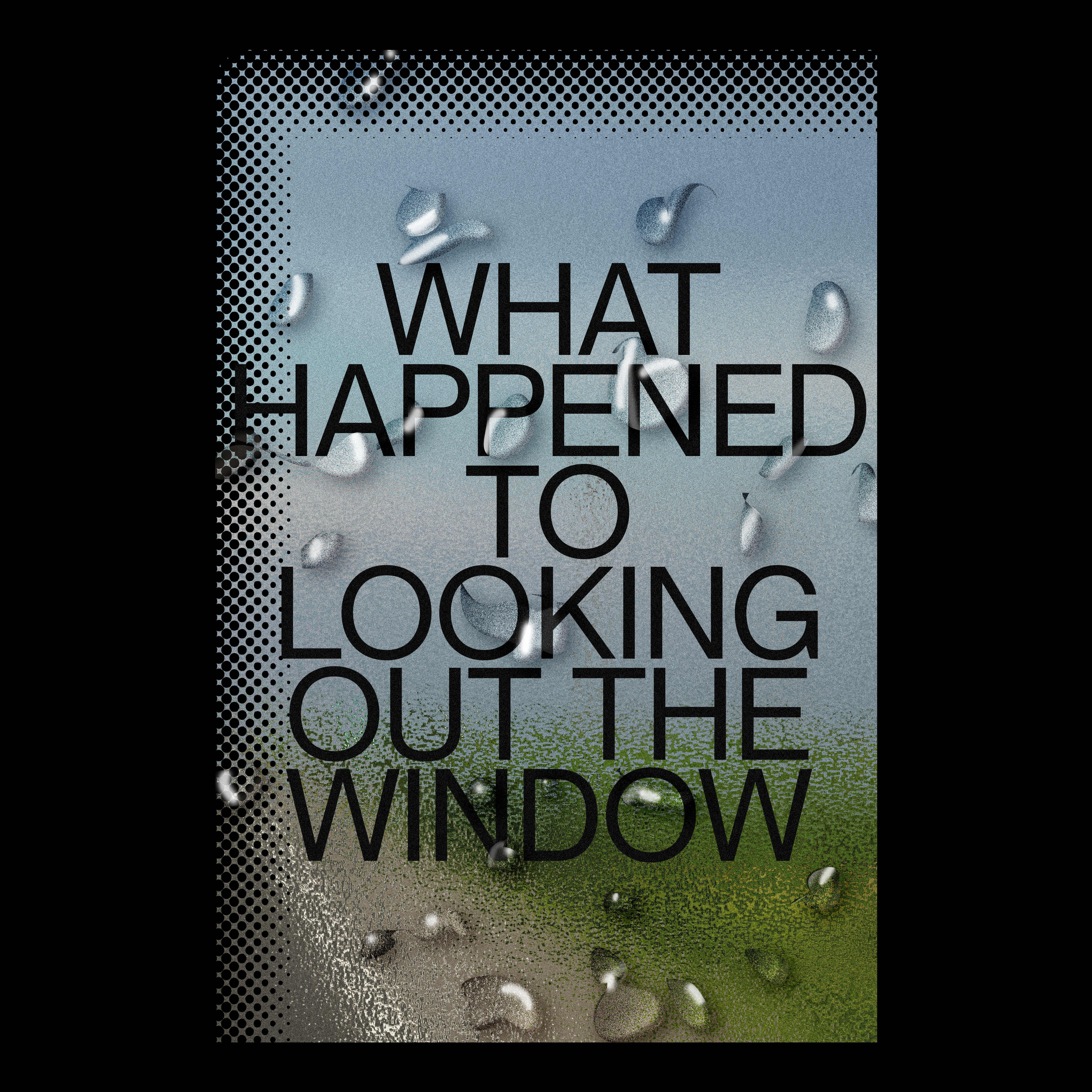
LOOK OUT POSTER
+ INFO
Do you ever think that you're not looking out enough?
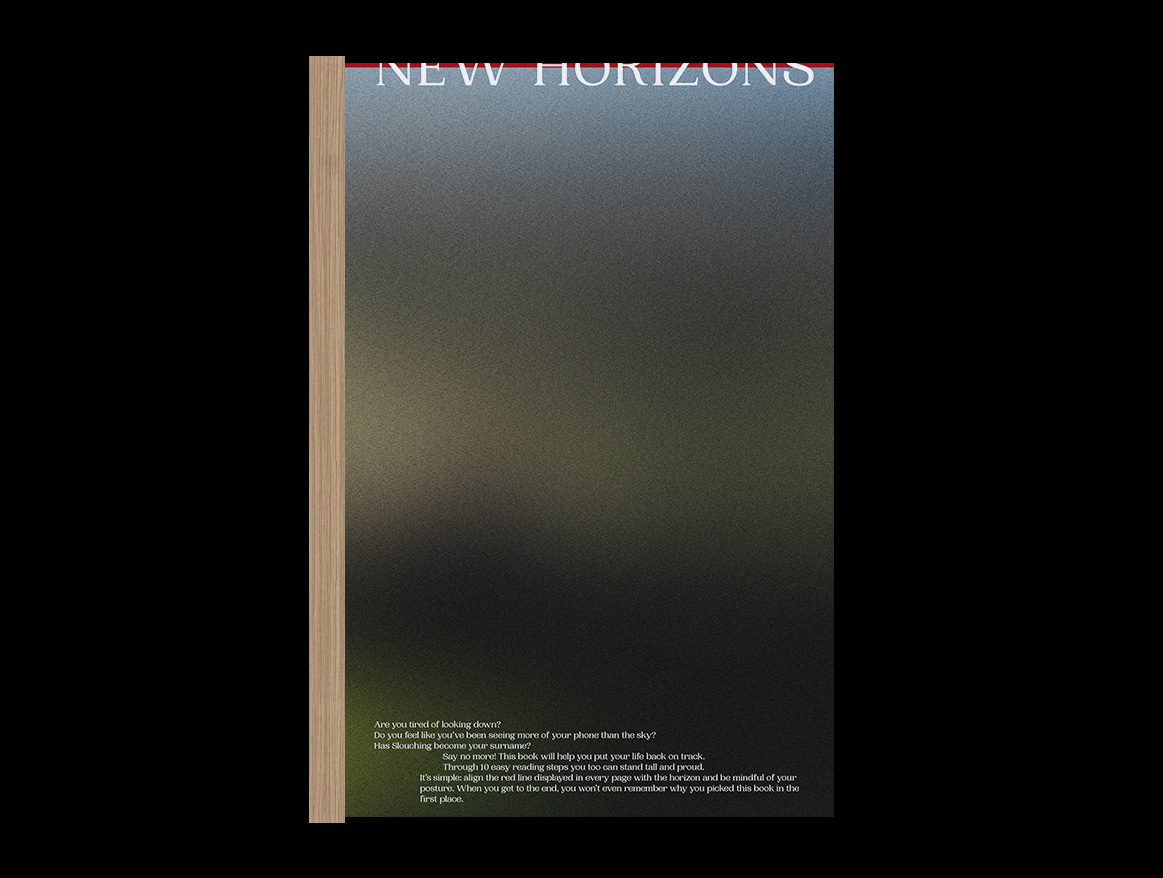
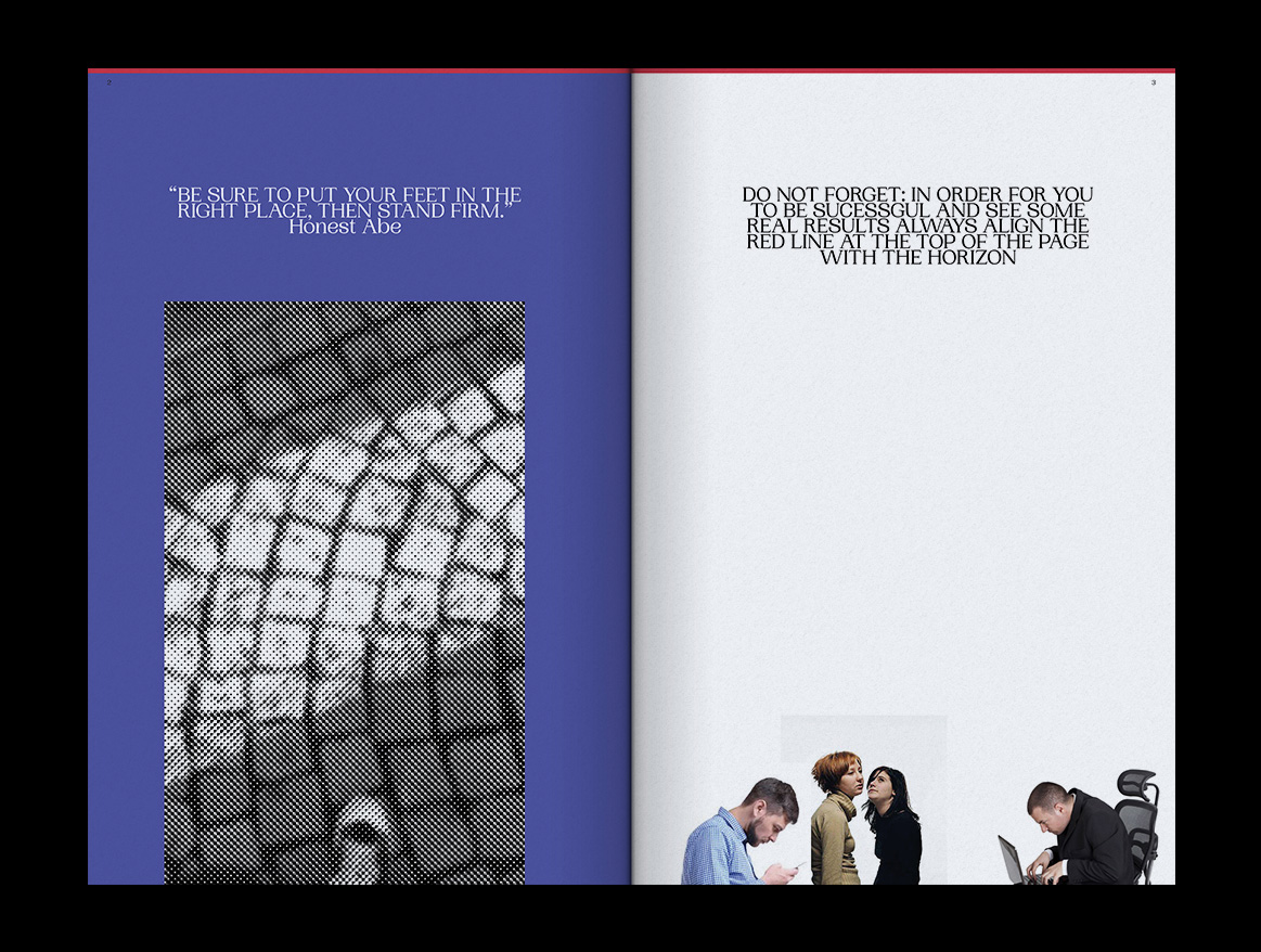


NEW HORIZONS
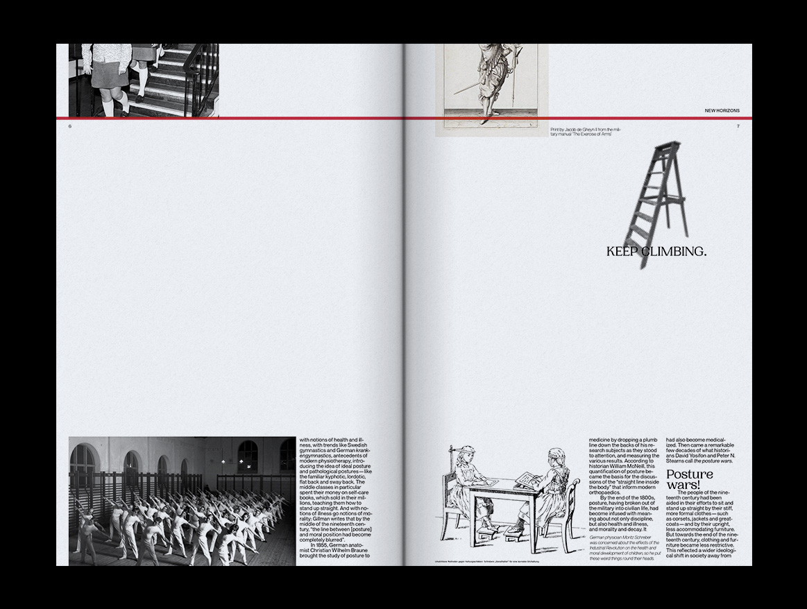
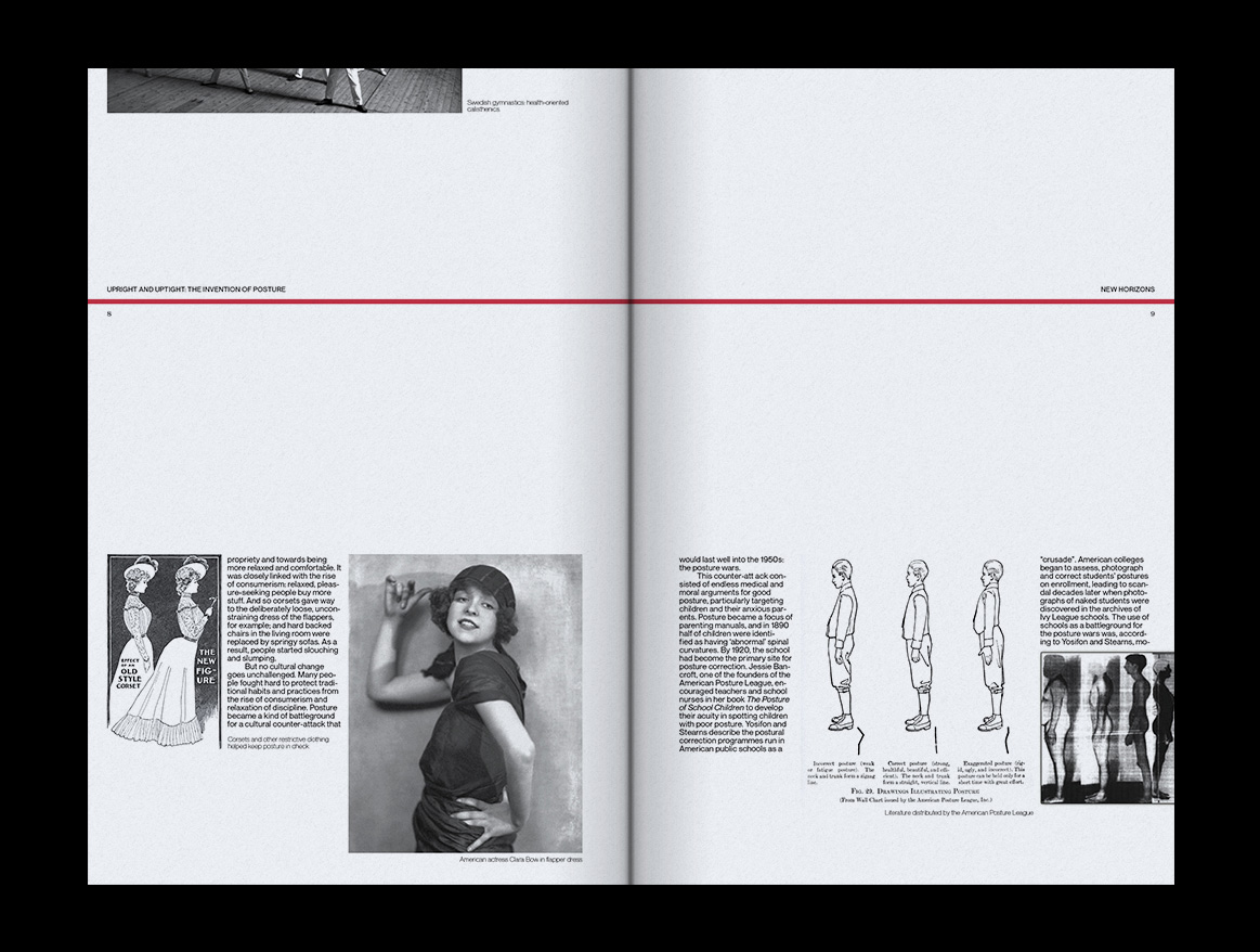
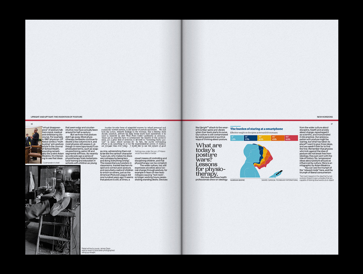
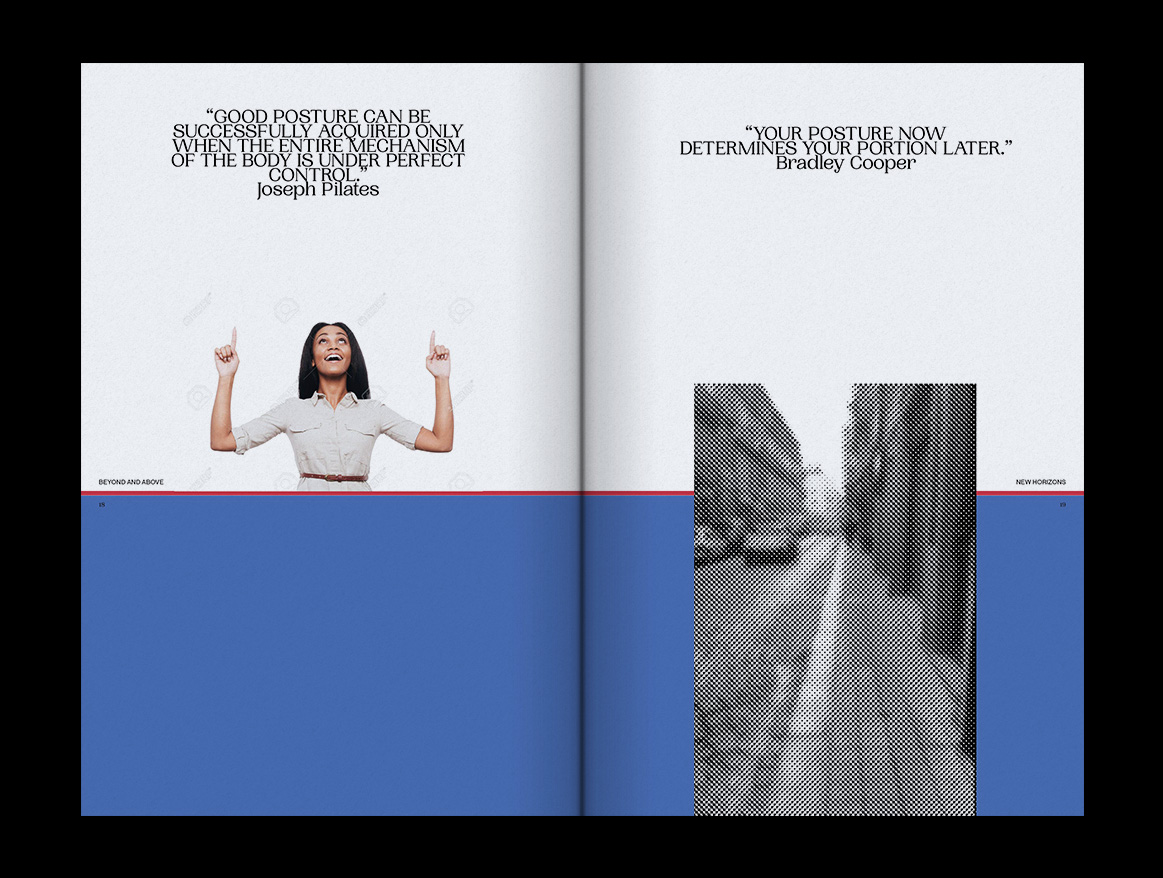
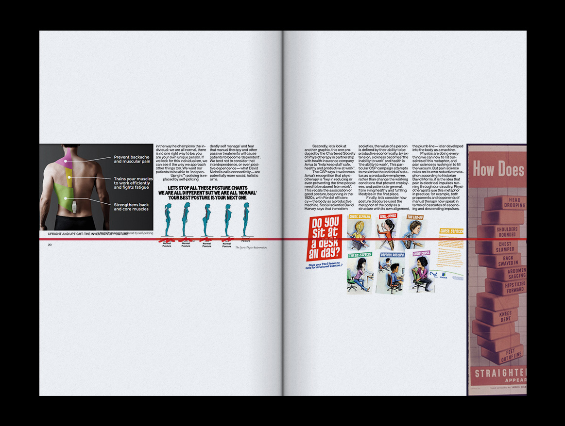
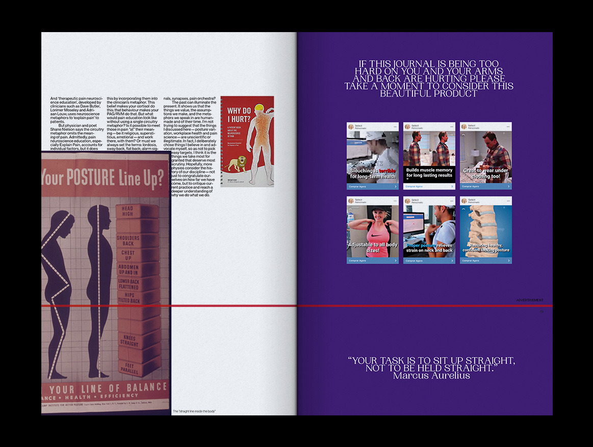
ACHIEVING A CORRECT BODY POSTURE HAS NEVER BEEN EASIER
ACHIEVING A CORRECT BODY POSTURE HAS NEVER BEEN EASIER
+ INFO
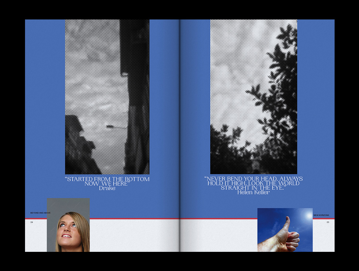
This curricular publication is my response to the my increasingly poor body posture.
Taking inspiration from self-help books it aims at correcting one's posture through a performative reading experience.The reader is encouraged to align the red line with the horizon at all times in order to progressively raise her/his head achieving by the end of it the perfect standing position.
If the reader lacks the willpower to follow it till the end, some pixelated stock photos and inspirational quotes are encouragement enough to see her/him be successful in this task.
The article and the images that make most of the publication are taken from Tom Jesson’s article for Medium Upright and Uptight: The Invention of Posture

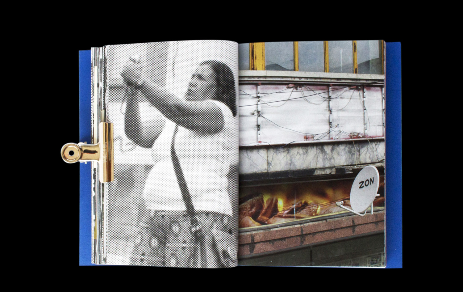

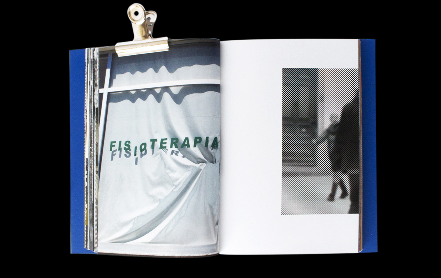

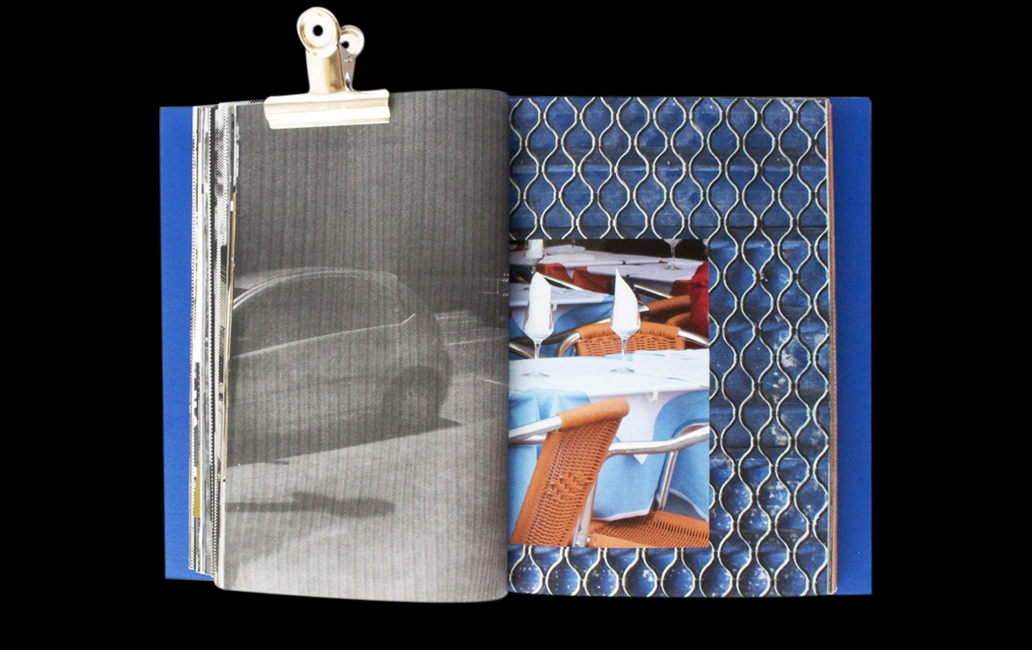
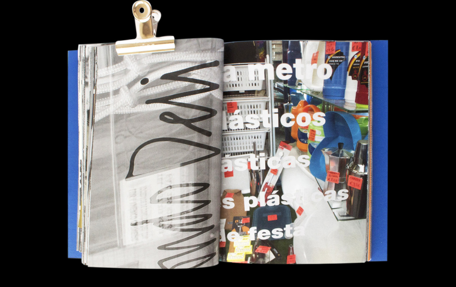
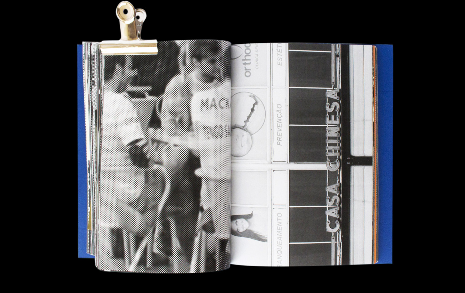


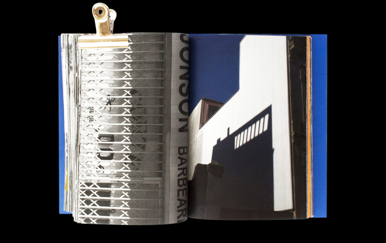
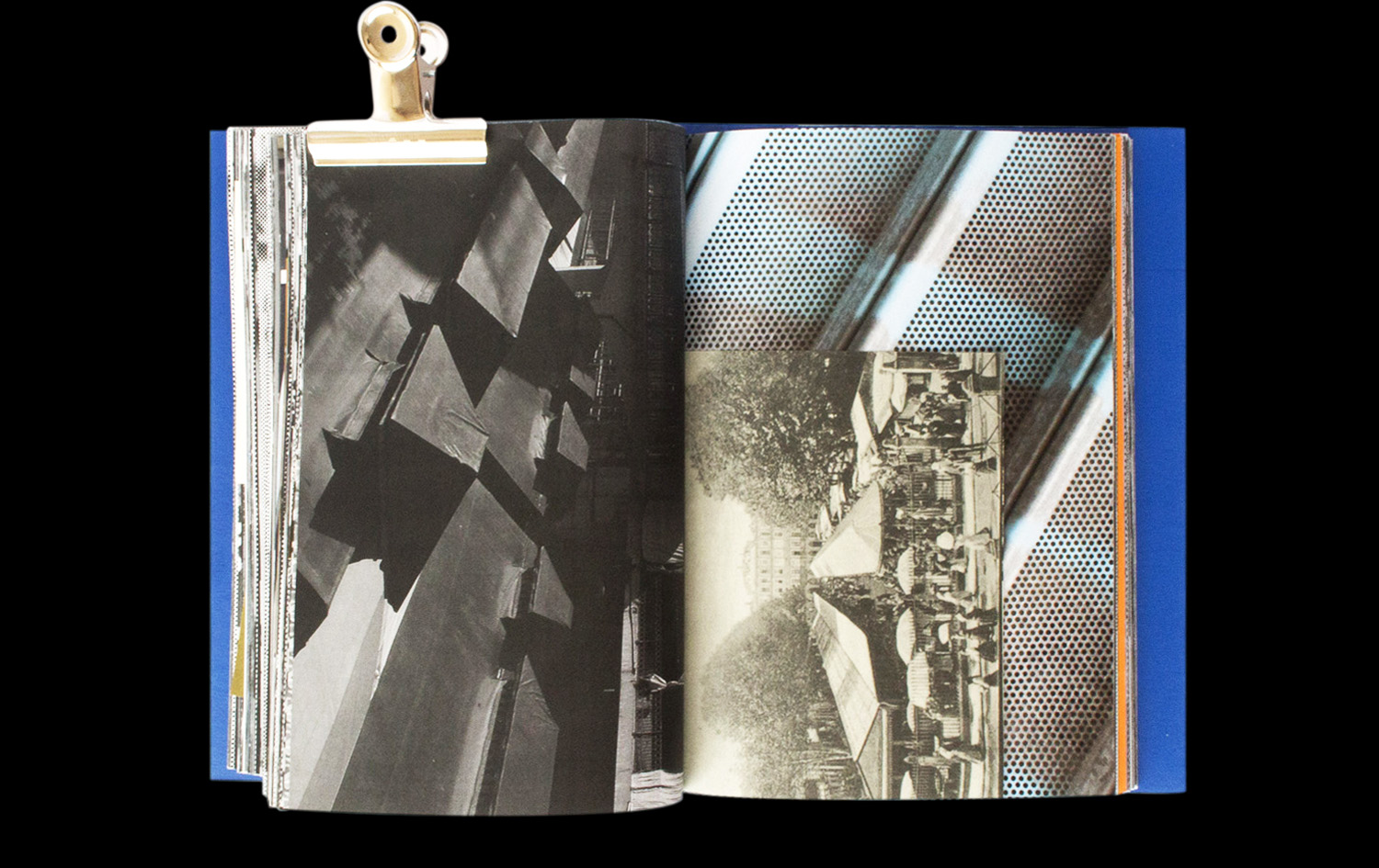
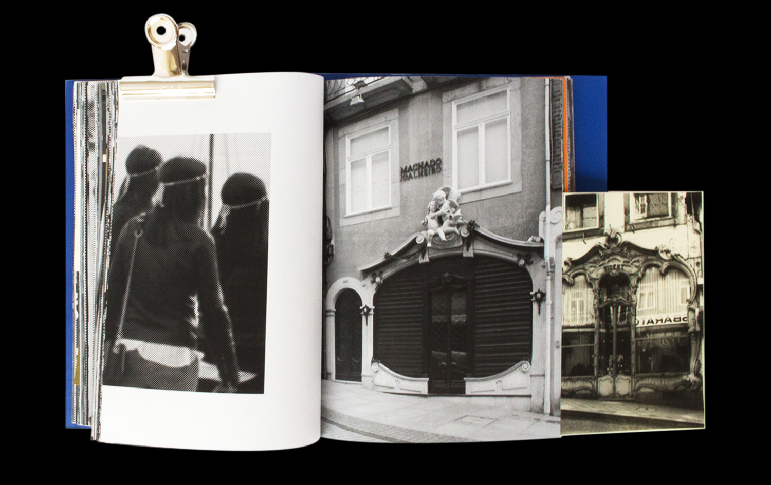


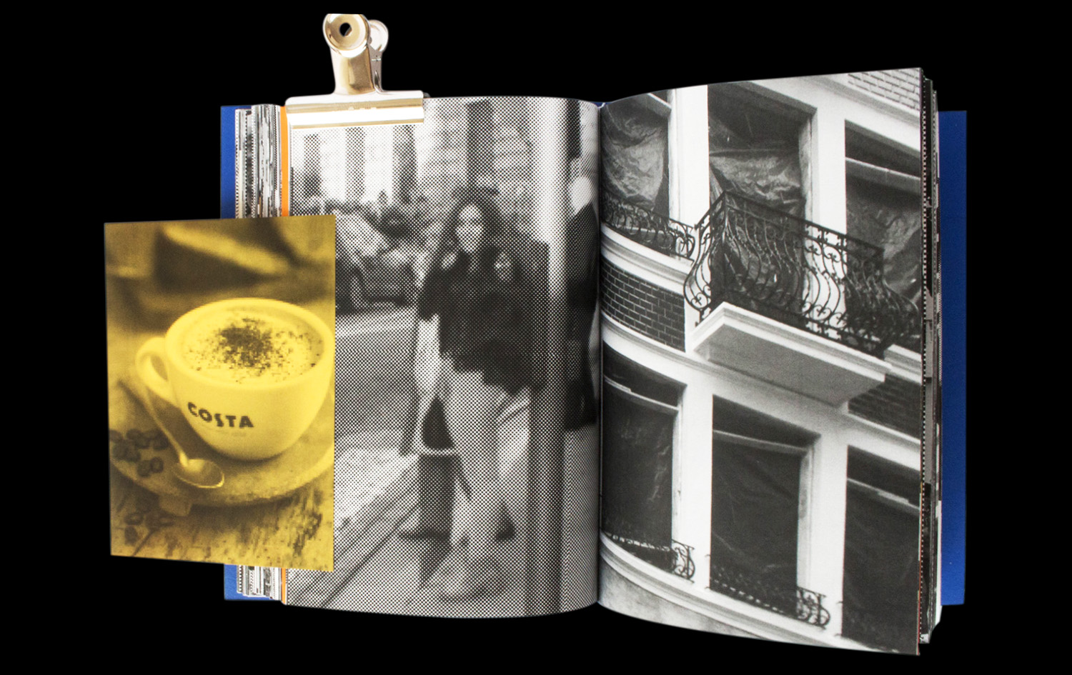


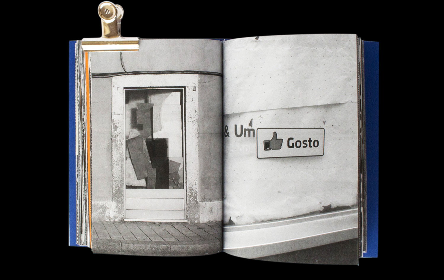


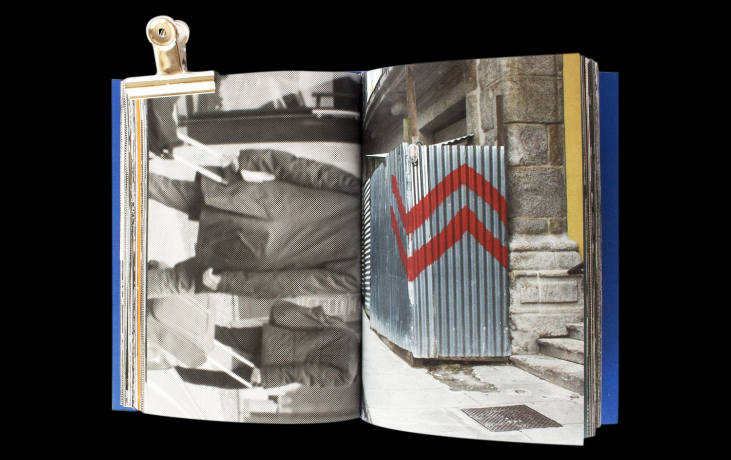

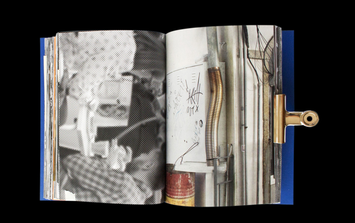
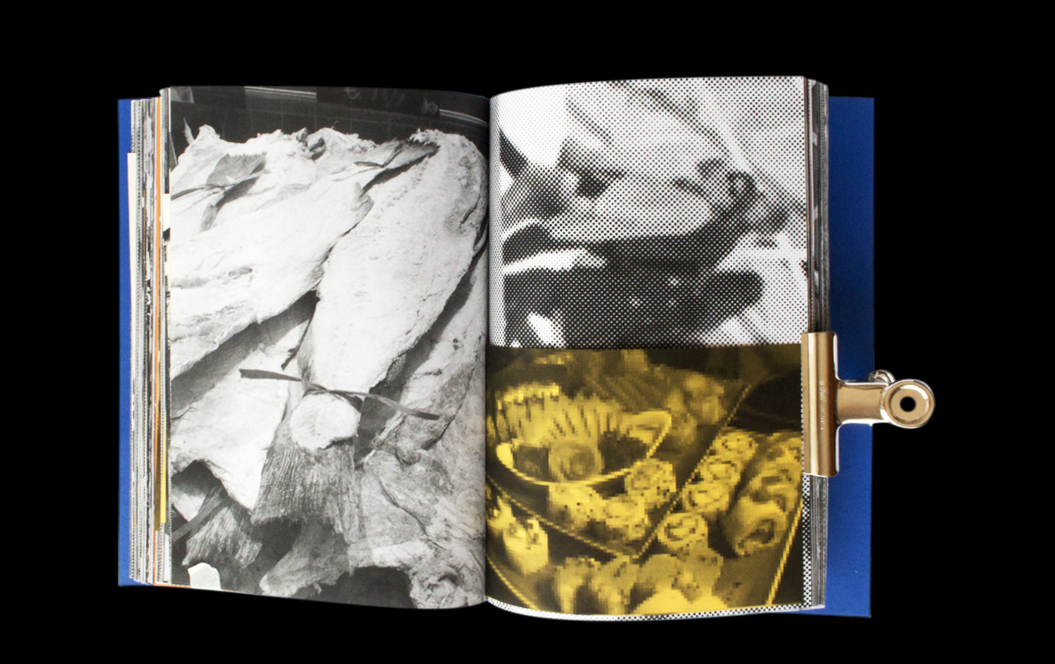


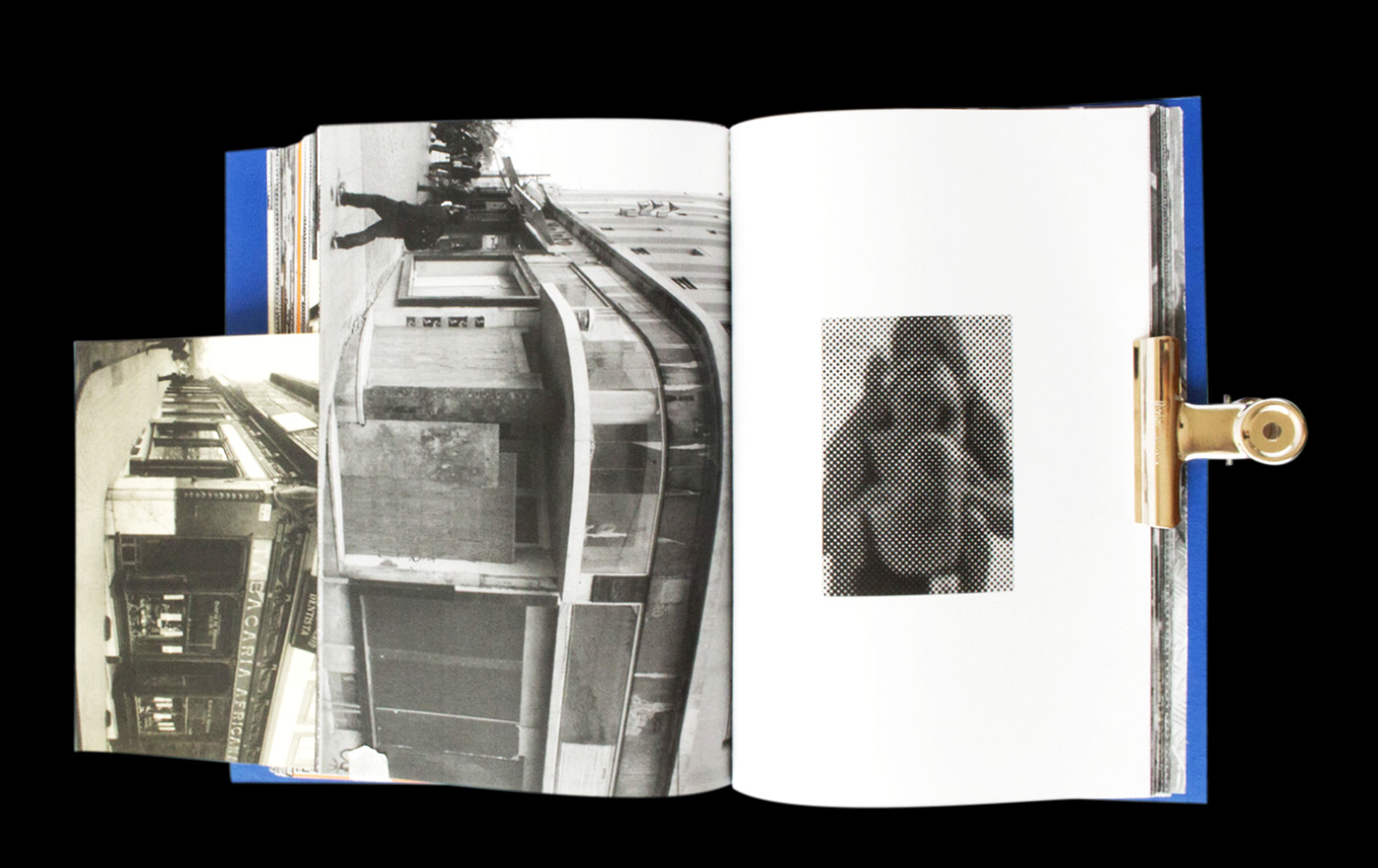


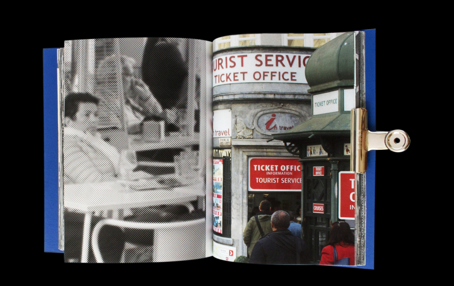
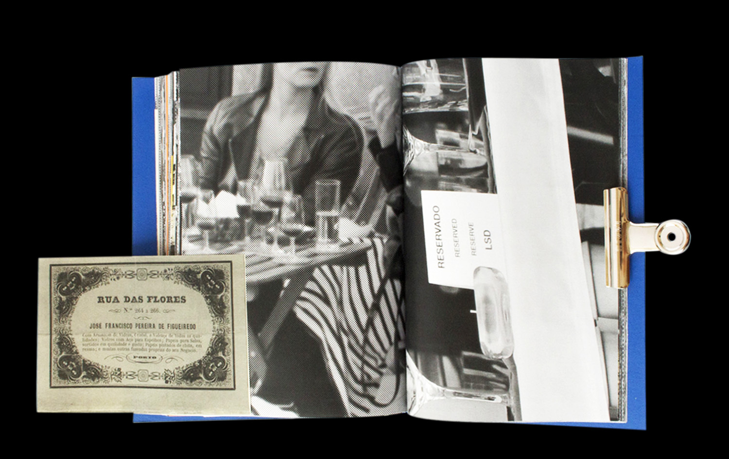


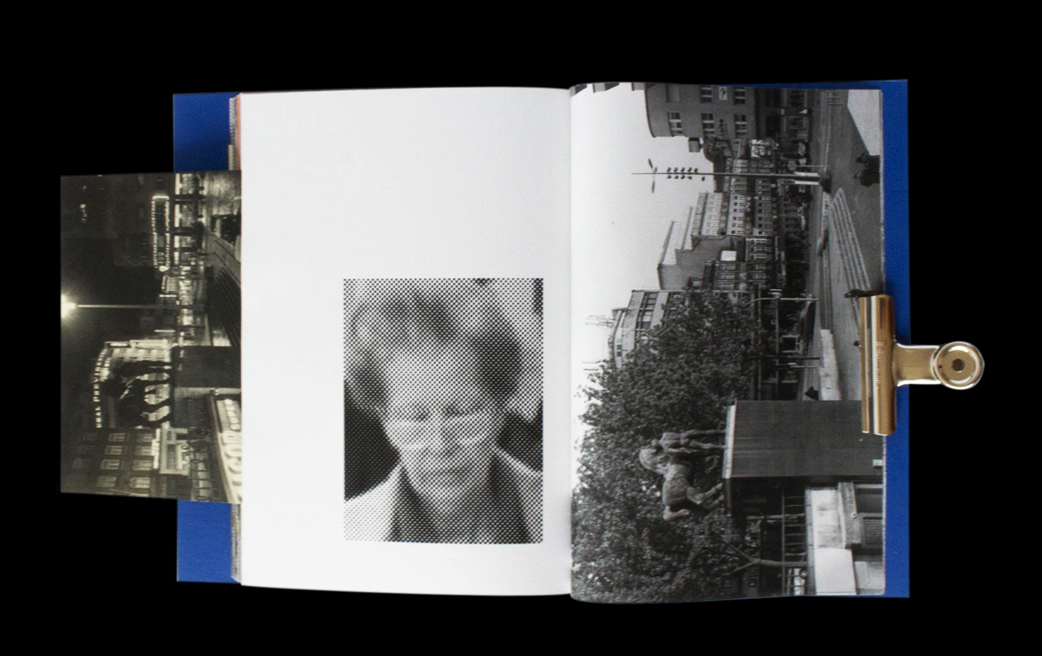

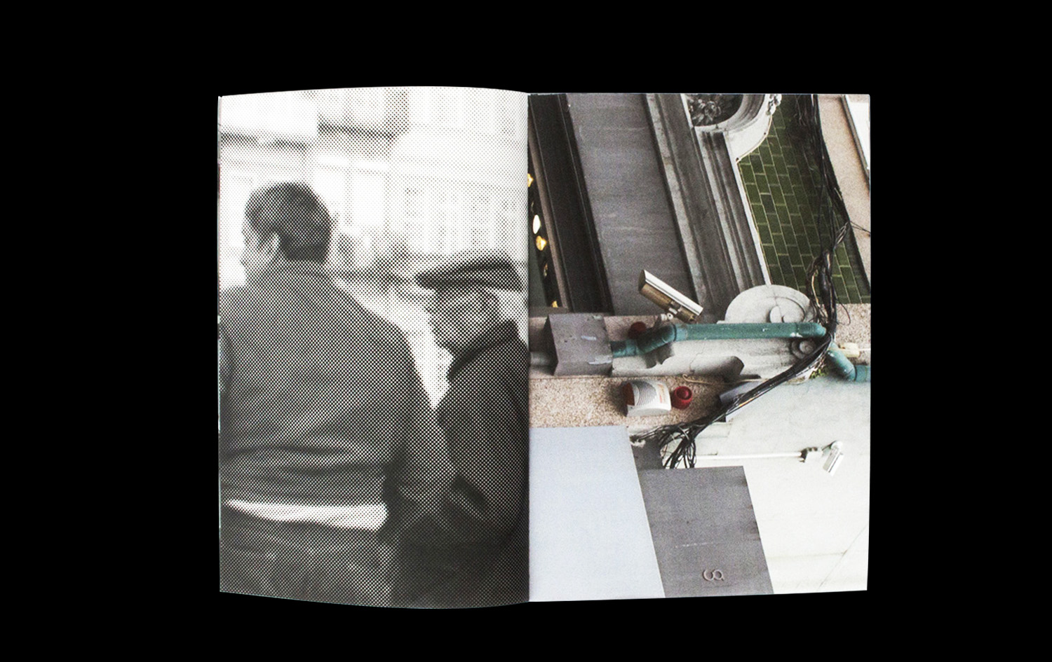
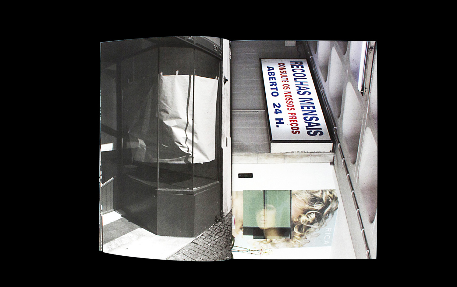


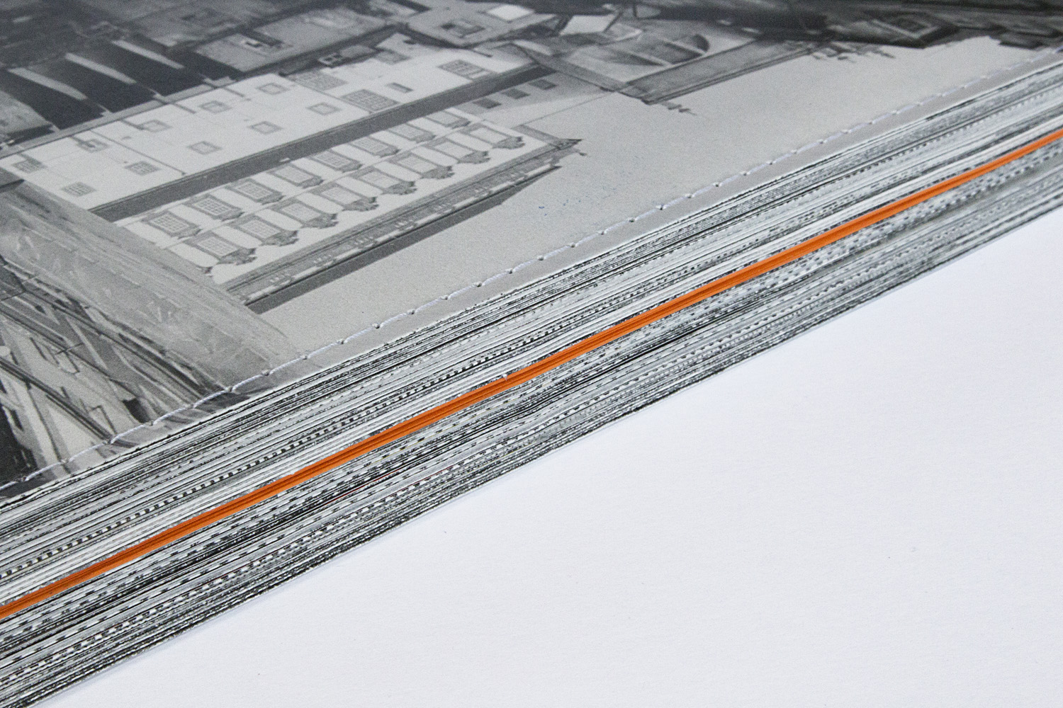
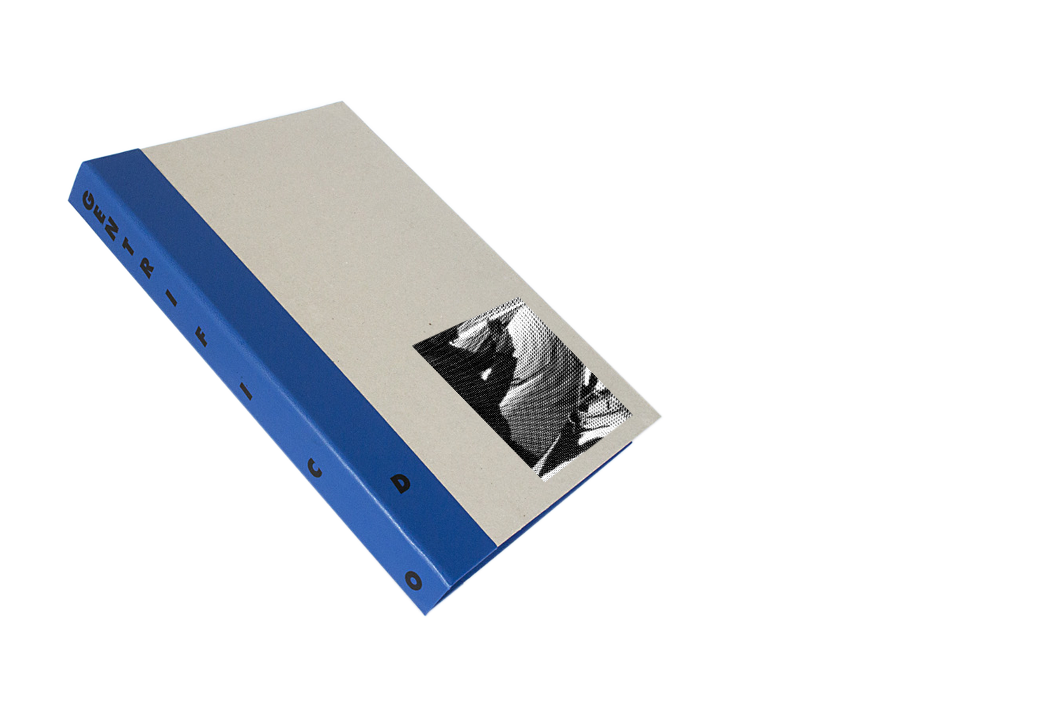
GENTRIFIC(AD)O
A PHOTOGRAPHIC ESSAY ON THE CHANGES OF A PROGRESSIVELY GENTRIFIED CITY
A PHOTOGRAPHIC ESSAY ON THE CHANGES OF A PROGRESSIVELY GENTRIFIED CITY
+ INFO
A photobook documenting the changes in the city of Porto primarily focused on the commercial displacement caused mainly by the ever increasing tourism induced gentrification process that sees small scale and old businesses being replaced by new commercial spaces catered to the visitors needs.
The images attempt to illustrate this issue by portraying the city's present day and confronting it with its past by adding images from the city's own archive in the form of postcards that evoke a space that has in most cases fundamentally changed. On the other hand, some generalist pixelated stock images of Porto and its new bland and glossy boutiques and restaurants.
The images attempt to illustrate this issue by portraying the city's present day and confronting it with its past by adding images from the city's own archive in the form of postcards that evoke a space that has in most cases fundamentally changed. On the other hand, some generalist pixelated stock images of Porto and its new bland and glossy boutiques and restaurants.
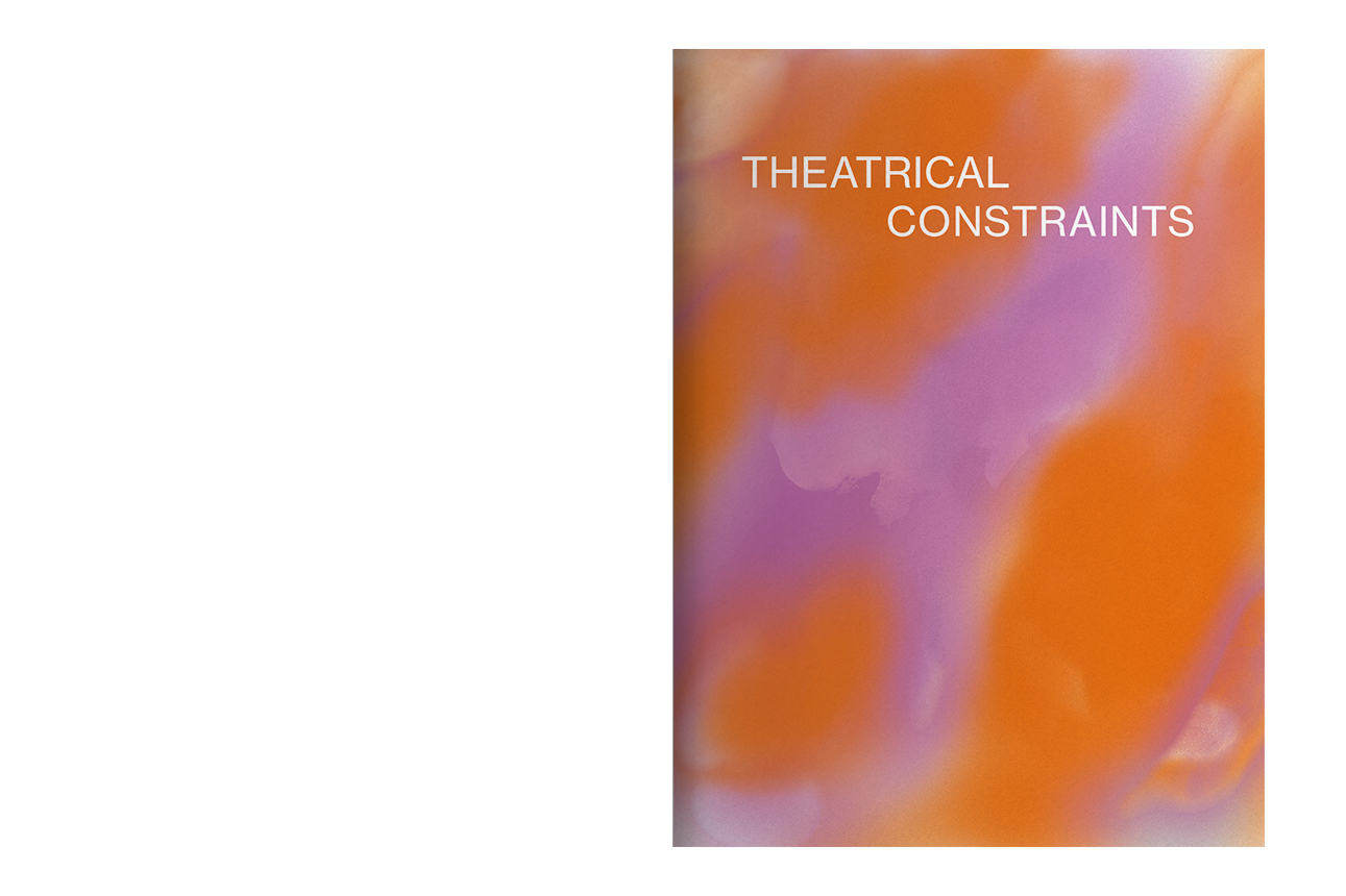
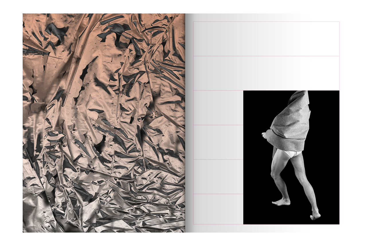
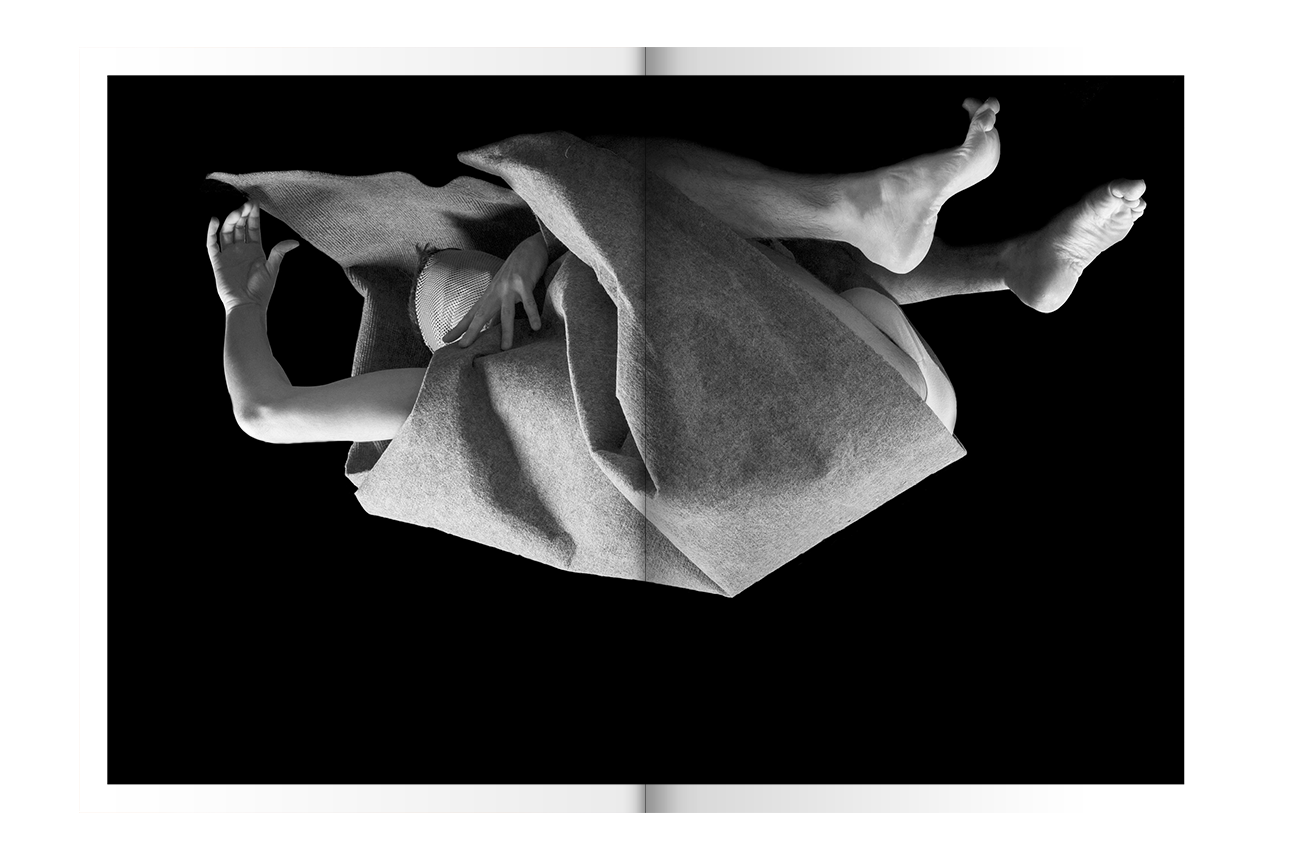
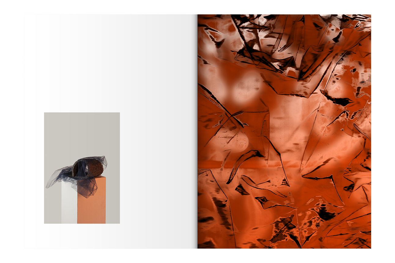

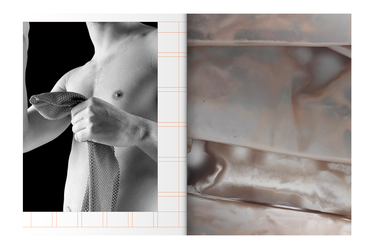
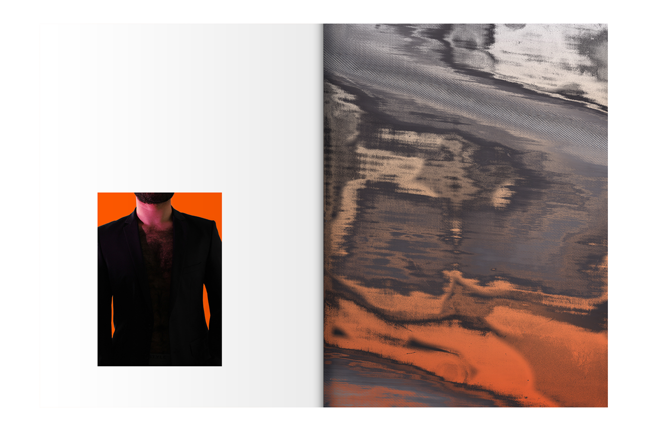
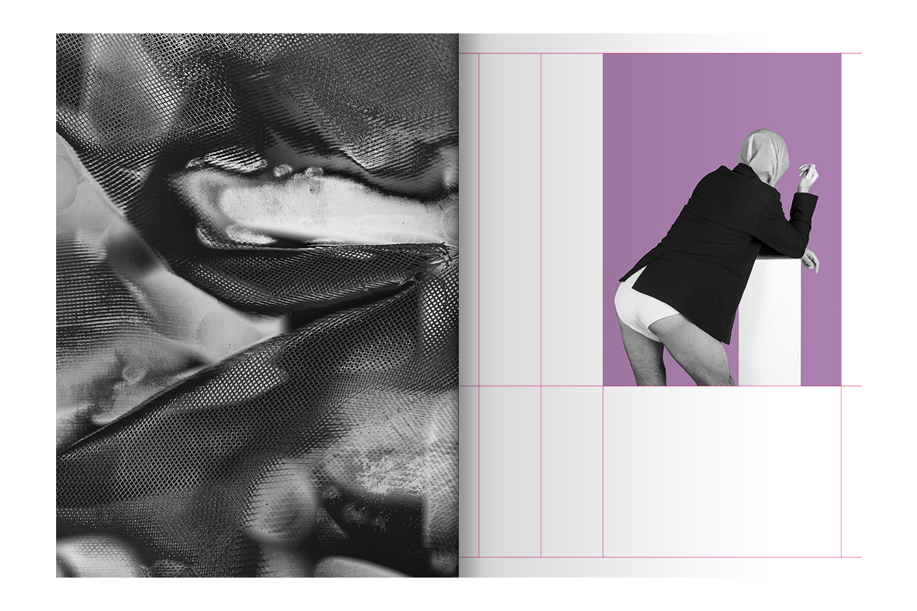
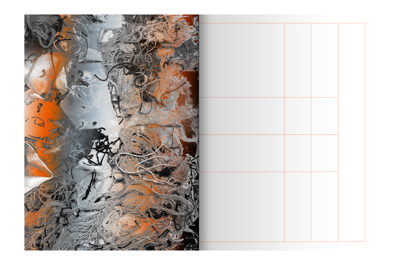
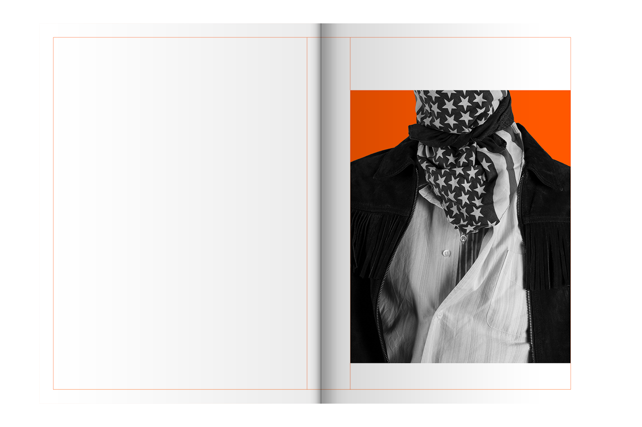
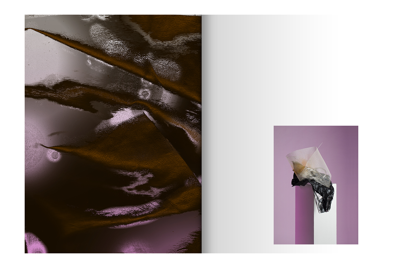
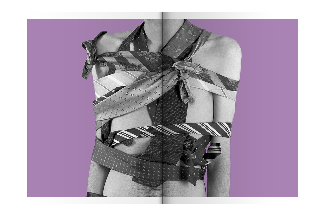
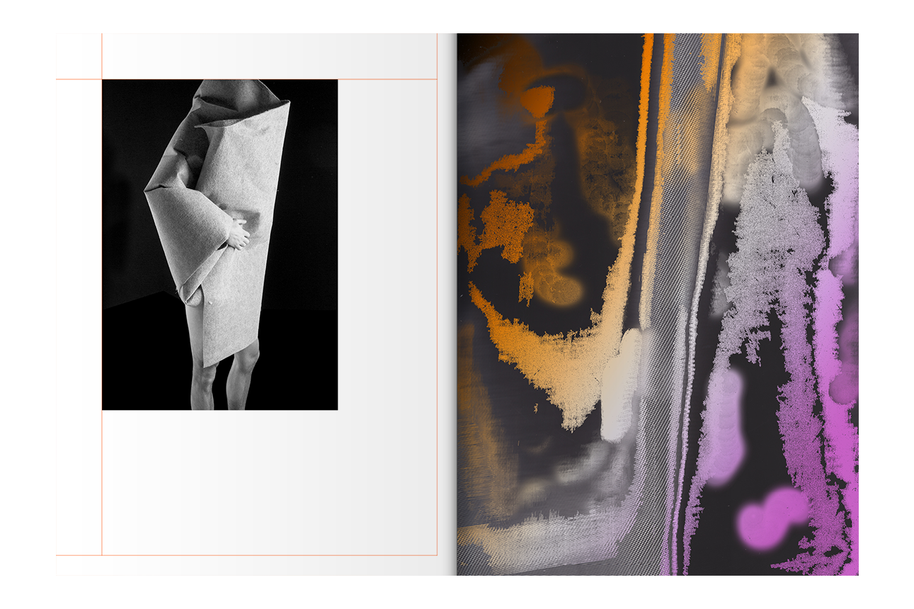
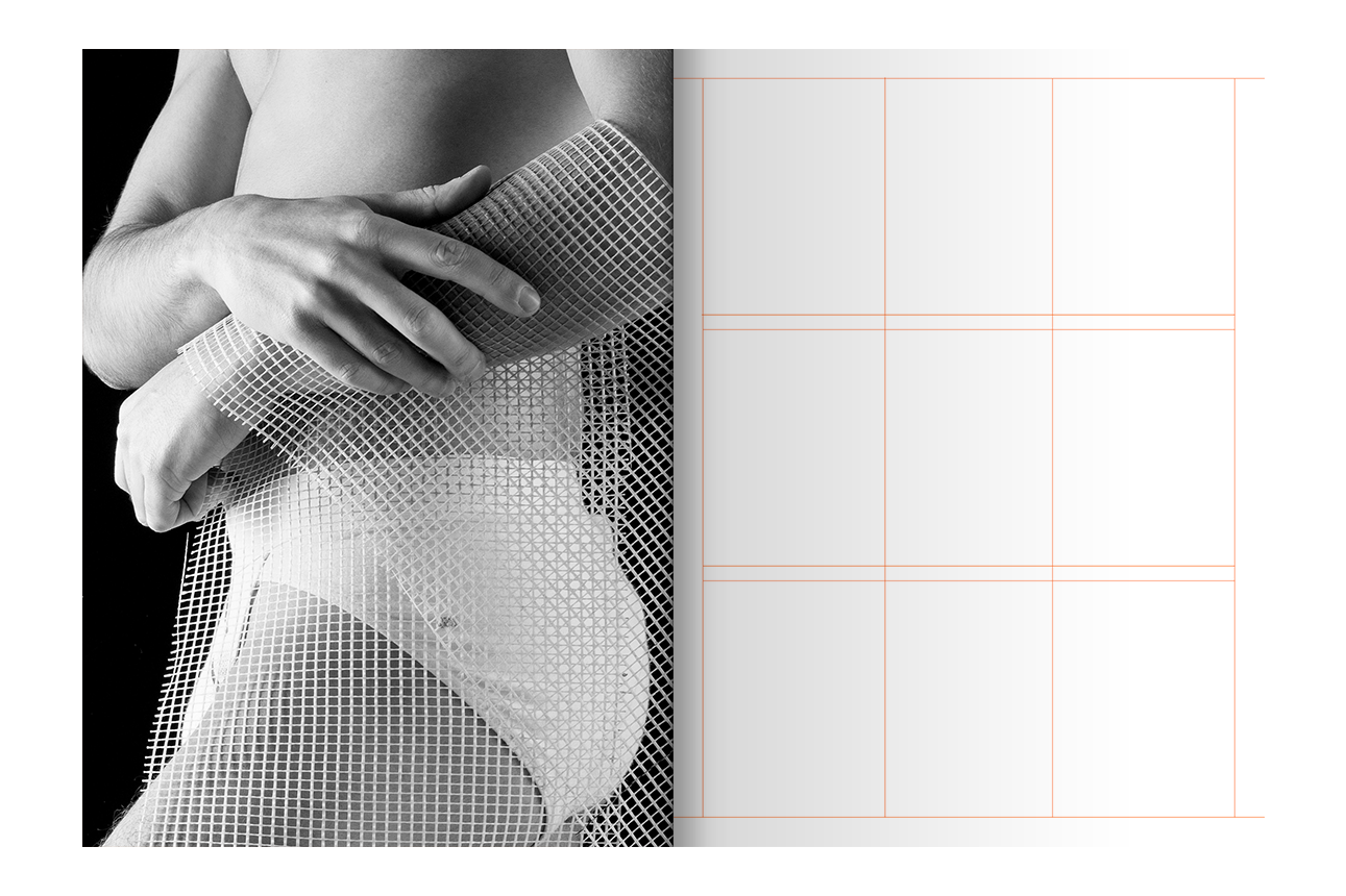
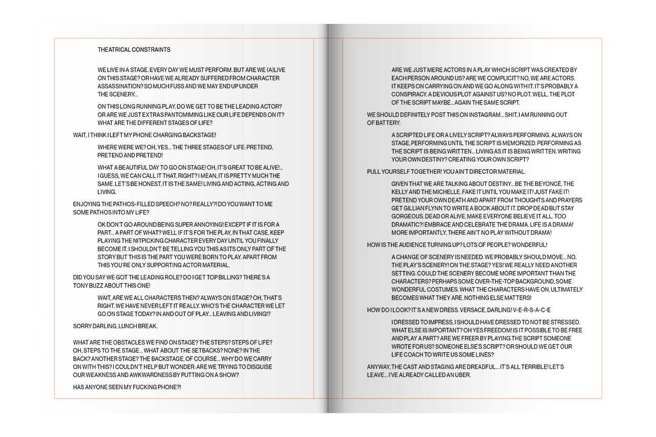


THEATRICAL CONSTRAINTS
A PHOTOBOOK ON SETTING ONESELF FREE
A PHOTOBOOK ON SETTING ONESELF FREE
+ INFO
"We live in a stage. Every day we must perform. But are we (a)live on this stage? Or have we already suffered from character assassination? So much fuss and we may end up under the scenery…
On this long running play, do we get to be the leading actor? Or are we just extras pantomiming like our life depends on it? What are the different stages of life?
Wait, I think I left my phone charging backstage!"
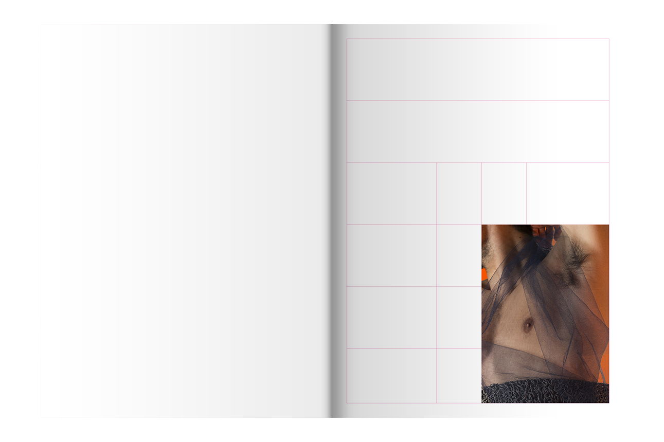
Theatrical Constraints is a photography project depicting a group of anonymous characters portraying their own existence in a rather artificial and camp way. These characters behave like actors on a stage making an effort to put on a show with their exaggerated movements and dramatic poses. All of this aims to underline the everyday constraints humans have to deal with, embracing and celebrating them in order to attempt setting themselves free in a cathartic visual spectacle.
In this staged photographic narrative, the characters interact with different materials that, at first, may look like props. However, by being transported to the full page, they get a leading role on the spreads as their visual properties are further explored through digital editing suggesting a more complex sensorial experience.
The book is the medium by which all of this comes together. The characters, the scenery, the props all exist on the stage that is the page, suggested in the coloured lines drawn from the grid that structures the book layout. These marks are used to indicate the location of the different elements of a theatre play. Moreover, the relation between these elements intents to emphasize the duality of the book structure. On one hand, it sets constraints to the way the elements of the book can be placed. On the other hand, it shows that there are many possibilities for their placement. A text at the end of the publication provides a satirical script for a monologue on the theme.
In collaboration with Rui Miranda
On this long running play, do we get to be the leading actor? Or are we just extras pantomiming like our life depends on it? What are the different stages of life?
Wait, I think I left my phone charging backstage!"
Theatrical Constraints is a photography project depicting a group of anonymous characters portraying their own existence in a rather artificial and camp way. These characters behave like actors on a stage making an effort to put on a show with their exaggerated movements and dramatic poses. All of this aims to underline the everyday constraints humans have to deal with, embracing and celebrating them in order to attempt setting themselves free in a cathartic visual spectacle.
In this staged photographic narrative, the characters interact with different materials that, at first, may look like props. However, by being transported to the full page, they get a leading role on the spreads as their visual properties are further explored through digital editing suggesting a more complex sensorial experience.
The book is the medium by which all of this comes together. The characters, the scenery, the props all exist on the stage that is the page, suggested in the coloured lines drawn from the grid that structures the book layout. These marks are used to indicate the location of the different elements of a theatre play. Moreover, the relation between these elements intents to emphasize the duality of the book structure. On one hand, it sets constraints to the way the elements of the book can be placed. On the other hand, it shows that there are many possibilities for their placement. A text at the end of the publication provides a satirical script for a monologue on the theme.
In collaboration with Rui Miranda


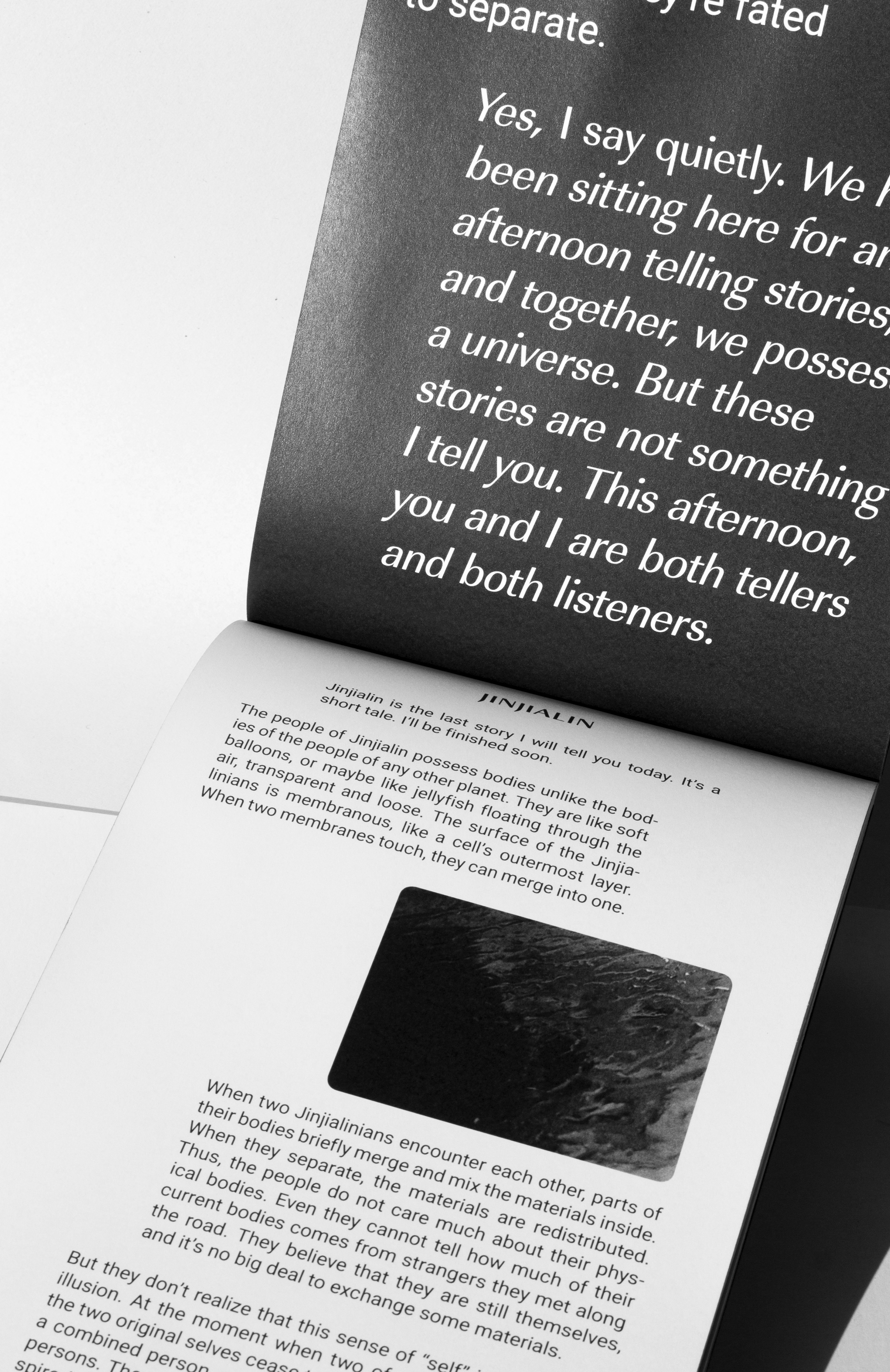
DID YOU READ?
WHEN DIALOGUE TAKES OVER
ROTTERDAM
WHEN DIALOGUE TAKES OVER
ROTTERDAM
+ INFO
Having Hao Jingfang's Invisible Planets as the starting point for this project, the brief consisted in developing an hybrid publication where both physical and digital could meet.
Natives, visitors, colonizers, the “third spacers” or the ones inhabiting the first one, all seem to react, accept, merge or fight amongst themselves. Even though they are not totally aware of this, they depend on each other in order not only to define themselves but to exist, too.
Like celestial bodies hanging in the vastness of the universe, they are connected to one another, the same way they seem to be constraint by the limits of their own existence, which define their purpose within the system.
It is like an endless dialogue binding the different elements together, just like gravity does. This dialogue doesn’t necessarily have to be heard but it can be seen.
The way we visualize conversations today is very much influenced by our own mobile devices that shape the structure of a dialogue. Me aligned to the right whilst the other is aligned left. Taking inspiration from the user interface of the phone, as the prefered communication medium of today, both the publication and the website borrow from its visual vocabulary to get their shape and structure.
So the intersocial dynamics between the different groups of the stories end up shaping not only their planets and spaces, but also the platforms where their stories happen to be written on.

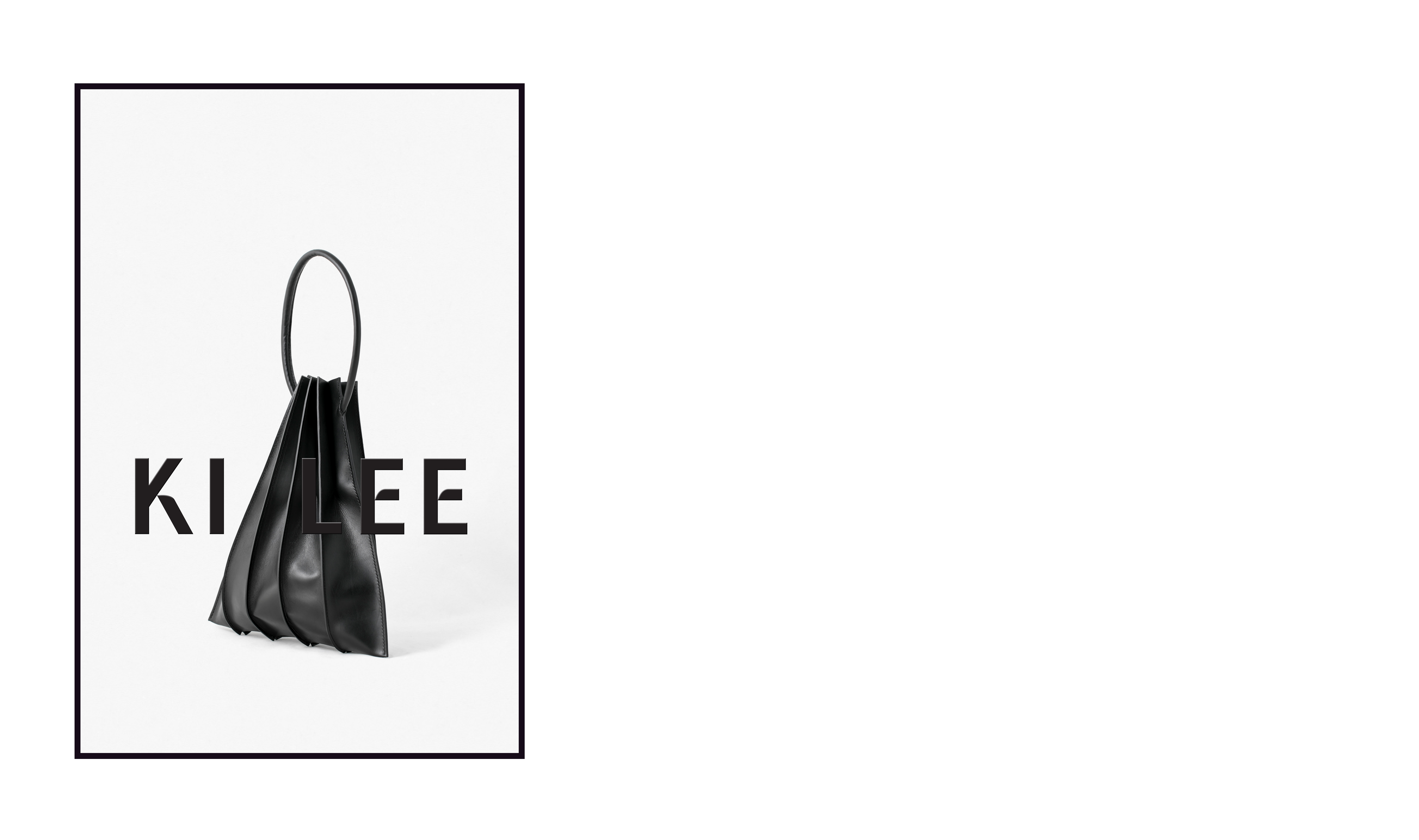
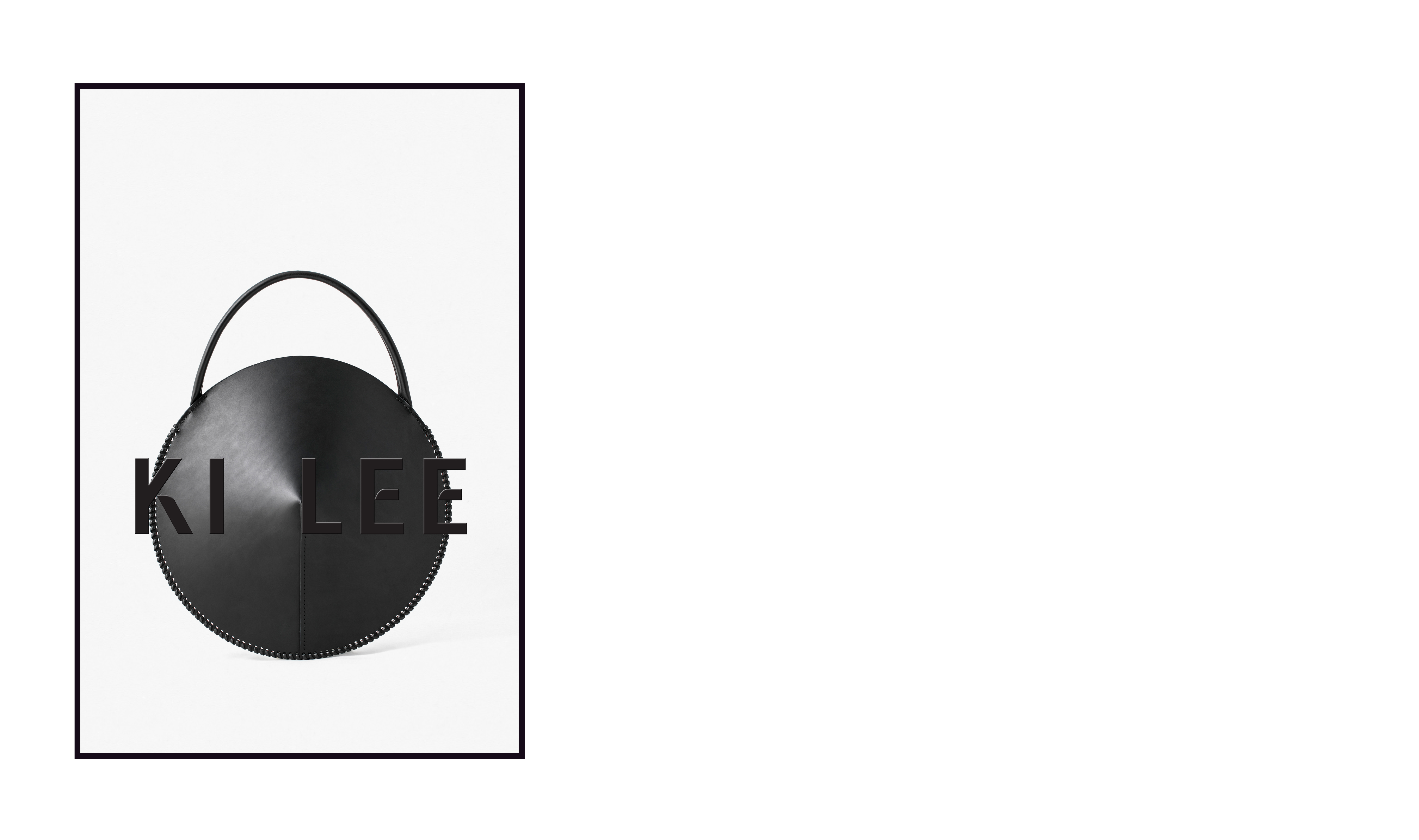

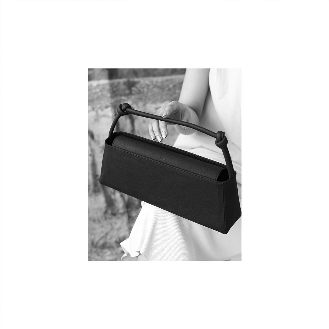
KI LEE
LOGO DESIGN
LOGO DESIGN
+ INFO
Logo design, business cards